
30
August
2017
I work on this for months, and I think it was time to ask for your participation to improve this blog ! Web technology is moving too fast for a print guy! When I design the second version in 2012, it was great to have 900px images, even if they were long to load! But today, the blog is not responsive, and we have worked on so many new features. The Kickstarter is now up here!
Following your answers to the recent survey, we work hard to design a new blog and improve your experience, this is what the new blog will features :
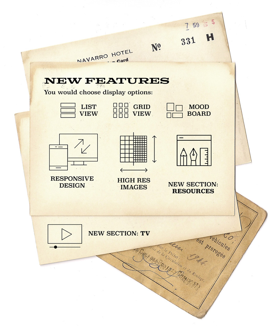
HD IMAGES : New images will be 1400px minimum, and if it is a success, we will repost all the images since 2014 at this size.
SHOWCASE : This will be the inspiration post, ordered by section like "identity", "packaging" or "print". On the actual blog, you can browse images and images! With the new version, you can choose between an "article view" and a "list view", an made the experience the best for you.
MOODBOARD : Imagine you can order the thousand of images from the blog by tags! You will now choose if you want to see all images, or just the ones from "metal ink", "letterpress" or "wood"!
RESOURCES : Added to the actual "inspiration" post, the new version will also refer to images, types, everything you can get online to improve your creations. I will also post some of my own vintages files in high resolution!
TV : It will feature all the videos that for now I only share on social media: printing technics, studio visits, lettering workshops etc...
REWARDS : new ebooks, posters and calendars !
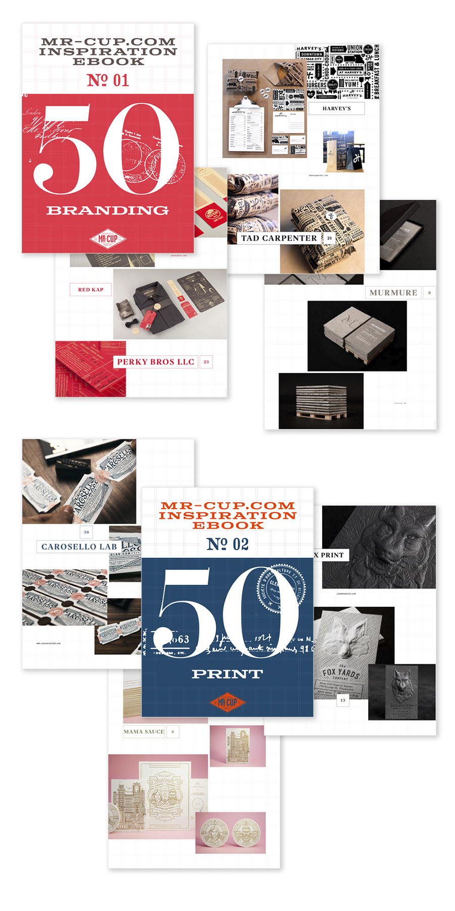
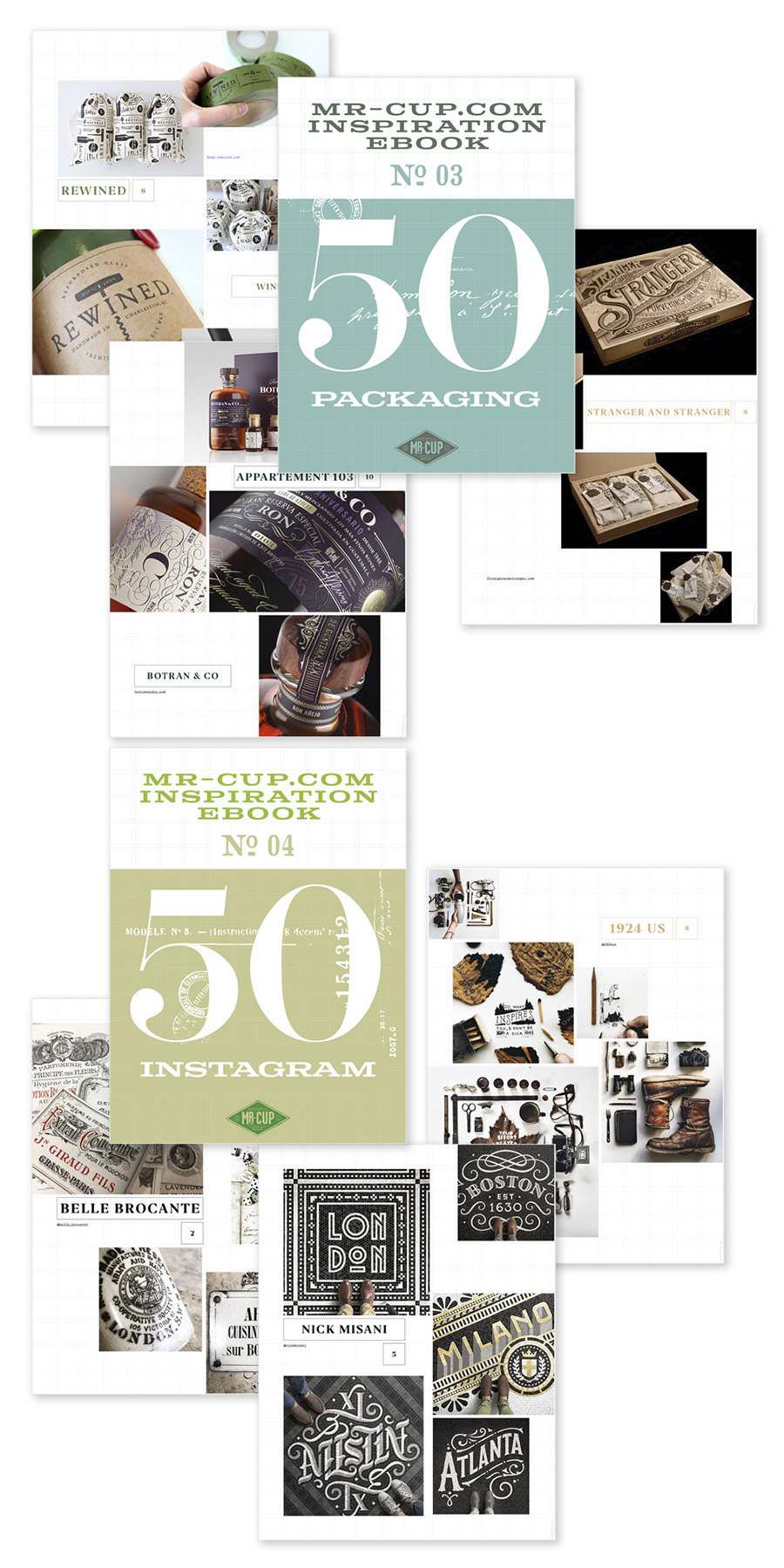
We design 4 e-books specially adapted for an iPad size, each one with 50 inspirational projects in 4 categories: Branding / Print / Packaging & Instagram!
I also propose you the recent letterpress posters at a special price and put some of my personal copies of the letterpress calendar on the table!
31
July
2017
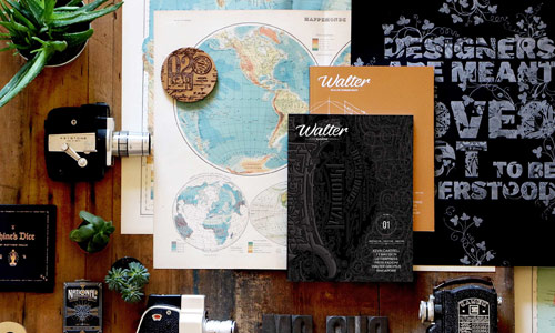
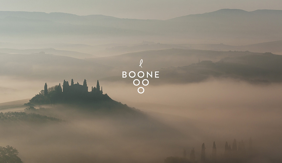
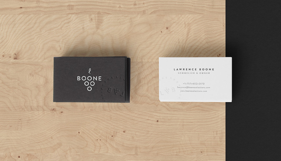
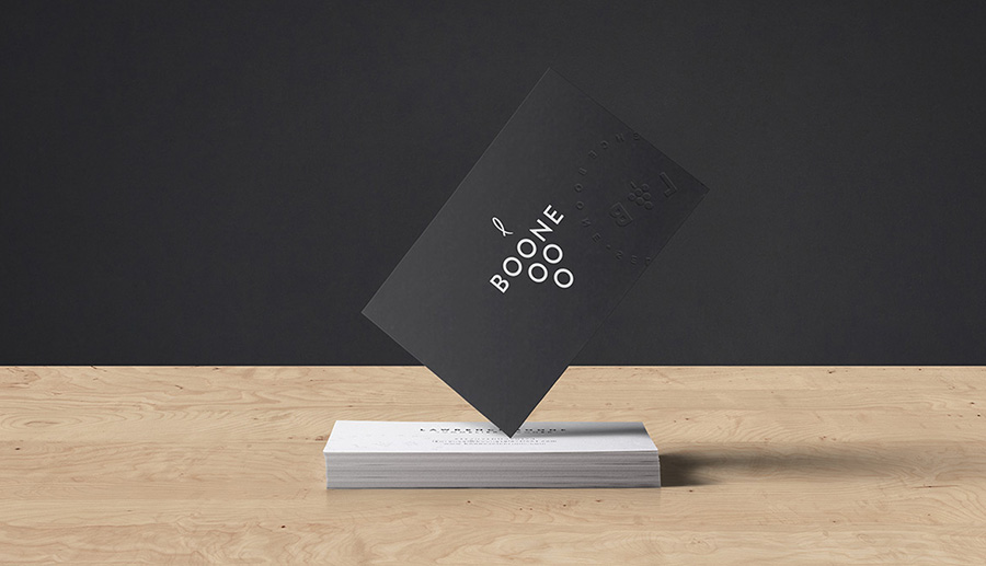
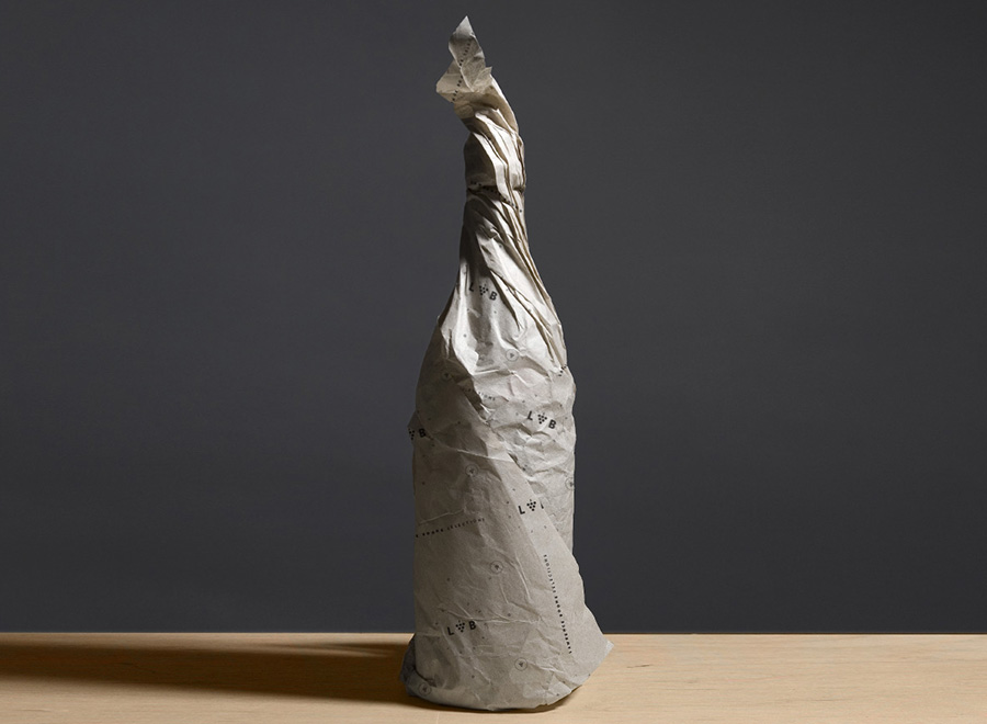
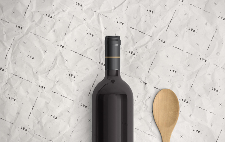
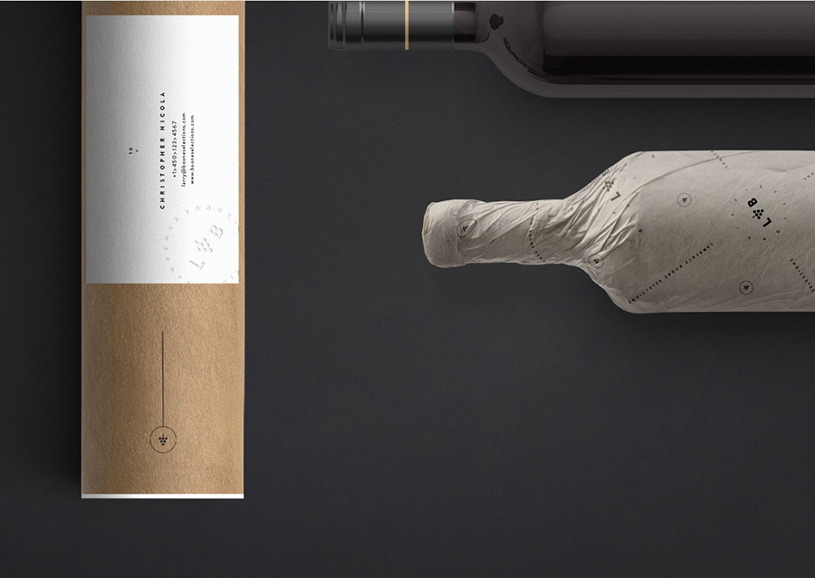
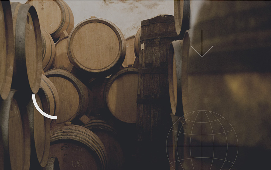
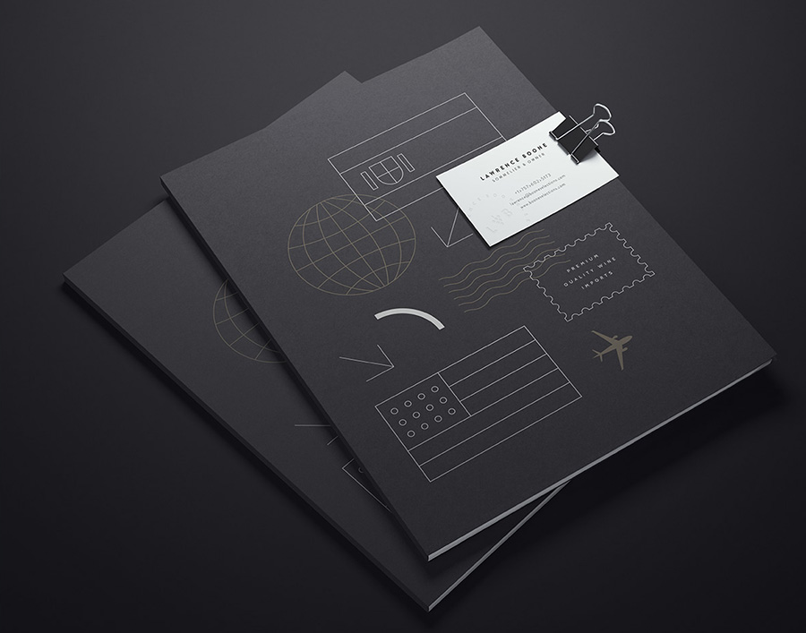
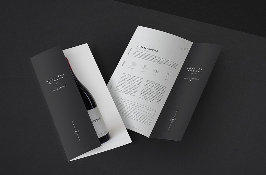
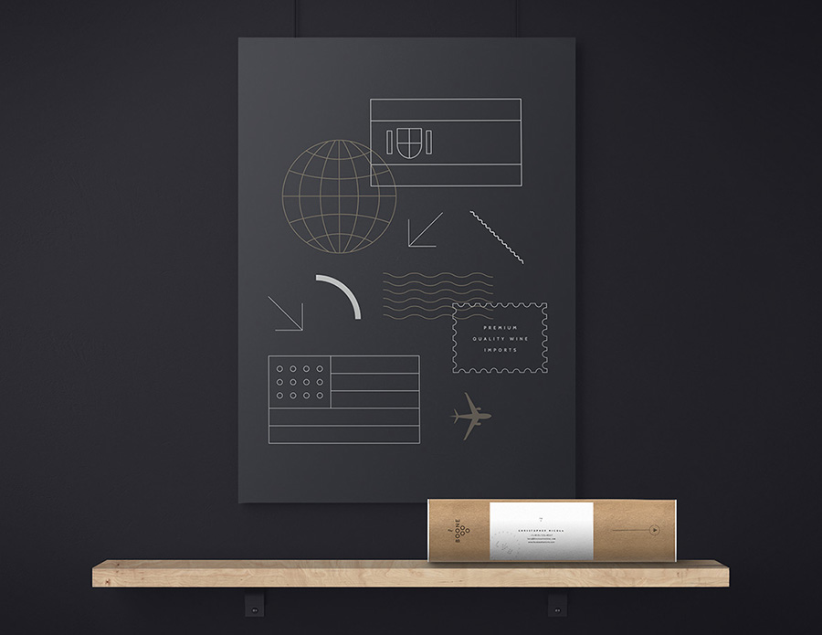
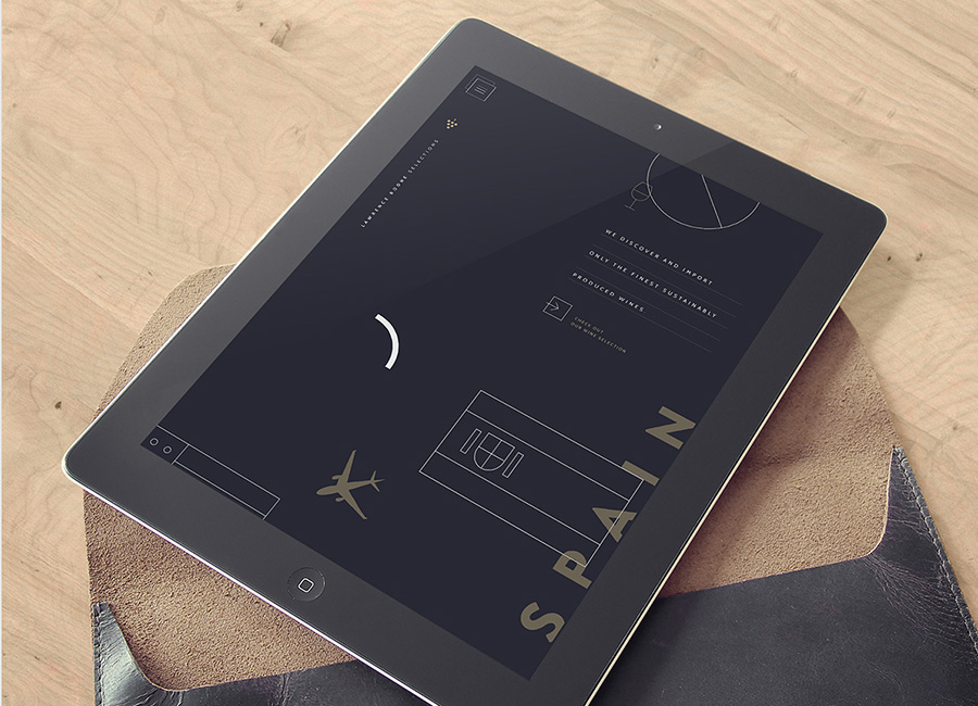
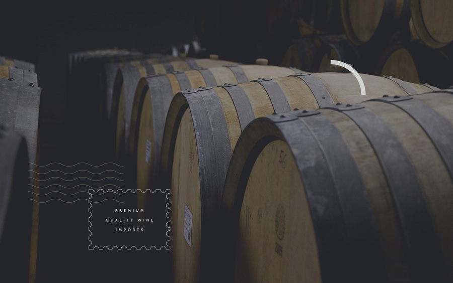
Lawrence Boone Selections by Phoenix
posted in Identity
at 11.29 AM
from
Mr Cup studio
(near Arles)
/ France
listening Sting live Olympia
24
July
2017
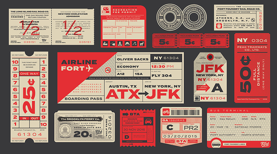
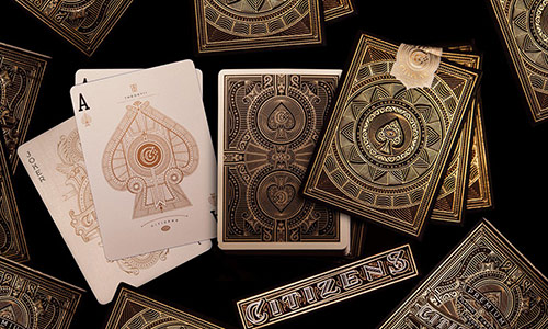
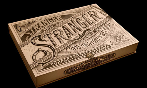
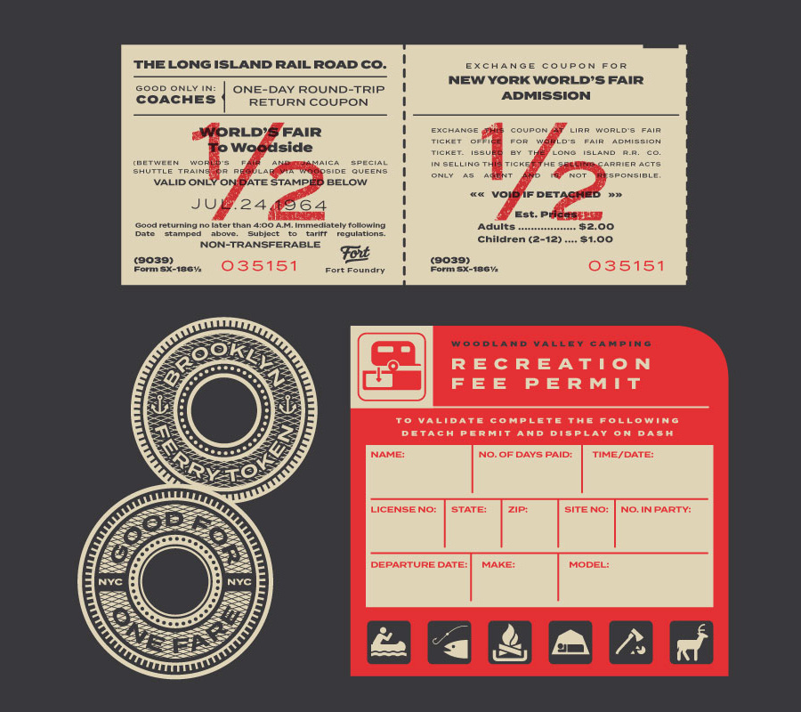
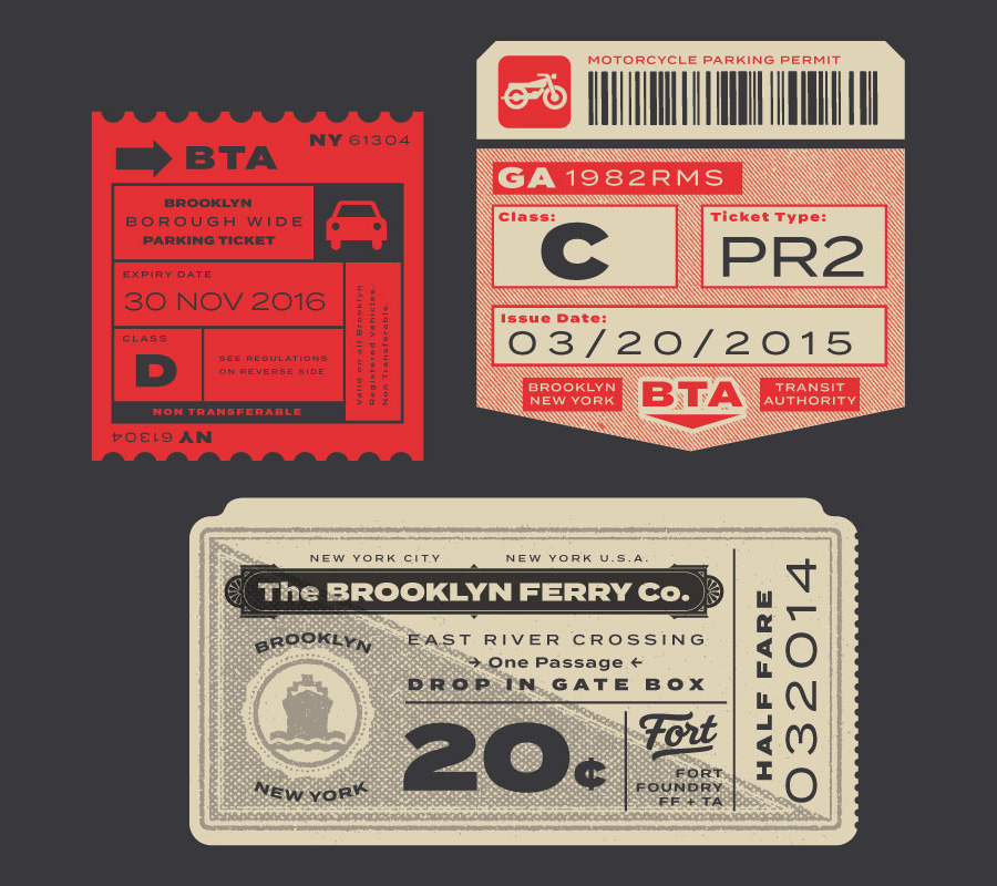
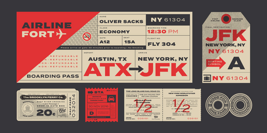
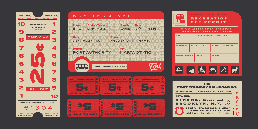
Love these vintage typographic ephemera created by Two Arms Inc: "We are huge type nerds and of course jumped at the chance to go crazy with this illustration. Termina by Fort Foundry is a typeface inspired by airport terminal type. We took it a step further and included all kinds of transportation."
19
July
2017
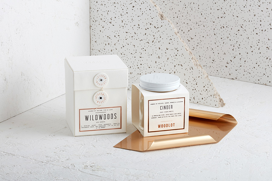
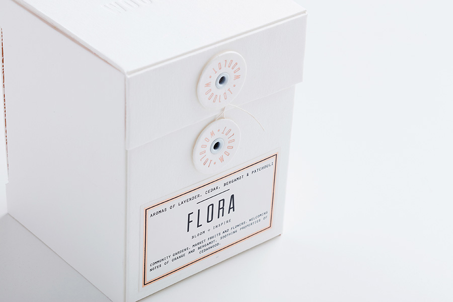
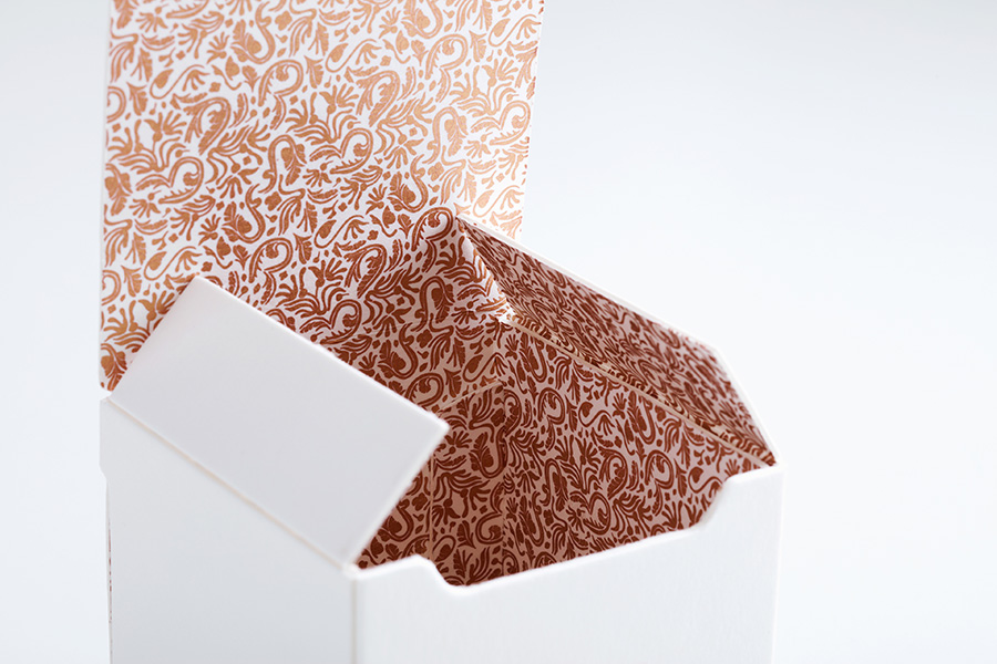
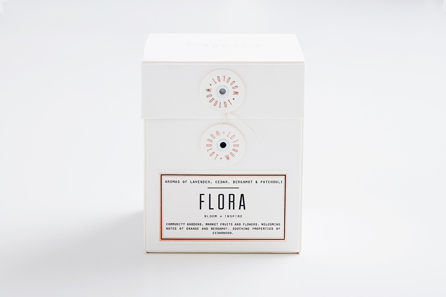
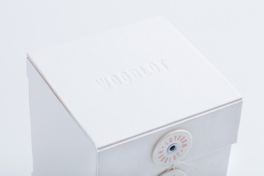
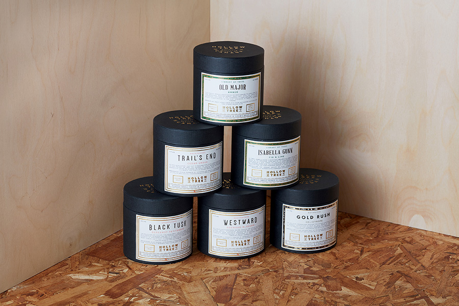
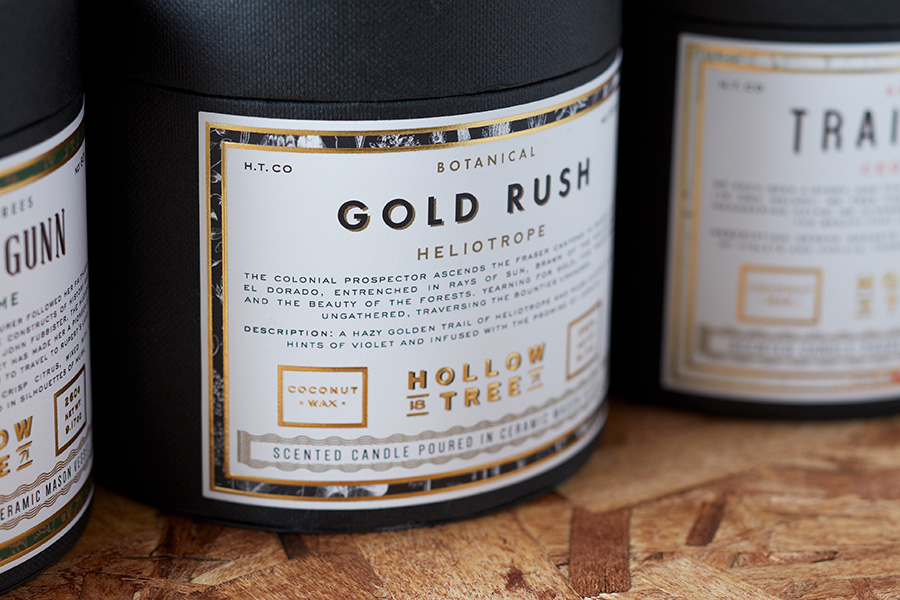
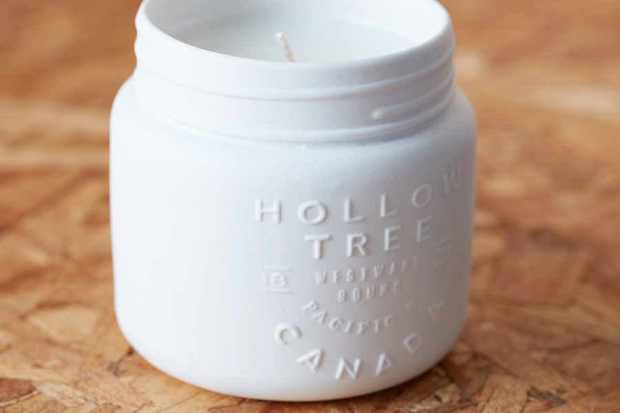
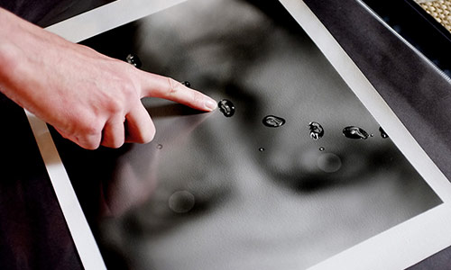
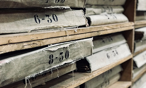
We are working on new e-books, following suggestions of the recent survey (49% think the best way to support the blog is e-books...). It makes me dig into the blog archives and ask intern here at the studio to order things and get better resolution images... It also brings to me to sites I visit months or years ago and see updates and the new project! It is the case with Arithmetic for which I share projects in 2014! Love these new packaging! Enjoy
To follow the Mr. Cup rebranding with the 3 web sites for the studio, shop and blog, I also now separate Instagram in 3: @mrcupstudio for all the self-initiated and commissioned projects, @mrcupblog to share inspiration and the original @iammrcup which is more my daily life!