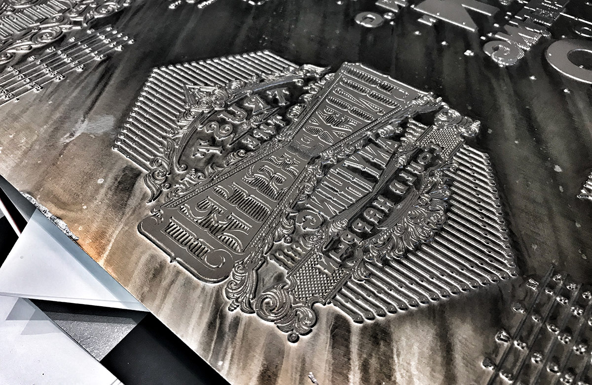

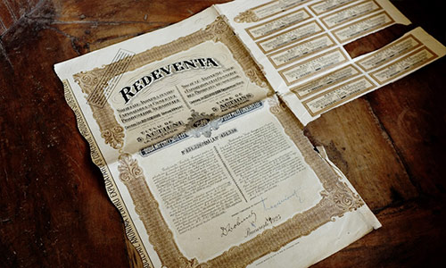

23
December
2018
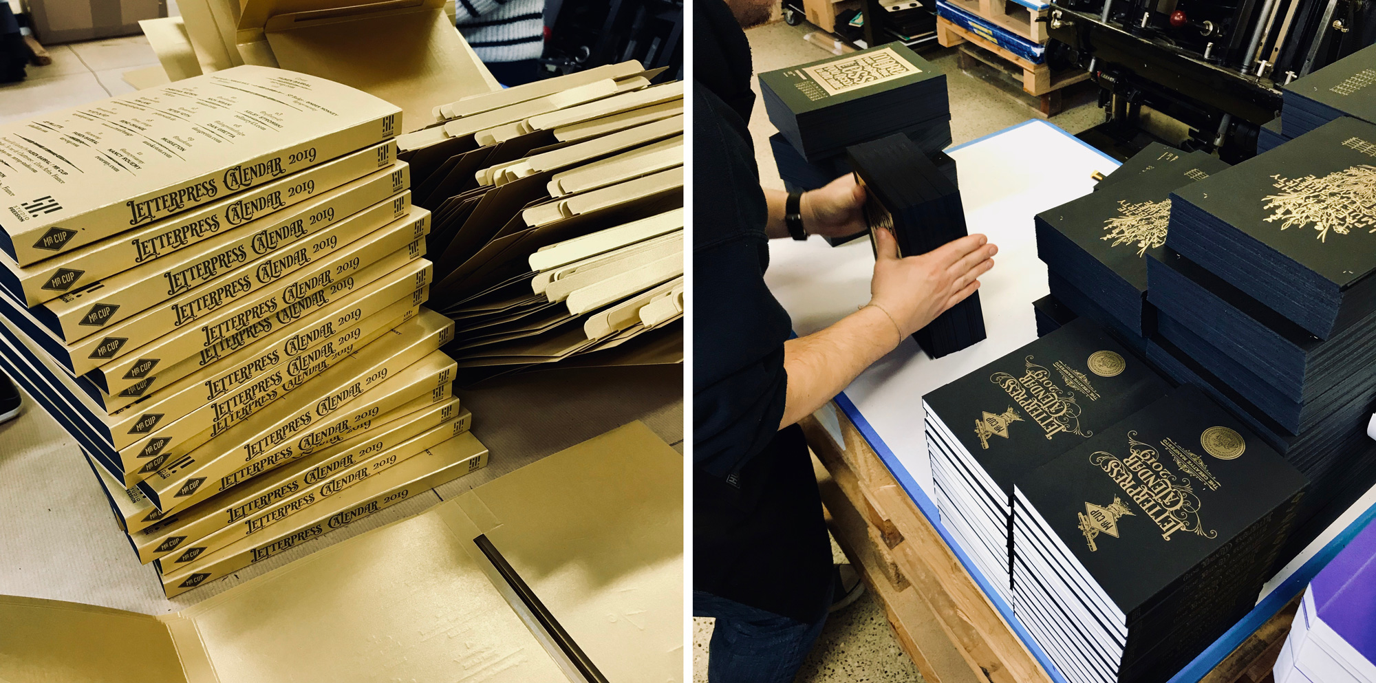
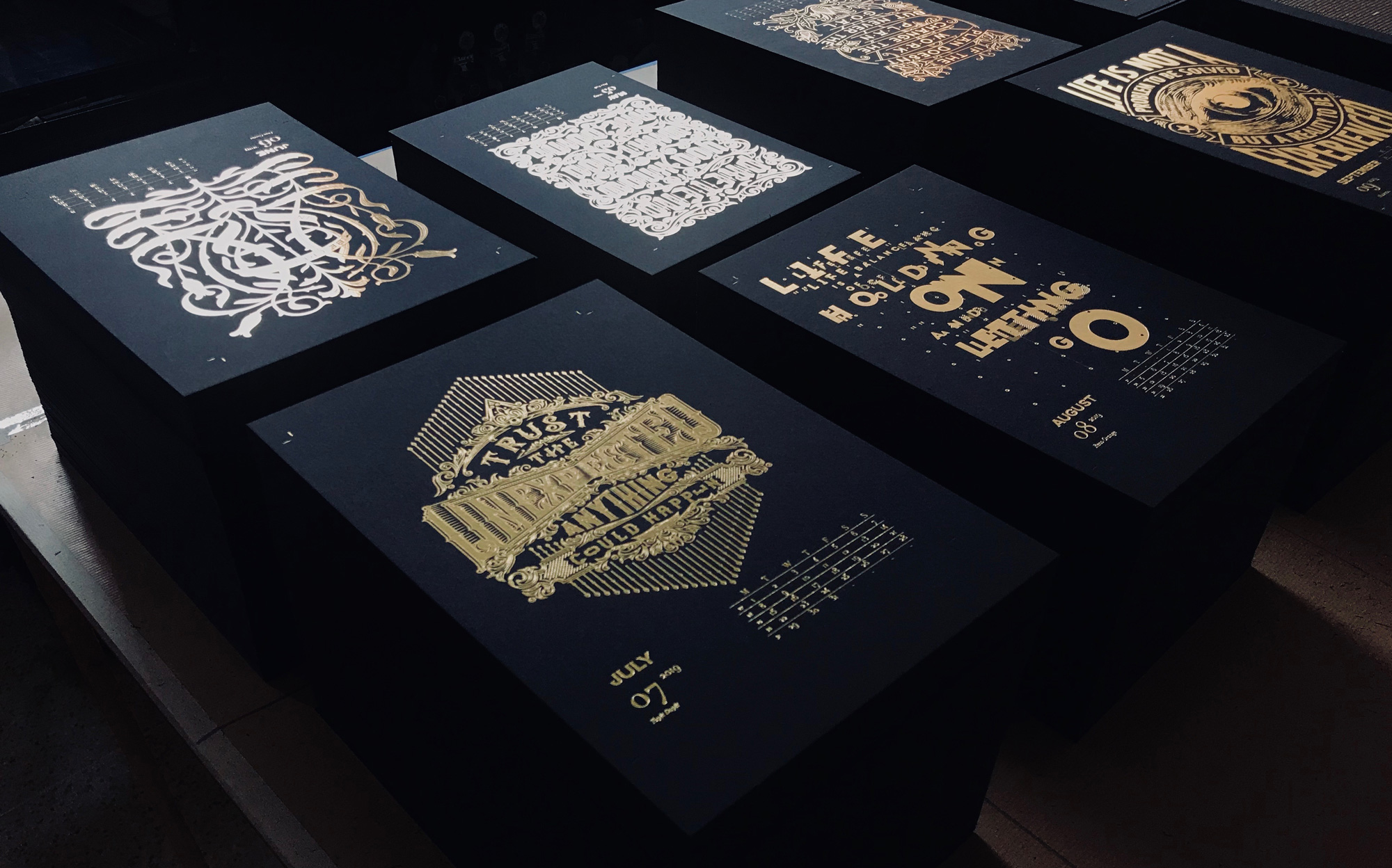
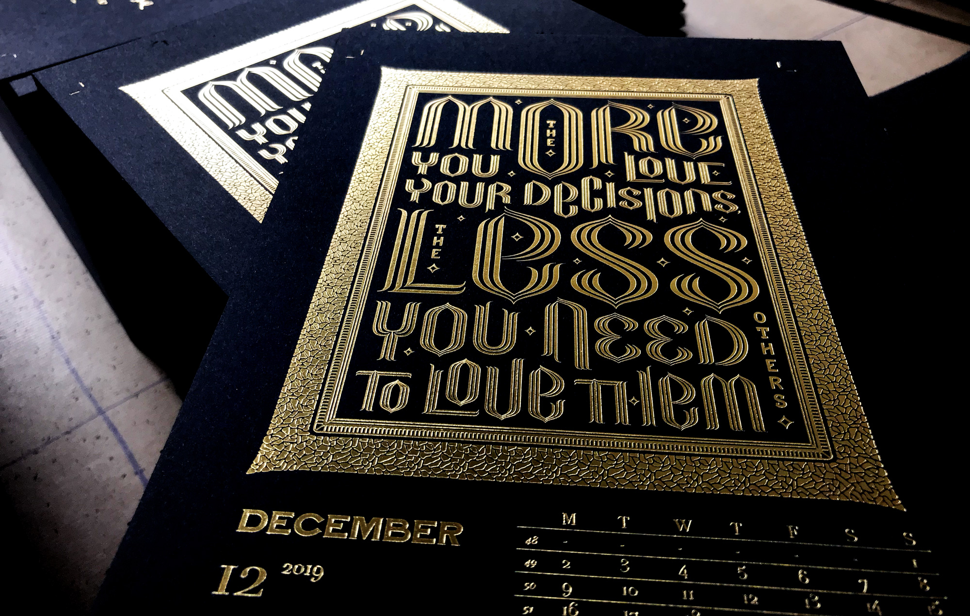
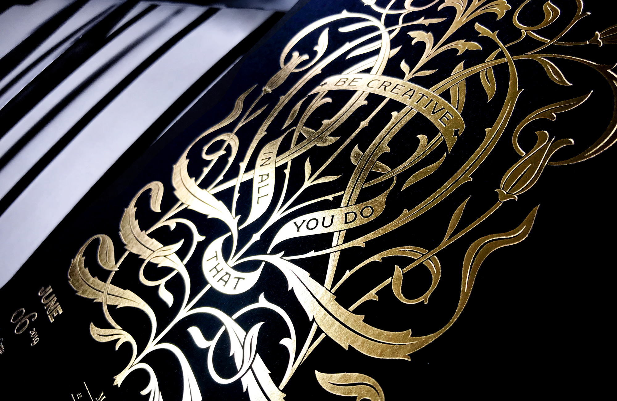
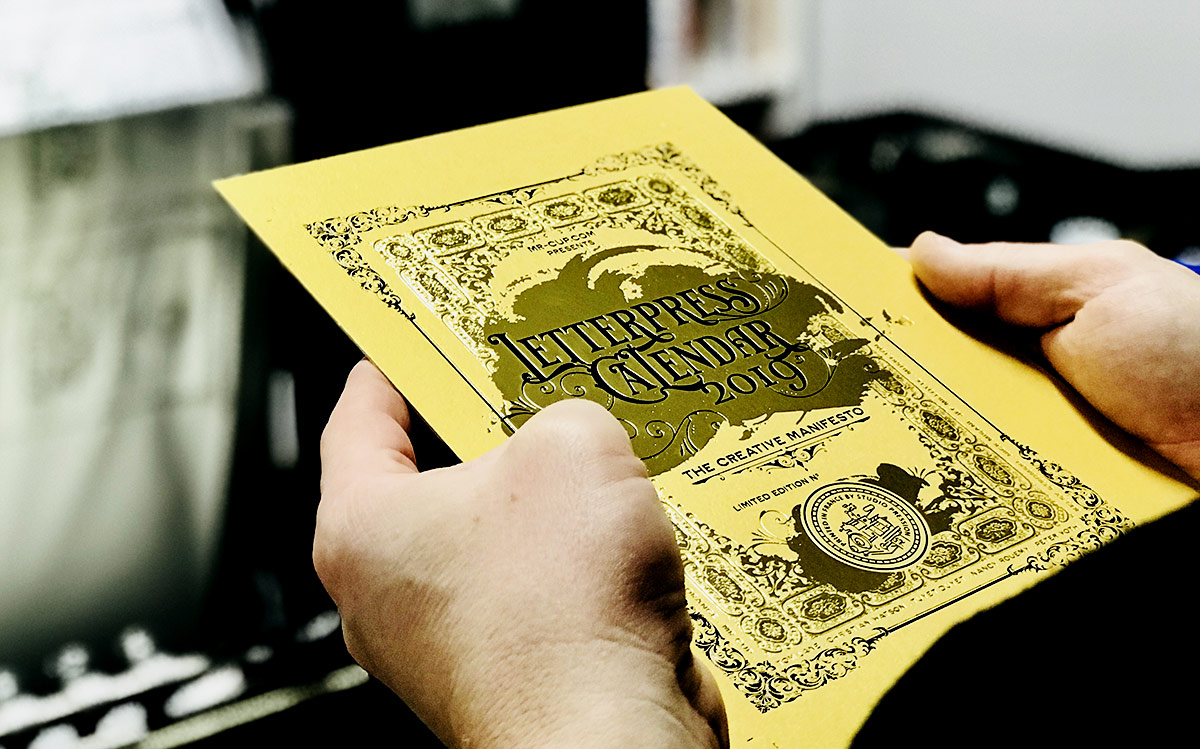
Hope you are fine and ready to enjoy Christmas time with family and friends. We work hard with Studio Pression this week to finish the calendars and start shipping. After some very long days, they are now ready and 1/4 are sent.
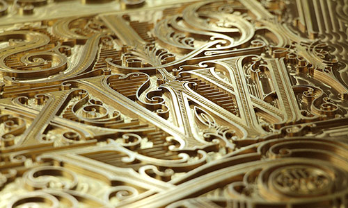
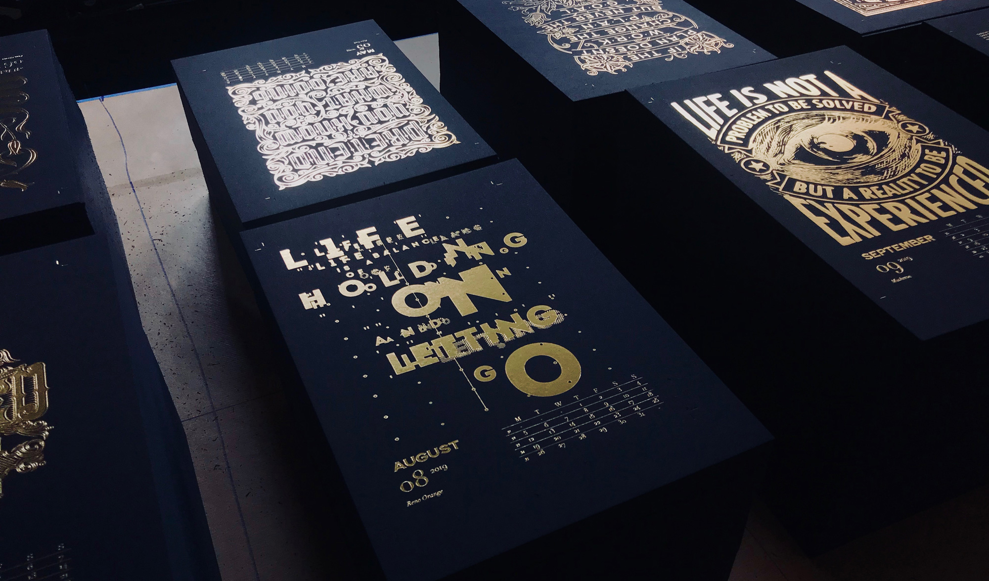
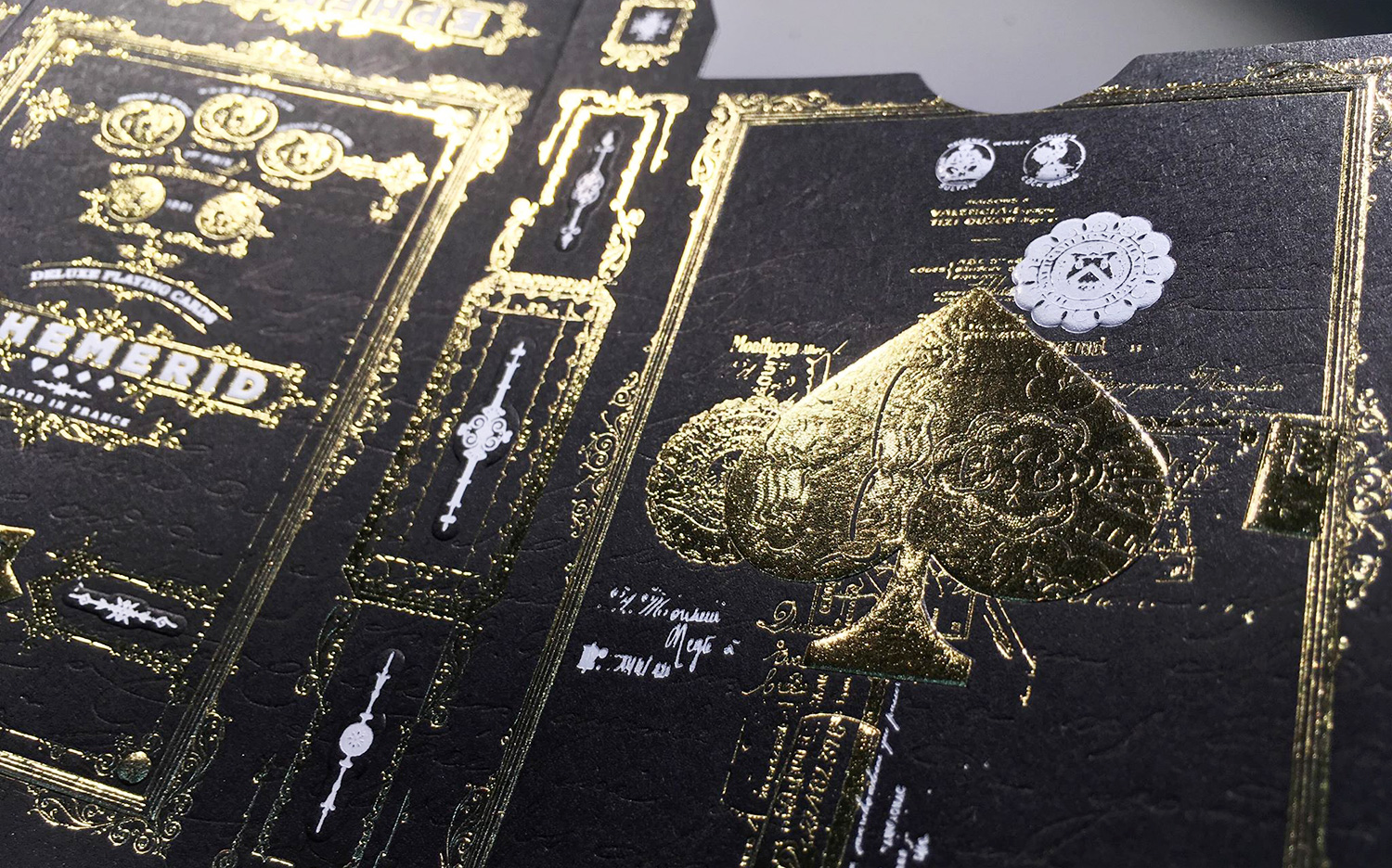
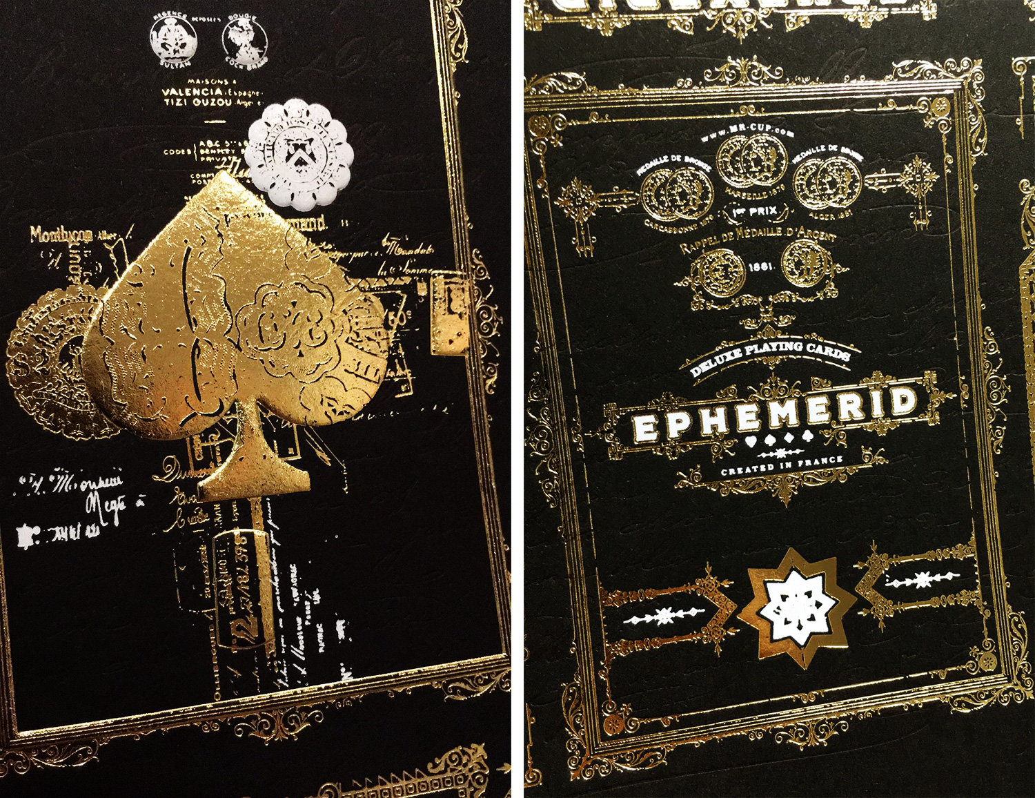
Here comes some more making of pictures of the hot foil pages...
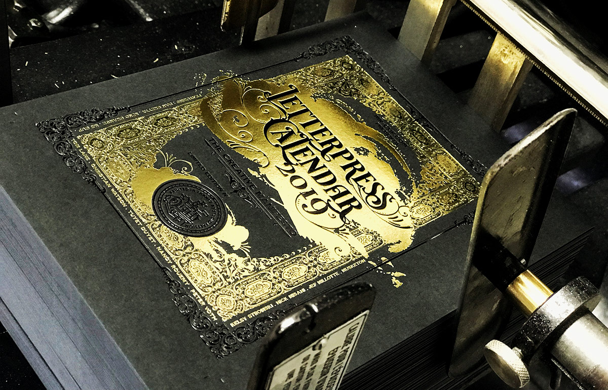
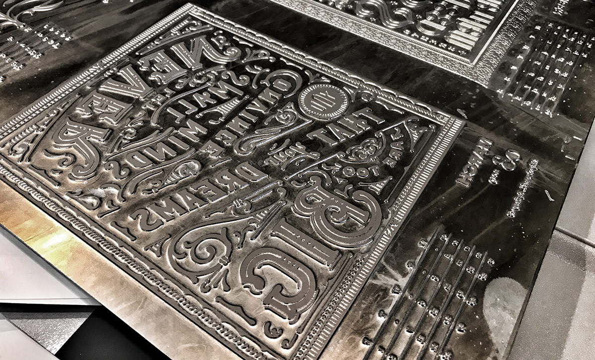
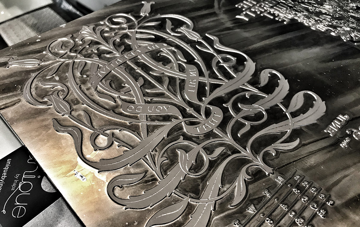
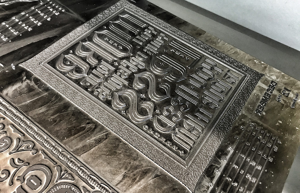
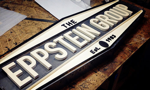
18
December
2018
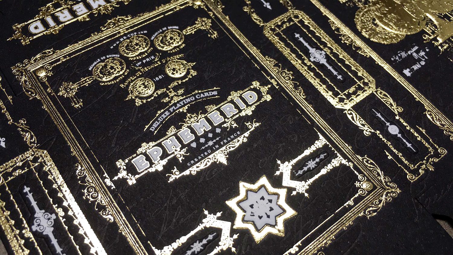
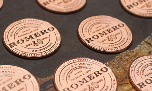
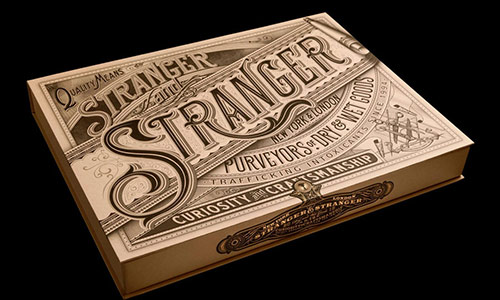
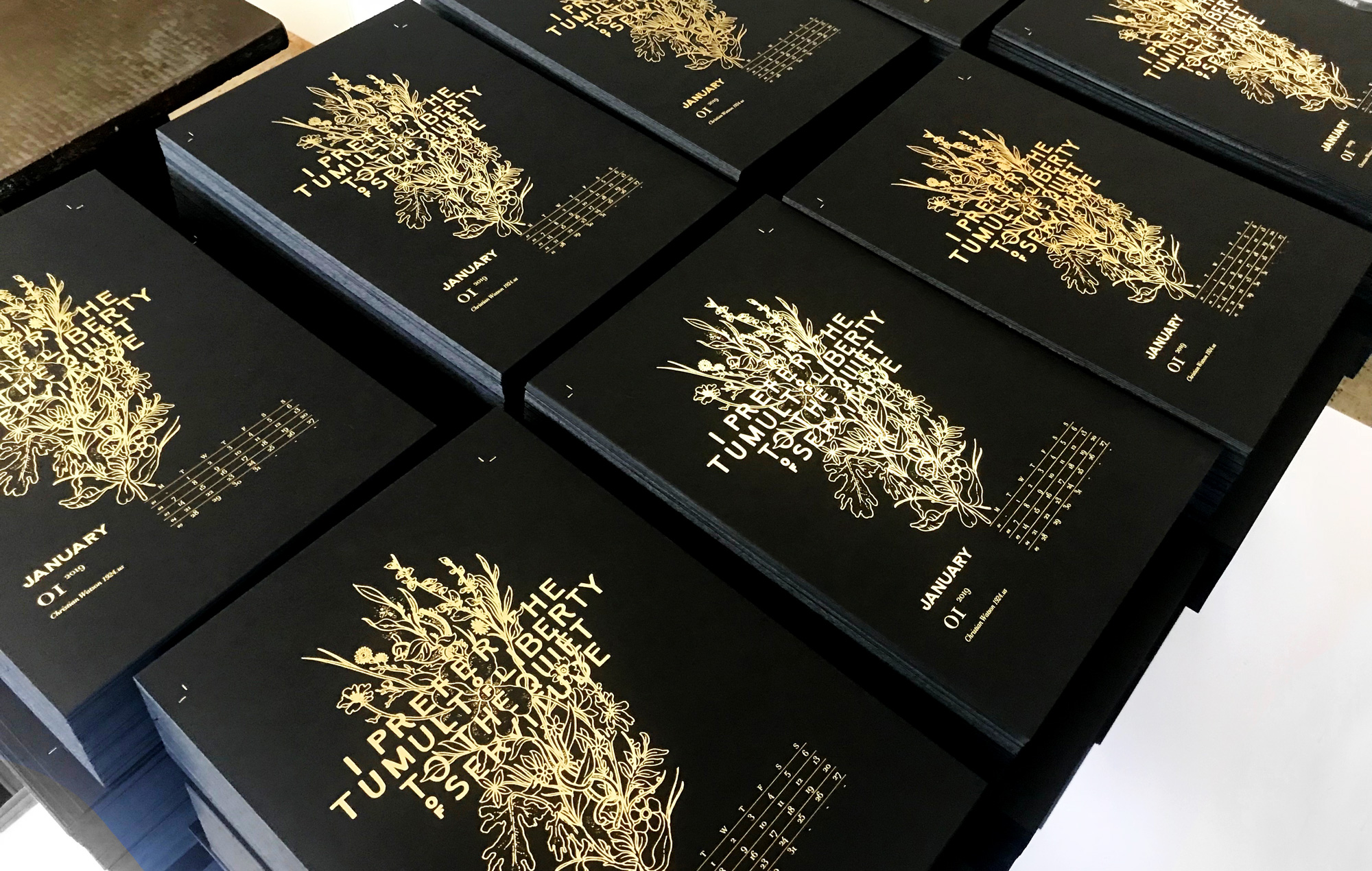
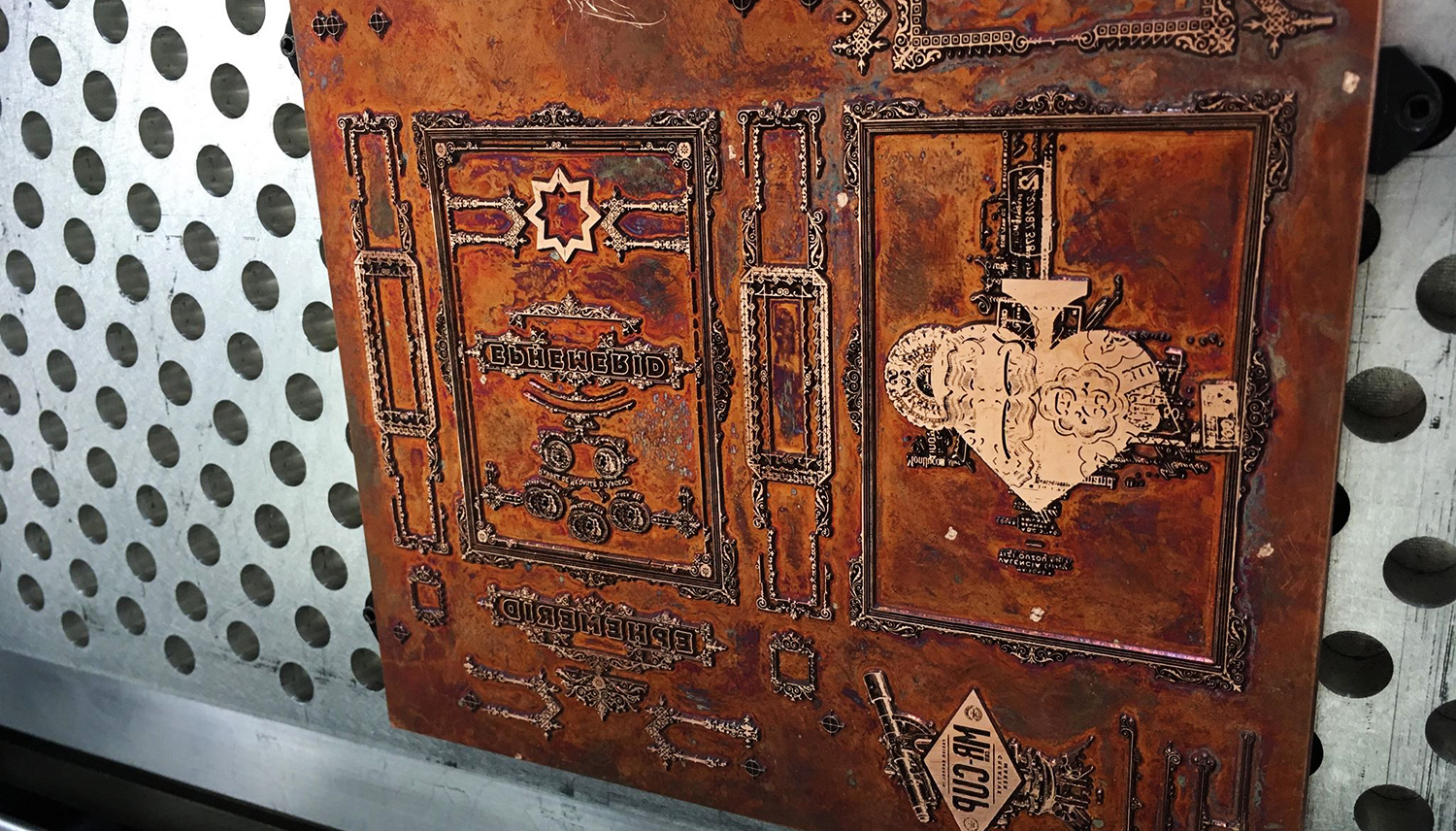
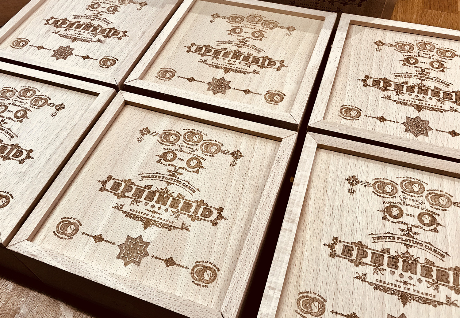
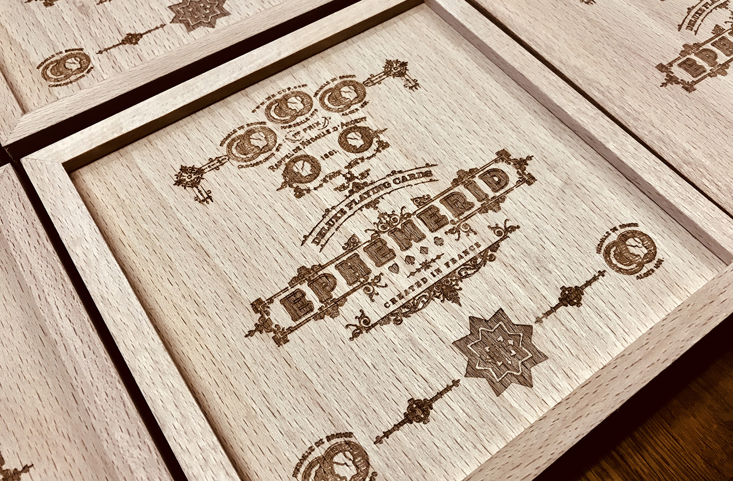
Past weeks have been very busy. I am very pleased how it turns out, the details are impressive as it is the first time we use copper plates. Here are some making of shoots...
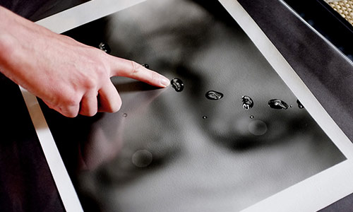
These were the good news! Because we still need to finalize the dealer coin which is very complicated. But I am close to found the solution. The coasters should be printed this week, as the thanks card! So, as you understand, I am really sorry to have to announce that the Ephemerid cards won't be delivered in time for Christmas. No magical power will bring them under the tree in time, sadly... Thanks again for support, understanding, and patience.
13
December
2018
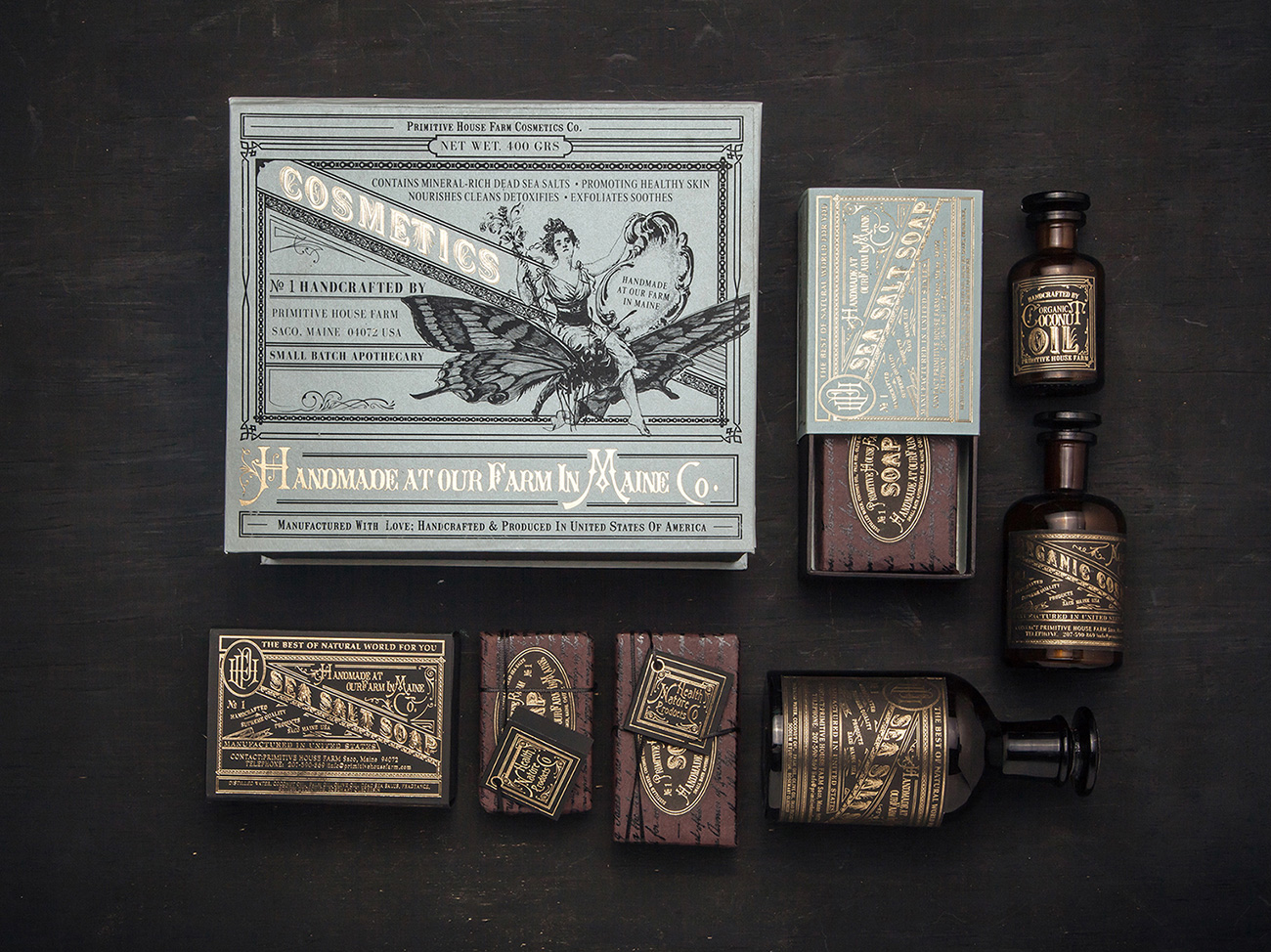
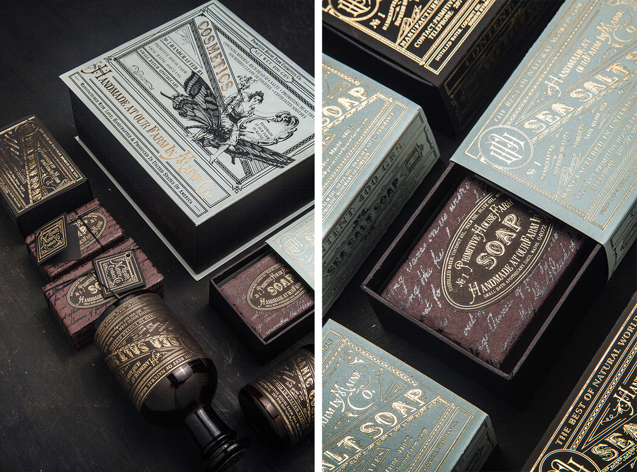
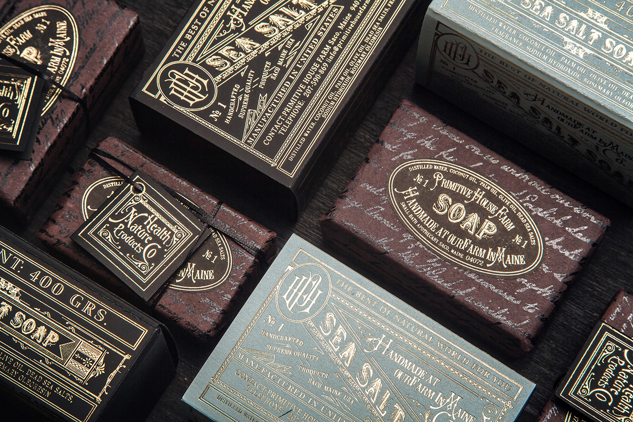
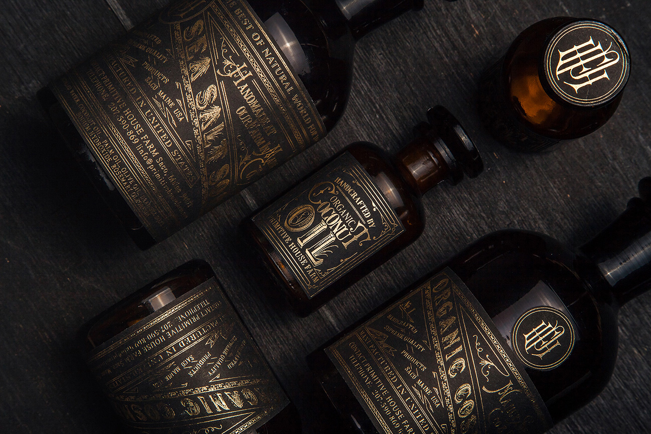
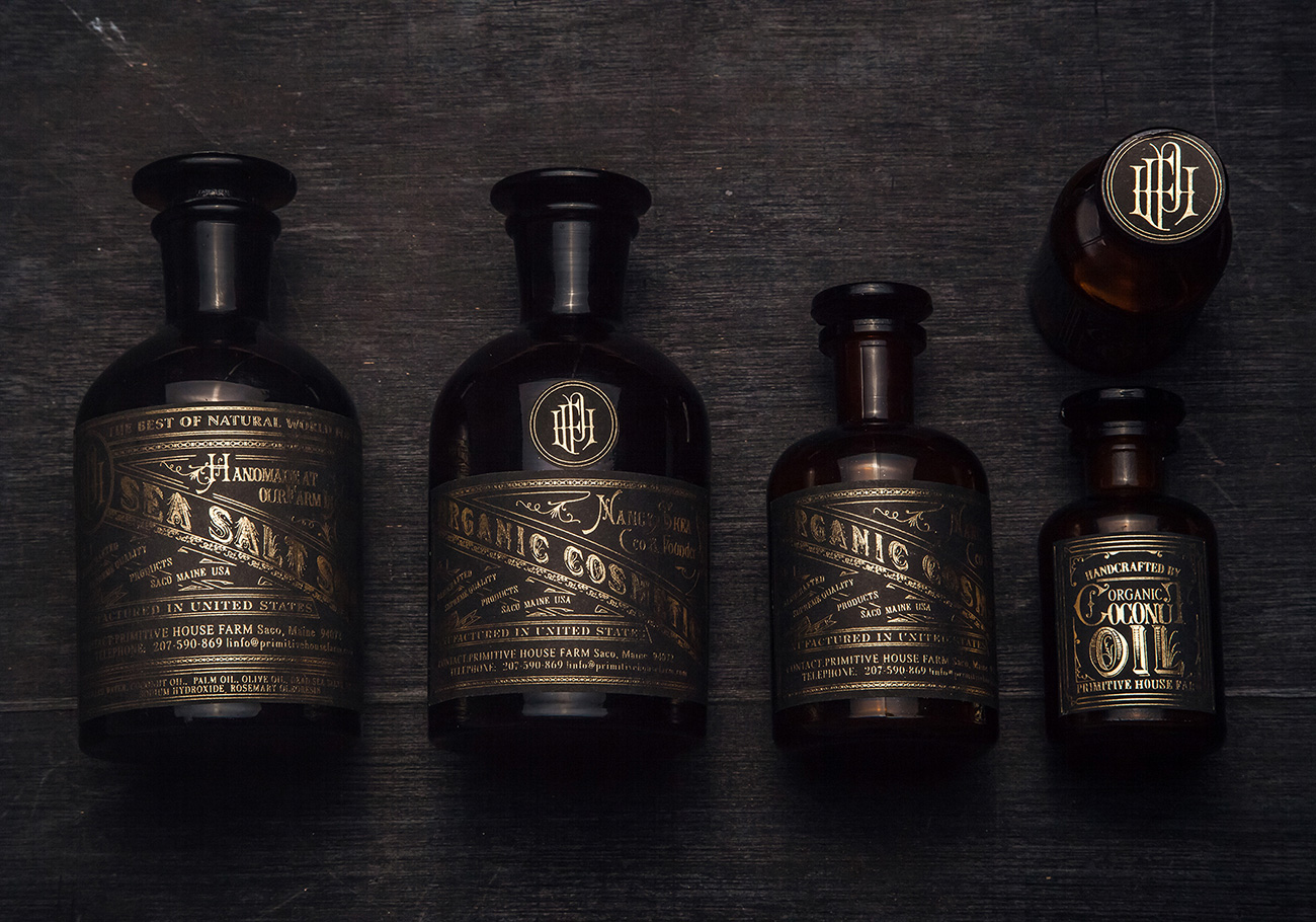
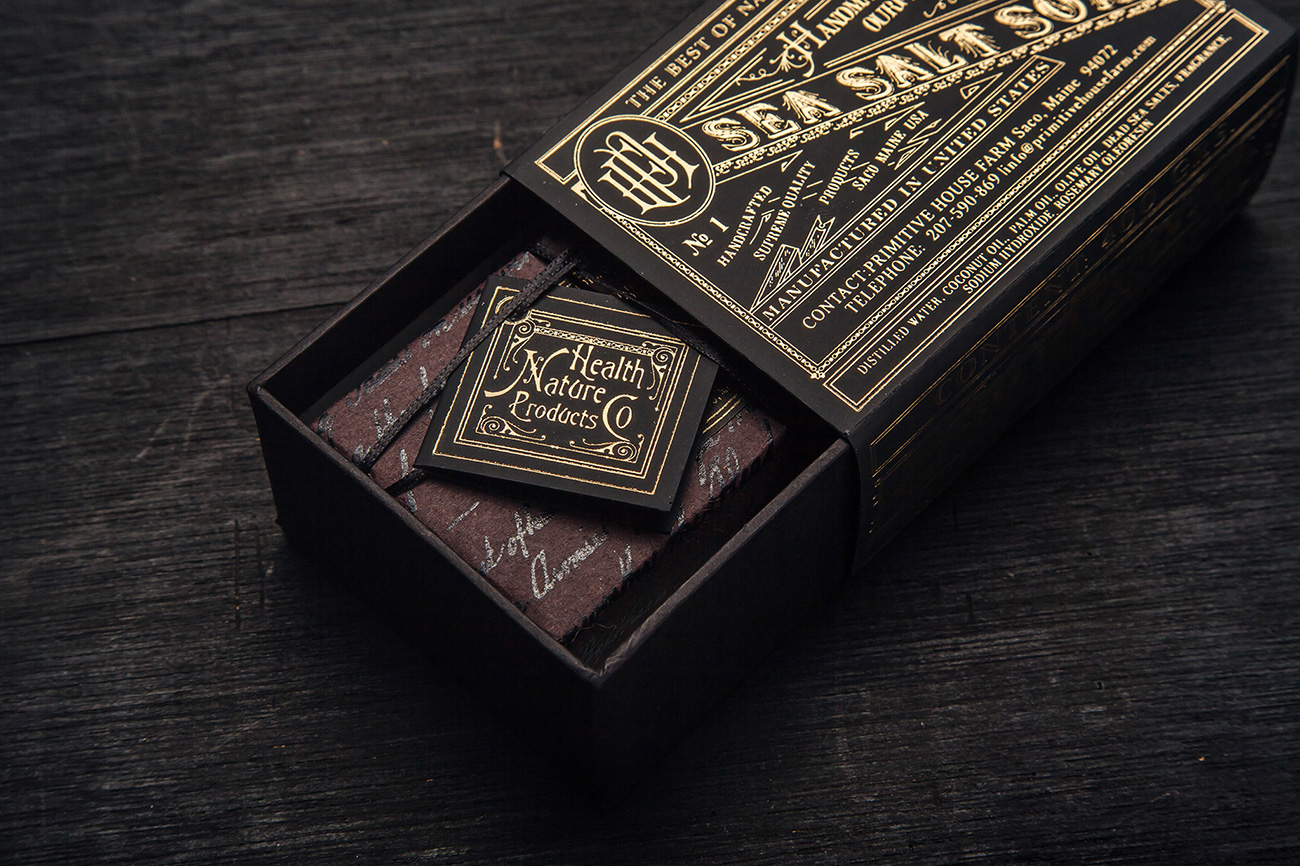
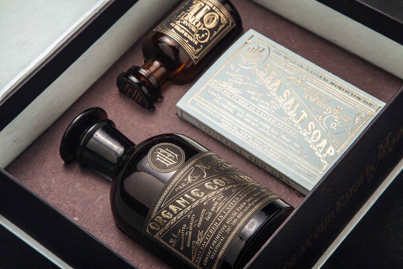
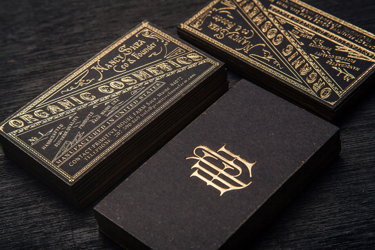
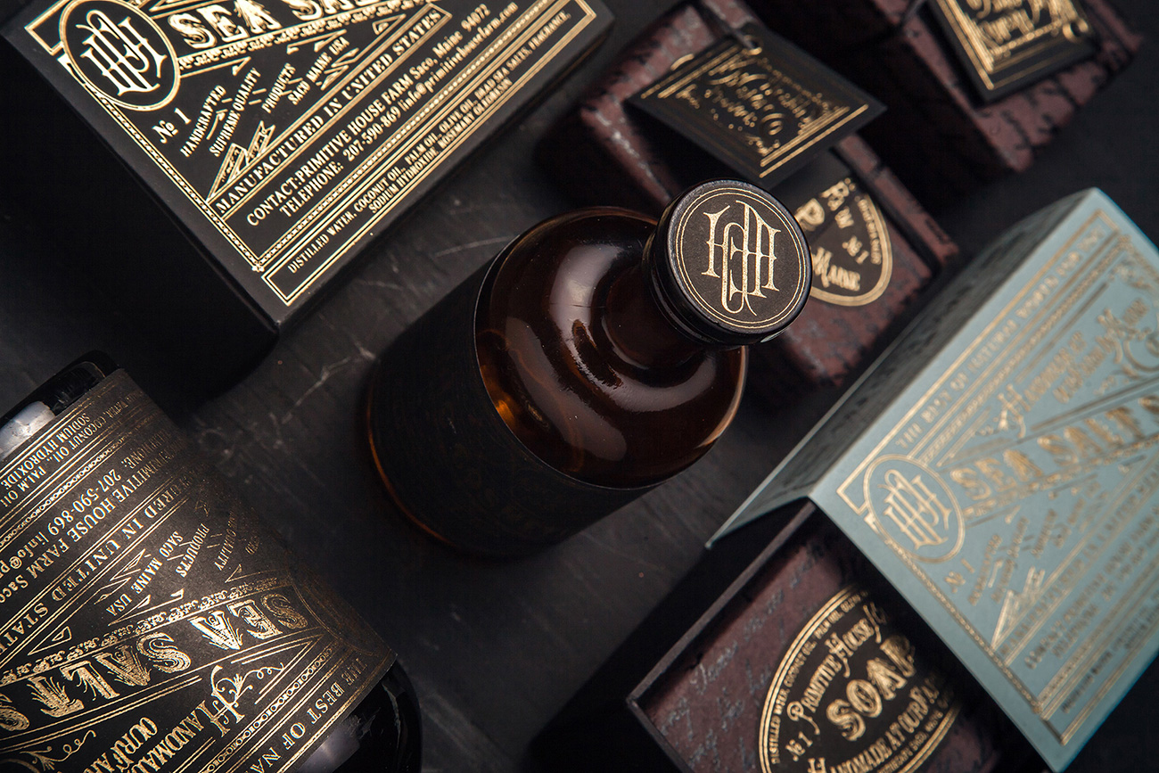
Primitive House Farm by Monotypo Studio
posted in Excellence | Packaging
at 1.35 PM
from
Mr Cup Studio
(near Arles)
/ France
listening REM Automatic for the people
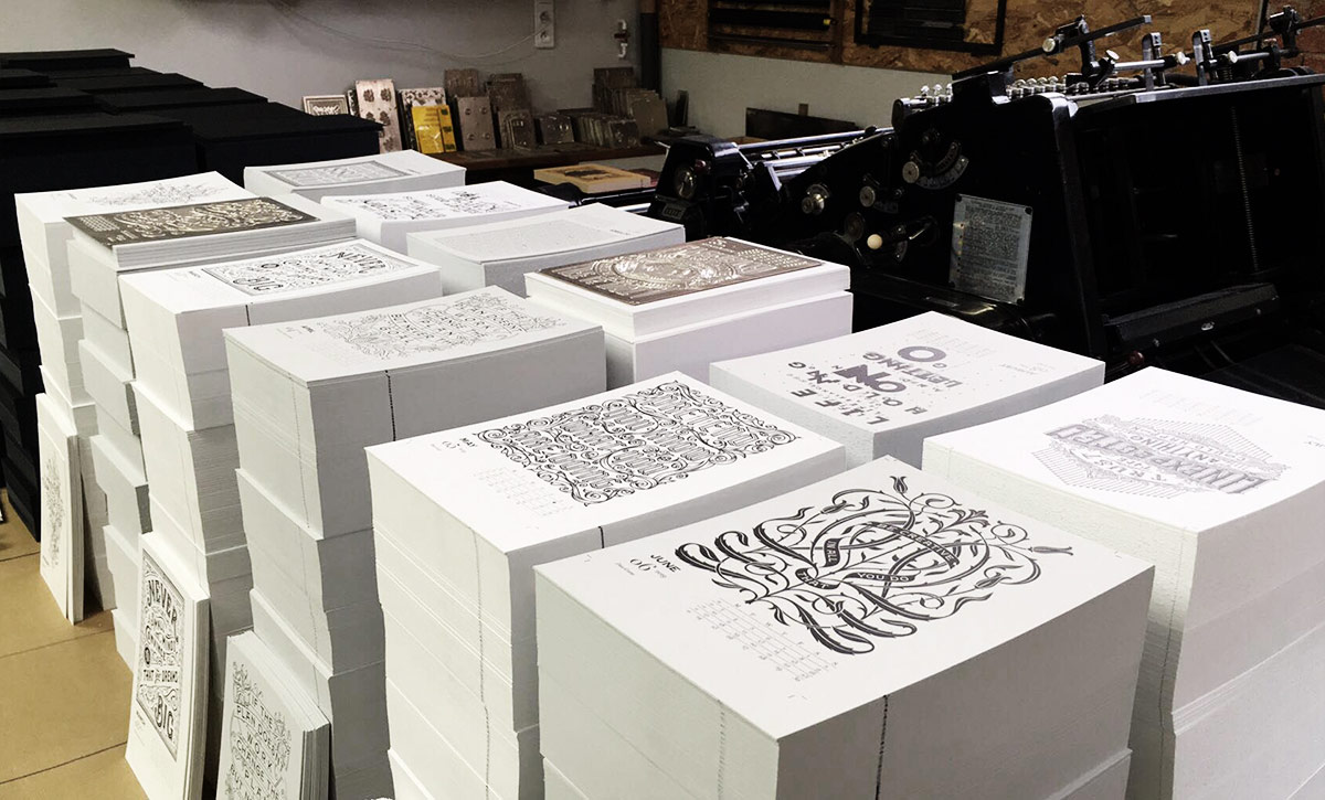
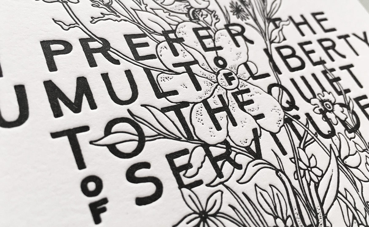
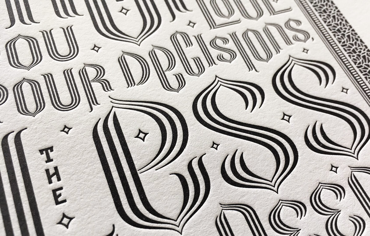
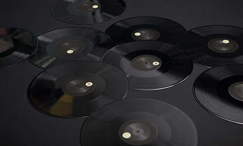
12
December
2018
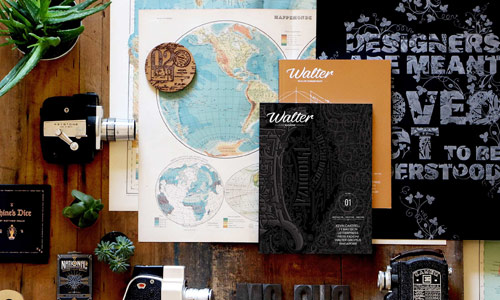
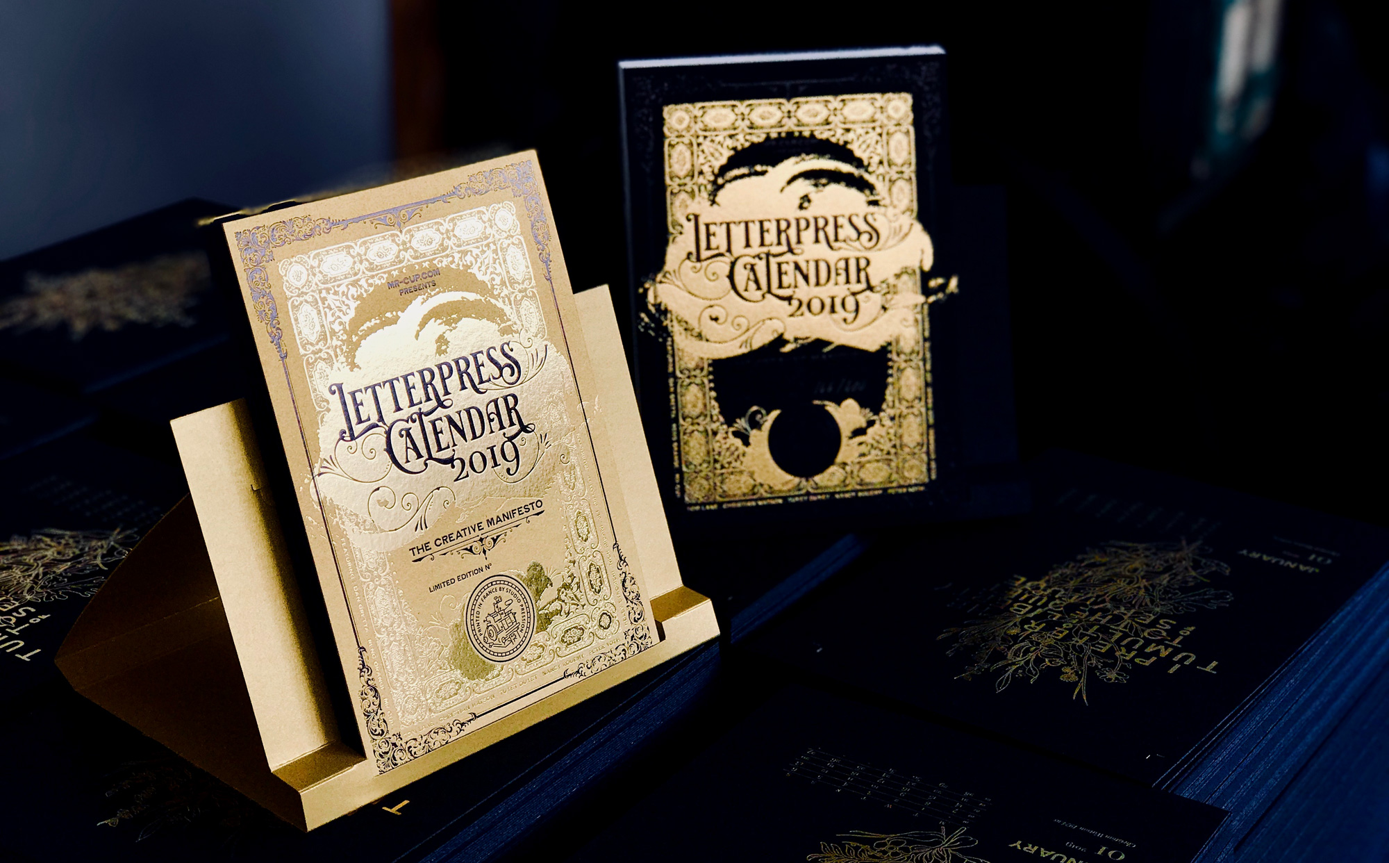
The printing is going well and so on here comes some behind the scene images! Get your copy now on the Mr. Cup shop!