

09
October
2013
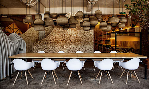
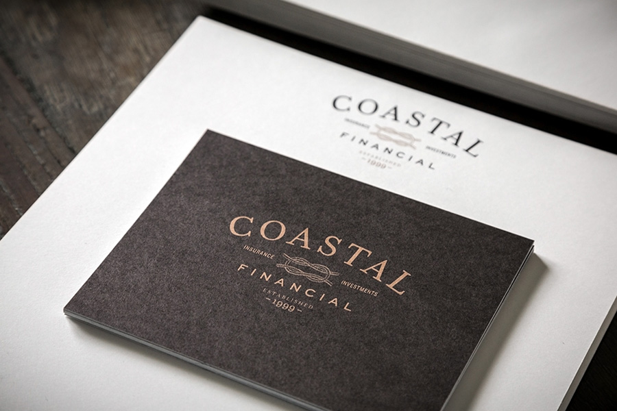
Bluerock Design (part 2)
posted in Identity
at 7.29 AM
from
Home ! Maruéjols Les Gardons
(near Alès / Nîmes / Uzès)
/ France
listening Pina soundtrack


07
October
2013
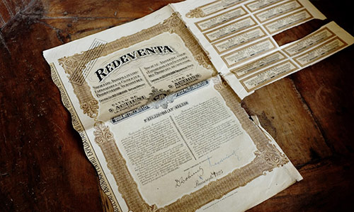
The beauty of handwriting (HD image to download)
posted in Vintage
at 7.10 PM
from
Home ! Maruéjols Les Gardons
(near Alès / Nîmes / Uzès)
/ France
listening Genesis - Trespass (back in 1970 !!!)
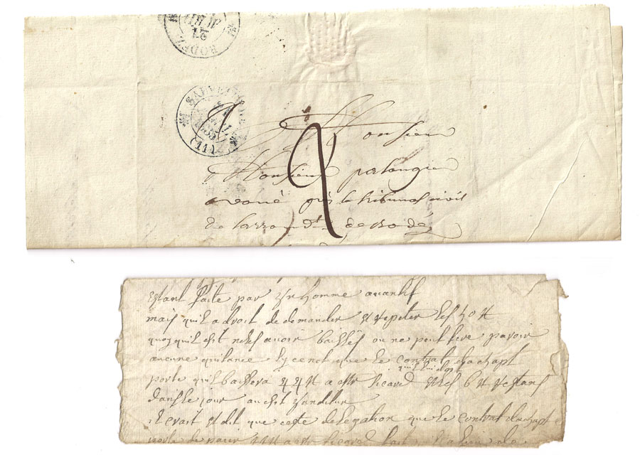
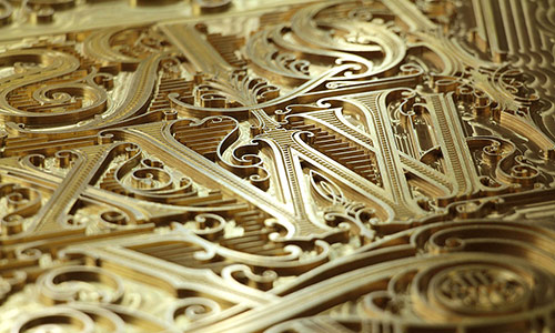
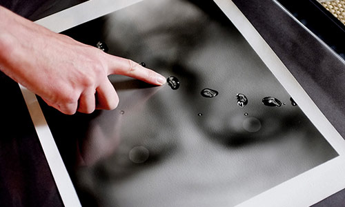
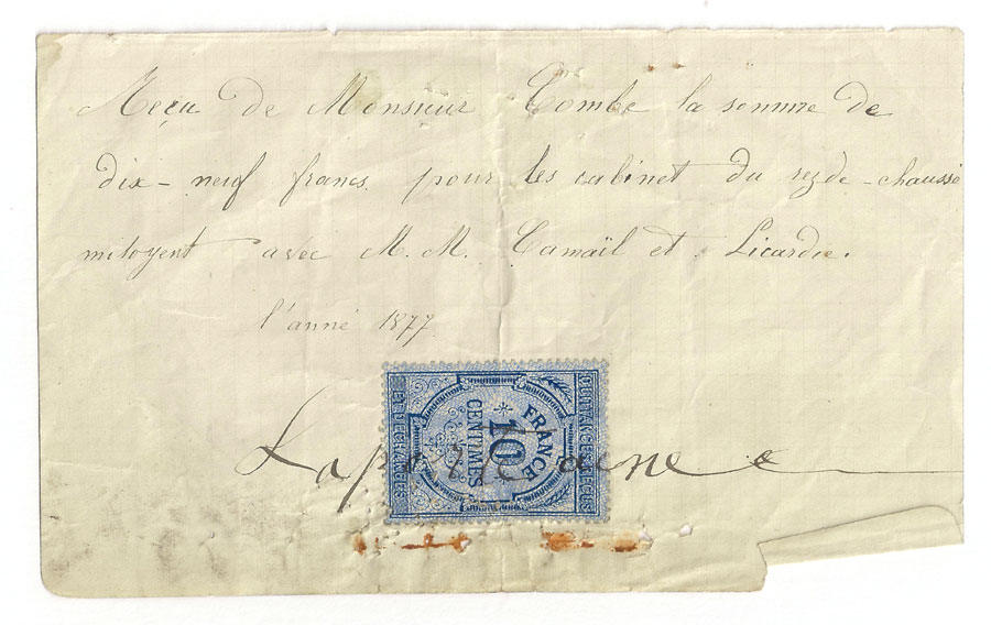
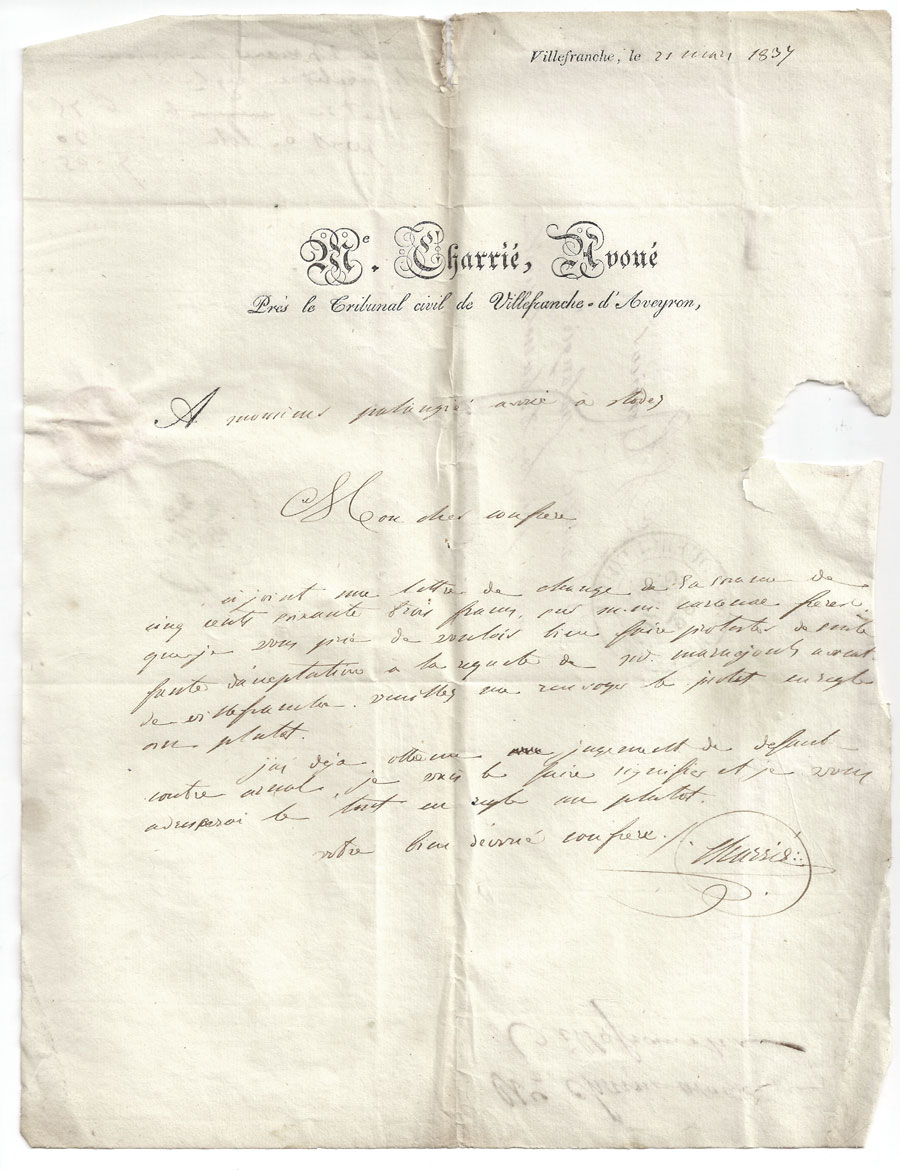
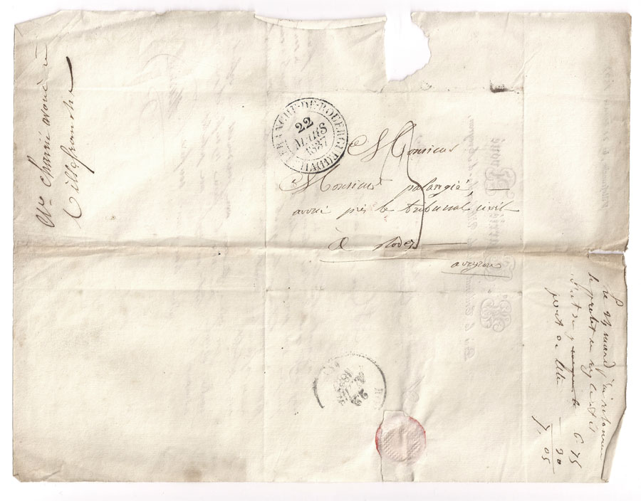
I love handwritten letters, I often found some on fleamarkets but I'm looking for those very graphic, like penmanship...
I often wonder if there are some tutorials of my work, but I never had the time to really make some... and I also think it is good to found your own way to do something that inspire you. But I wanted to share a bit about the process of creating one of the 2014 calendar page and of the cover the last THREE ebook, since both use common elements.
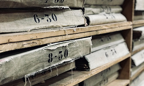
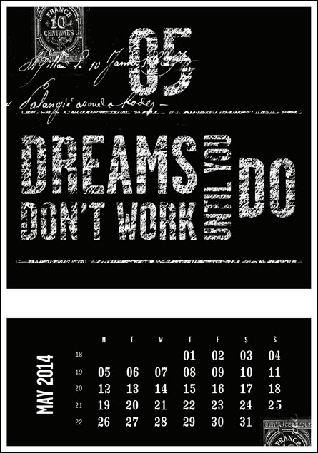
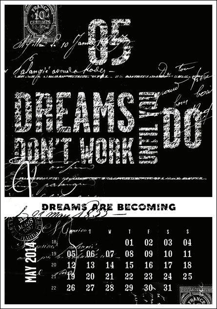
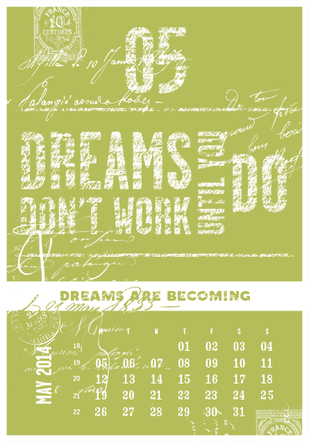
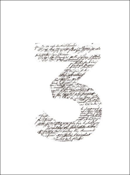
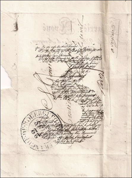
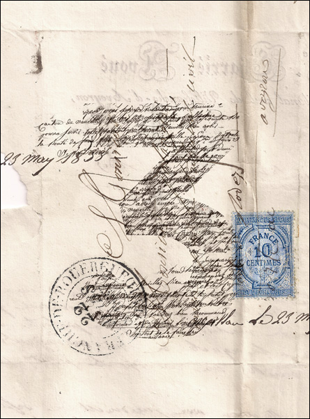
Start with the source, after buying old letters dating from the late 1800s, I scanned them in high definition.
Start with the source, after buying old letters dating from the late 1800s, I scanned them in high definition.
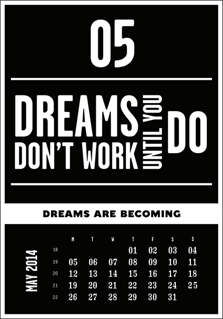
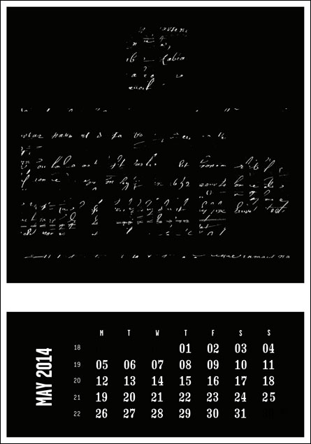
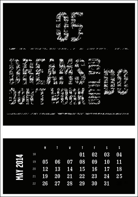
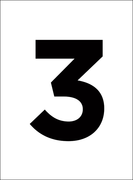
may card of the letterpress calendar
Before continuing, I want to thank those who have already pre-ordered the calendar (and those who will soon do it!). Half of the deluxe edition is already gone, it's very motivating for the future. Printing should start this week ... I also created a Facebook page dedicated to the project if you want to follow in detail.
So for the 2014 letterpress calendar, like for the 2012 one, I illustrated sentence using graphics. For the May page, these are handwriting. I think the pictures explain my job better than me, so here is a breakdown of the process...
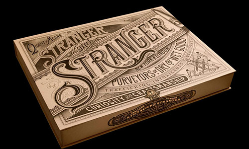
THREE . Vol2 . front cover
The principle of composition is the same for the cover of Volume 2 of the eBook THREE, but this time keeping the texture of the paper and ink.
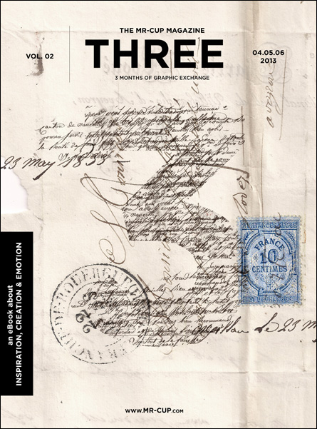
The THREE ebook is available here and contains all what was published on this blog from april to june this year.
SPecial gift - download this paper texture in high resolution
So, yes, here comes a special gift ! Click on the image below to download this paper texture in high resolution ! (available until october 14th)
Enjoy life !
07
October
2013
Upside Down Title Sequence by Moustache
posted in Movies
at 1.22 PM
from
Home ! Maruéjols Les Gardons
(near Alès / Nîmes / Uzès)
/ France
listening Grey Reverend
If you have not seen the movie "Upside Down", and if you can ignore large invressemblances in scenario, I suggest you to see it for its visual poetry... Worth a look only for its title sequence, using watercolor effects and vintage illustrations, as Sherlock Holmes ends credits did before (full article & interview on the first and second in the archives). Plus it is designed by Moustache, a French studio !
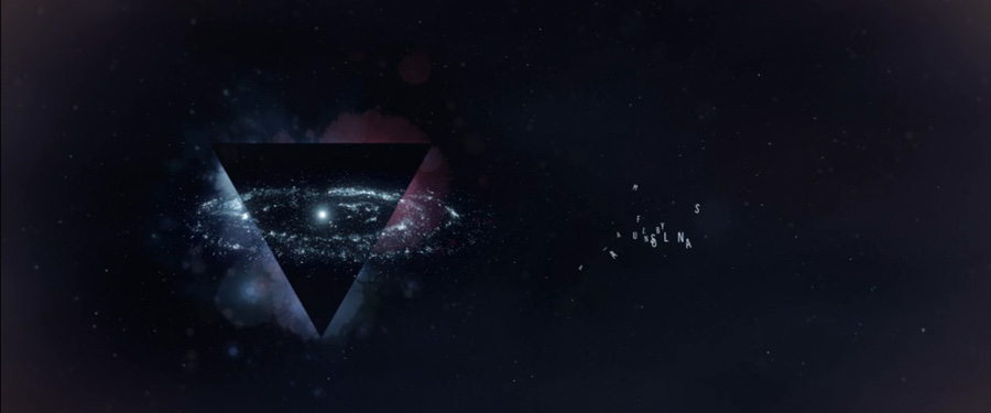
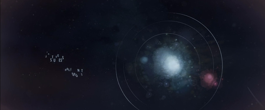
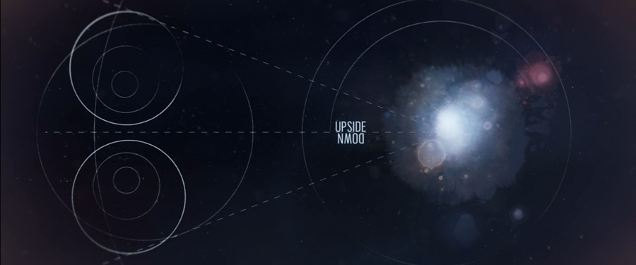
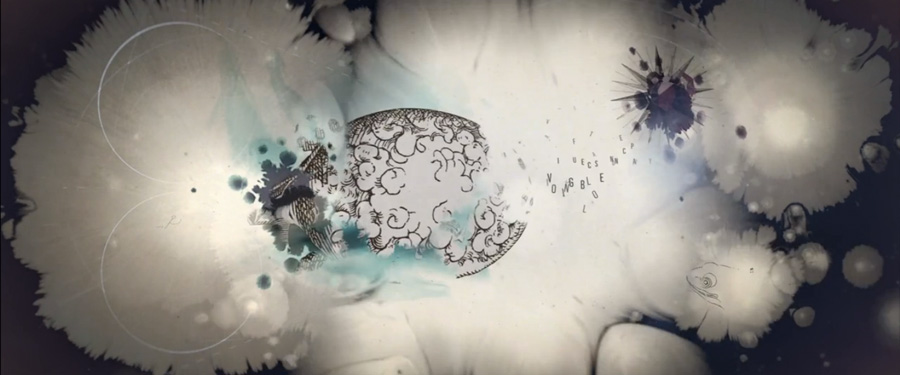
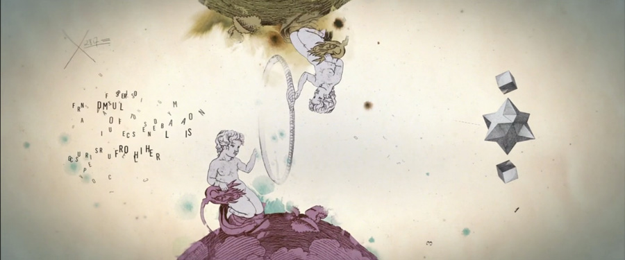
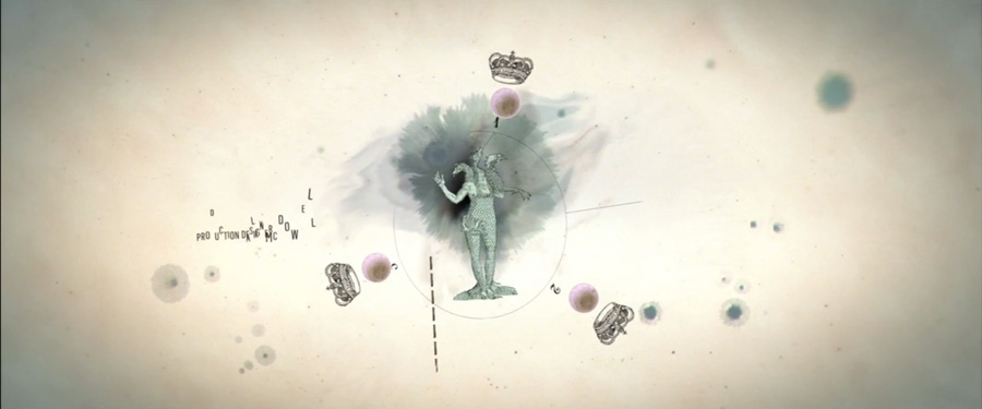
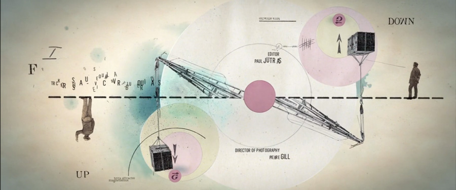
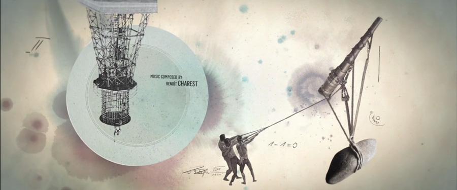
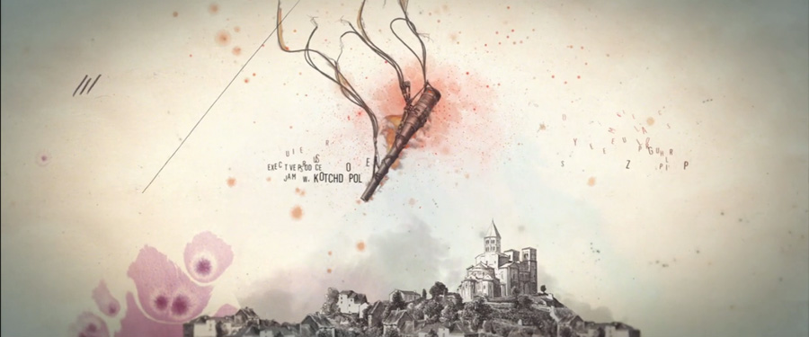
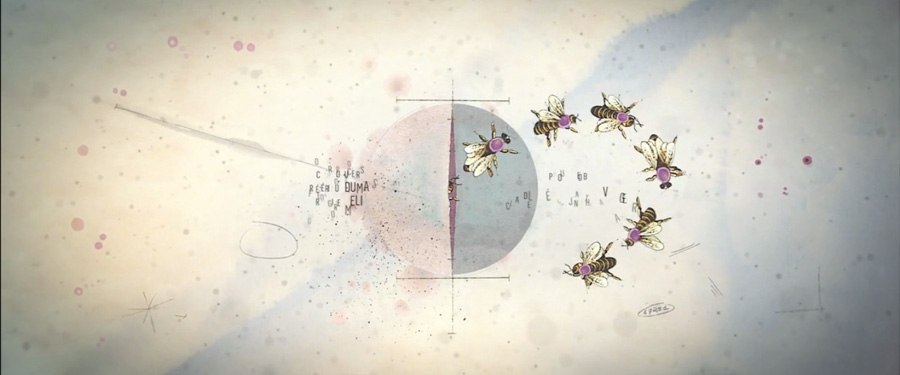
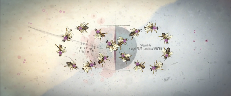
Full video here www.lesfreresmoustache.com/project/upside-down
07
October
2013
Bohan Advertising
posted in Graphic
at 11.36 AM
from
Home ! Maruéjols Les Gardons
(near Alès / Nîmes / Uzès)
/ France
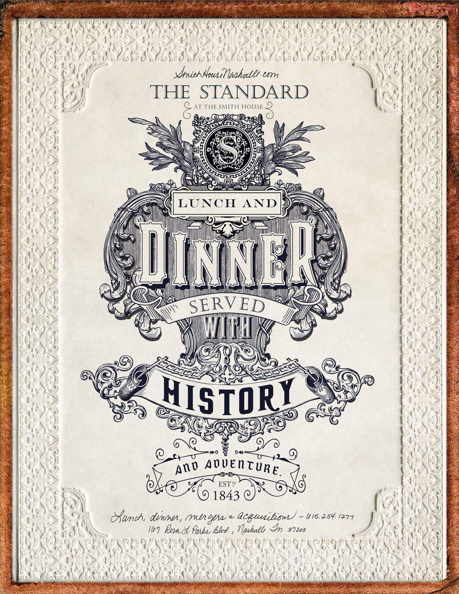
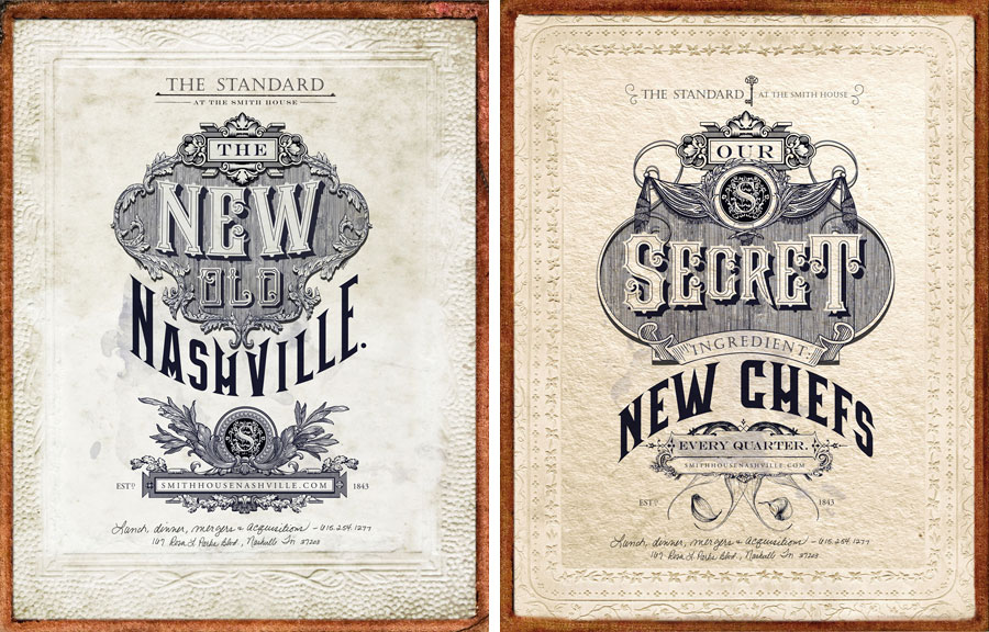
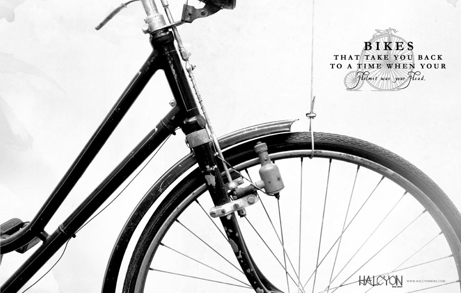
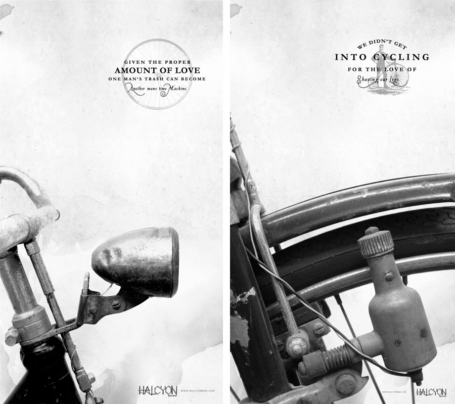
listening Grey Reverend
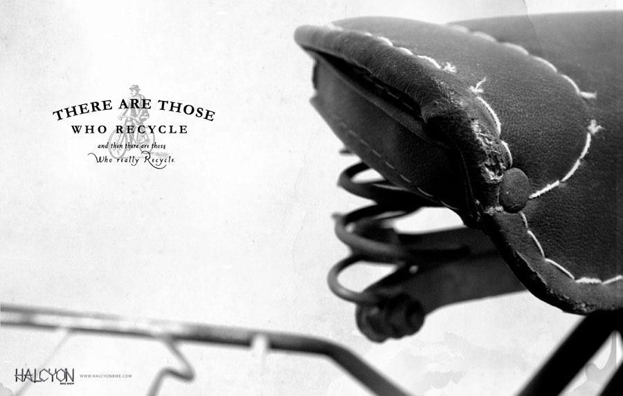
We see a lot of "vintage modern" design for identities and packaging, this is an exemple how nice it looks for advertising campains... by Bohan Advertising.