


TAVERN playings cards and shop updates
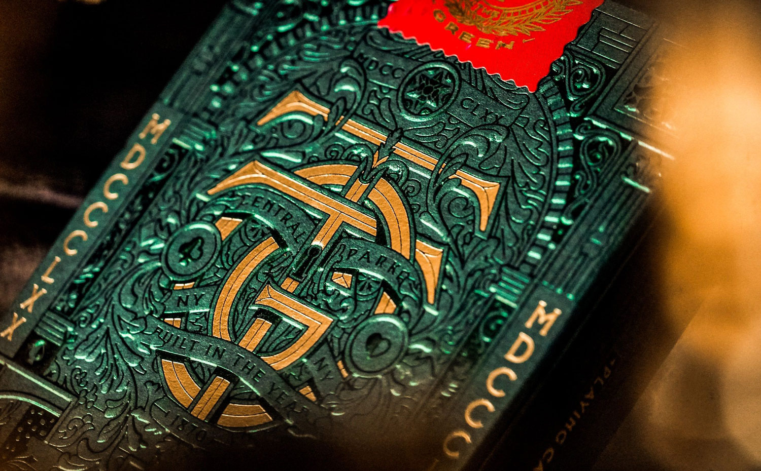
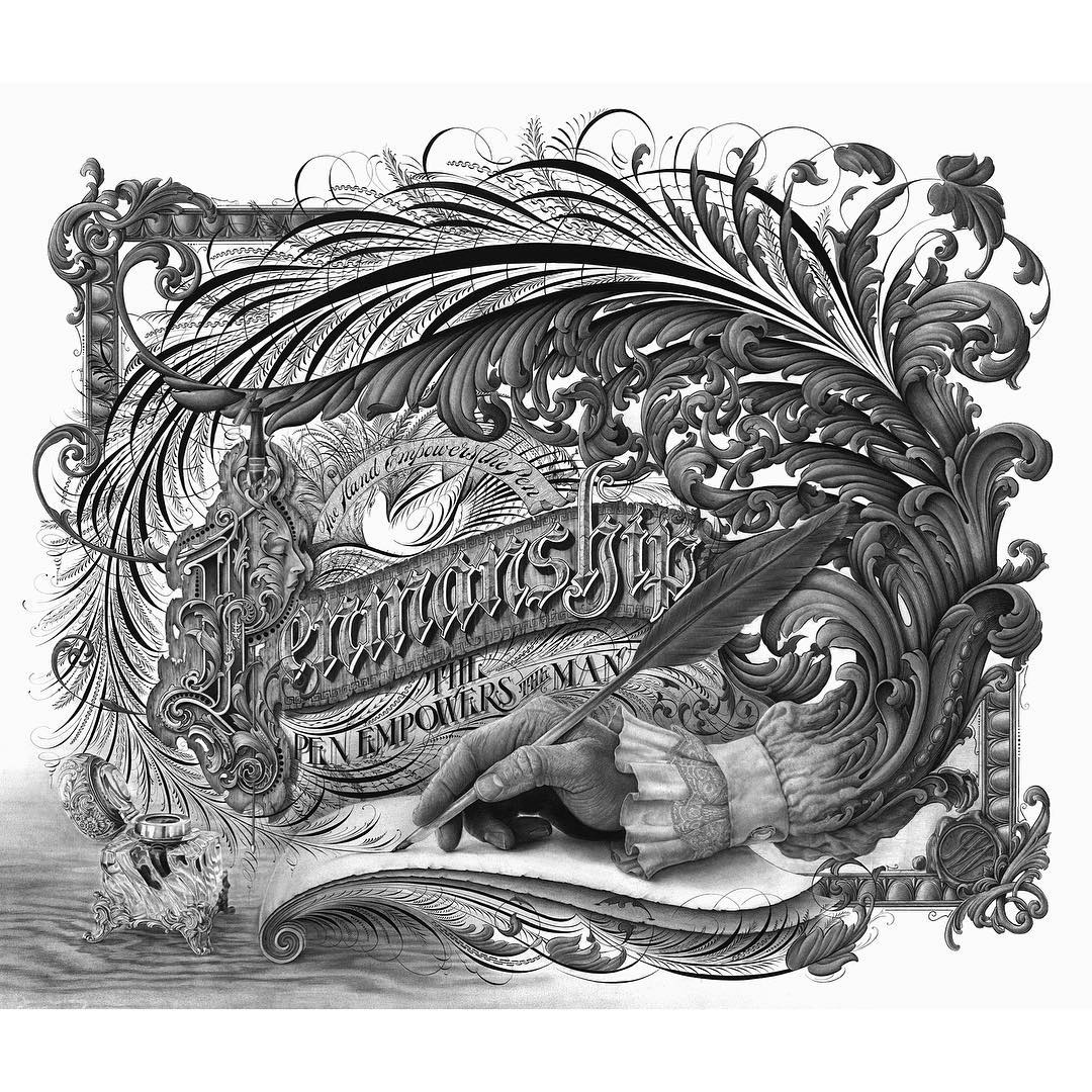
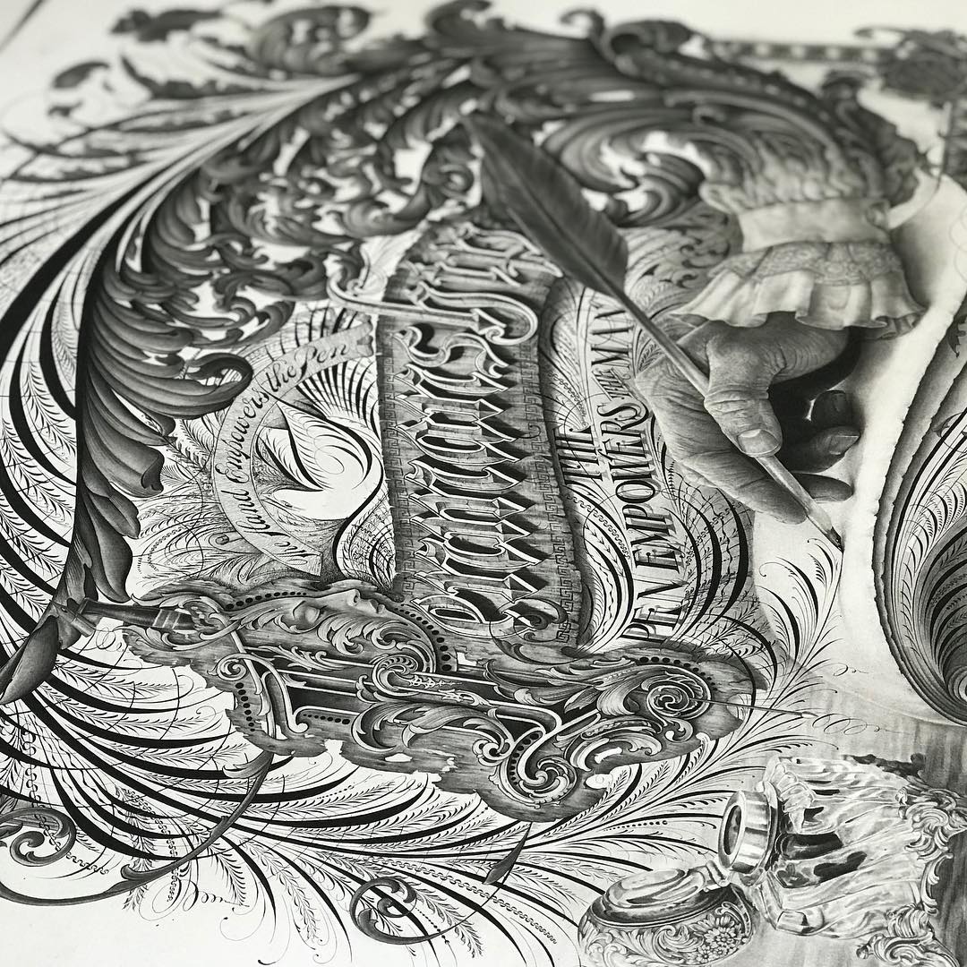
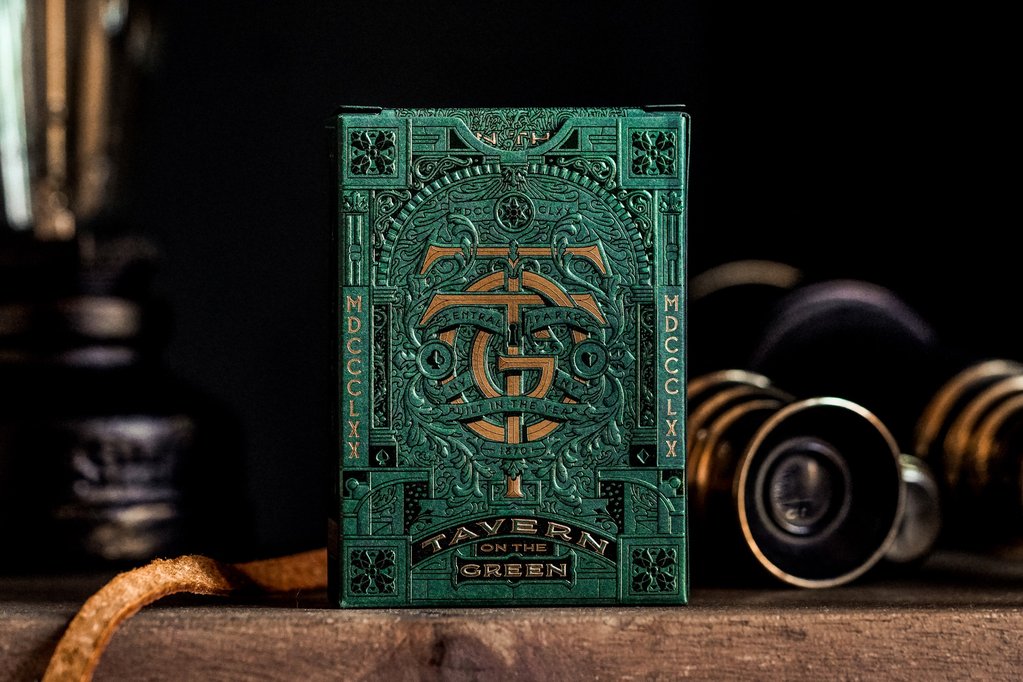
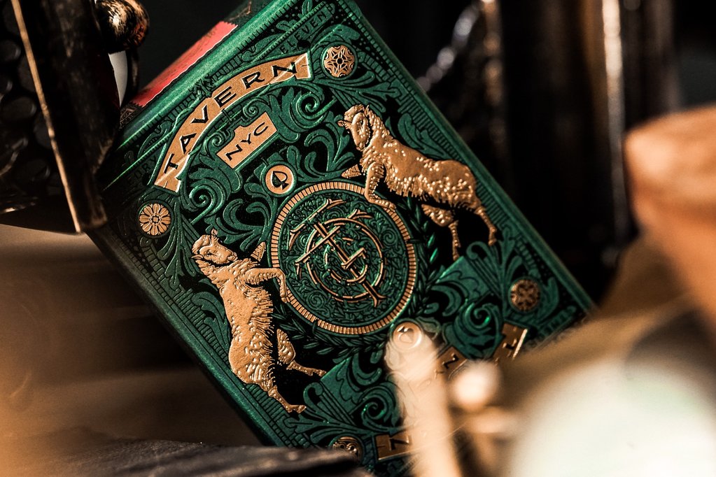
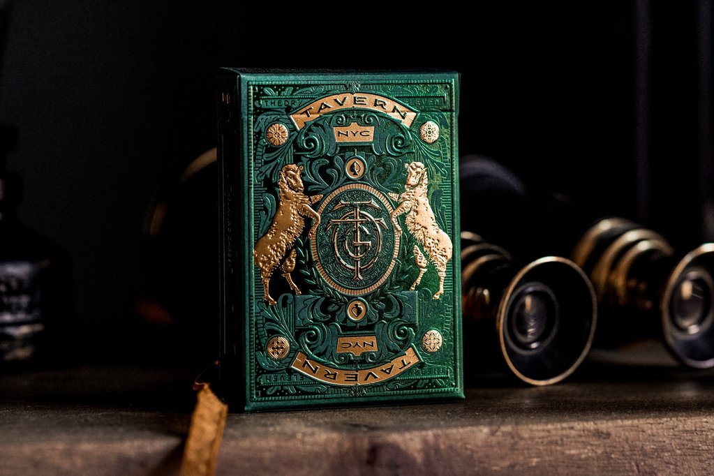
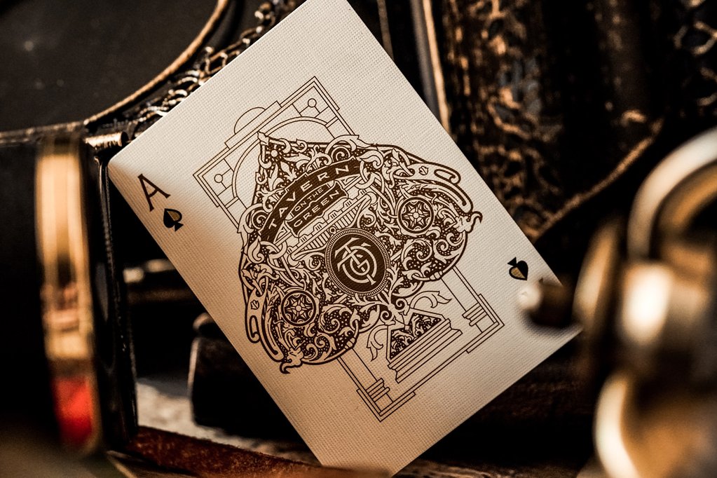
TAVERN PLAYING CARDS BY KEVIN CANTRELL
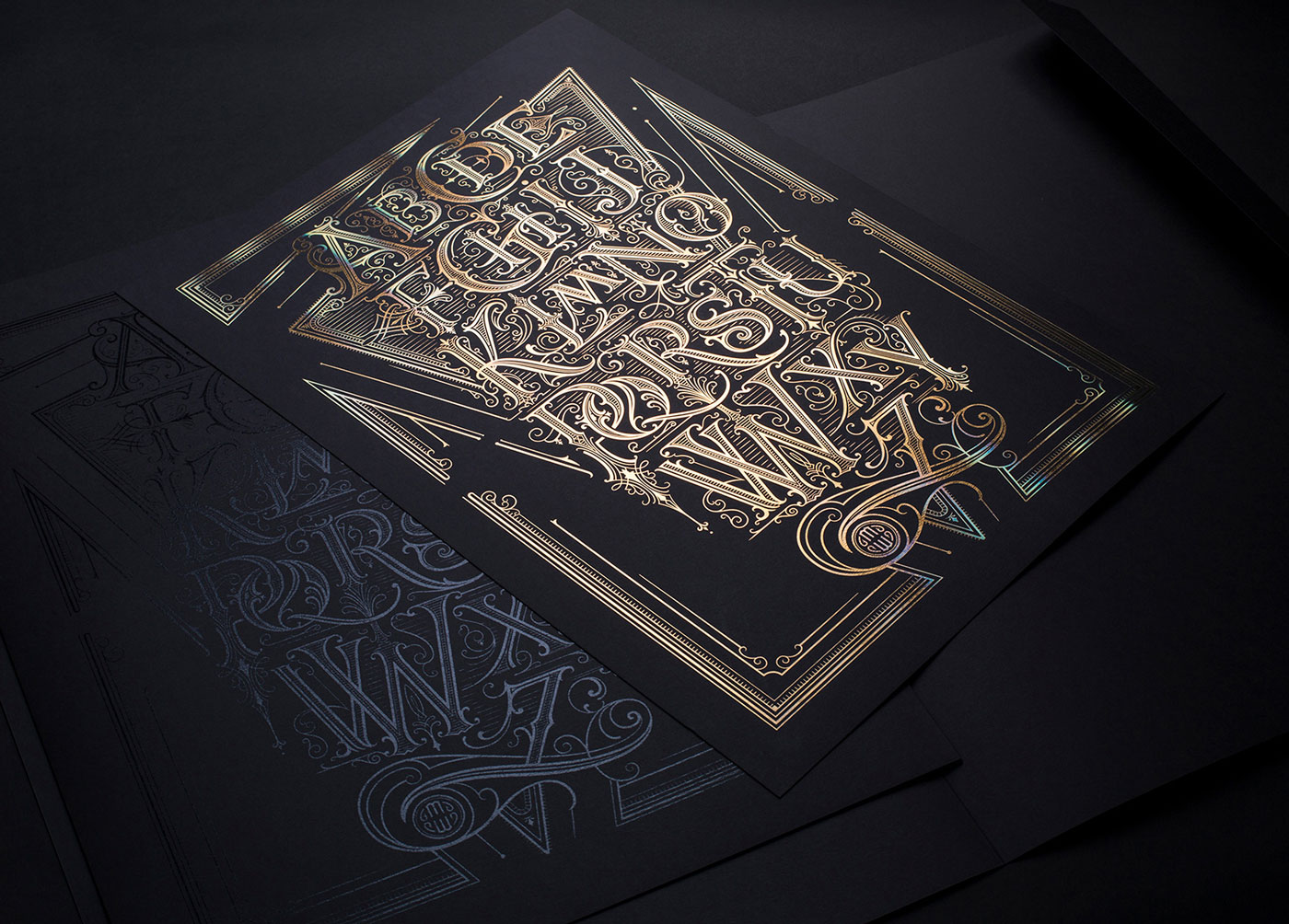
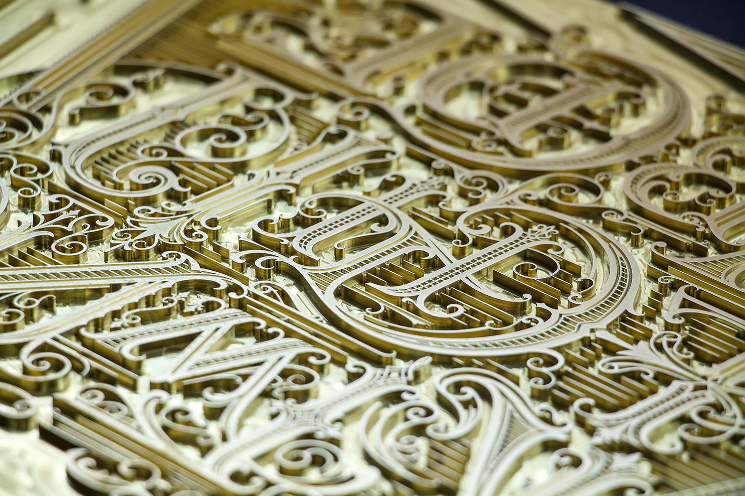
FROM A TO Z: THE ALPHABET POSTER
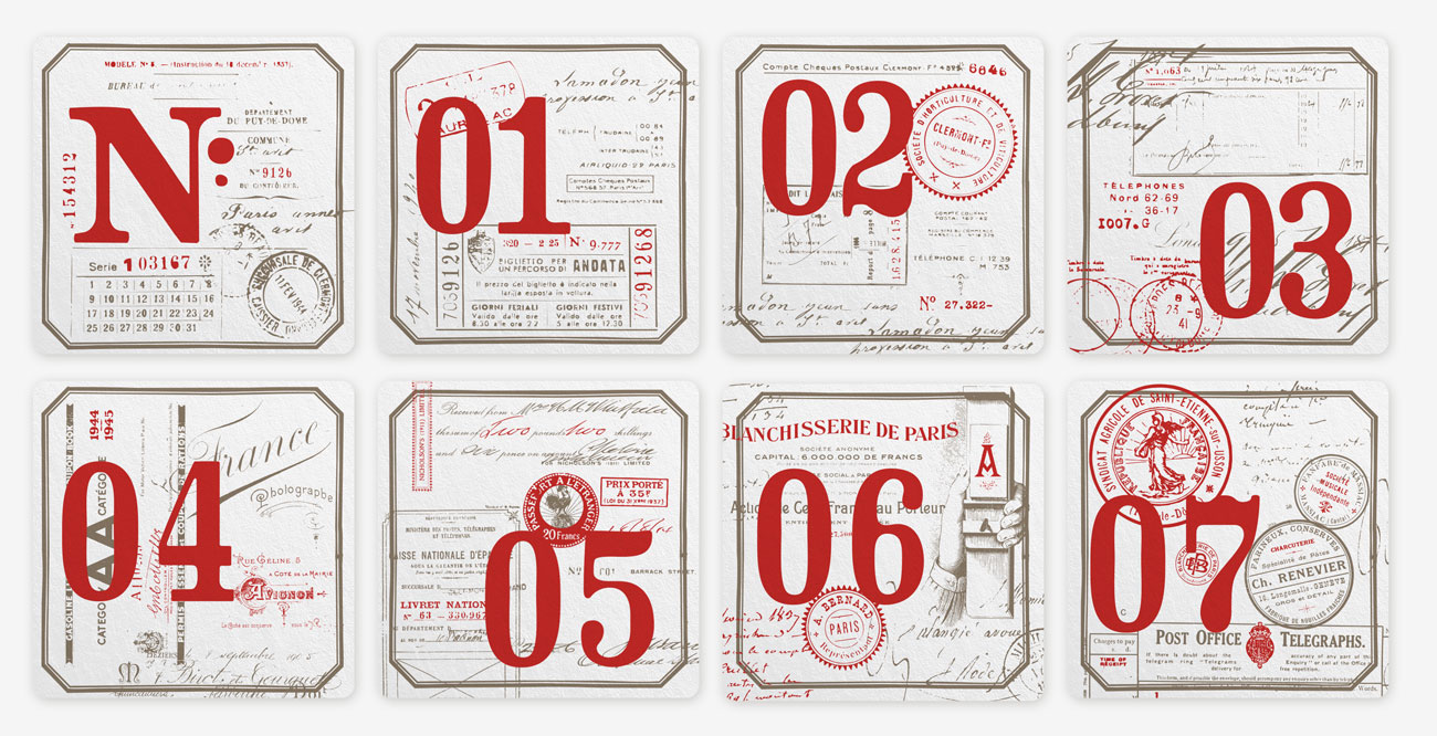
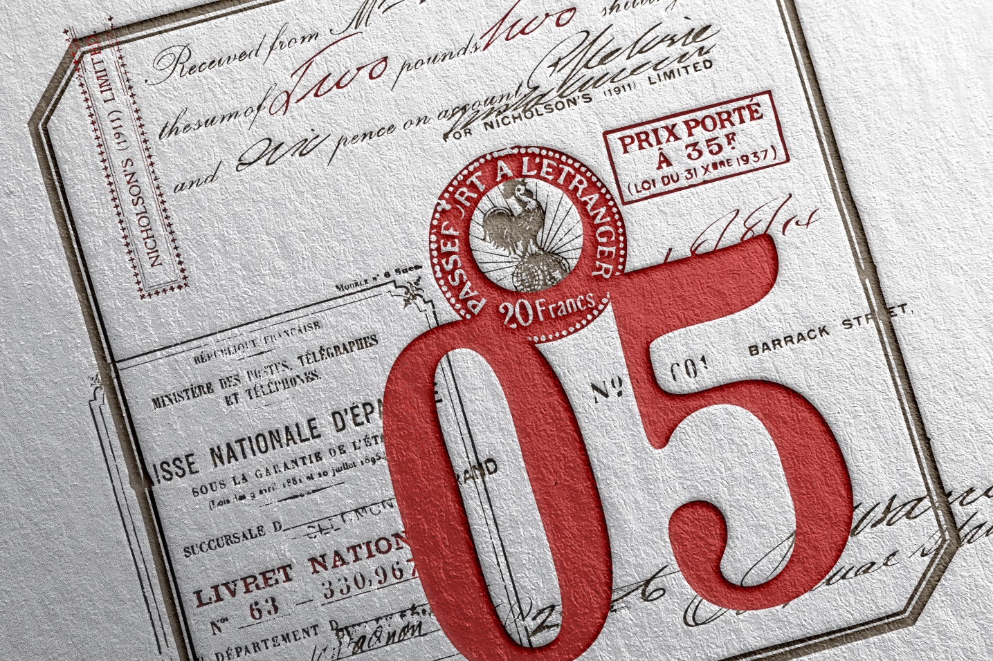
THE LETTERPRESS COASTERS UPDATE


Thank you to those who support me and understand the pitfalls encountered on a project of scope like this one. Despite the many projects I've launched, with or without kickstarter, this card game is by far the biggest challenge I've had to deal with, probably because it is my biggest success! I guess I would not have thought that the creation will take so much time, but it's nothing compared to the production.
Why so much delay?
I may repeat the explanation but here it comes. When I started the project, I did not think it would be so successful. I was then contacted by several specialized card manufacturers. But I'm in France, which causes logistical issues: the game had to be produced in France, or at least in Europe. It was not possible for me to produce the game in the US and then bring it to France, because of customs fees, etc ...
In addition I wanted the box to be printed as a letterpress by Studio Press, my partner for several years on the Calendar project. So on the cards manufacturer has to agree to finalize the cards with boxes from another workshop. Only Noir Arts has accepted the challenge, but they are in Ukraine. It is also them who can do the fulfillment, the reason why I choose to work with them.
But again the shipments are not simple considering the different options offered. One thing I really did not anticipate was the delivery times between France and Ukraine. To give you an example, when the boxes were finished in France, the package was sent to Ukraine and it took ... 5 weeks! With 4 weeks of no news of the package, stuck in customs, I thought I would have to print everything again! The letterpress thank you cards have also made a small trip for nothing ... sent by express parcel, it was delivered to me .... to me! Another week lost! You imagine my face when I was delivered my own package !!!
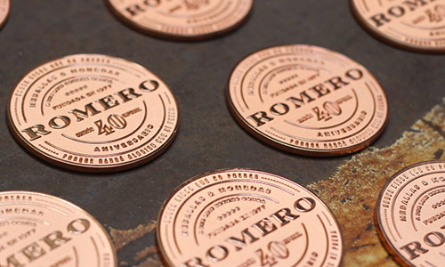
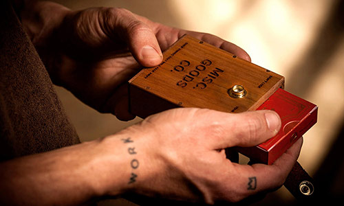
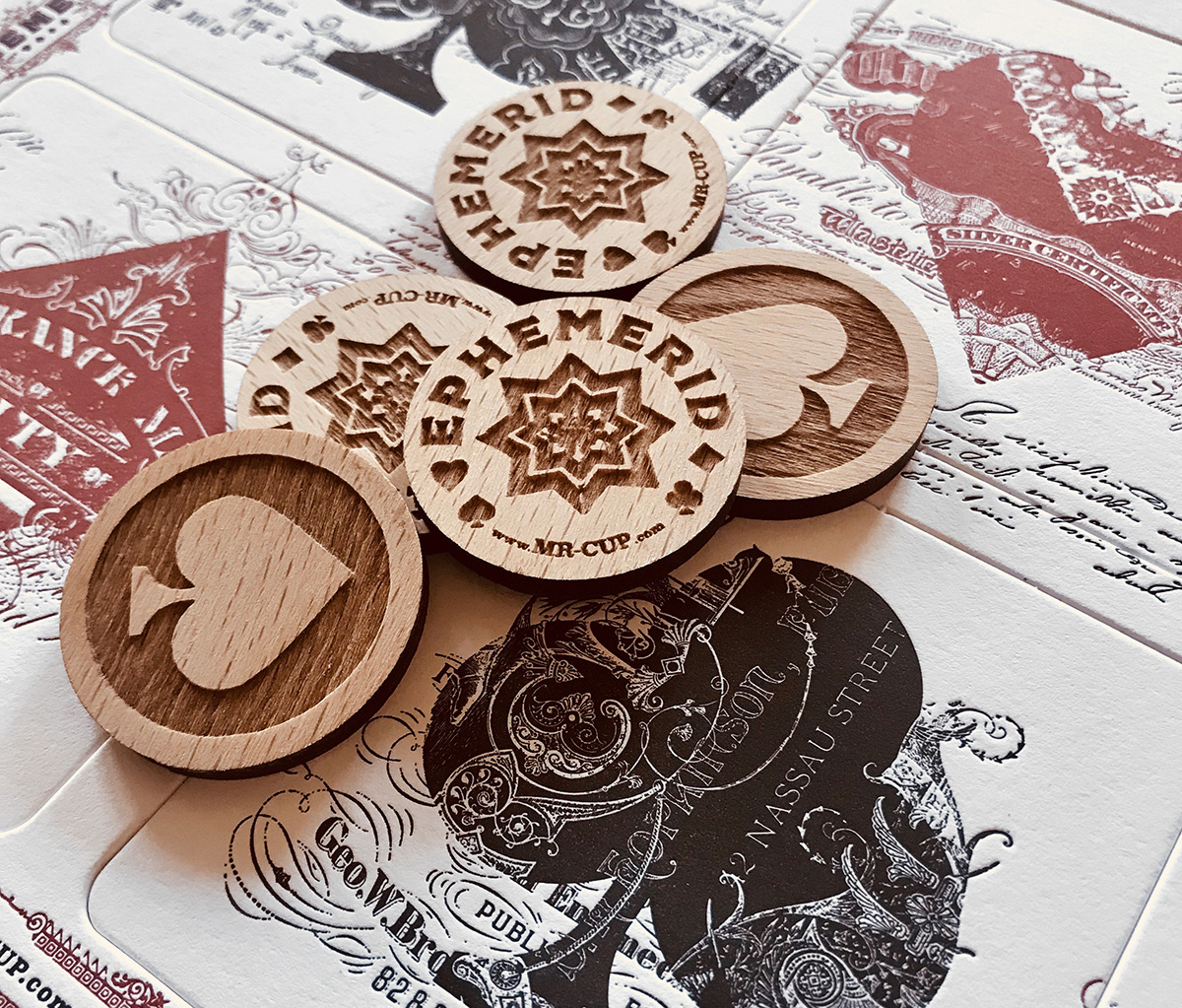
The coins and the wooden boxes were made by Thibaut Malet, but he could not engrave them because of technical problems with the fab lab which he has access. So he made them but we had to send all this to Studio Pression who could do the laser engraving. Put in the middle of this crisis yellow jackets that took place in France for several weeks at the end of the year and here we are!
I understand that some people have lost their desire to believe that I have not done my best for this project, and I understand it. But I assure you that I did my best.
The important is that did not discourage me to continue, because I was so happy and pride to see this project succeed. And now I learn so much from all these problems and mistakes. I can not wait to get your feedback on it! I am preparing the next project, even more ambitious! This project change my life in a way I am impatient to share with you. It is my Iron Man movie...
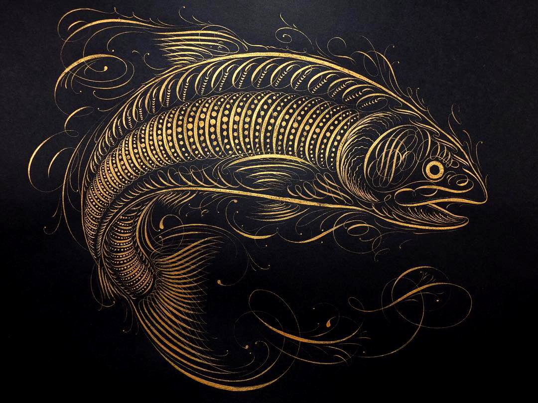
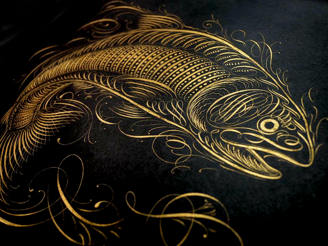
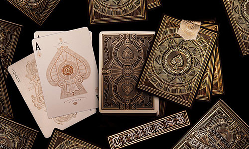
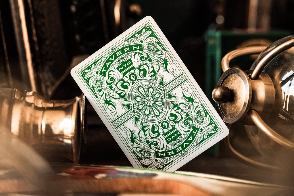
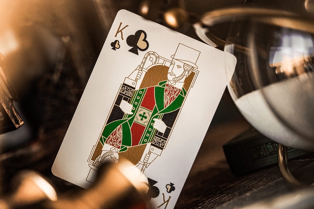
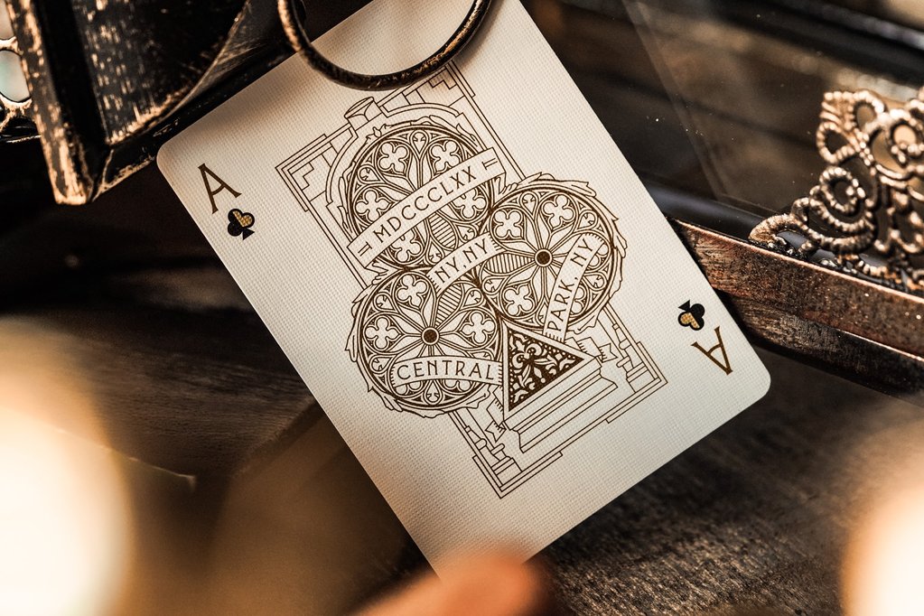
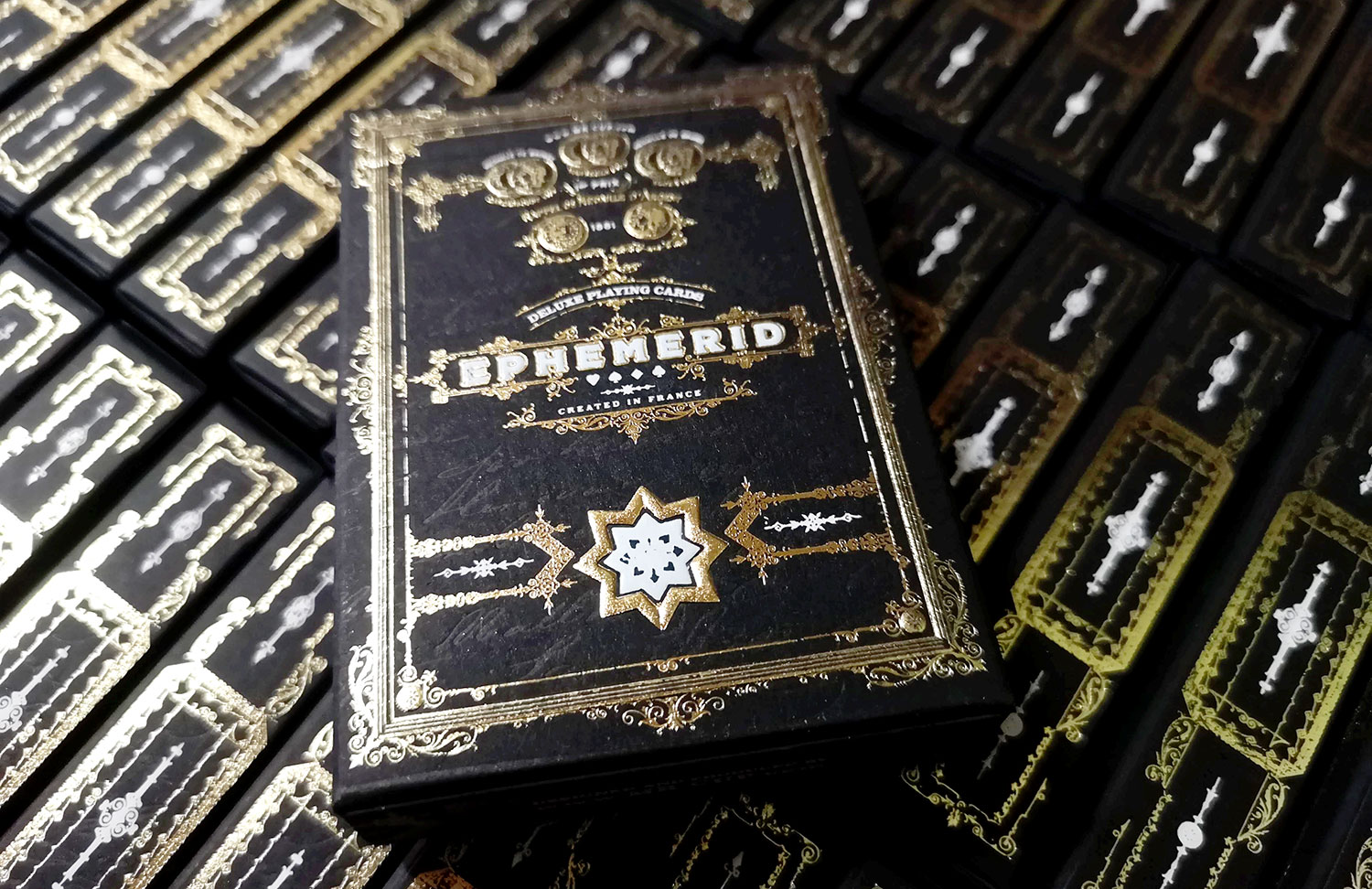
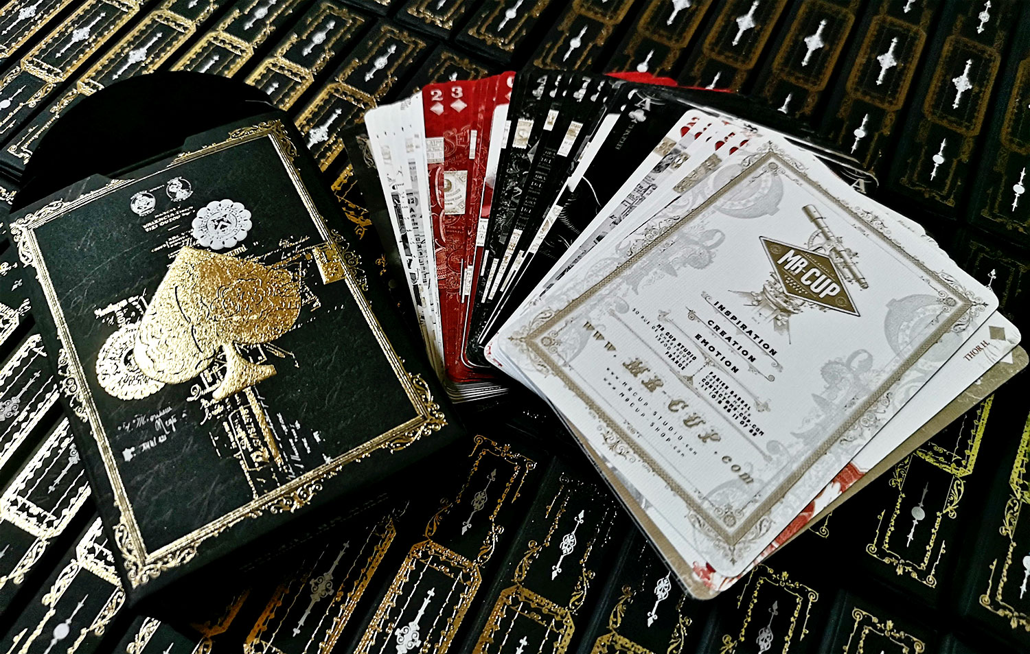
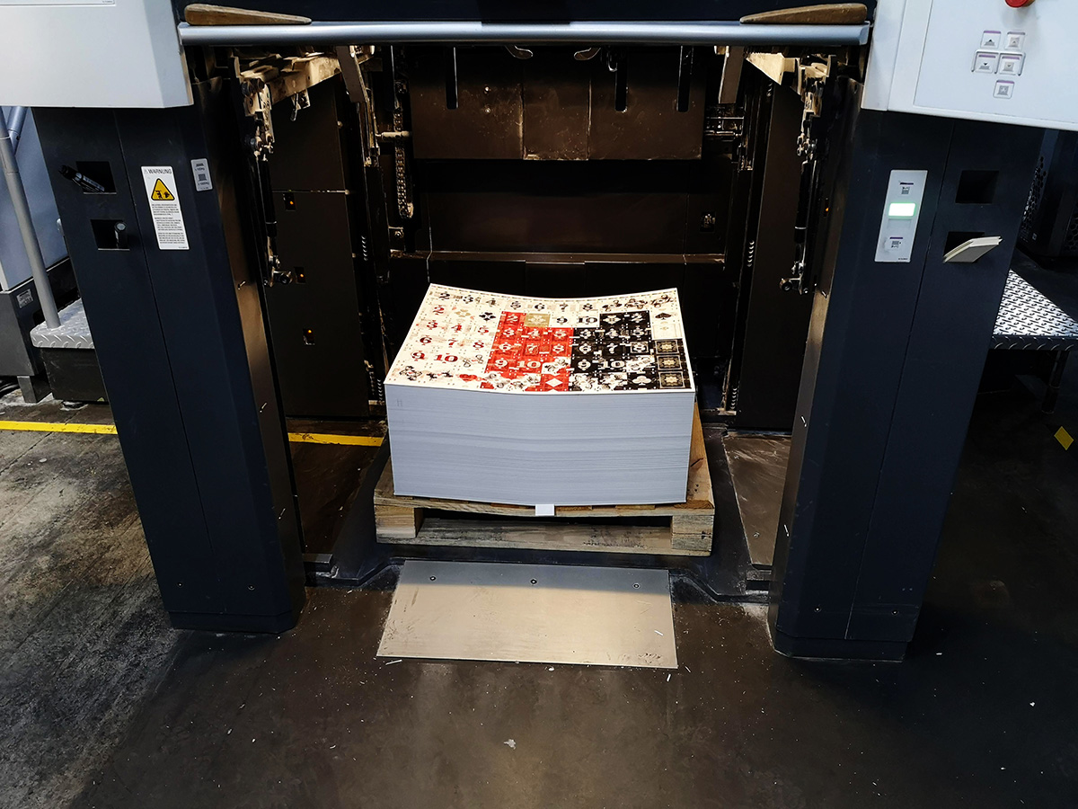
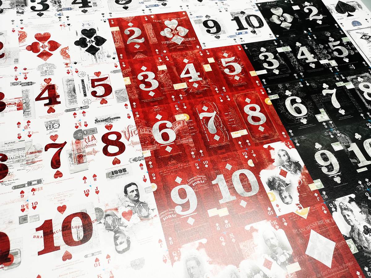
Here are picture of the final cards. As soon as I receive them from the manufacturer I will take care of all the orders waiting.
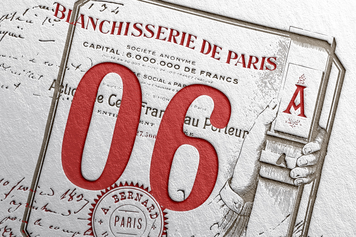
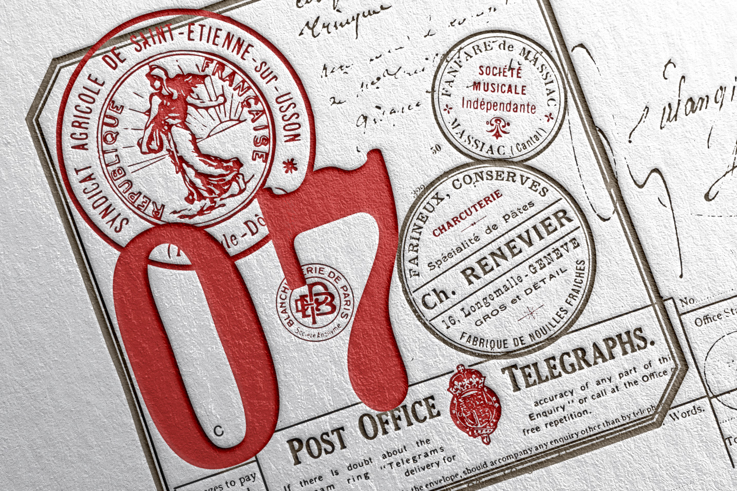
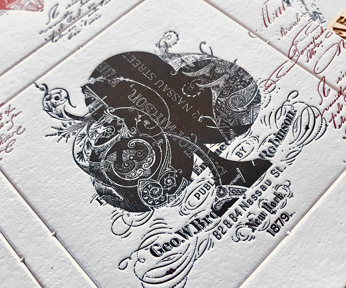
And here are the coins and letterpress coasters.
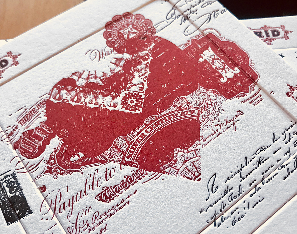
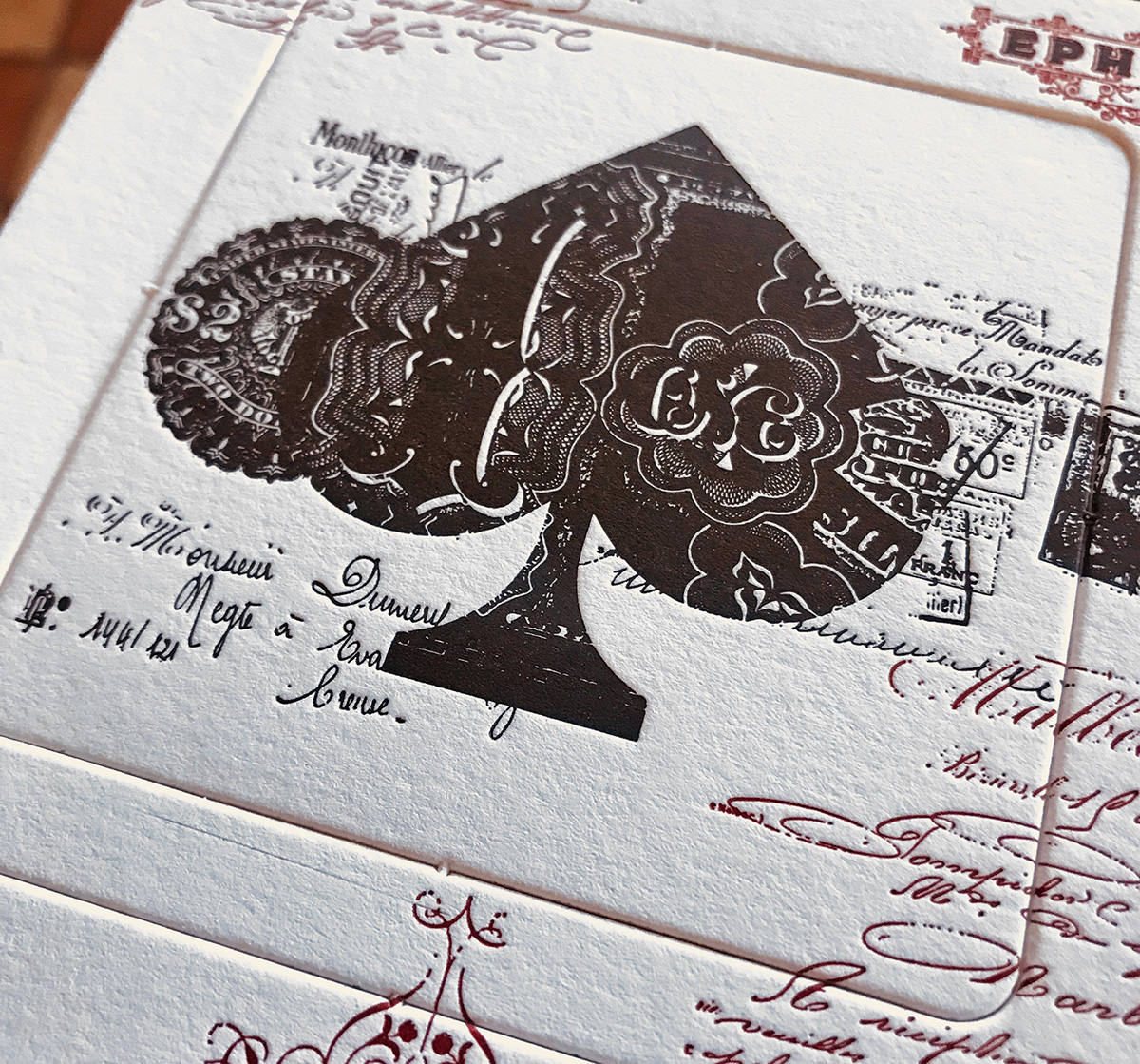
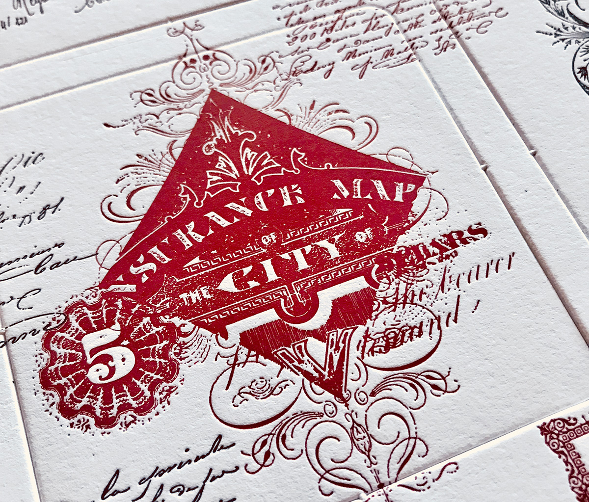
They are available in the Mr Cup Shop and should be sent at the end of the week or early next week when they finally arrive!