

16
October
2016
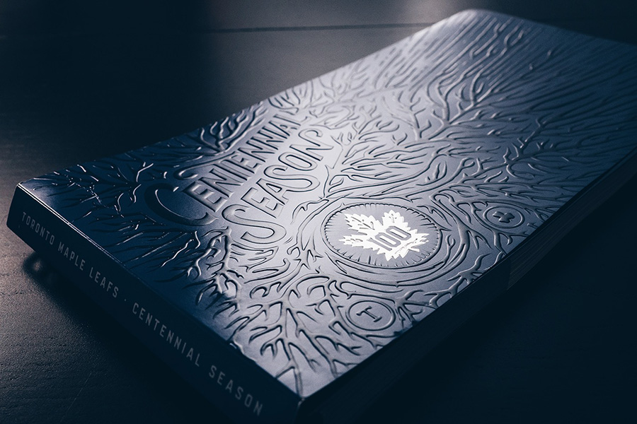
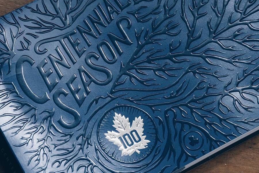
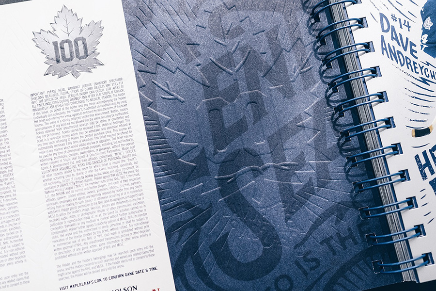
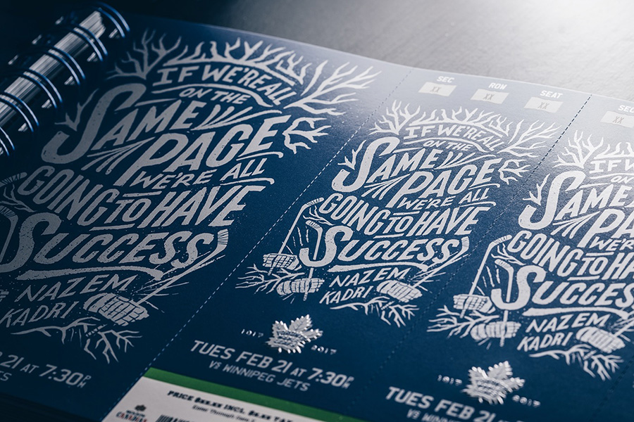
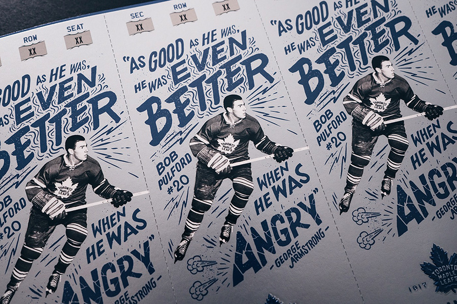
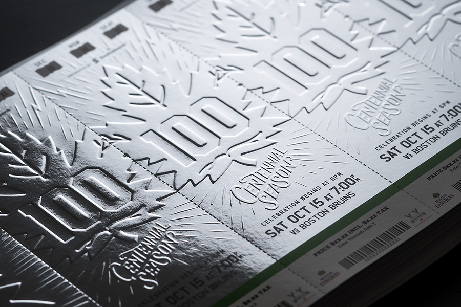
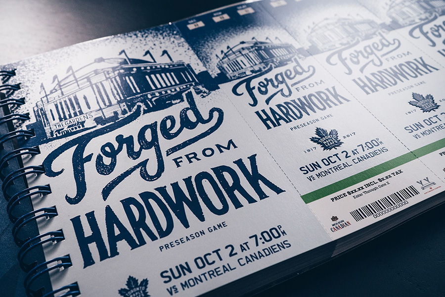
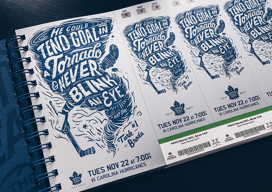
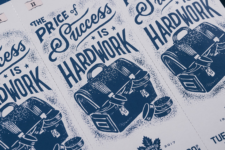
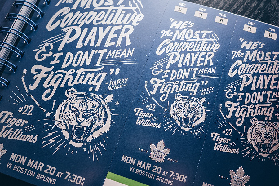
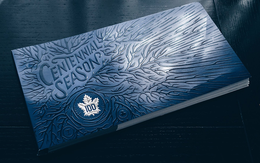
By Conrad Garner : The 2017 season marks the Toronto Maple Leafs Centennial Season this year. I had the absolute privilege and honor of being asked to illustrate and create the artwork for the entire 2017 centennial season ticket package, tickets and cover. It is the largest project I have done to date with over 250 sketches and almost 60 finished pieces.
12
October
2016
Less than a week since the launch of the 2017 letterpress calendar Kickstarter and almost 50% funded ! You are awesome ! It gives so much motivation for next step and for creating more beautiful objects ! Thanks for your order and now I need you to spread the word about the project, to share it on social media to tell your friends and followers.
Such a great feeling to start receiving the design for the pages ! Here come the first one by Eric Kass, Scott Biersack and Tomasz Biernat who already participate for last year edition. I am also pleased to collaborate with Tom Ludd for the first time, who creates a great facebook group called "the designer's league".
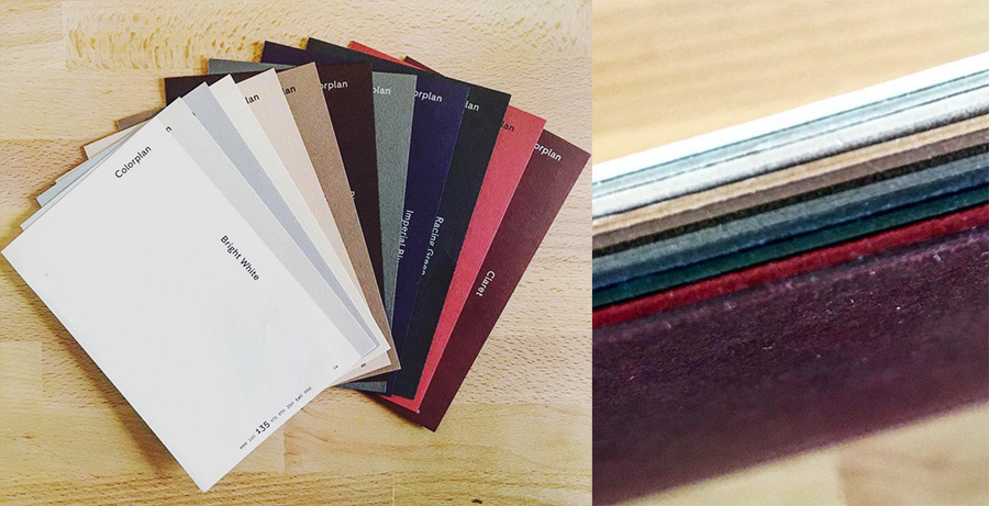
This year edition will be printed on color papers, in dark on light paper for the first 6 months, and in light on dark paper for the other ones. The great thing about color papers is that the spines will be in colors too !

12
October
2016
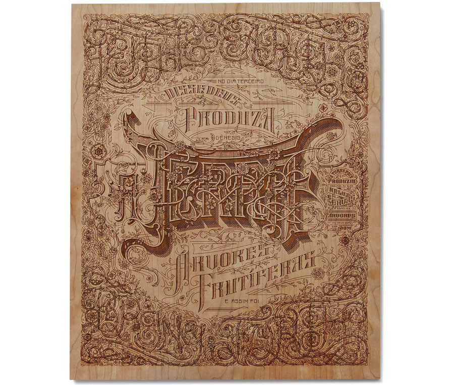
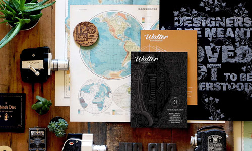
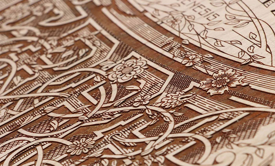
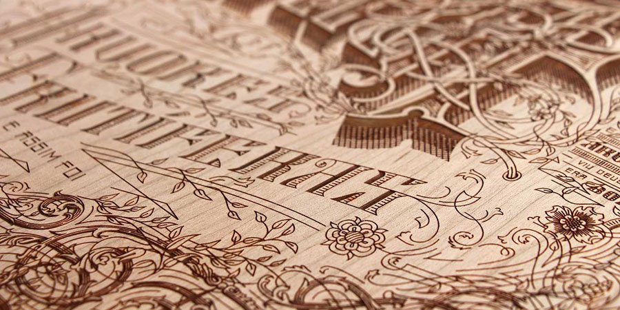
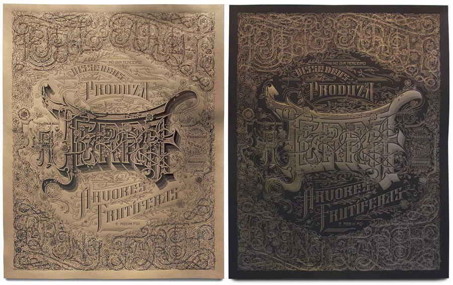
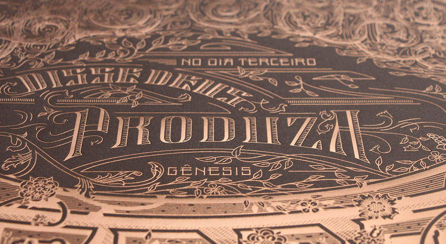
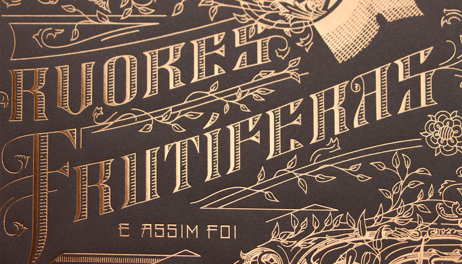
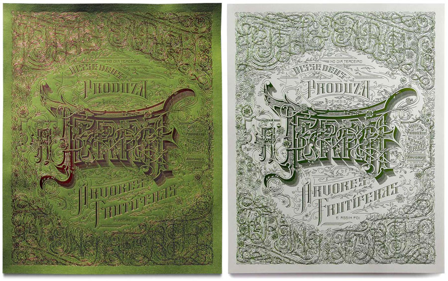
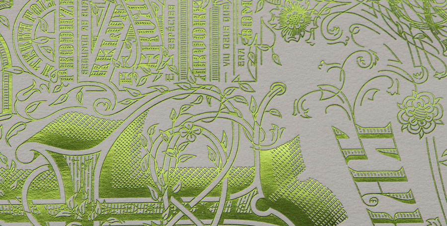
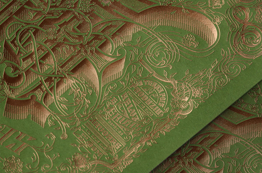
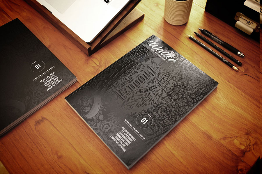
This is the Terra poster designed by Kevin Cantrell ! You may recognize it as it was used on the front cover of the Walter magazine 1, printed in varnish on black mat paper. I am so happy Kevin design this year edition of the letterpress calendar. Some copies of the poster are available with the rewards on the Kickstarter !
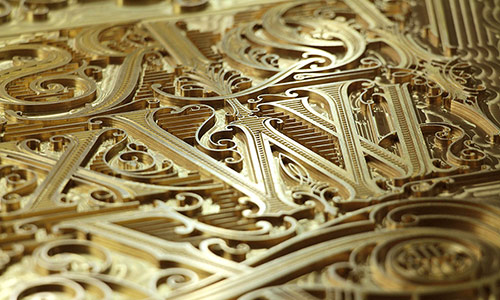
I will let him present the TERRA project : it is inspired by map insurance lettering. The text is taken from the first few verses in genesis on the creation, suggesting the infinite possibilities to create using gruppo cordenons paper. The negative space around terra creates a circle further expressing the concept of earth. Terra is currently being printed in 14 versions: wood laser etching, as well as copper foil, green foil, and brown foil on various papers.
Yes, you well read, 14 versions ! Here come the wood one and variations.
11
October
2016
It is this time of the year ! The Kickstarter campaign of the 2017 letterpress calendar just starts with special early bird prices this year!
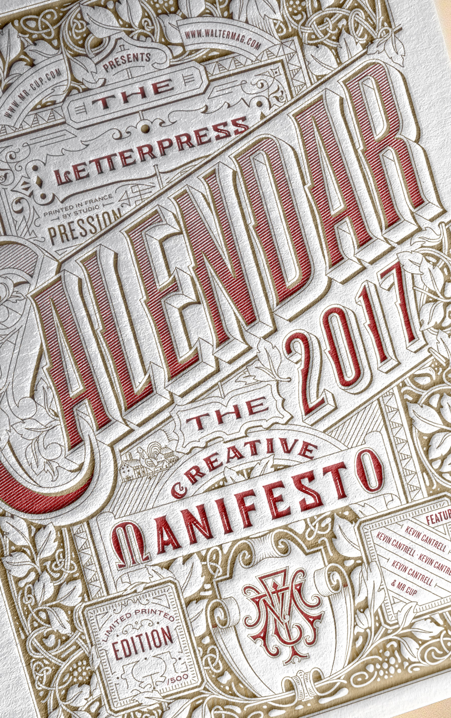
The front cover of the Deluxe edition will be laser engraved on wood. Each cover will be engraved one by one ! The normal edition cover will be printed on white paper with 2 colors. This year is designed by Kevin Cantrell !
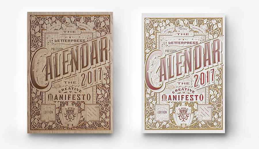
The calendar will be composed of 13 20x14 cm cards printed on 700g colorplan papers : 6 light colors papers with black printing / 6 dark colors papers with light printing.
This year edition will feature unique designs by Matt Stevens, Jef Millotte, Scott Biersack, Tom Ludd, Renaud Orange, Tomasz Biernat, Joseph Alessio, Salih Kucukaga and Eric Kass. They are currently working on the design and they will be shown as soon as possible during the campaign!
As last year, the printing plates of the front cover are part of the campaign reward, and only one is available. Early bird prices are limited, as a good start is always important on Kickstarter.
To avoid last year problems, we are almost 1 month in advance compared to 2016 ! The printing will start as soon as the project is funded to be sure everything is ready early December and sent before December 10th to arrive in time for the Christmas season.