

12
October
2016
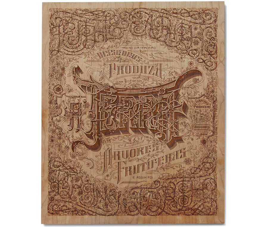
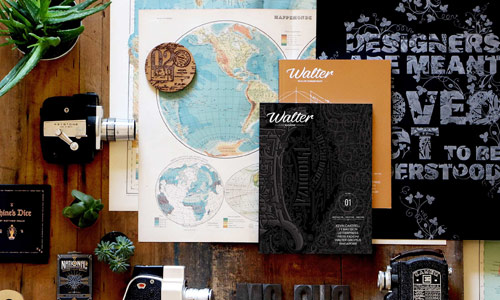
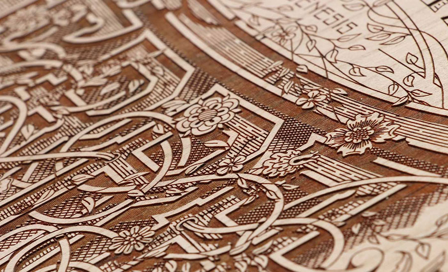
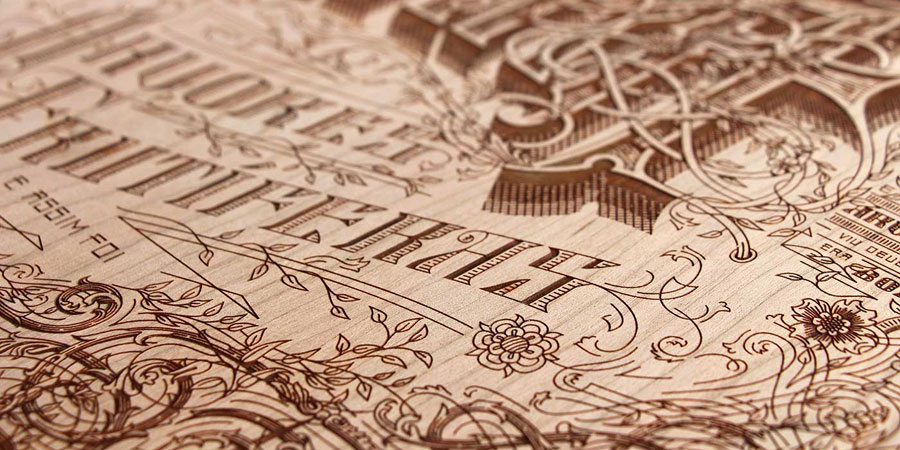
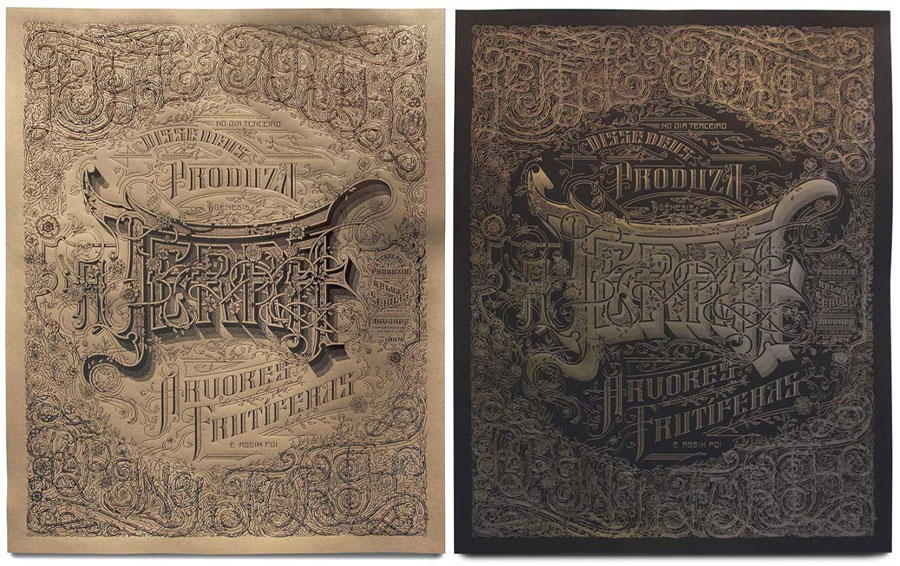
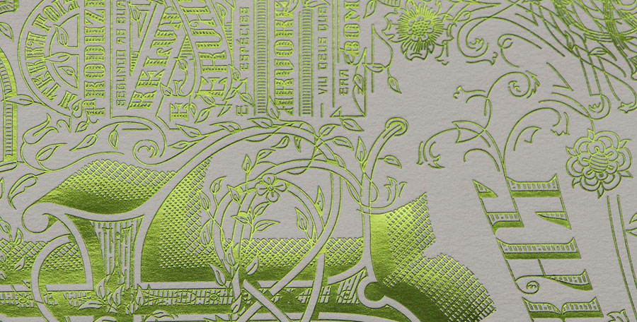
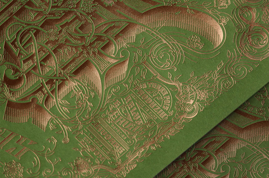
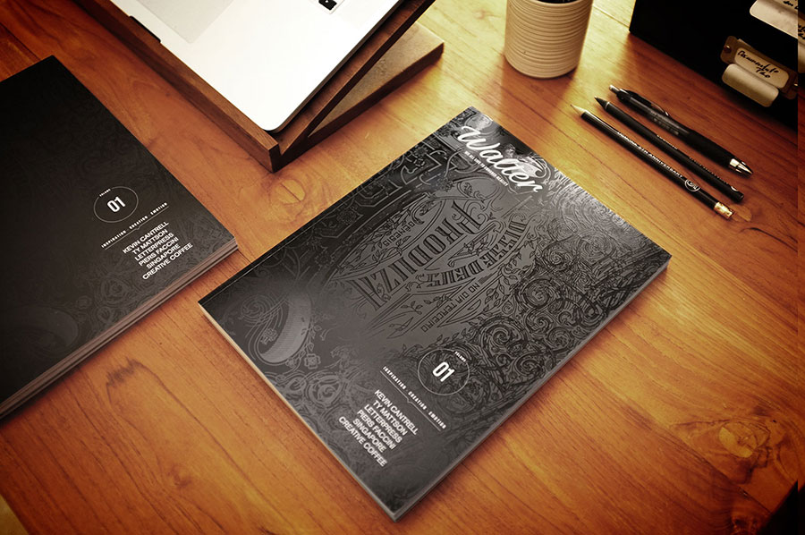
This is the Terra poster designed by Kevin Cantrell ! You may recognize it as it was used on the front cover of the Walter magazine 1, printed in varnish on black mat paper. I am so happy Kevin design this year edition of the letterpress calendar. Some copies of the poster are available with the rewards on the Kickstarter !
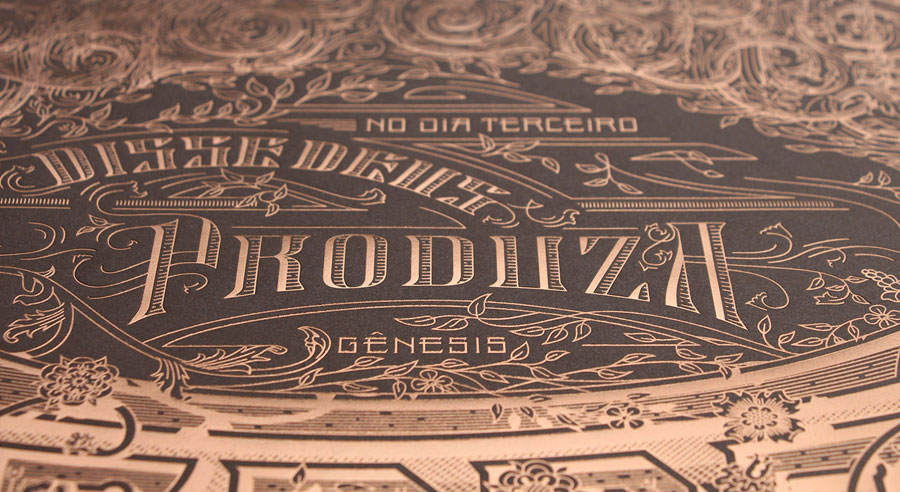
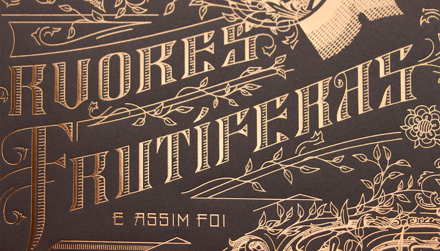
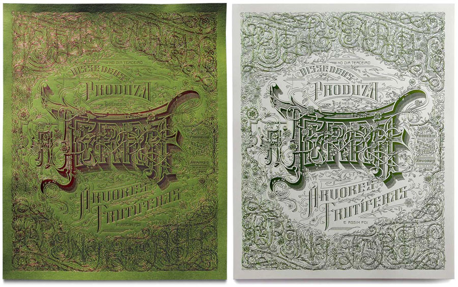
I will let him present the TERRA project : it is inspired by map insurance lettering. The text is taken from the first few verses in genesis on the creation, suggesting the infinite possibilities to create using gruppo cordenons paper. The negative space around terra creates a circle further expressing the concept of earth. Terra is currently being printed in 14 versions: wood laser etching, as well as copper foil, green foil, and brown foil on various papers.
Yes, you well read, 14 versions ! Here come the wood one and variations.
25
September
2016
20
September
2016
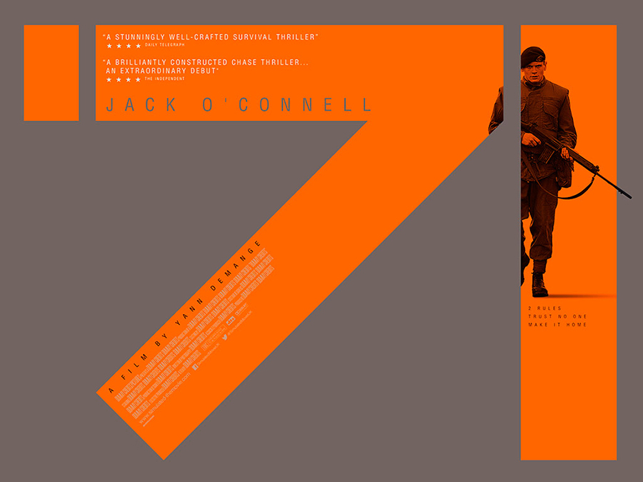
The movie posters is a very specific category of graphic design. It speaks directly to the public and must communicate instantly the "bankable" aspect of the the movie. Hard to be creative when it is a blockbuster with De Niro. Not to mention the codes applied to the film's style (see previous article here).
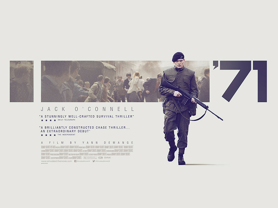
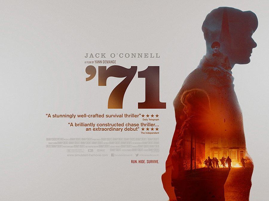
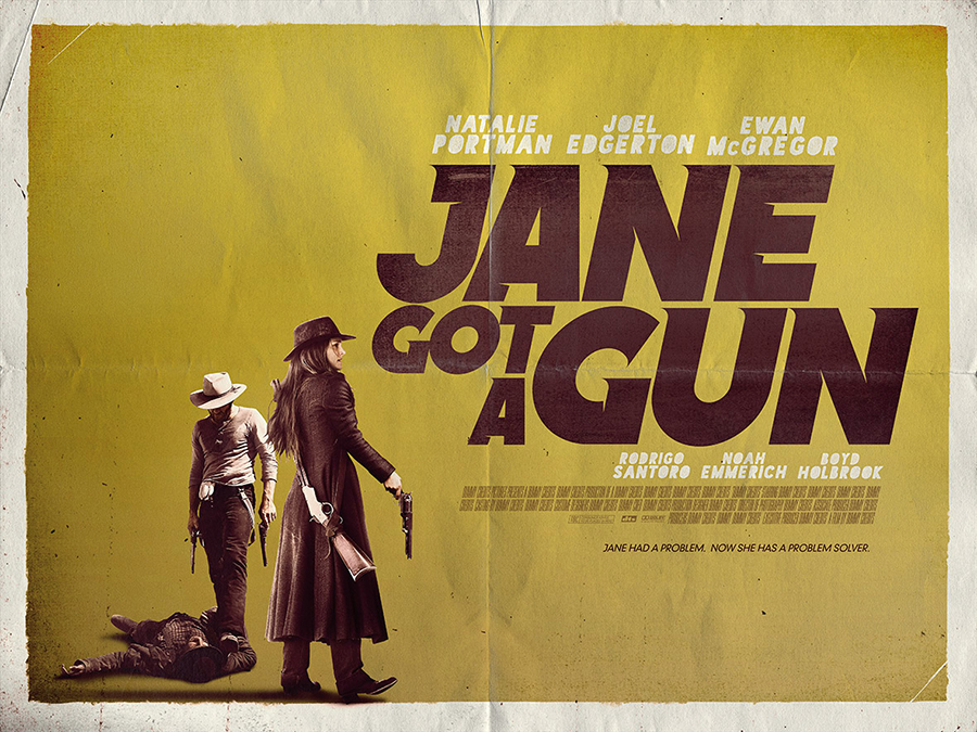
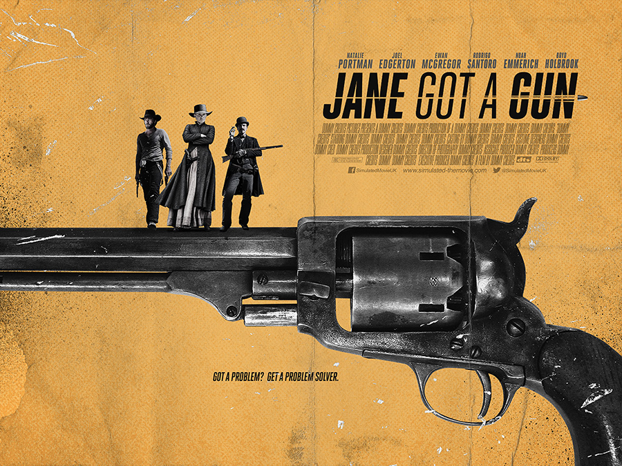
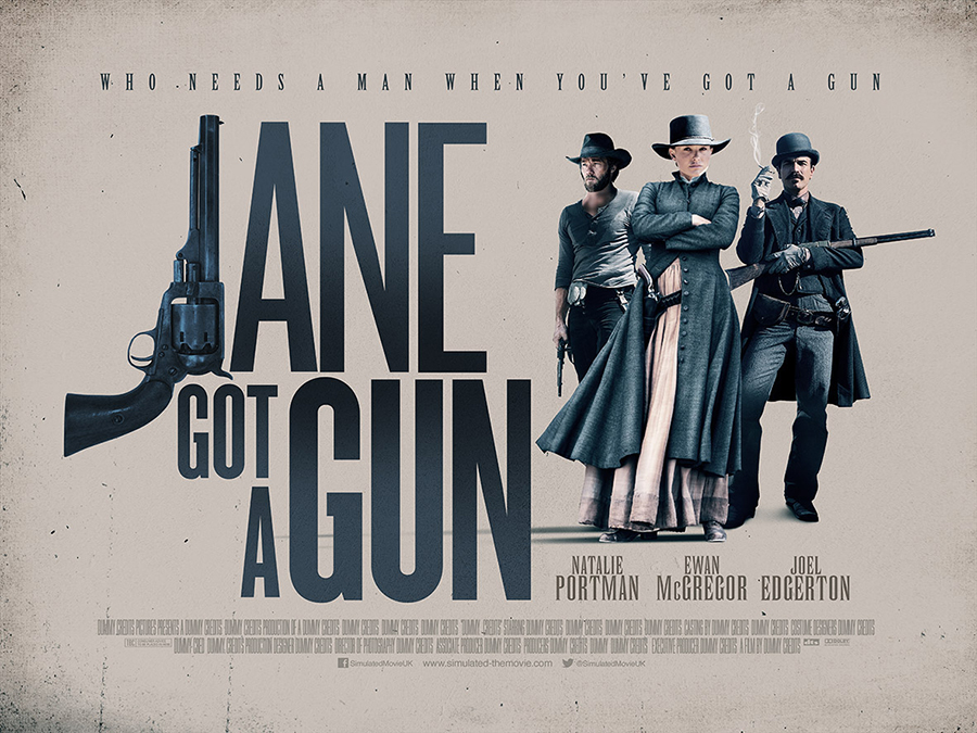
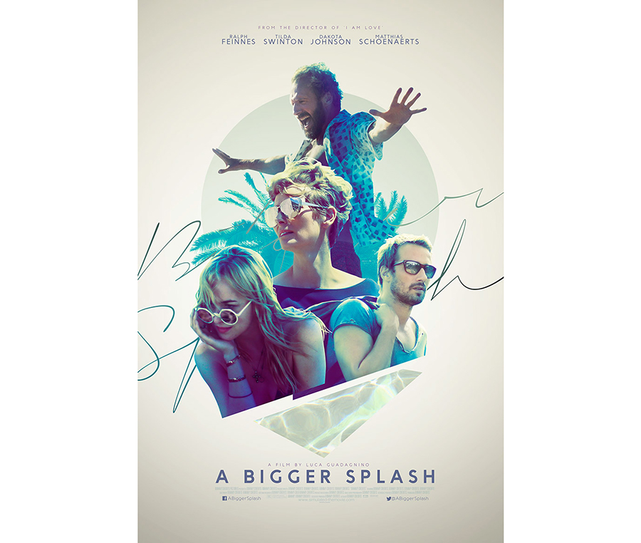
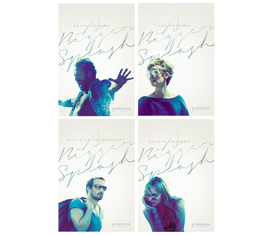
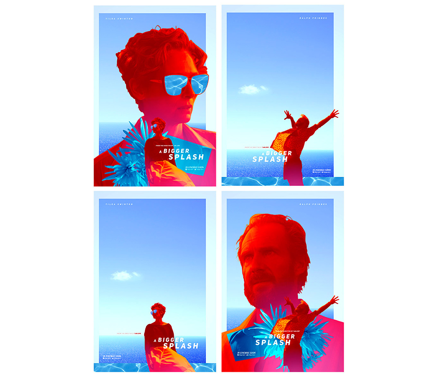
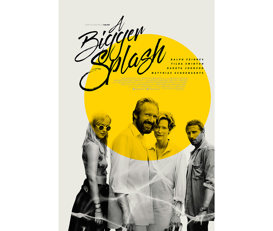
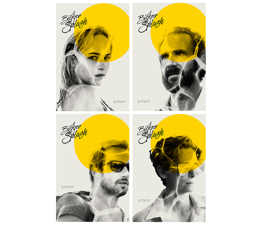
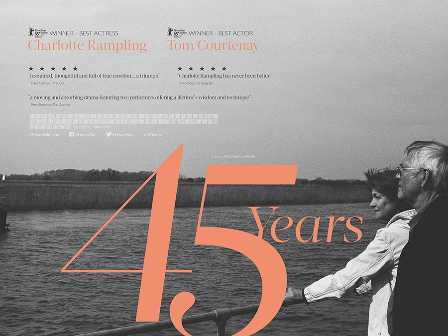
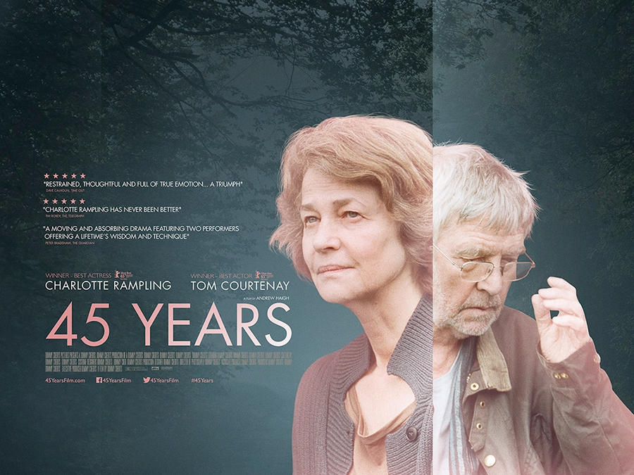
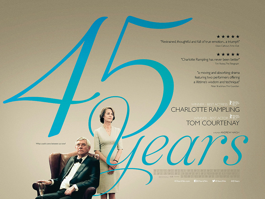
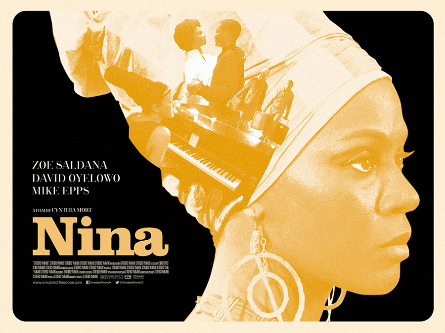
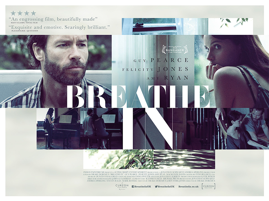
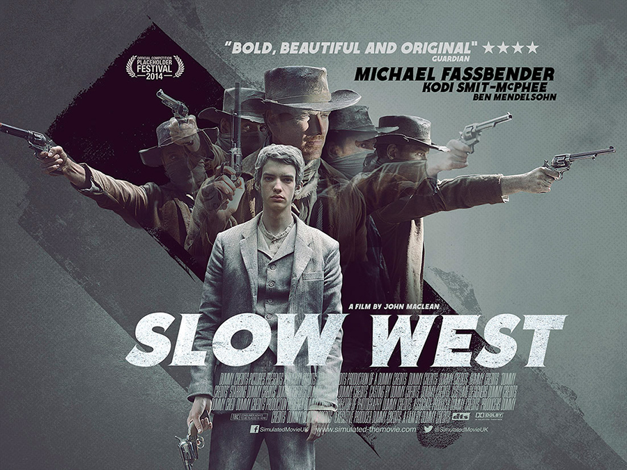
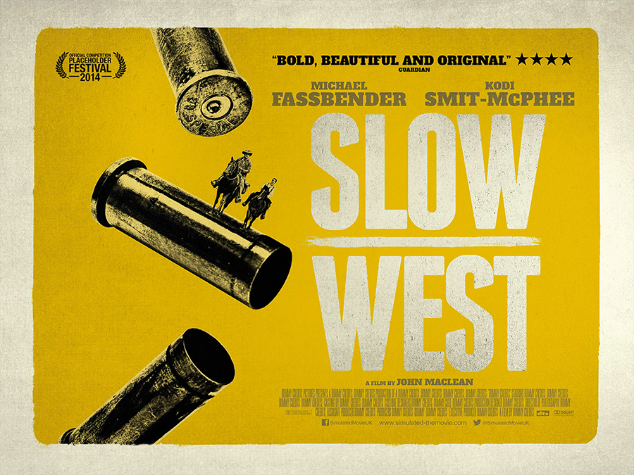
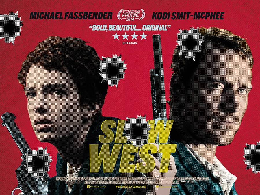
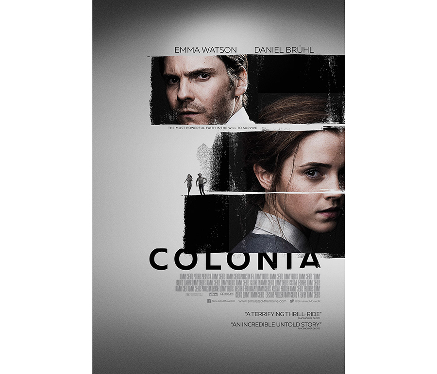
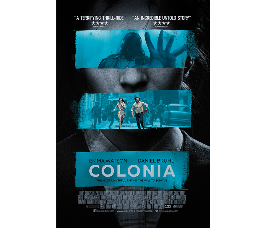
The work of Scott Woolston stands out with its very graphic posters. What I particularly like in his work is the diversity of the proposals for a single film, because the atmosphere is really different and therefore the perception of the film too. Selection.
08
September
2016
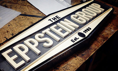
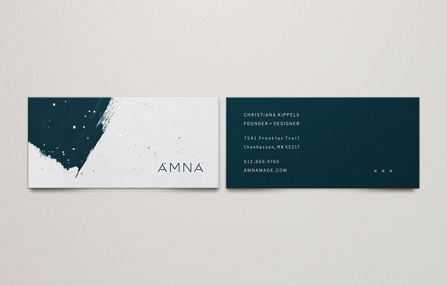
Studio MPLS (part 1)
posted in Identity | Packaging
at 8.30 AM
from
Mr Cup Creative Studio - Arles
/ France
listening Pearl Jam - No Code
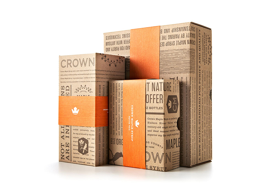
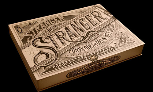
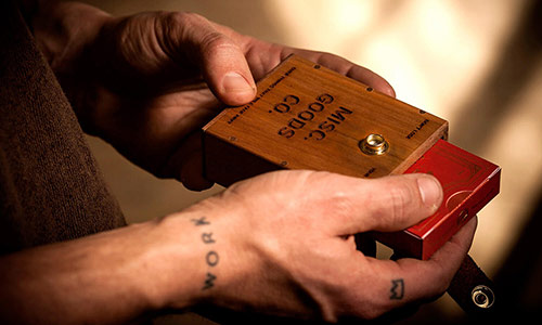
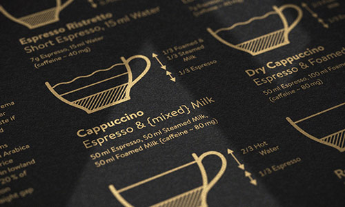
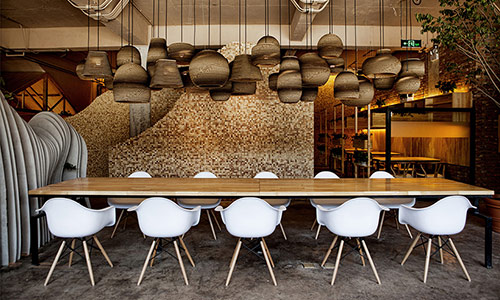
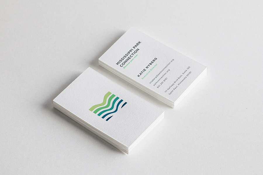
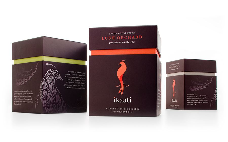
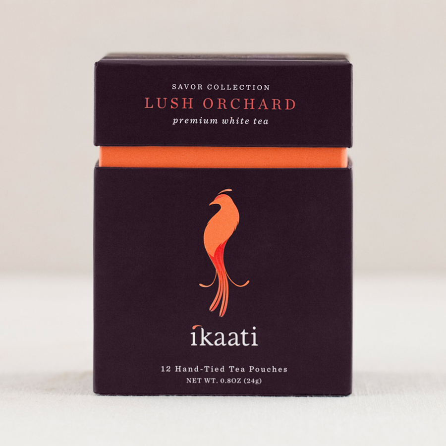
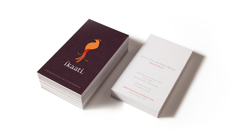
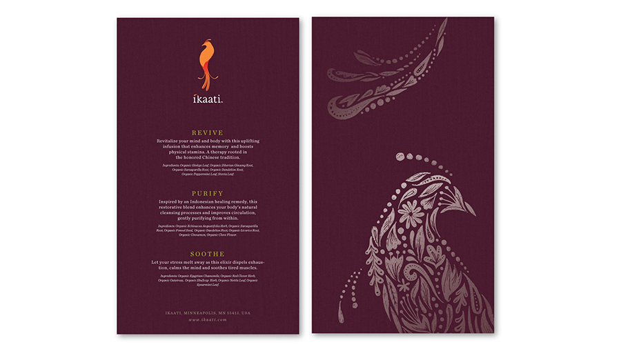
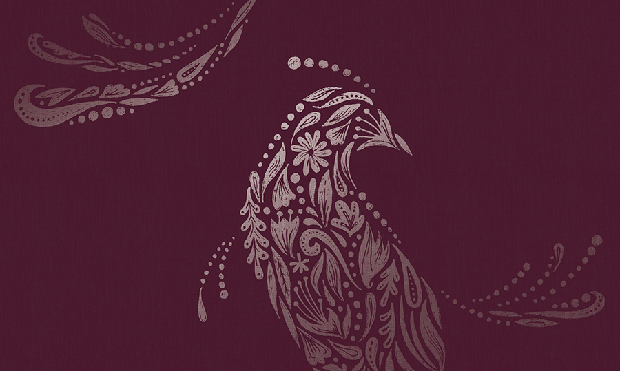
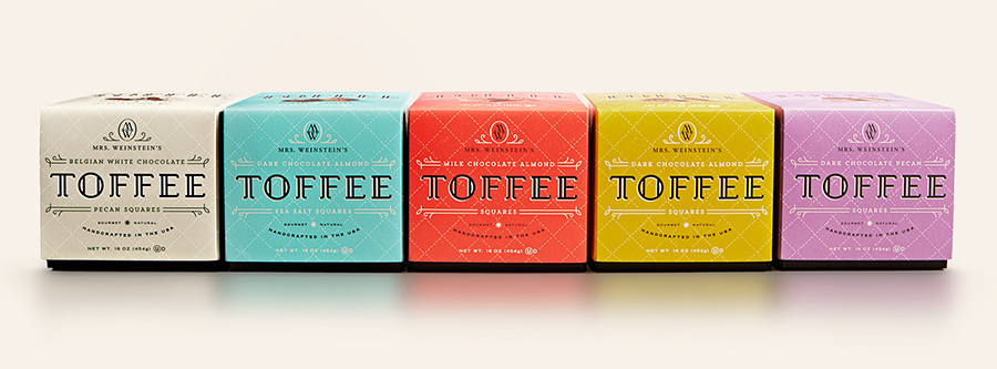
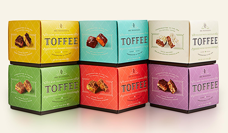
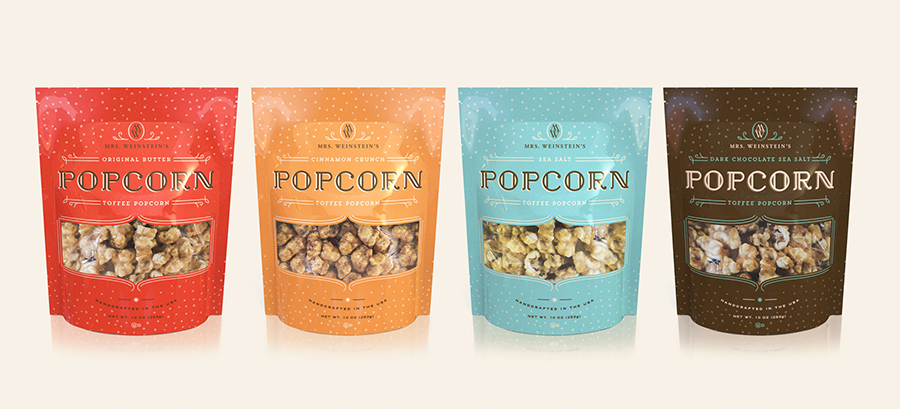
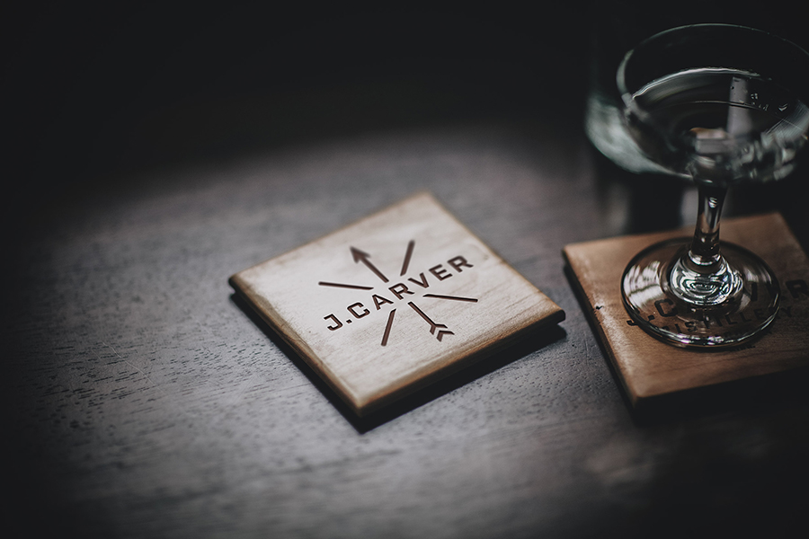
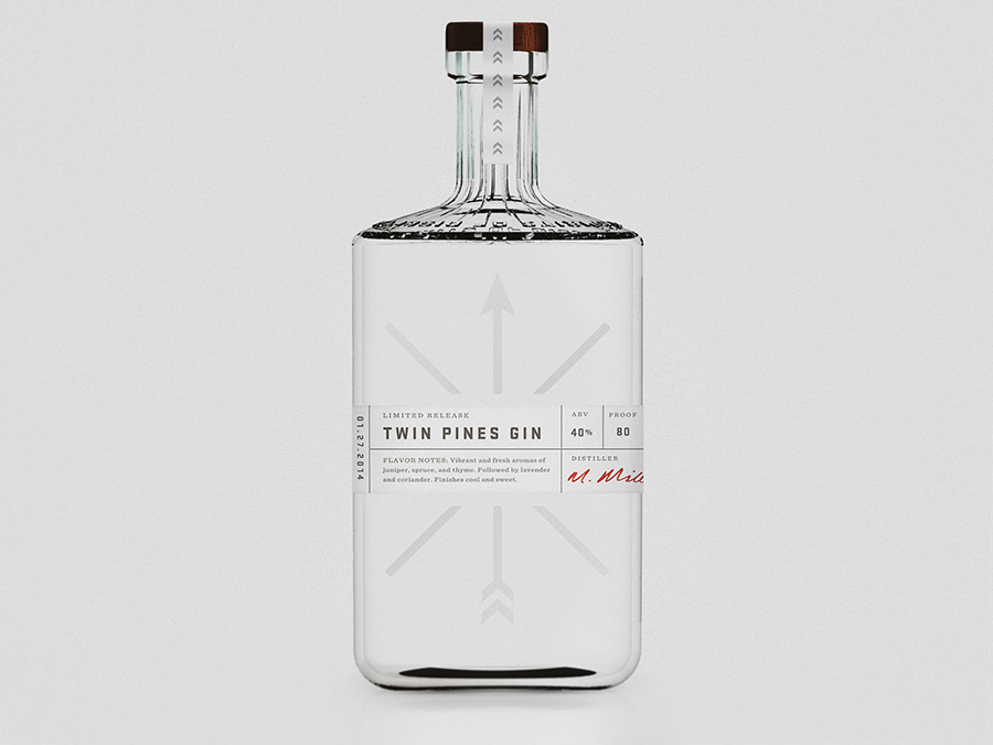
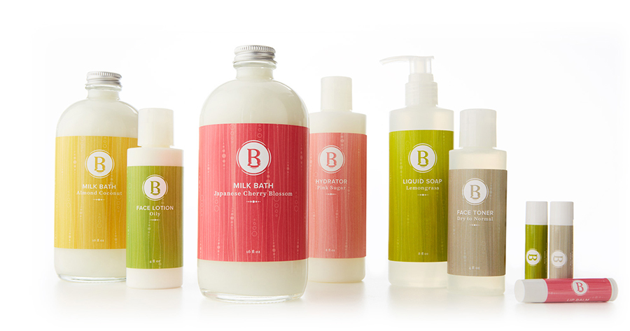
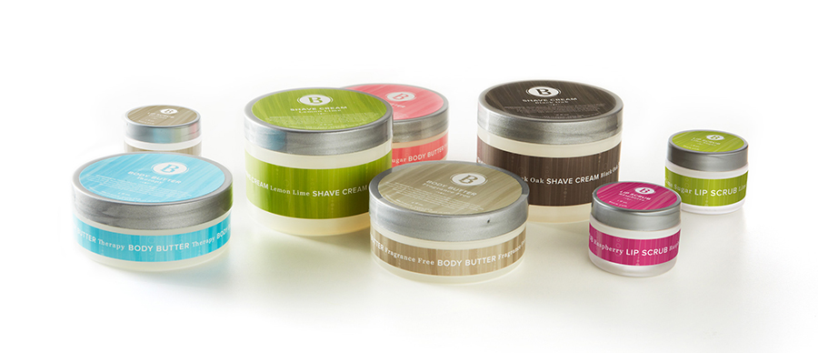
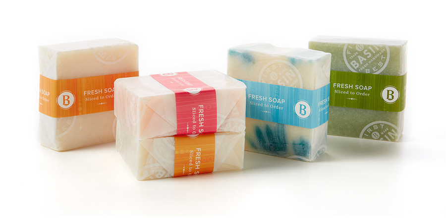
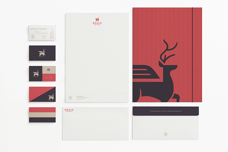
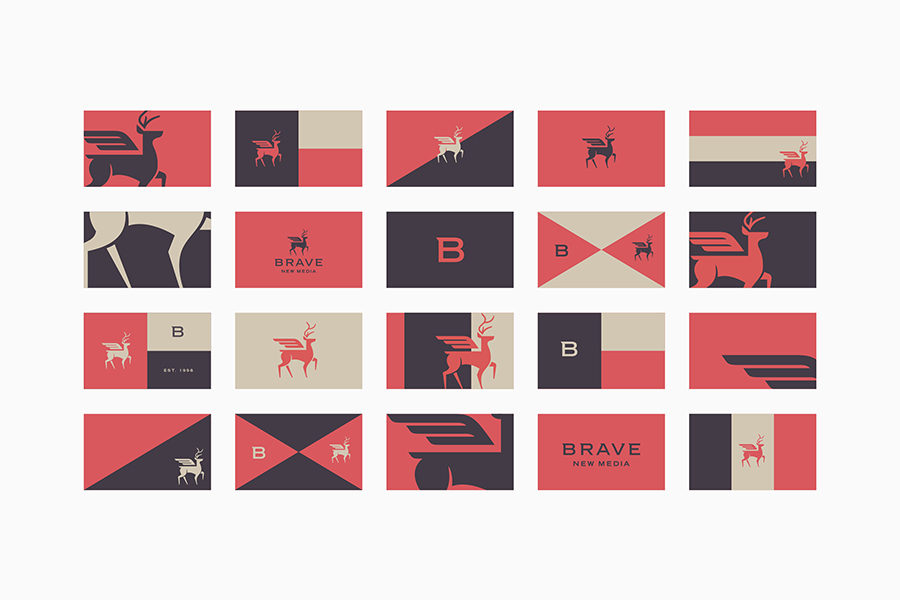
I think posts with too much images are not good, so when I want to share a lot of projects from the same studio, I will now split in 2 differents post. Here comes first part of the the impressive work of Minneapolis based studio MPLS.
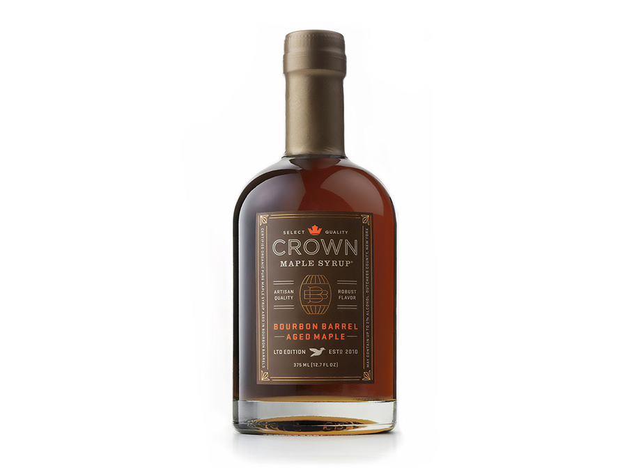
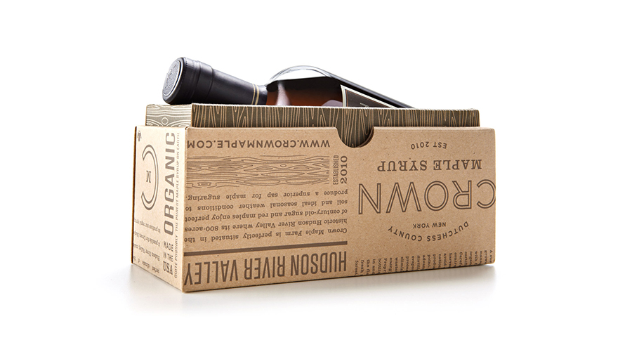
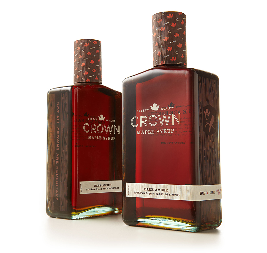
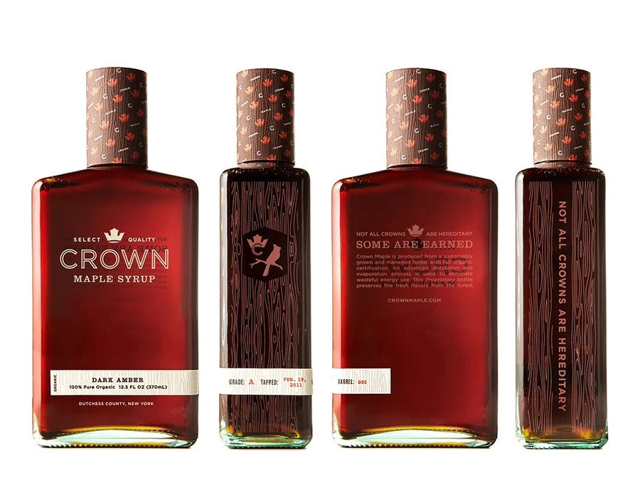
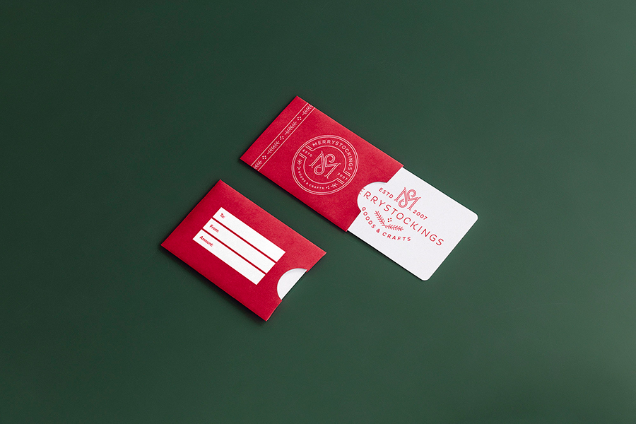
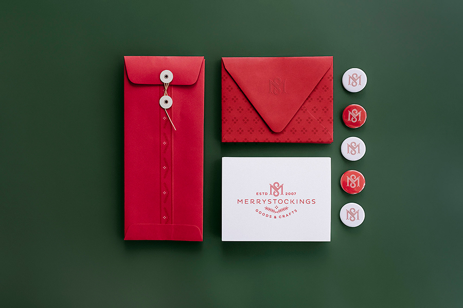

More coming soon in part 2 / studiompls.com
- 1
- 2