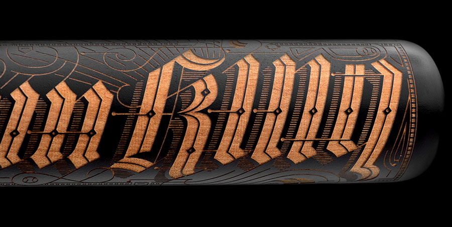


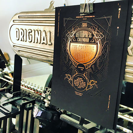
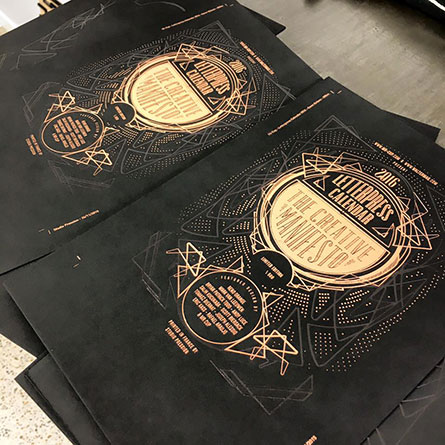
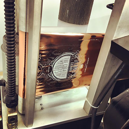
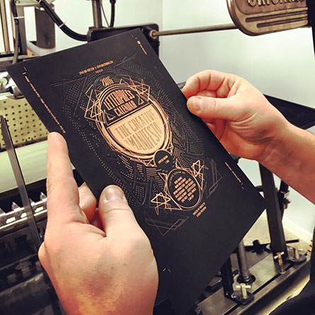
The letterpress calendar is a project I launched in 2011. Each edition consists of 12 cards, each with its color in reference to the season. For the 2015 edition, in addition to hire more designers than last year, I decided to try printing "copperplate" on the cover the foil edging of 200 copies. If it improves the quality of the project, this also increases the costs. So I decided to use kickstarter to finance the project and expand brand awareness.
I proposed a black print for each pages keeping in mind the possible print multiple color if funding was a success. Print 12 cards in different colors requires more work, time, and therefore money than a simple black print. It is truly an improvement for the final product in my point of view. I consider offering this as an additional step in the fundraising campaign, but I finally decided to ask your opinion : black or color ? If the funding goes very high, I could have do 2 colors print (black + color), but this is much more expensive (in letterpress, it is one ink at a time…).
Many people who have discovered the calendar with this version is therefore expected to have a black print, while the "regulars" contacted me to tell me their disappointment to not have the colors. It's hard to please everyone, and if I could I would do two editions to satisfy everyone. The vote showed that 61% want the color, against 39 for black. I would have preferred to 90/10, but that is not the case. The calendar will be printed in 12 different colors to satisfy the most. The cover of the normal edition remains in "black and white".
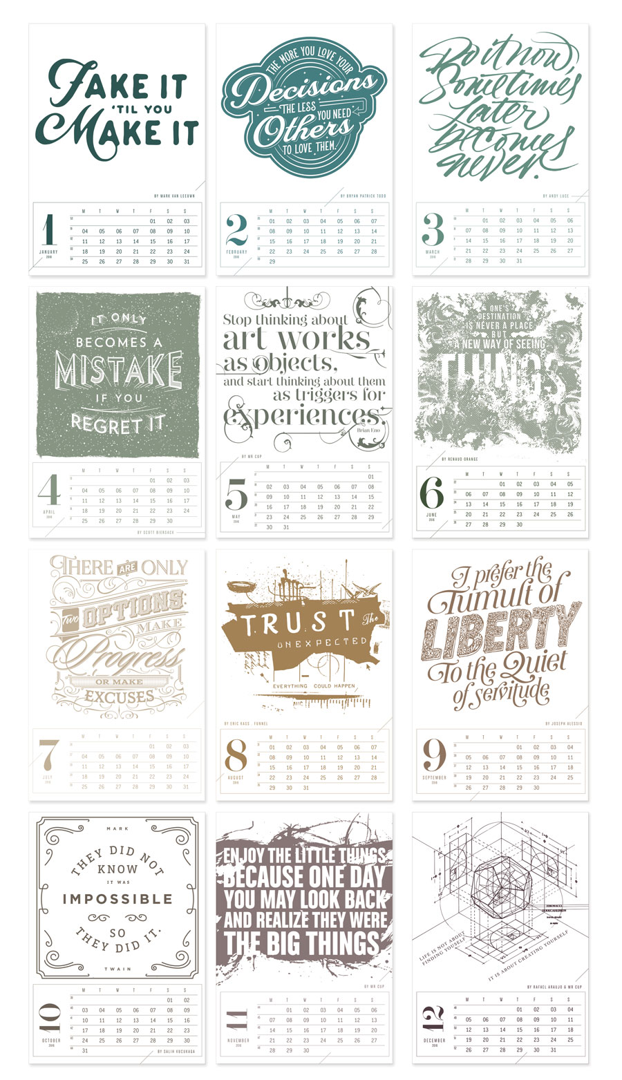
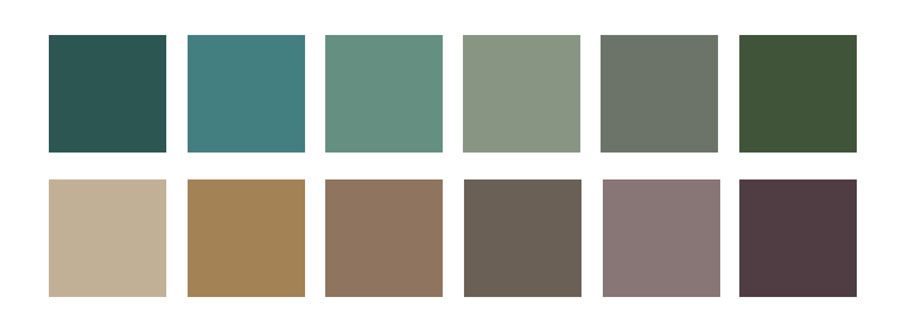
Also, I have choose a little darker colors for the june and july month, here comes the final colors. (Please consider seeing it on screen and letterpress printed will be different !)
2 people canceled their contribution to the project, and I confess that this makes me greatly sad, although I understand it. I hope you once you have the calendar in your hands, you will be proud to have participated in this project.
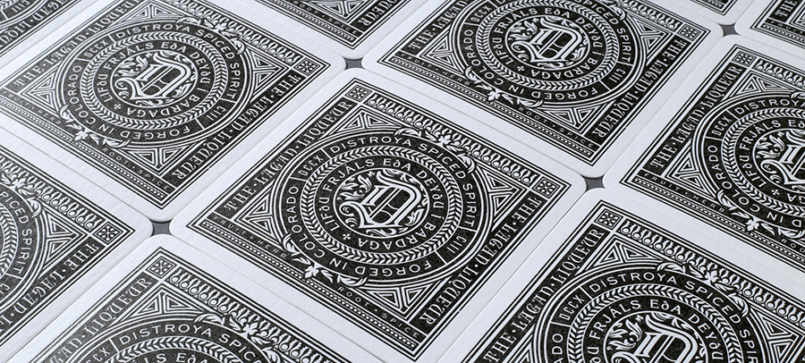
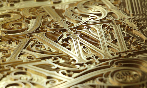
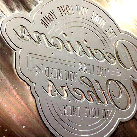
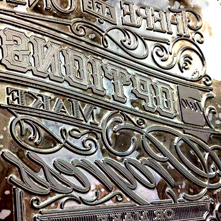
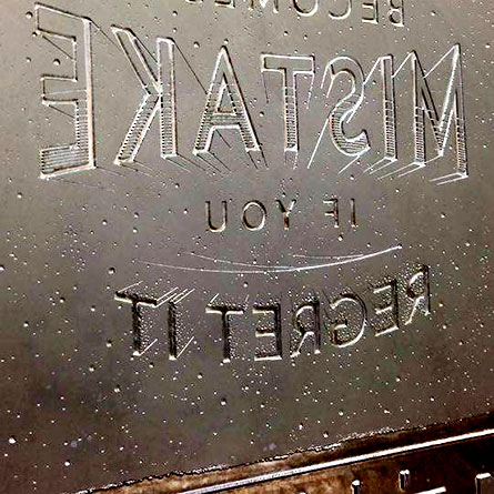
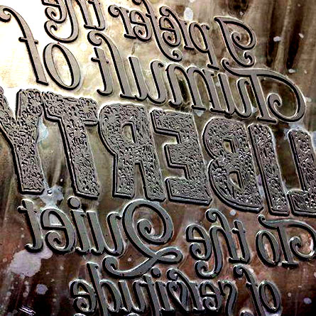
Here come the plates, I will be happy to have them in hands tomorrow and can share printing of the cover while I visit Studio pression !
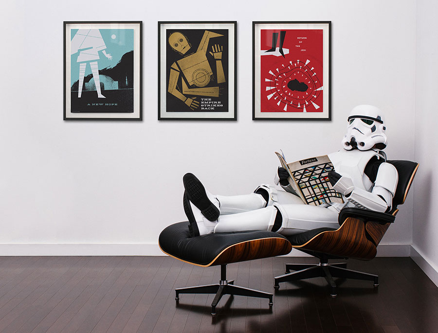
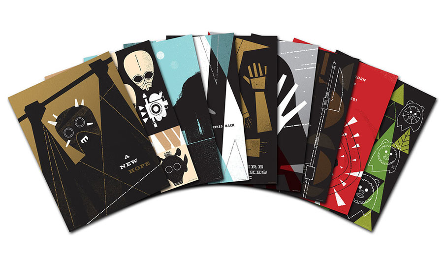
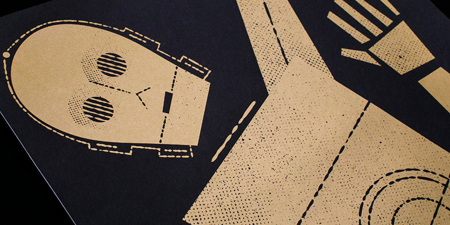
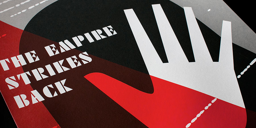
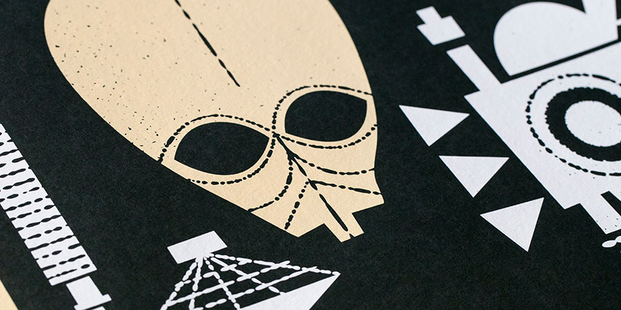
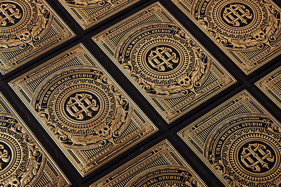
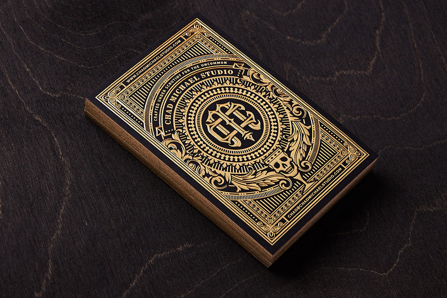
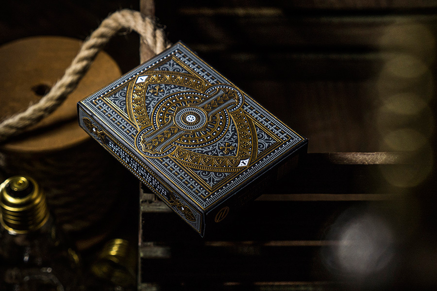
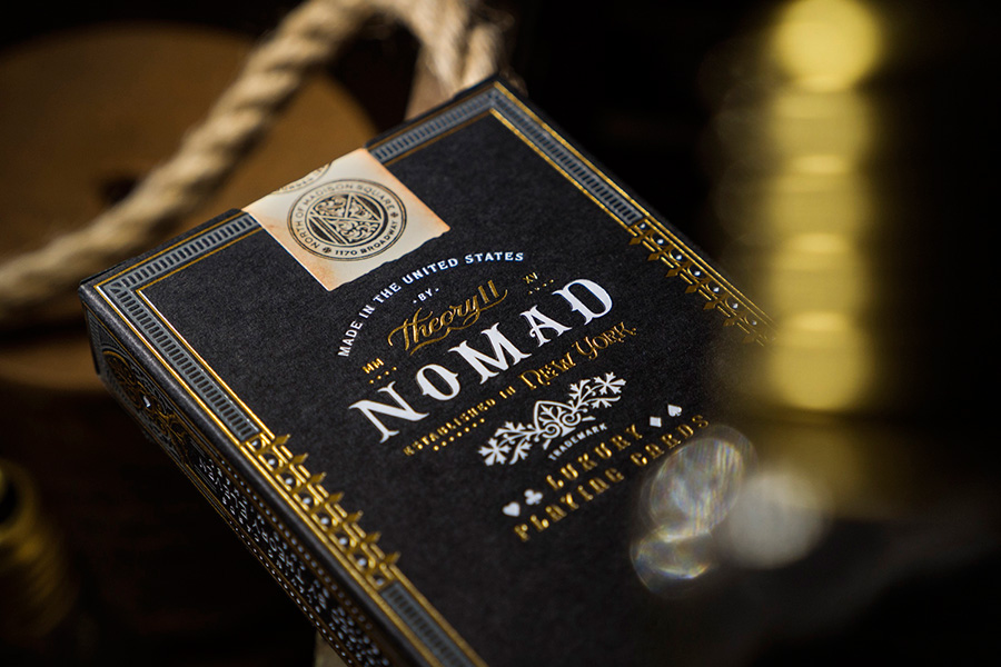
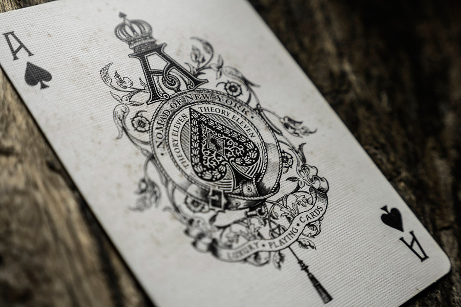
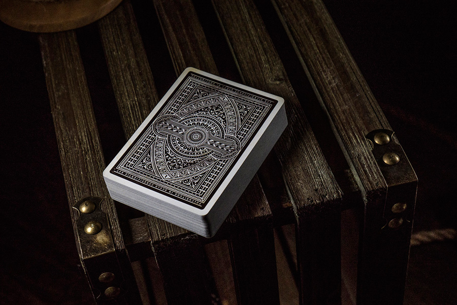
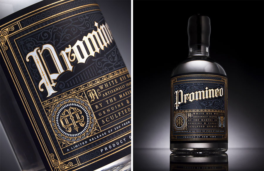
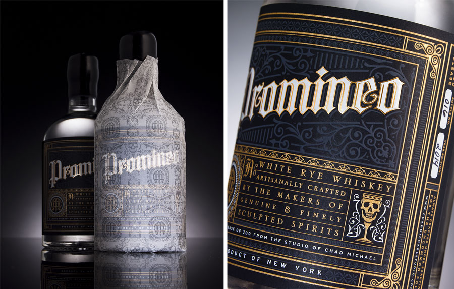
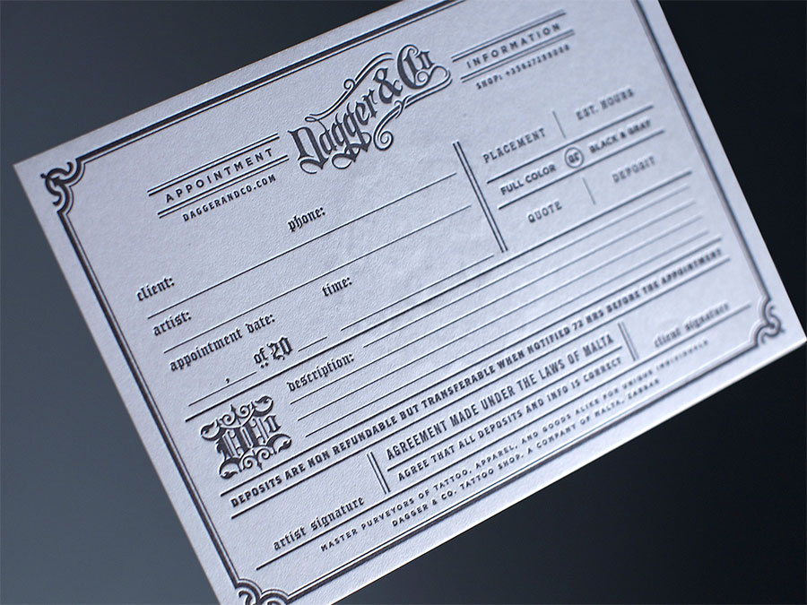
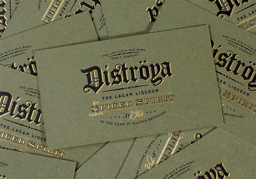
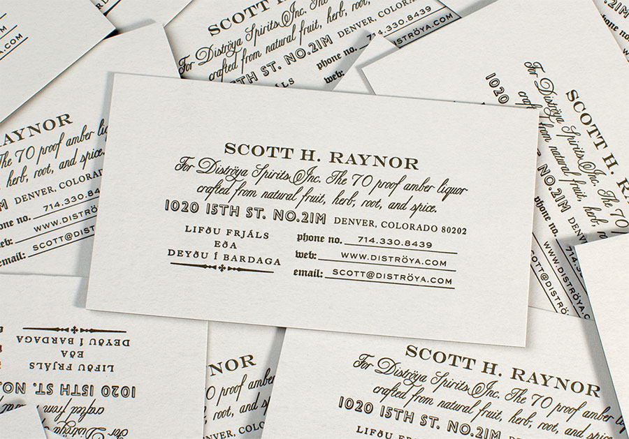
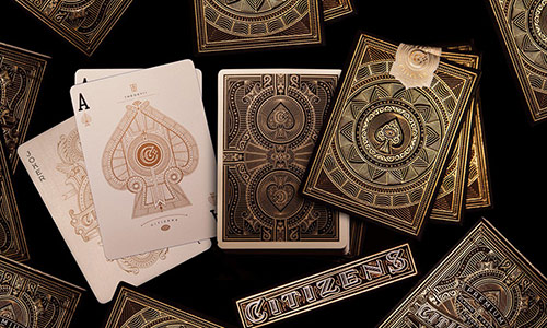
I love Chad work, and he was one of the first I ask to participate to the 2016 letterpress calendar, but of course he was too busy ! That's what happen when you are talented ! He sent me some of his cards last week and they are amazing in real ! But you have to "just" enjoy the pictures ! He is the man behind the design of the great NoMad plying deck available in the shop. It was time to have him in the exellence section of the site !