30
August
2016
CRAIG WARD / Words are pictures !
posted in Graphic
Tuesday, 30 August 2016
from
Mr Cup creative Studio
/ France
listening Stranger Things soundtrack !
Craig Ward is a British born designer and art director currently based in New York. An occasional artist, sometimes an author and a contributor to several industry journals, he is known primarily for his pioneering typographic works. Here comes a selection of his projects.
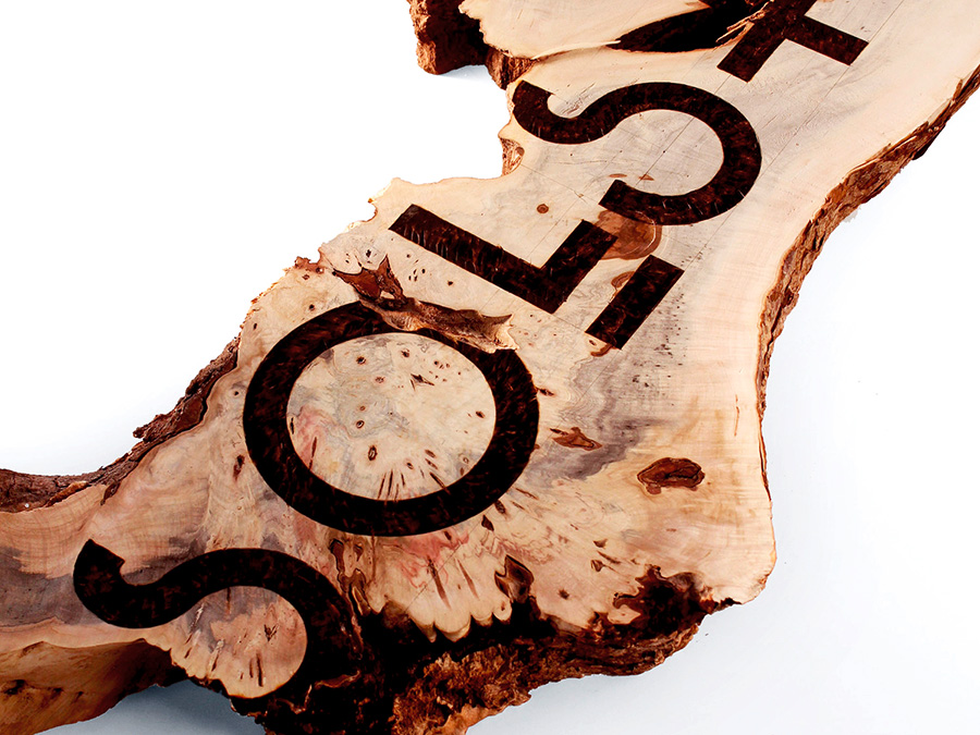
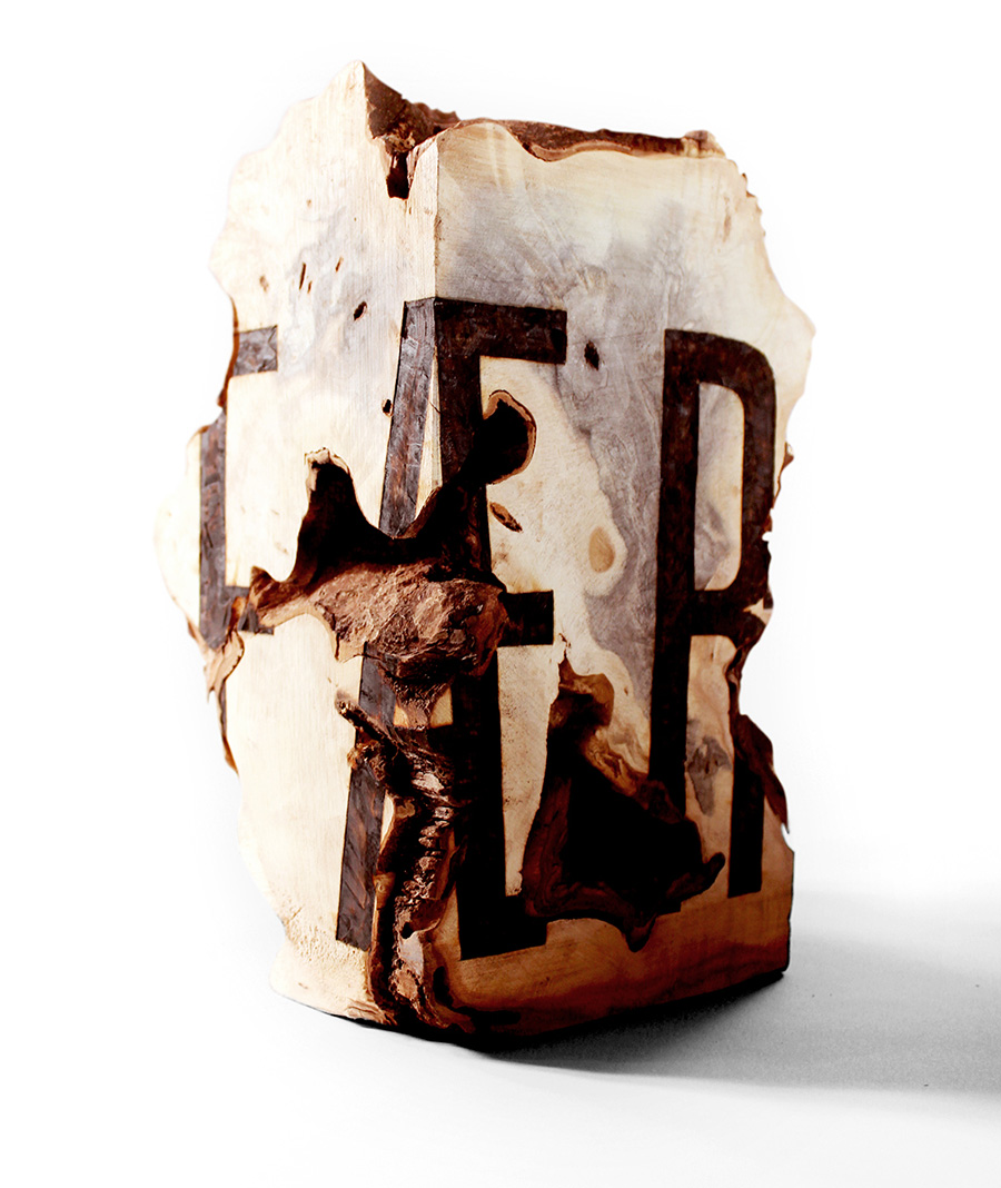
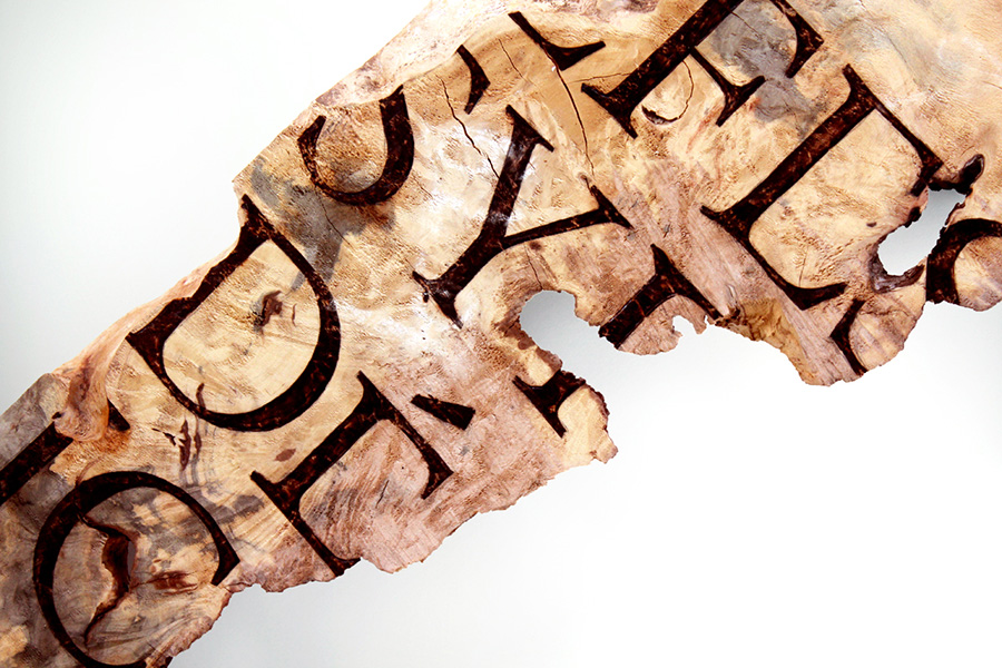
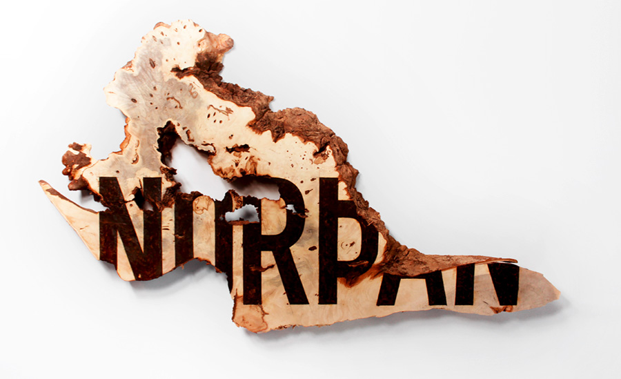
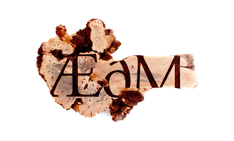
Pagan
"The series continues my preoccupation with the juxtaposition of clean, classically designed typography with the chaos of natural processes and organic materials. When combined, these aspects create a visual tension; a conversation between the typography and the surface, with each jostling for visual dominance. The subject matter for the series is Pagan and Heathen terminology from the Old English dialects of 5th to 12th Century Britain. Pagan and Heathen in this context are taken to mean “country dweller” or “rustic” - without intending to invoke the religious connotations applied since the 20th century. The typography was applied by hand using a method known as pyrography - a centuries old arts and crafts technique used for decoration, with the earliest surviving examples in Britain dating back to the 4th century."
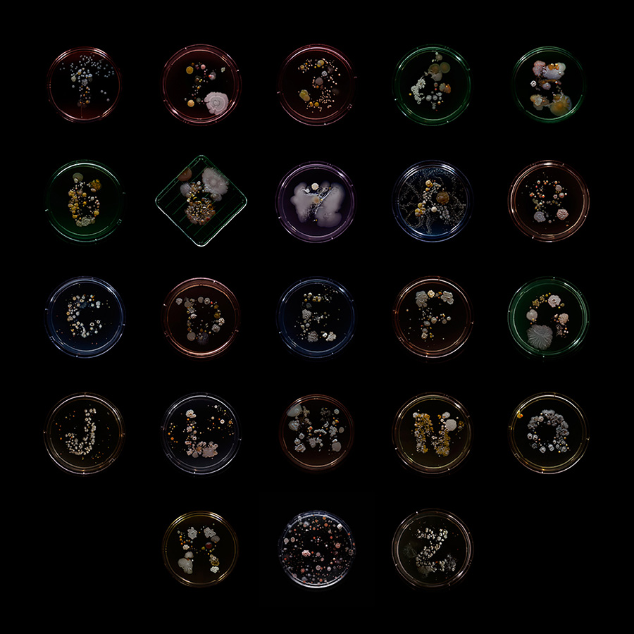
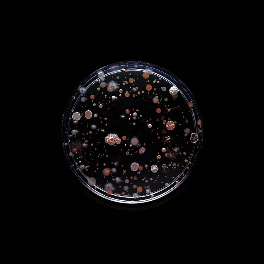
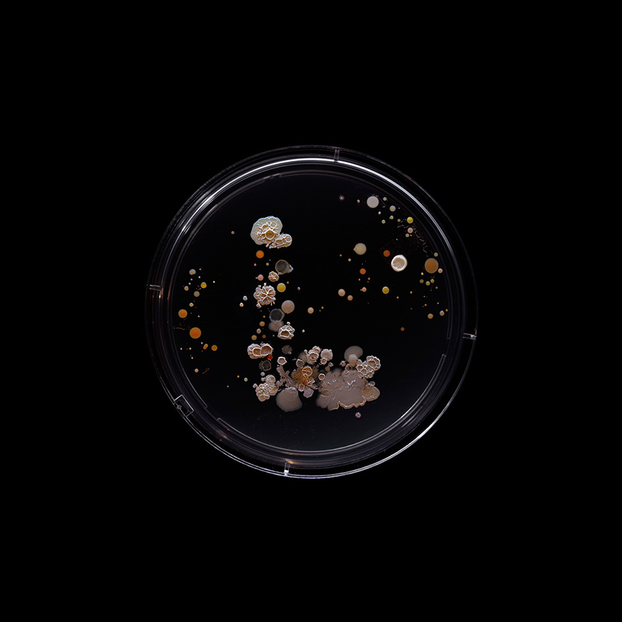
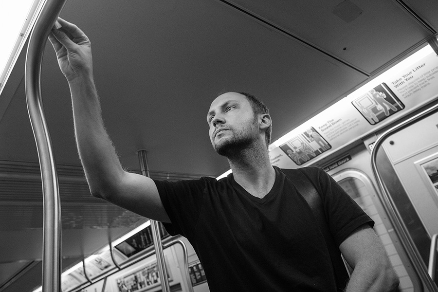
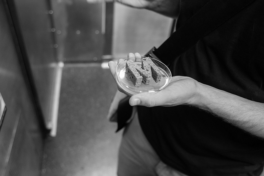
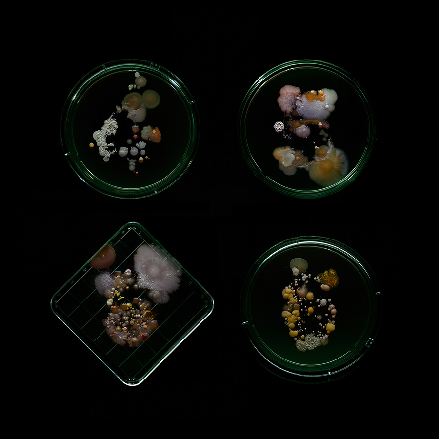
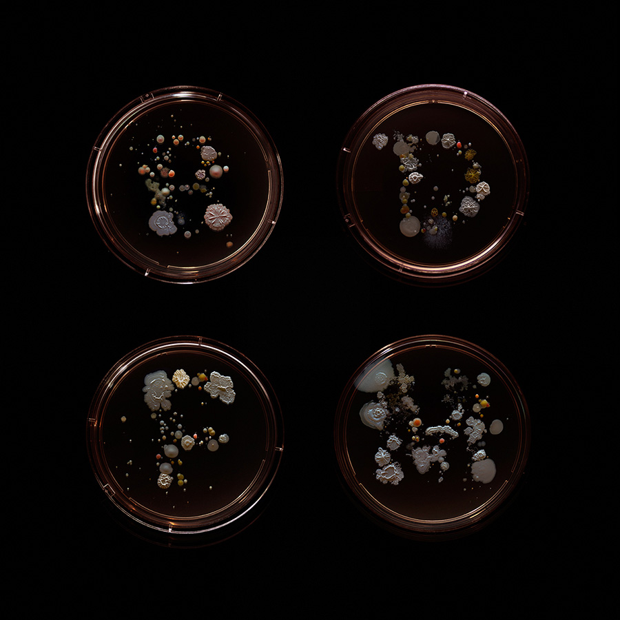
Subvisual Subway - Bacteria of the New York City subway
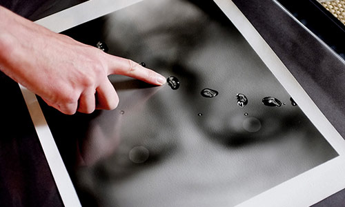
“Over the summer of 2015, I rode the trains of each of New York City’s twenty-two subway lines, collecting bacterial samples from hand rails, seats and other high traffic surfaces in an attempt to create an unconventional series of portraits of the city’s complex ecosystem and a snapshot of the city at large. The samples were taken using sterilized sponges that had been pre-cut into the letter or number of the subway line from which the sample was to be taken - A, C, 1, 6, etc. The swabs were then pressed into prepoured agar plates – their circular shape echoing the graphic language of the subway – and incubated for up to a week in my Brooklyn workshop, and photographed at various stages of development before being safely neutralized and disposed of. The resulting images are a portrait of the complex microcosm that each one of us contributes to and is a part of, and serve as an excellent visual analogy for diversity of the city at large. They hopefully also serve as a reminder that in a place that can make you feel extremely small, there are countless billions of smaller inhabitants.”
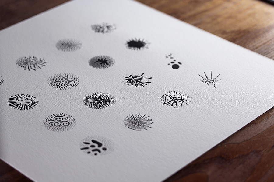
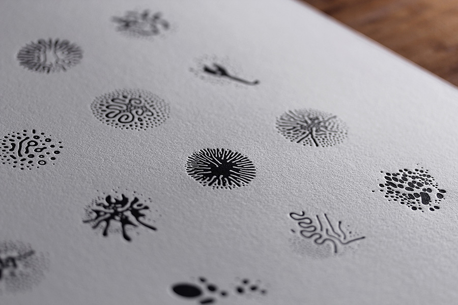
Fe2O3 Glyphs
Over the summer of 2015 I once again collaborated with pioneering biochemist and experimental photographer Linden Gledhill, this time in the creation of a unique, ornamental type system and an accompanying set of one-of-a-kind letterpress prints.
Wait, what? Why?
Because science. And curiosity. Fe2O3 Glyphs transcends the traditional role of a typeface - to provide a consistent and coherent platform for communication - and completely inverts it. The typically fastidious design of the glyphs is given over to an evolving, unrepeatable organic process and the 'grid' at its heart is replaced by conflicting magnetic field lines.
Craig Ward work was featured in Walter magazine Volume 2, get your copy here !