
27
April
2016
Creative playing cards : Citizens, The sons of Liberty, and more...
posted in Mr CUP News | Print | Packaging
at 8.33 AM
from
Mr Cup Creative Studio . Arles
/ France
listening Depeche Mode
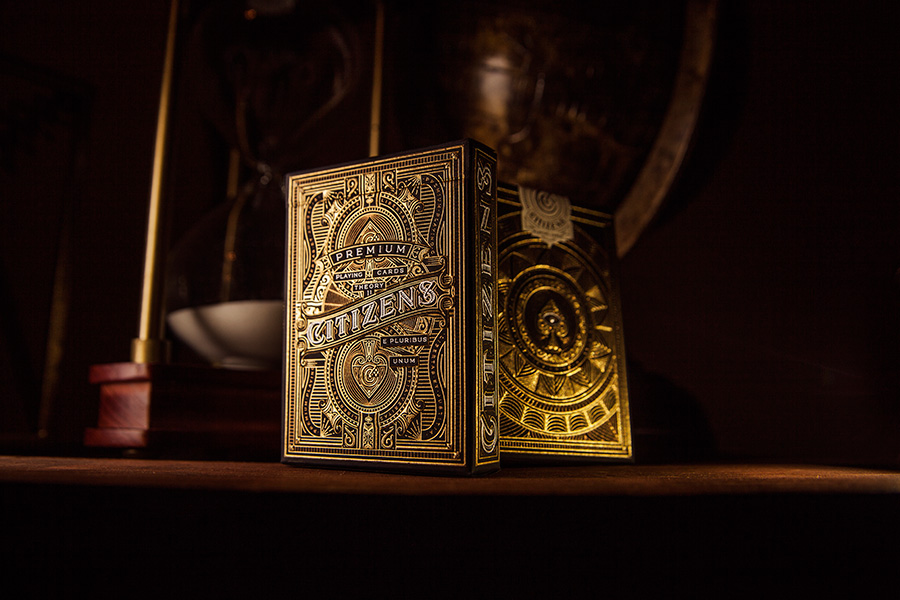
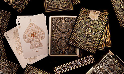
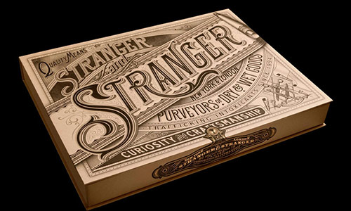
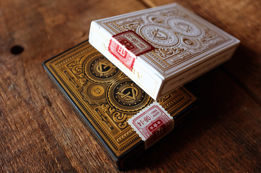
We all know the visual codes of a deck of cards – ace, king, queen, jack... hearts, clubs, diamonds, spades ... red, black. Theory11 reinvent these codes and call in graphic designers and printing craftsmen to create remarka ble games ! Everything is in the experience, the feeling, the paper quality, the gilding and the decoration. Walter 2 will feature a full story behind these decks and here comes Citizens, designed by th one and only Kevin Cantrell. You know him, he his behind the deign of Walter 1 front cover !
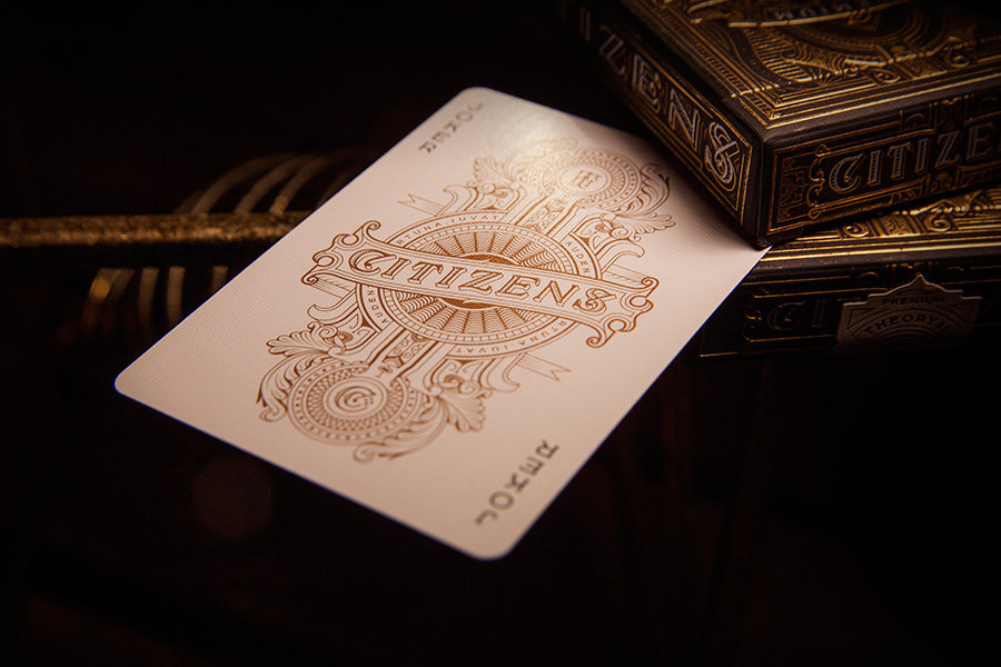
Citizens by Kevin Cantrell
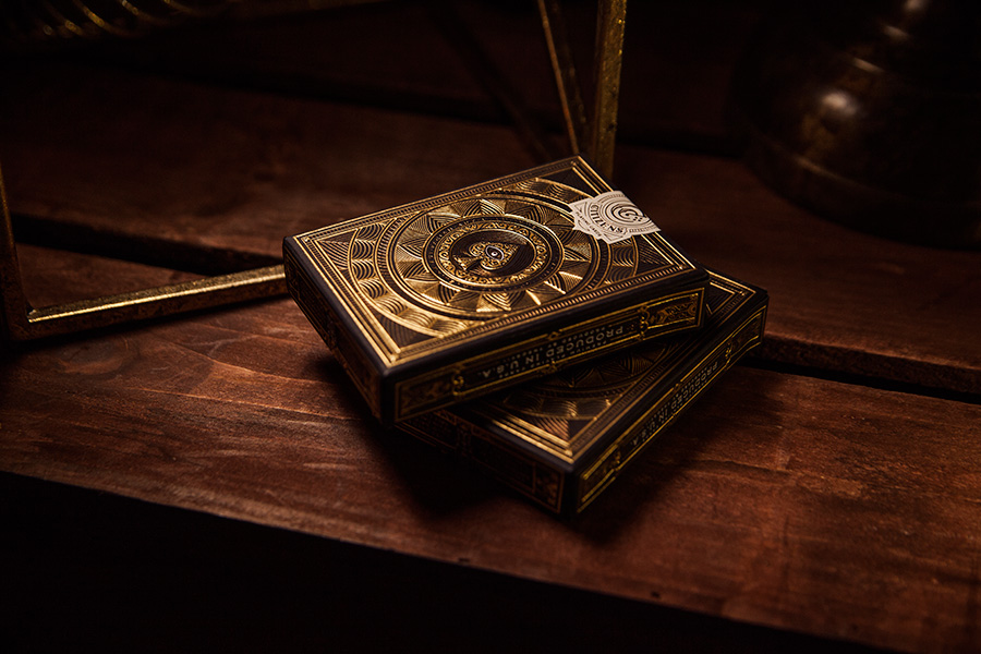
Kevin this story behind these cards : Theory11 contacted me to create an opulent and currency inspired deck for a specific magician. The initial ask was to create something singular but with hidden iconography throughout that told the magician’s story in a subtle manner. As the creative progressed, the hidden iconography became more tertiary as the currency theme and other design elements rose to the surface. The iconography and subtle connection to the magician became so tertiary, in fact, that we decided it was better to have the deck stand on its own independent of the magician.
We changed the name, drawing inspiration from the rich look and feel. The concept of justice and equality, written in latin as “libertas et justitia” and “e pluribus unum” meaning "one for all,” or the idea of justice and liberty for everyone, made the name “Citizens” really resonate. My process is two fold: architectural and gardening. I come up with the basic structure for the key components centered around typographic components such as the logotype and a custom monogram made inside a custom ace of spade. Following the architectural foundation, I then fill in the space as needed (gardening) which is really more intuitive than anything else.
We wanted every panel to tie into the other, almost like a magic box. So if you turn the box around you’ll notice that there are subtle connection panels that run to the spine. Every panel was integrated and considered; we didn’t want any detail to feel unintentional or an after thought (just as we wouldn’t want any individual or citizen to feel ... unimportant as the latin them of “liberty and justice for all” resonated throughout). In addition to the aesthetic connectivity, we wanted there to be a high sense of functionality to the deck as it stood on a shelf. The name “CITIZENS” fit beautifully large on the main side panel, so that from a distance CITIZENS would read easily above the rest; hence this citizen is sure to stand out in a crowd!
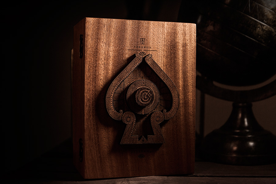
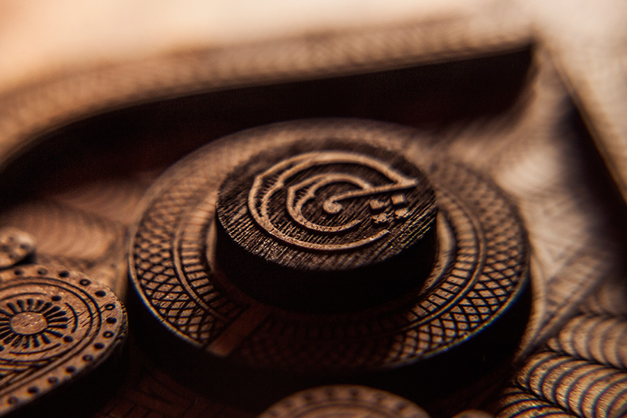
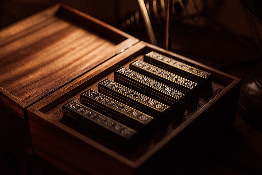
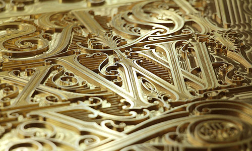
The detailed ornaments of Kevin Cantrell combined with a gold foil, hot stamping and bronze foil give Citizens the masterpiece status! Even the inside of the box has a breathtaking, intricate guilloche pattern. The Joker and back design bear the Latin phrase “Audentes Fortuna Iuvat.” Fortune favors the brave. The Ace of Spades features an iconic Citizen “C” emblem. Citizens artwork extends in three dimensions from the laser-etched hardwood cover. Open it to reveal 6 decks of Citizens. Handcrafted detail with laseretched panels and the finest African hardwood make this box set the most luxurious collector’s edition to date.
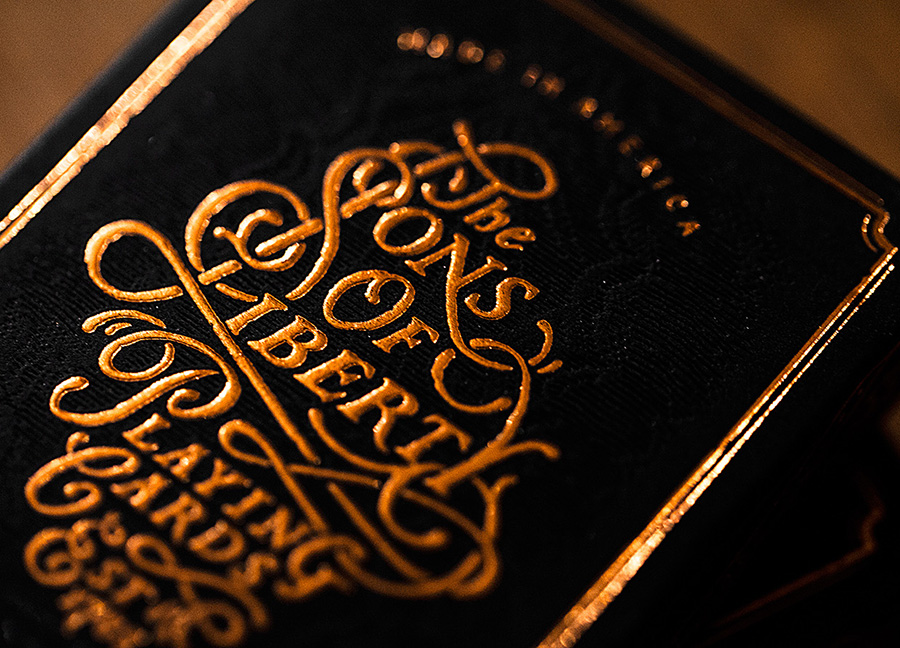
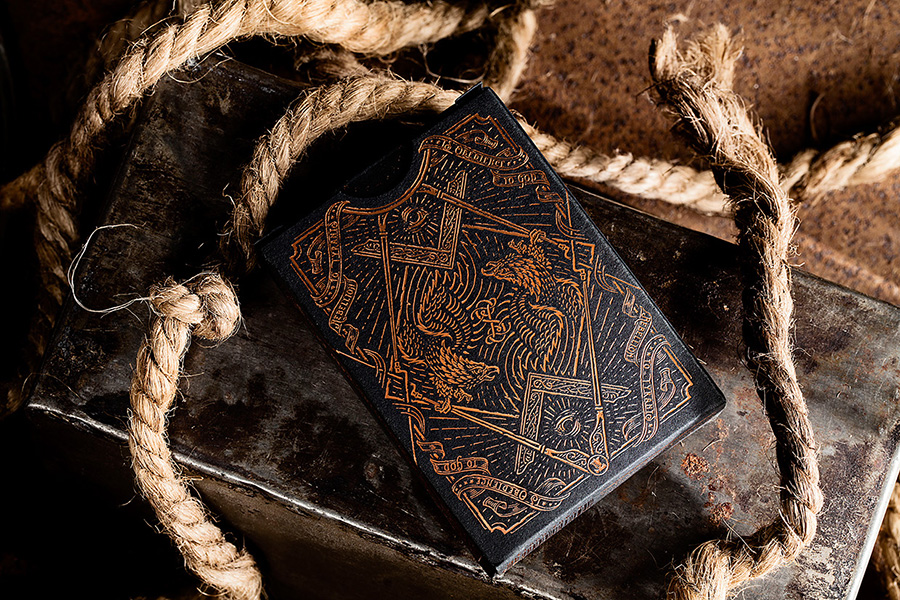
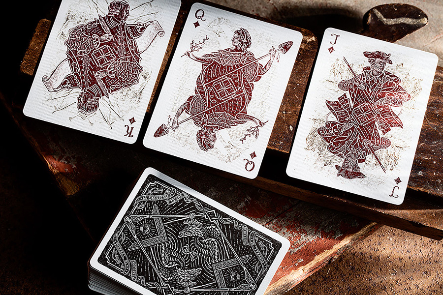
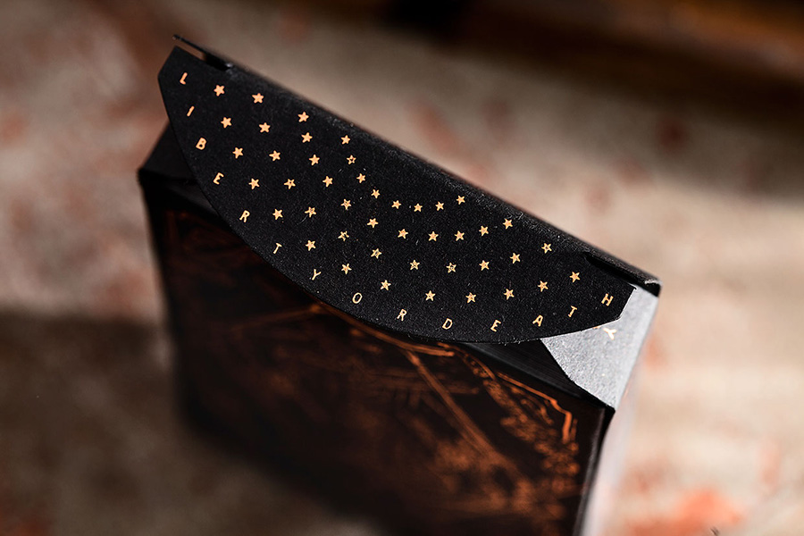
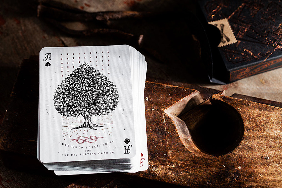
Sons of liberty by Jeff Trish
“A time before the United States existed, a time when we were subjects of a King across an ocean, we, the Sons of Liberty operated in the shadows, leaving secret signals, passing hidden messages, and meeting in the dead of night.” These playing cards embody the spirit of freedom that the Sons of Liberty fought for, featuring Freemason symbols, the Liberty Tree, and many other secret images. A few of the many heroes of the War are represented on the court cards, giving you a chance to become acquainted with brave men and women. Illustrated by Jeff Trish in a woodcut style with intricate details throughout. Custom court cards, aces, Jokers and subtle variations in all the spot cards make this deck completely unique all around.
A few copies of the Sons of liberty are also available in the shop.
Other cards back in stock.
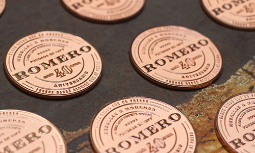
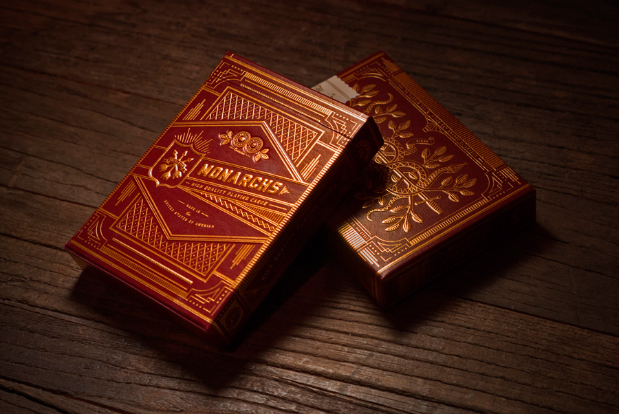
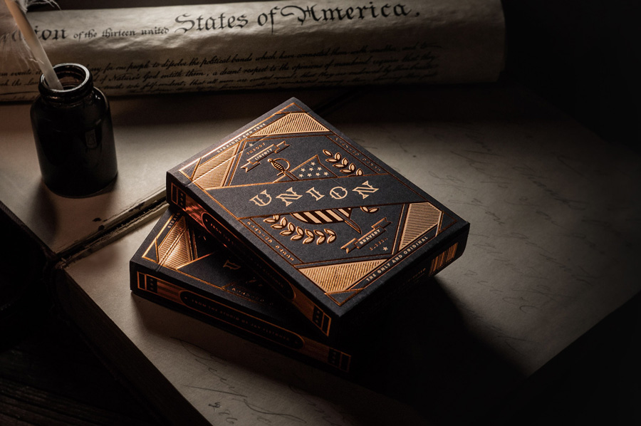
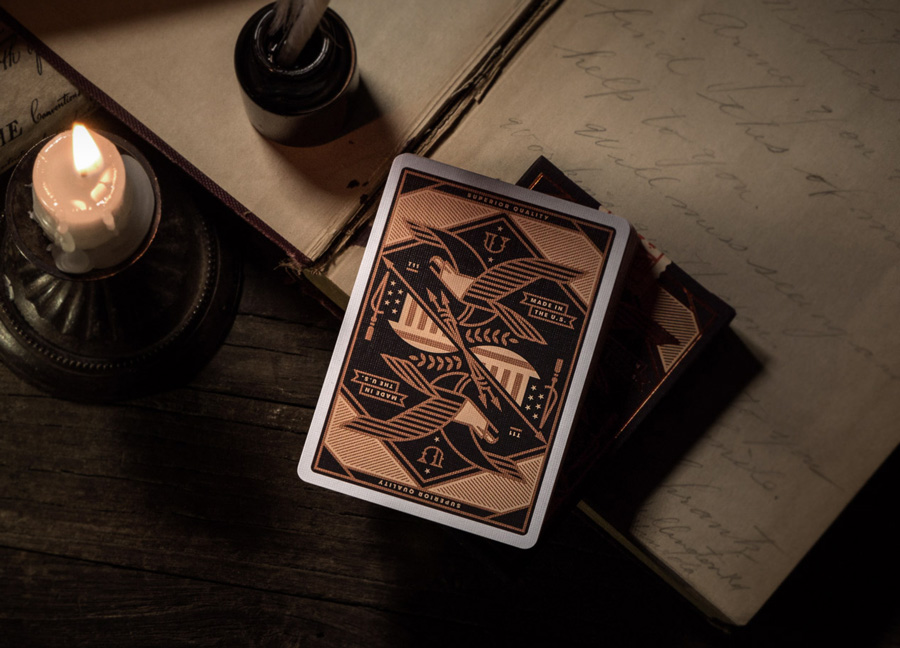
I have buy several decks for my personal collection of the past weeks and took some more to propose them in the shop. Check the updated part of the shop to get Union, Monarch red and more.
Check all the cards available in the shop here.
24
April
2016
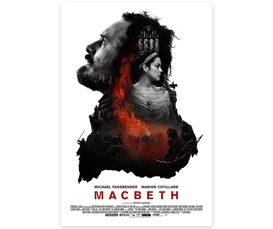
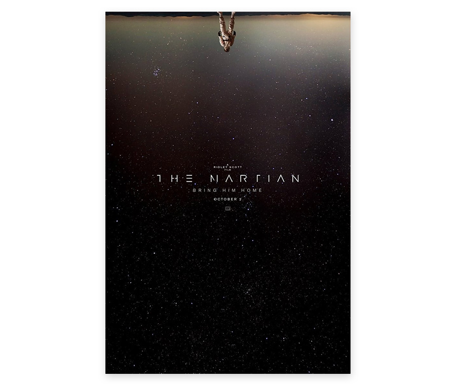
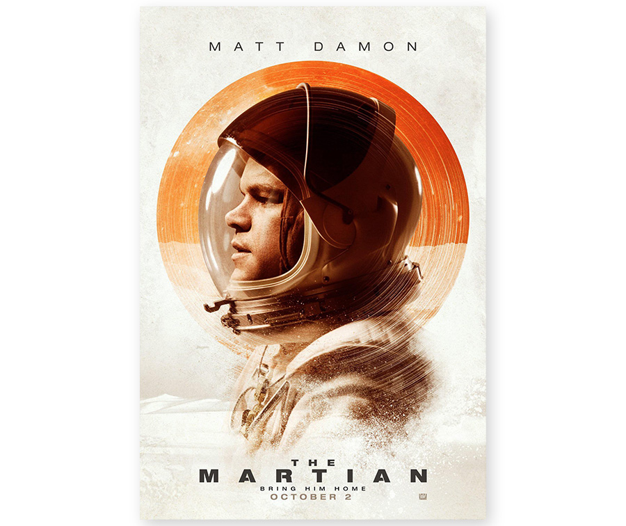
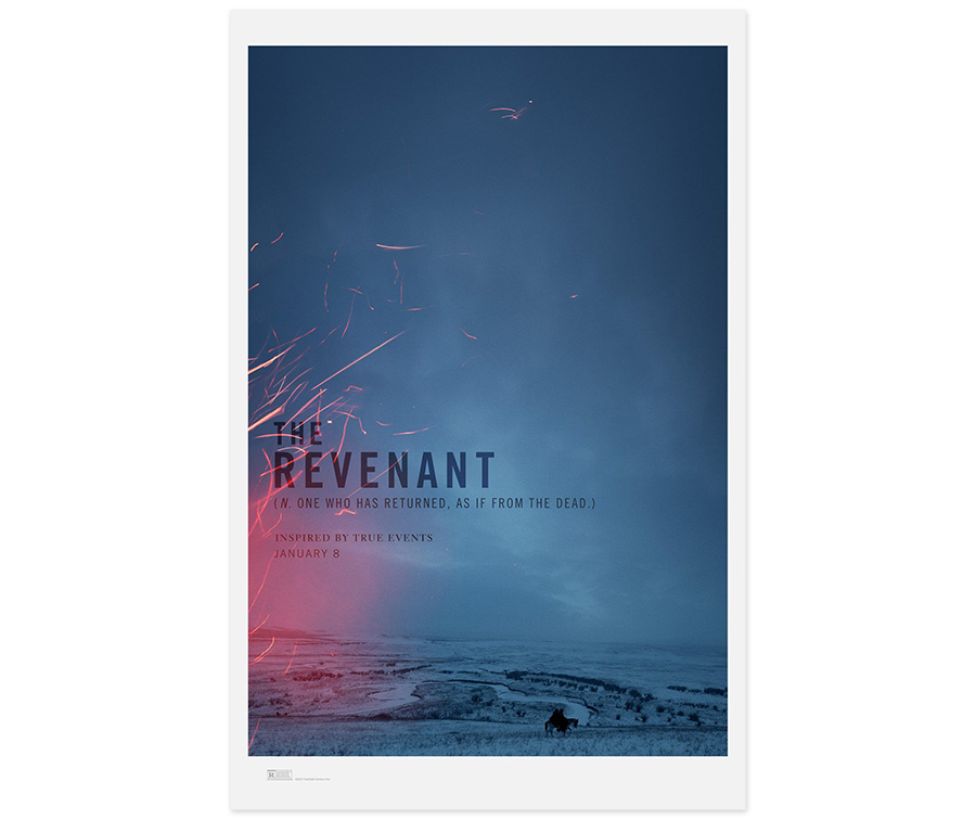
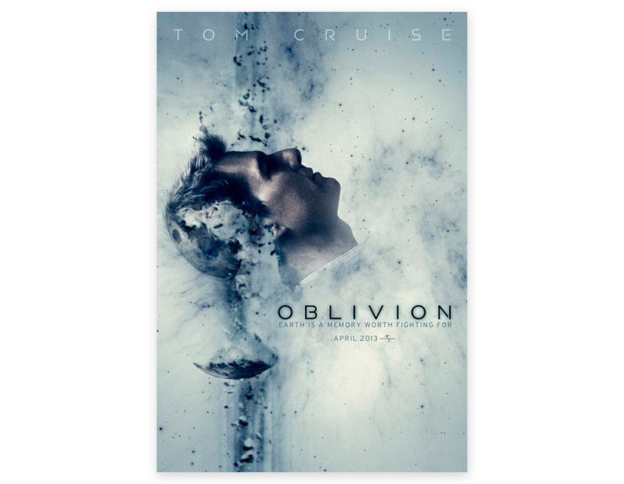
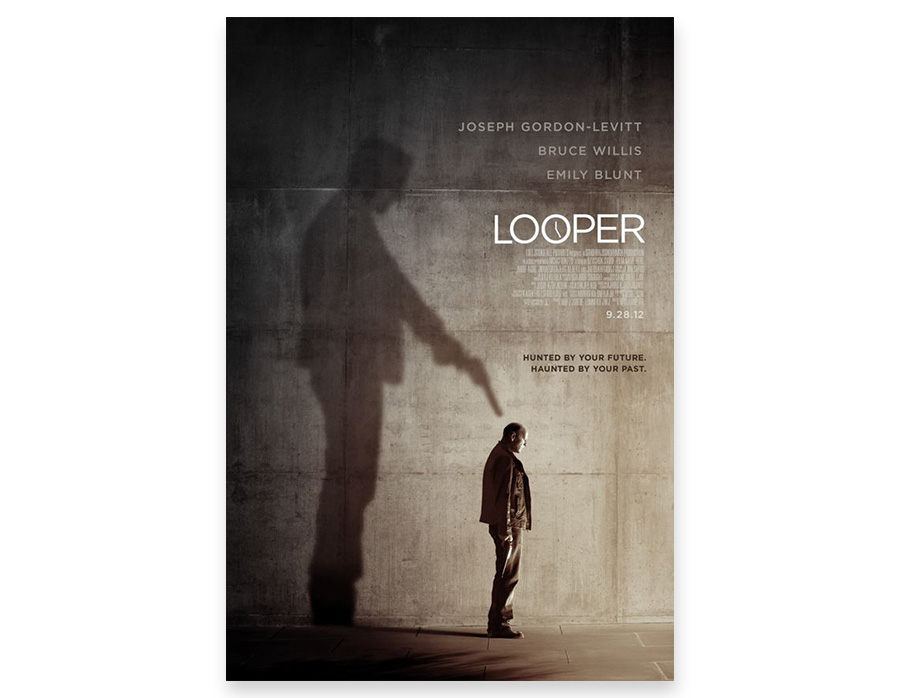
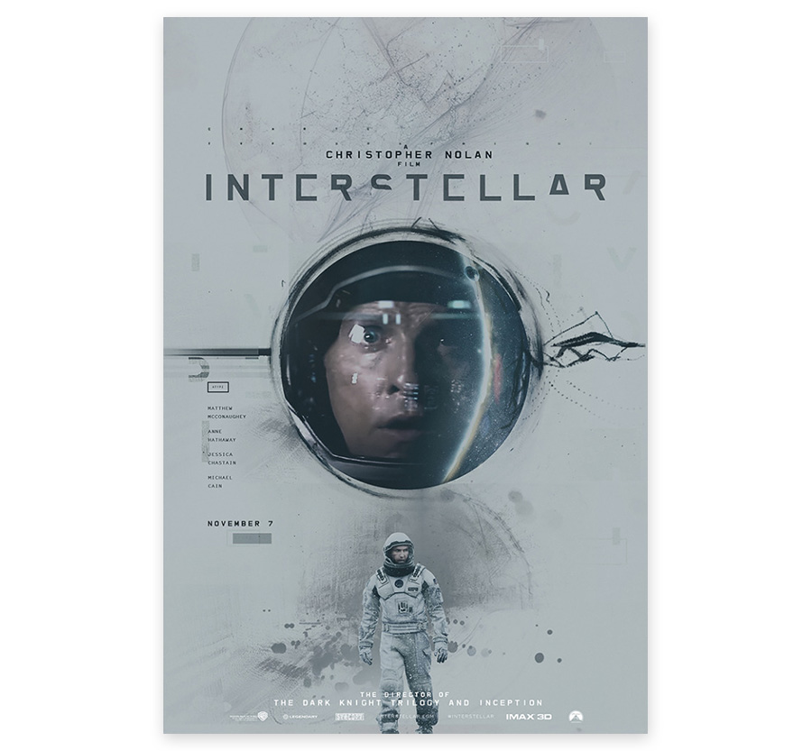
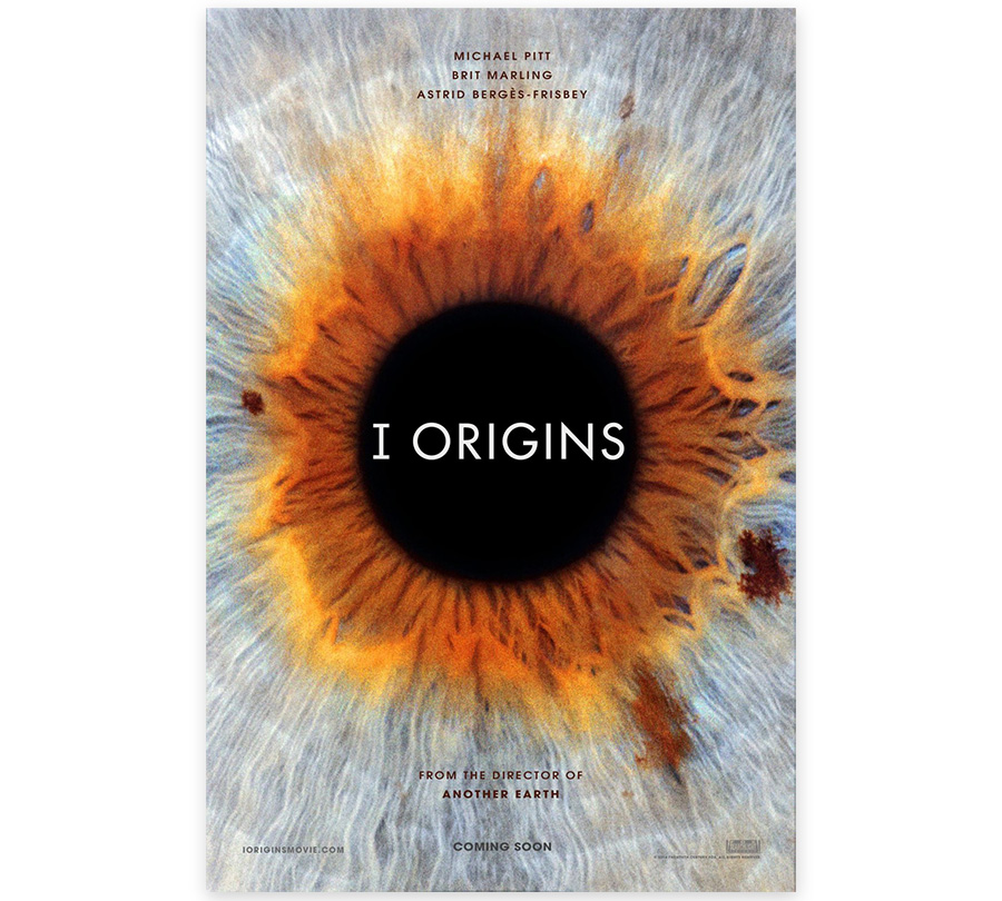
It's been a long time since I have published movie posters. Here is a very small selection of the latest posters with interesting design and especially outside the usual standards and codes. If a movie poster can be a dream to work on for a graphic designer, film industry has more than binding principles! For example, do a search in google images "trajan movie posters" and you will see the number of film use the Trajan, it's impressive, from Star Wars to Titanic...
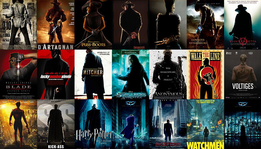
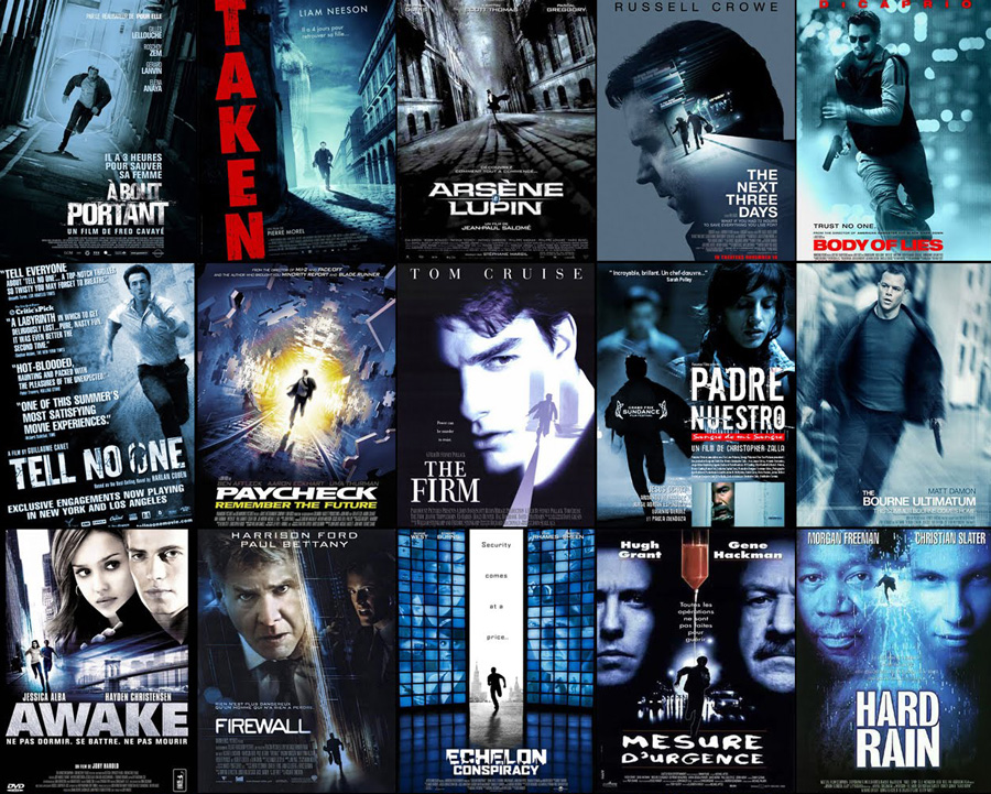
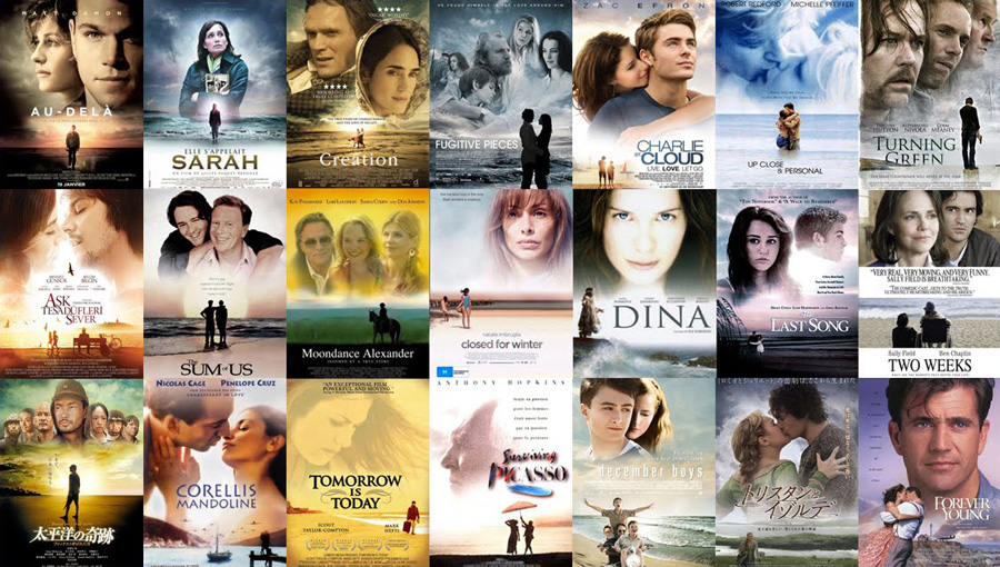
After publishing posts about it on facebook, I was referred to the colossal and fun working Christophe Courtois. I mention it after these posters slection, not all are official but they are inspiring !
I have published thousand posters over the years, you can see them here
- more than 300 in the facebook folder
- a lot of posters in the archives here, here and there
- a more updated selection in my pinterest folder here
- more than 300 in the facebook folder
- a lot of posters in the archives here, here and there
- a more updated selection in my pinterest folder here
Getting back to the work of Christophe Courtois, he made posters compilations ordering by their codes and common points :
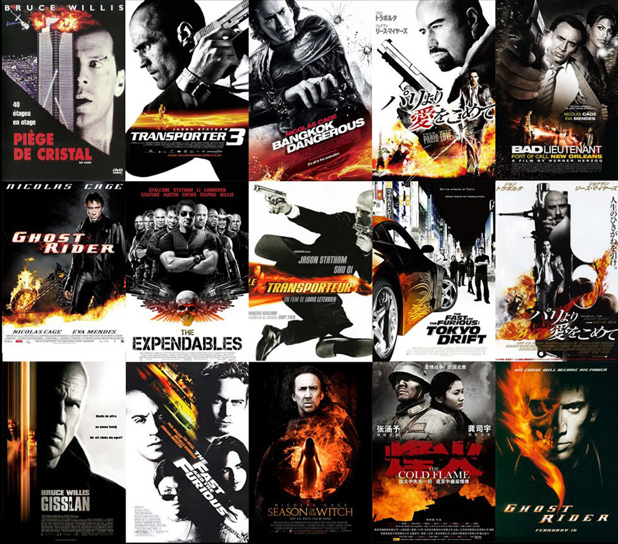
the posters "heroes back"
the "blue bent street with a running man"
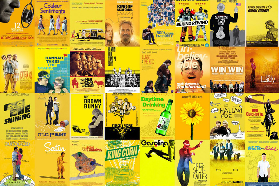
The big heads and small people on the beach
The yellow posters ...
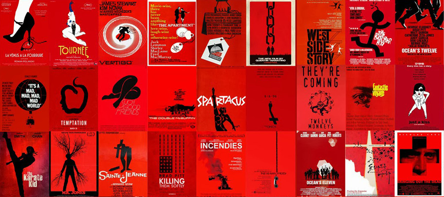
... and the red ones
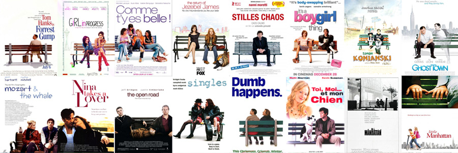
The publich benches
The black and white with some fires...
See them all at afficheschristophecourtois.blogspot.fr
20
April
2016
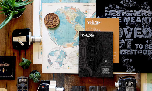
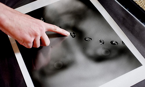
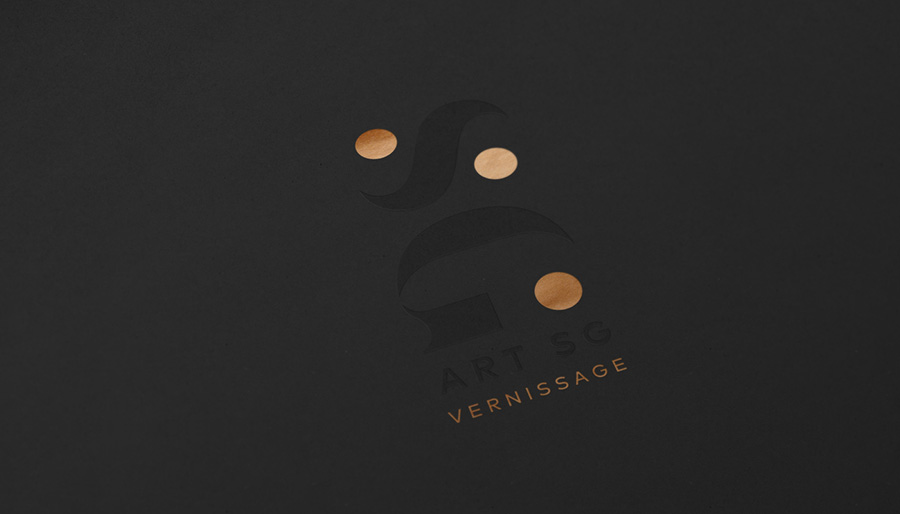
The Walter 2 is almost done by now and will do a dedicated post with annoucement soon ! It will features a project by BMD design in Bordeaux, France, and while browsing his work I discover this project I wanted to share !
18
April
2016
The plant
posted in Identity | Packaging
at 8.35 AM
from
Mr Cup Creative Studio . Arles
/ France
listening Piers Faccini
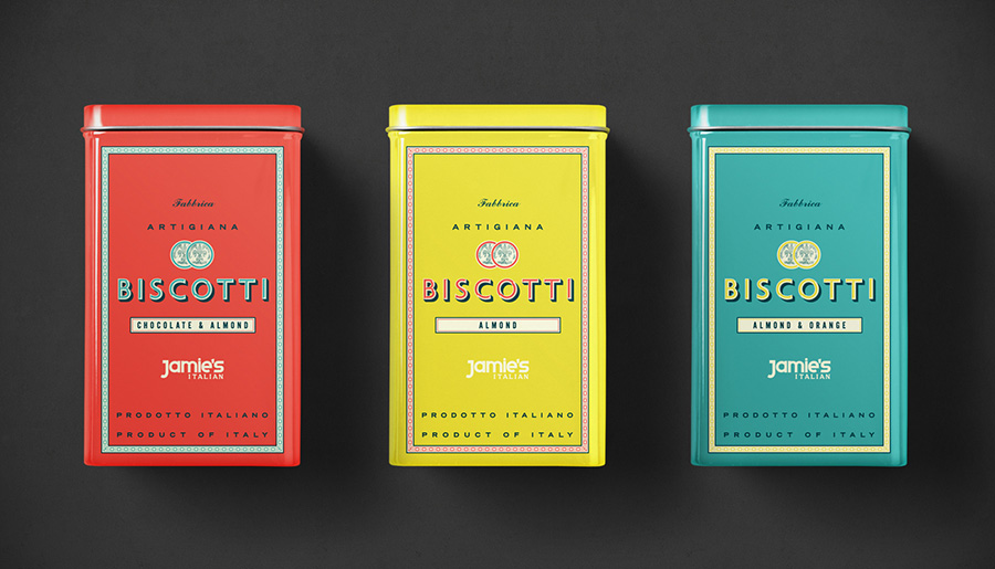
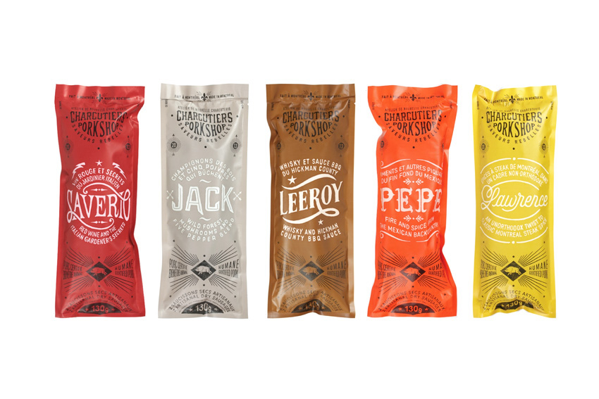
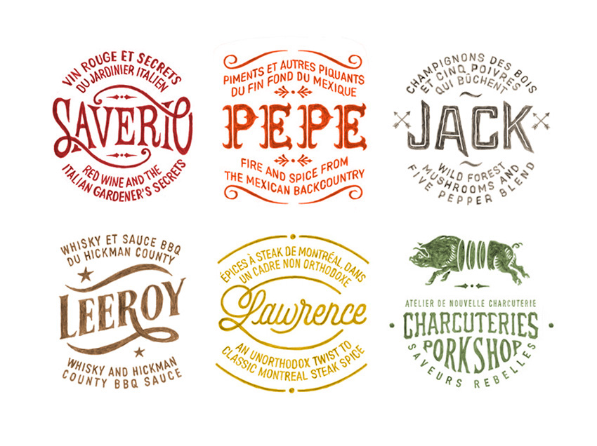
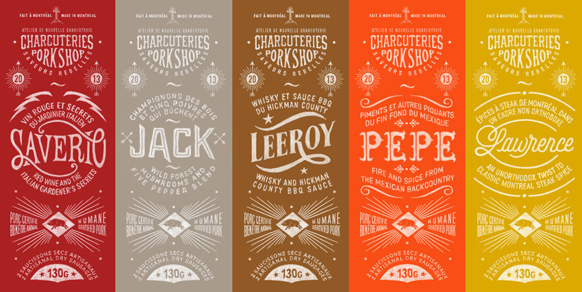
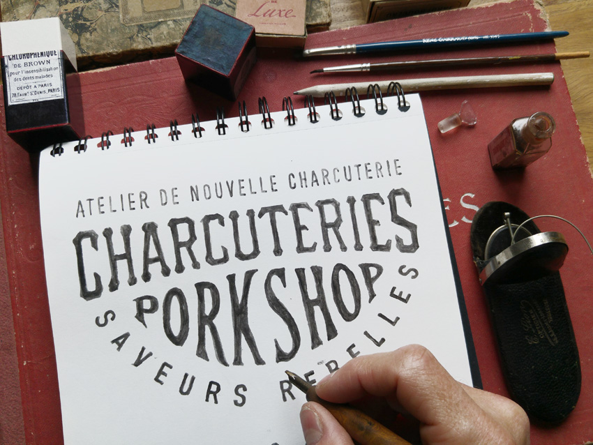
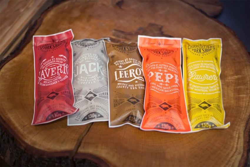
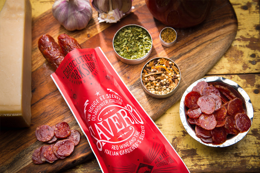
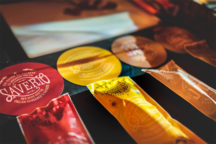
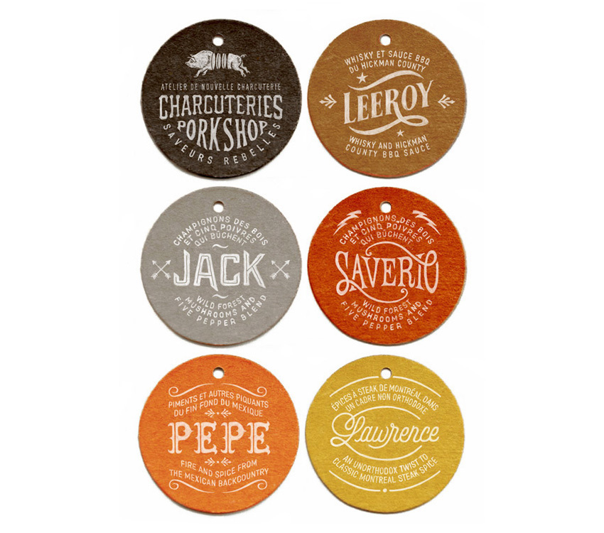
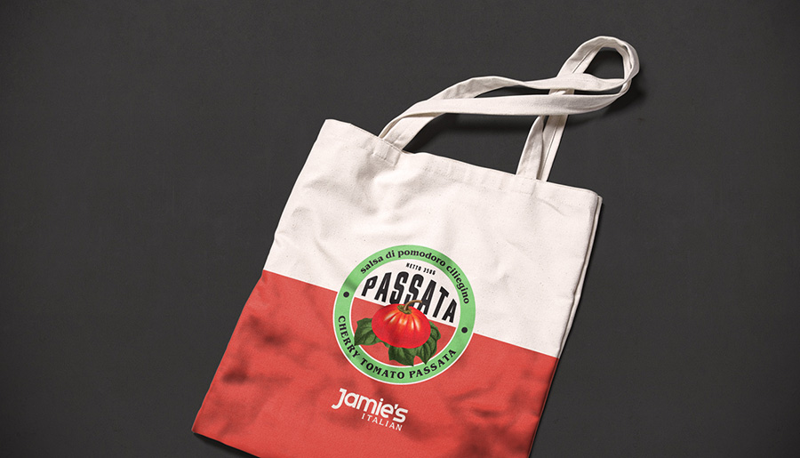
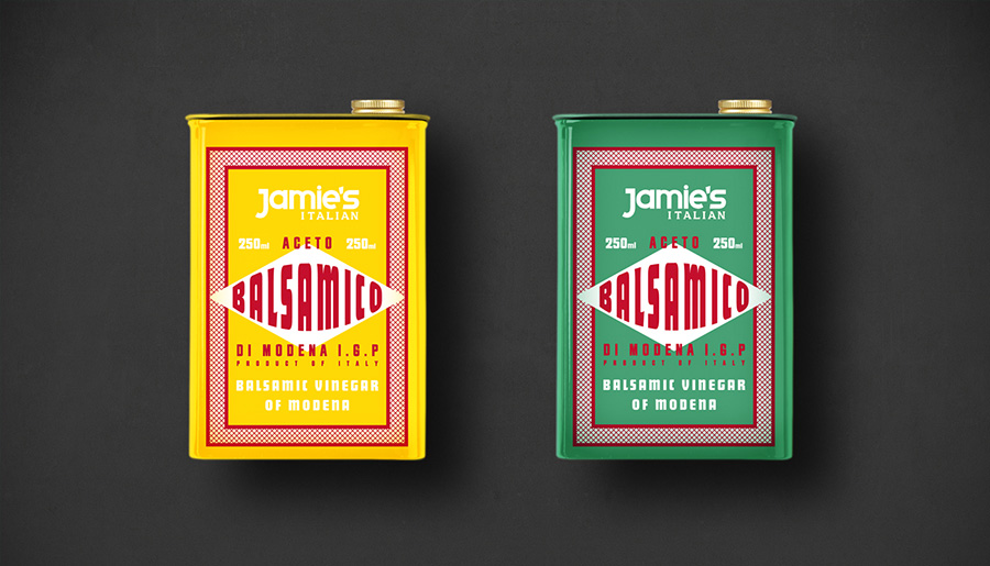
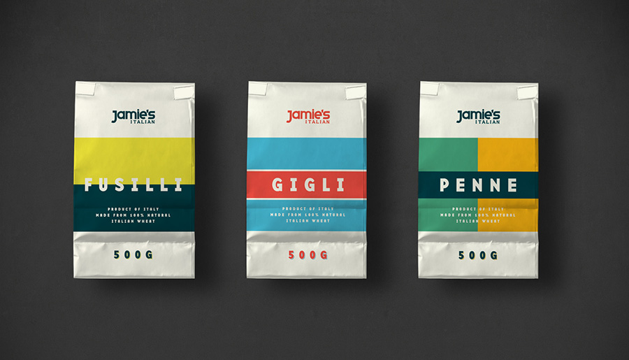
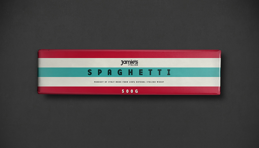
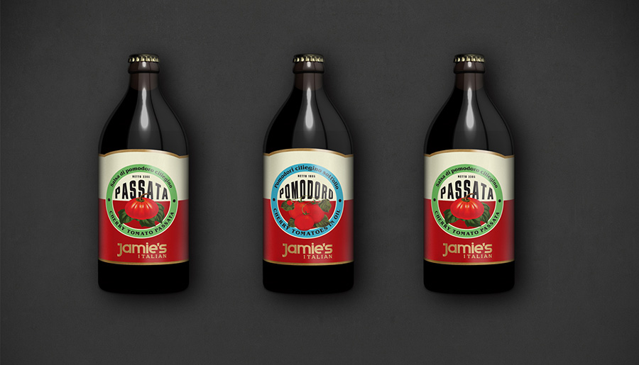
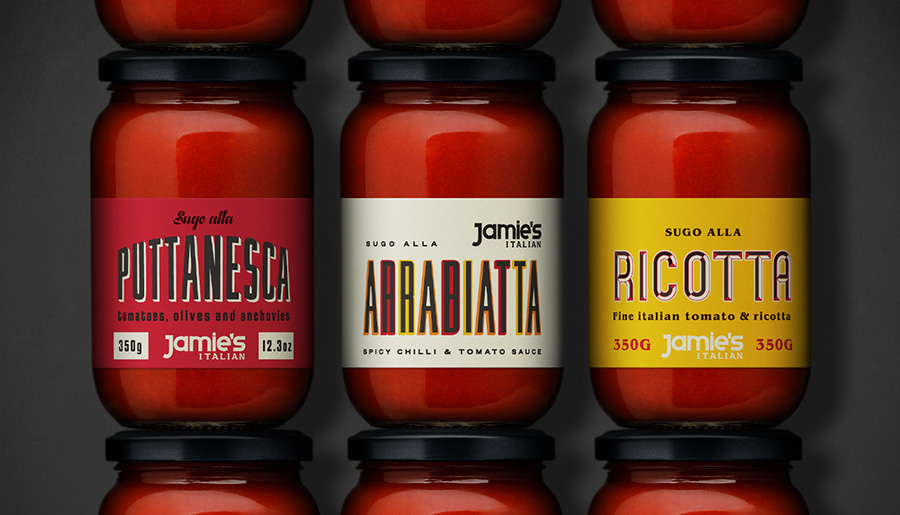
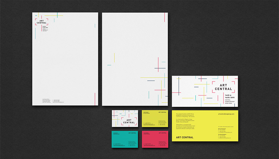
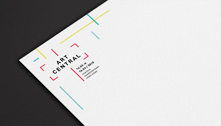
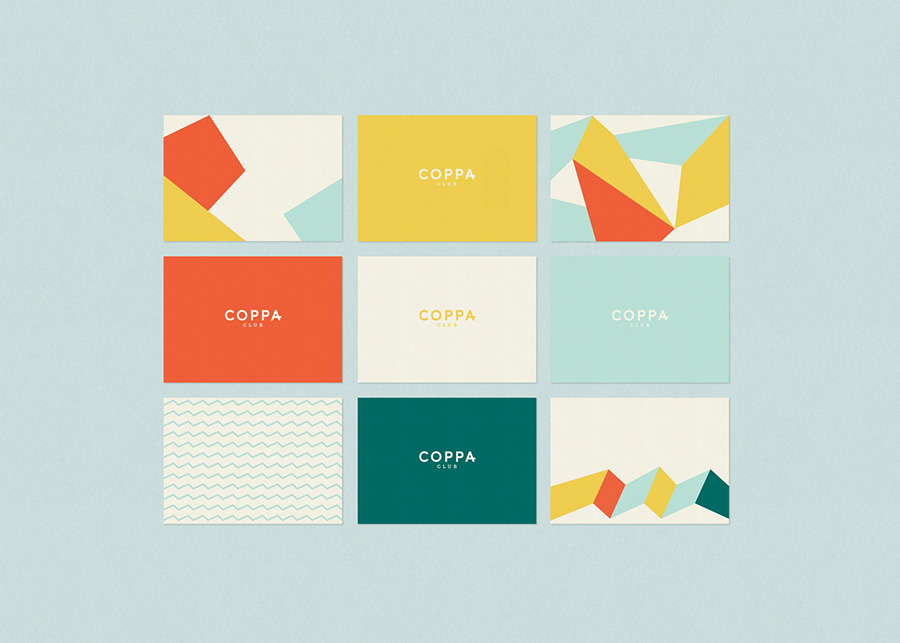
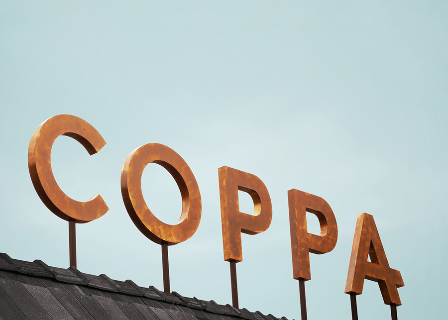
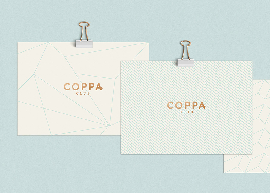
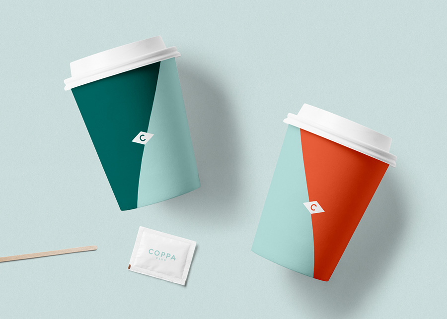
For today post I want some colors ! The work of London based studio "The plant" is perfect for a sunny spring monday at the Mr Cup creative studio !


- 1
- 2