


21
October
2013
The Letterpress calendar : first months are printed !
posted in Mr CUP News | Print
at 10.00 PM
from
Home ! Maruéjols Les Gardons
(near Alès / Nîmes / Uzès)
/ France
listening Piers Faccini - live FIP
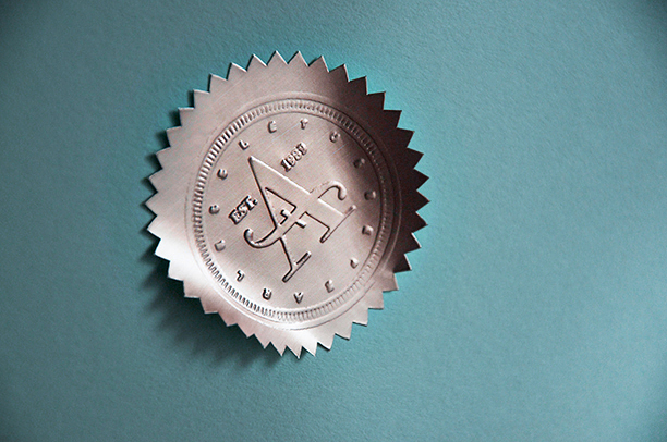
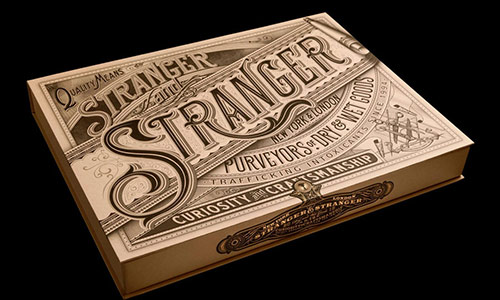
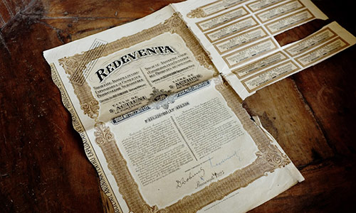
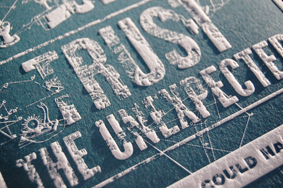
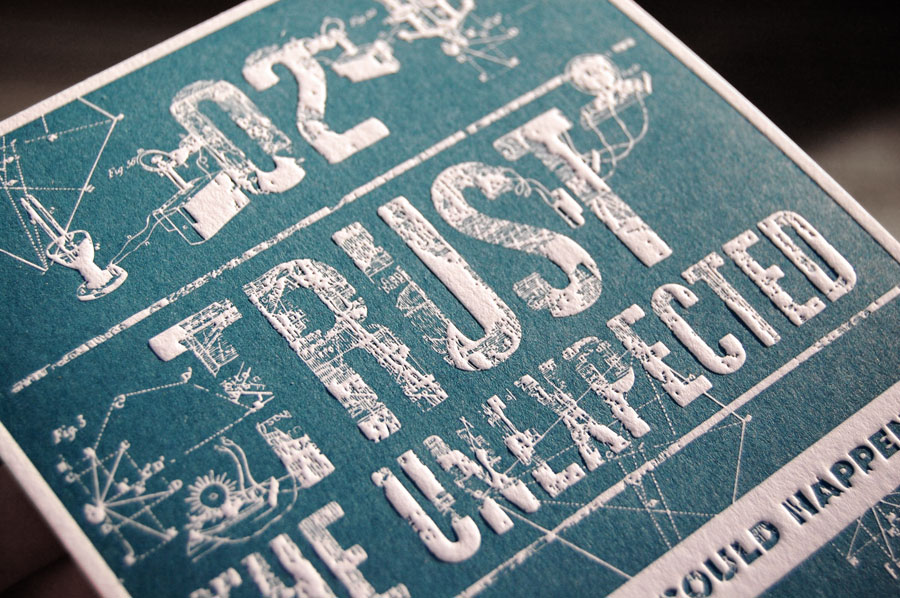
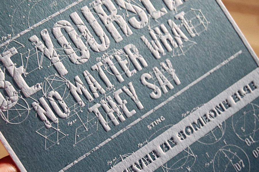
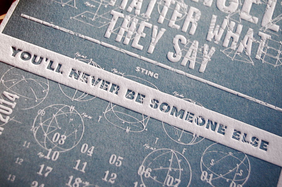
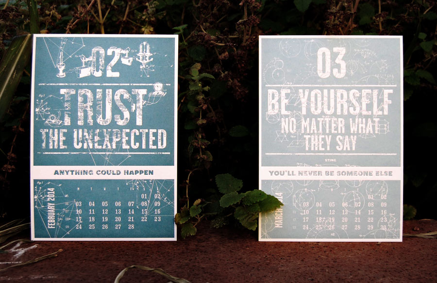
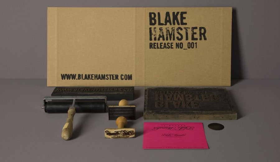
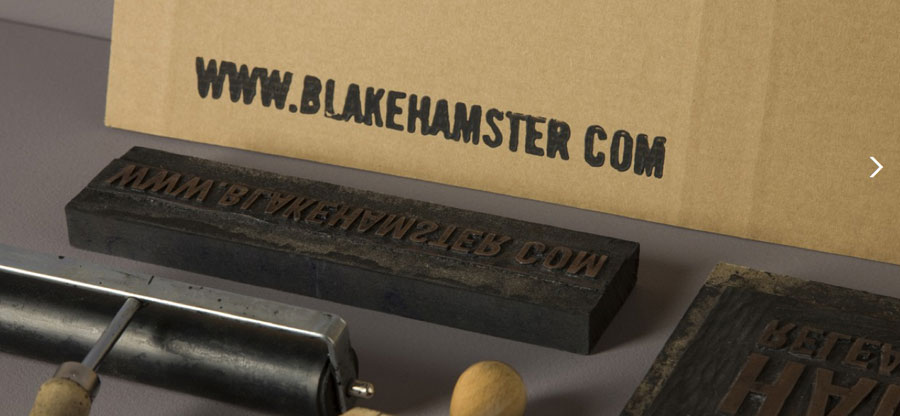
Some updates on the Letterpress "Creative manifesto" calendar. El Calotipo told me the first months are printed, and they send me these pictures... the spanish sunlight help to see the relief !!! There are only 20 copies left of the deluxe edition (with multicolor painted edges), so I guess they will be sold out before the end of the pre-sale phase. You also can pre-order the normal version.

21
October
2013
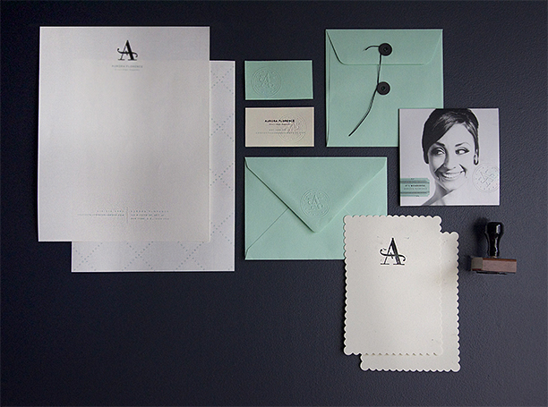
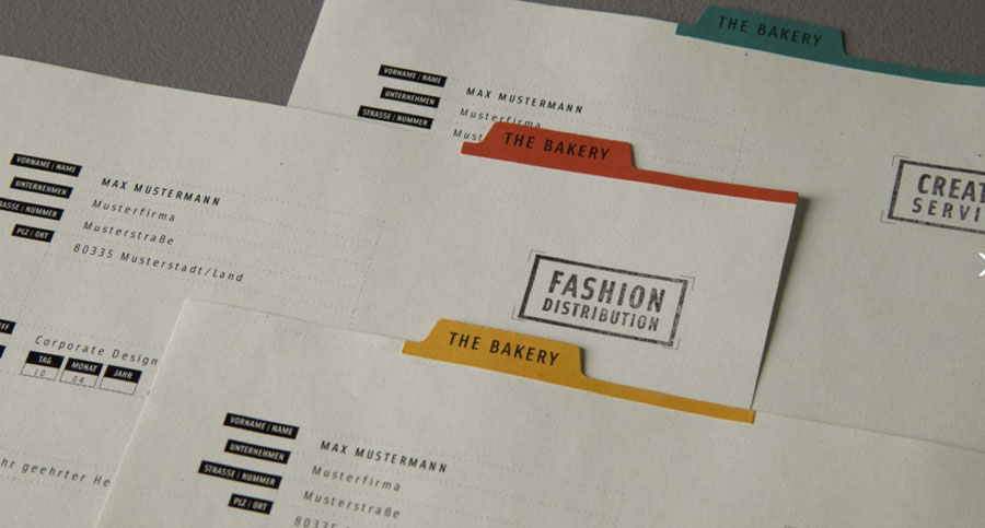
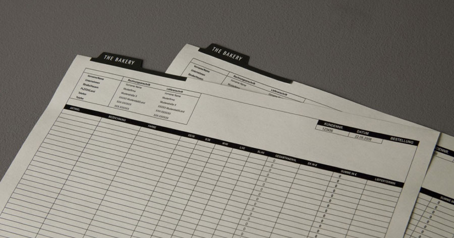
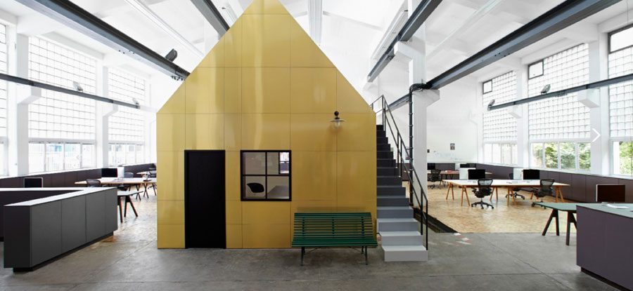
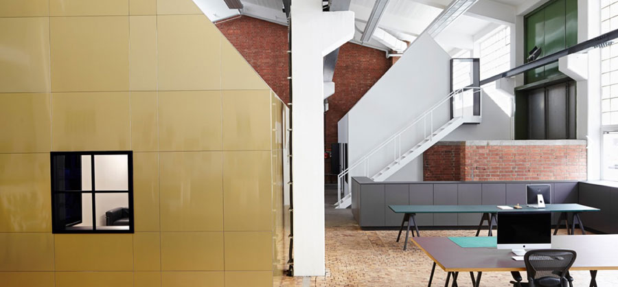
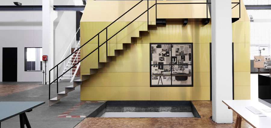
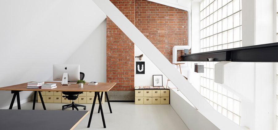
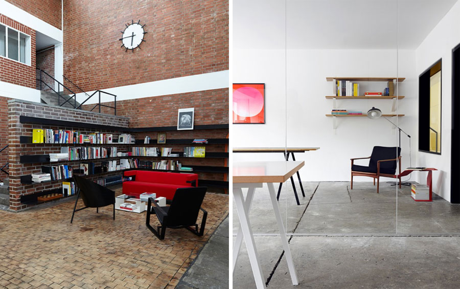
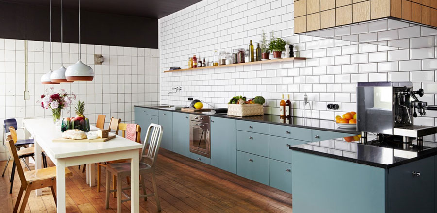
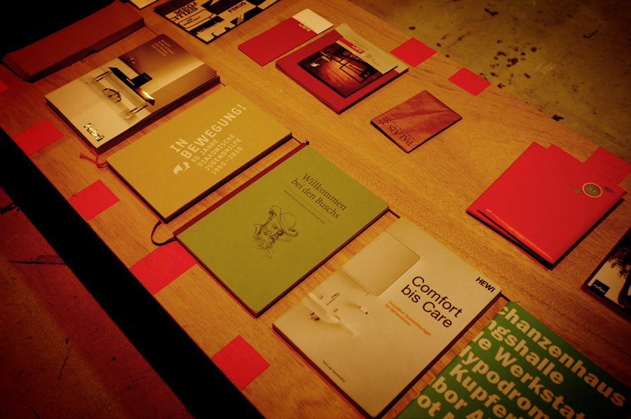
DESIGNLIGA
posted in Print | Interior
at 9.40 PM
from
Home ! Maruéjols Les Gardons
(near Alès / Nîmes / Uzès)
/ France
listening Piers Faccini - Live FIP
20
October
2013
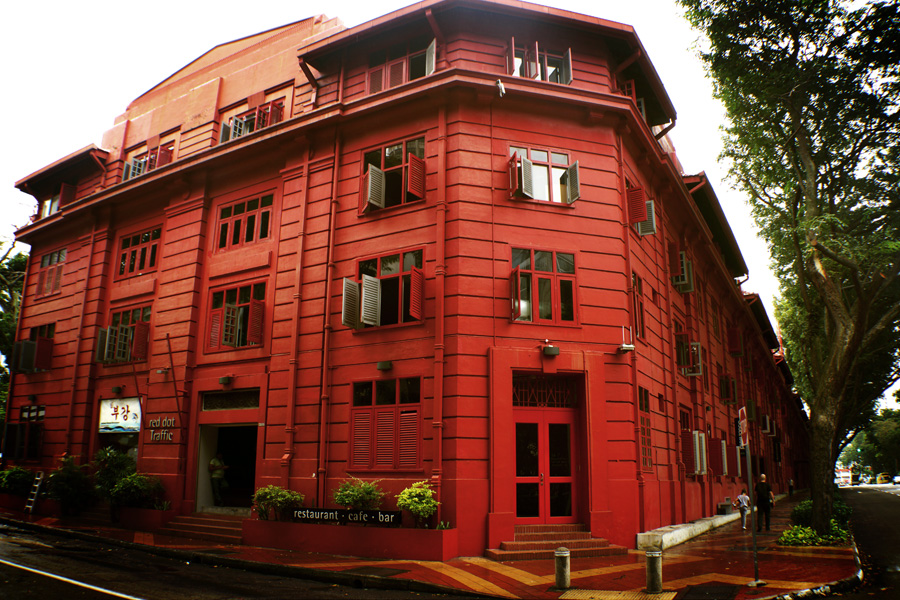
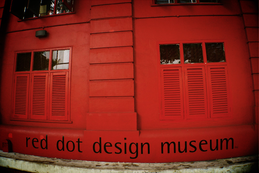
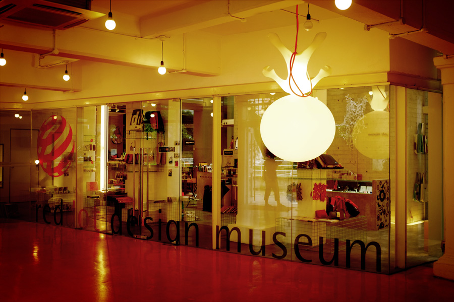
Singapore : Red dot design museum / Kam Leng Hotel / The hub
posted in Life & travels
at 9.49 PM
from
Home ! Maruéjols Les Gardons
(near Alès / Nîmes / Uzès)
/ France
listening Genesis - The way we walk
Last year, exactly on that date, I was in Singapore for the first time. I start meeting designers and creatives and I realy loved that ! If you want to read all the articles I have done with thousand pictures, read the articles in the "Nice to meet you" and "Life and travels" sections. I figure out I still have things to said and show about this very inspiring country/city.
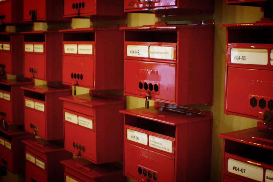
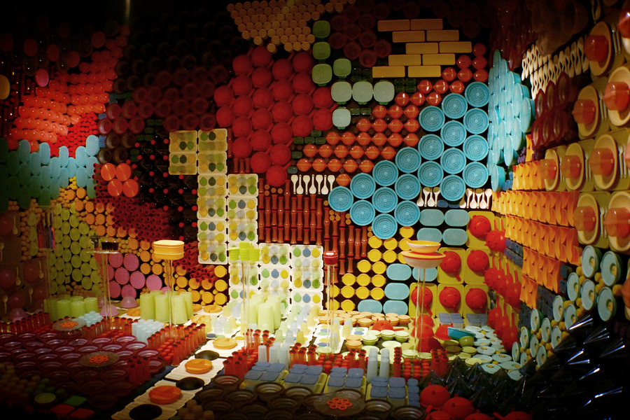
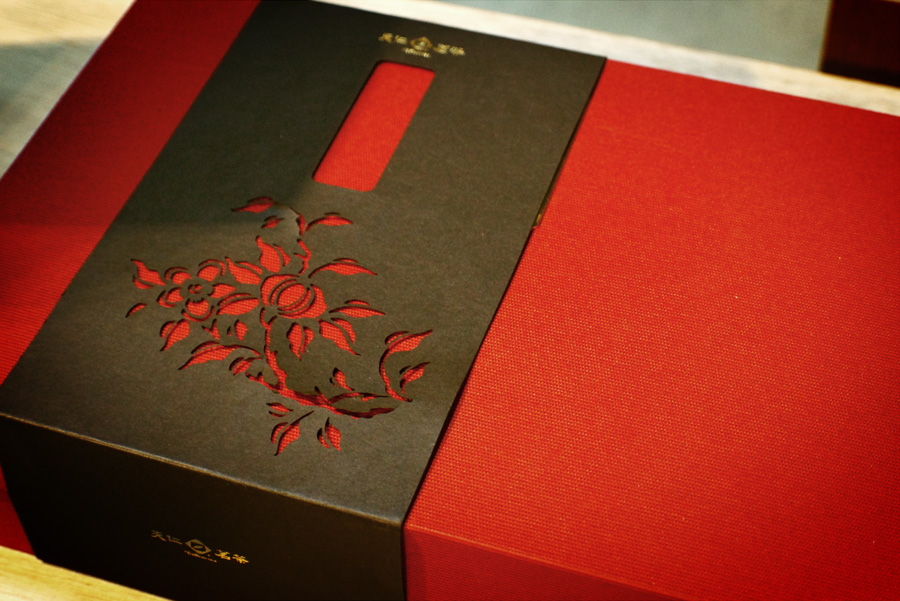
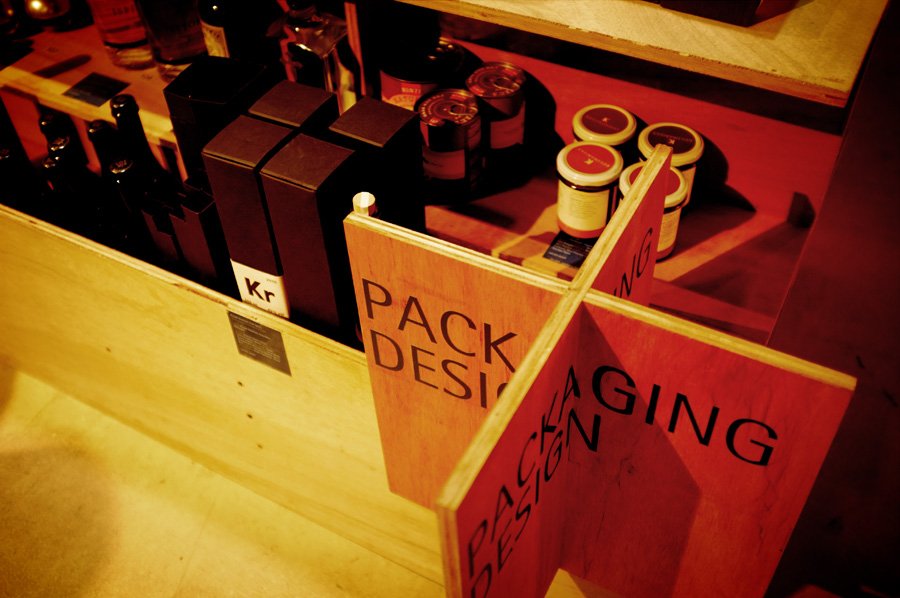
Red dot design museum
Red Dot stands for belonging to the best in design and business. And its museum, dedicated to creativity in all its shapes is in Singapore ! Great to see in real some packaging, magazines or products you usually see only online.
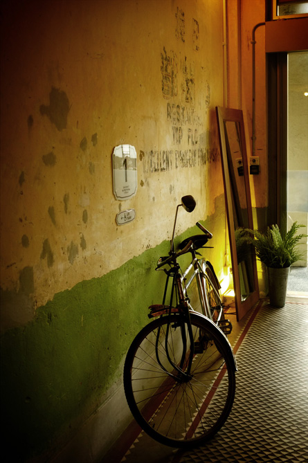
Kam Leng Hotel
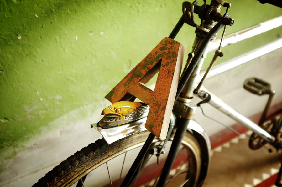
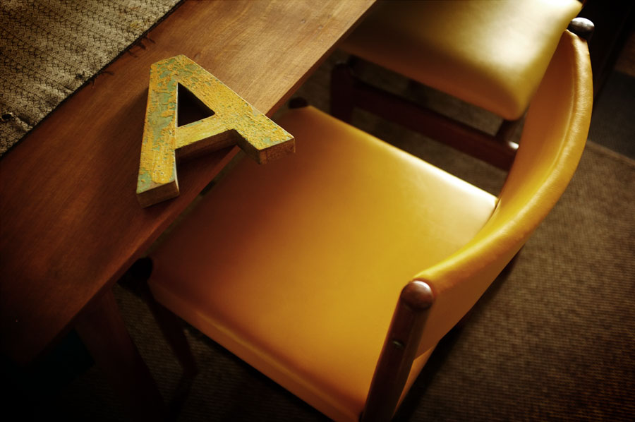
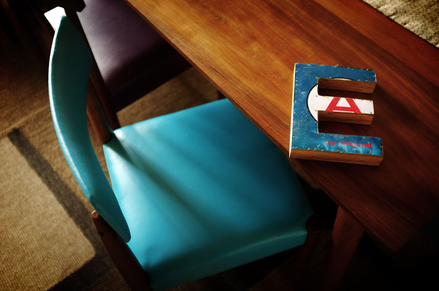
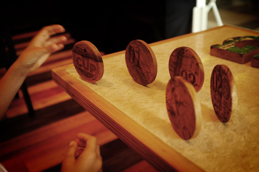
Most of the time, I reserve hotel room considering the prices more than the design (hope it would change someday ;) ! I choose this one for the design, the identity was well done (and extended on special travelers kit or water bootles), and they kept the ancient walls during renovation. The problem is that the room was sooooo small !!! Anyway, we had fun with my wife shooting some wood letters and coasters in this hotel... It is something to arrive at the breakfast with a set of strange wood letters and to put them everywhere, I love to look like a crazy family !
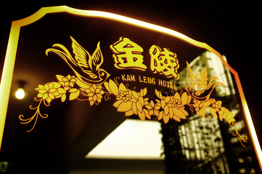
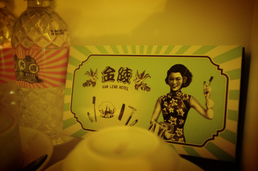
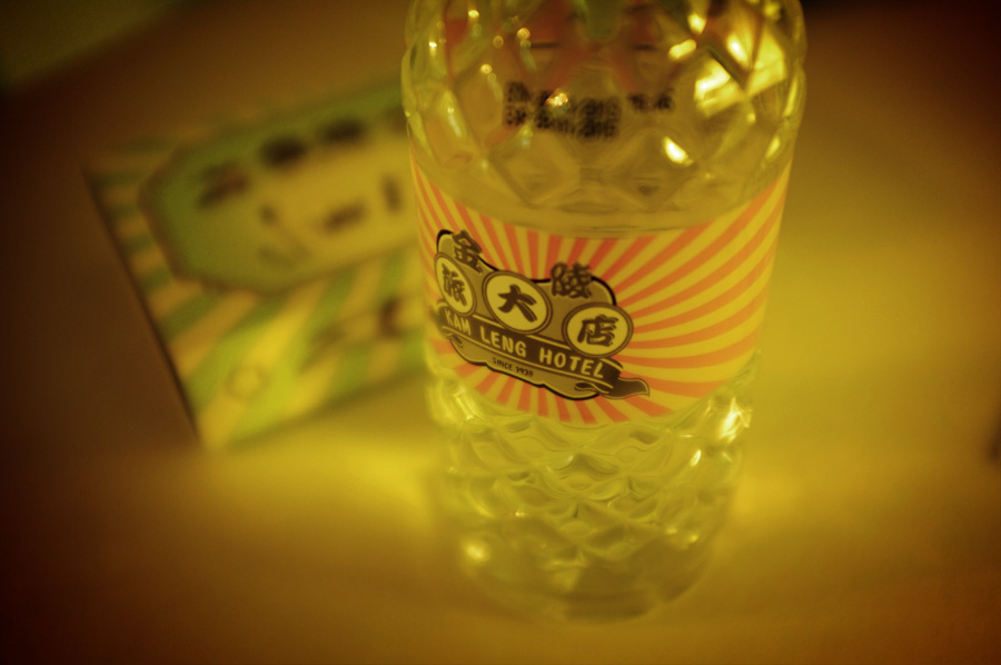
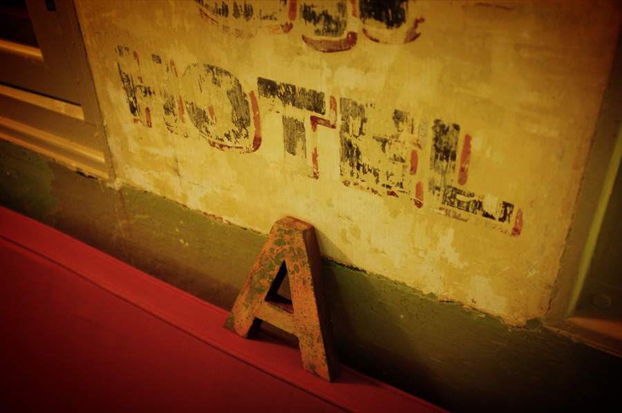
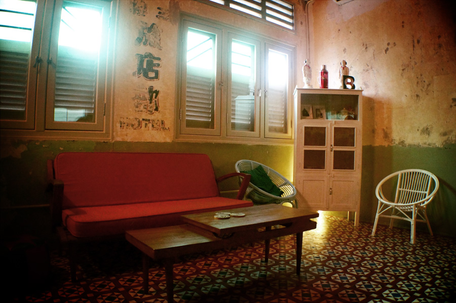

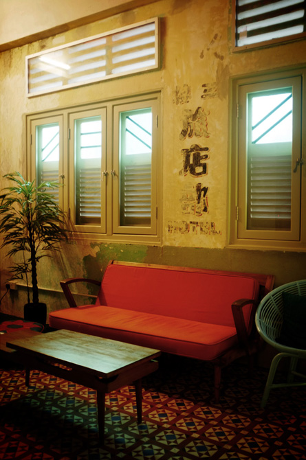
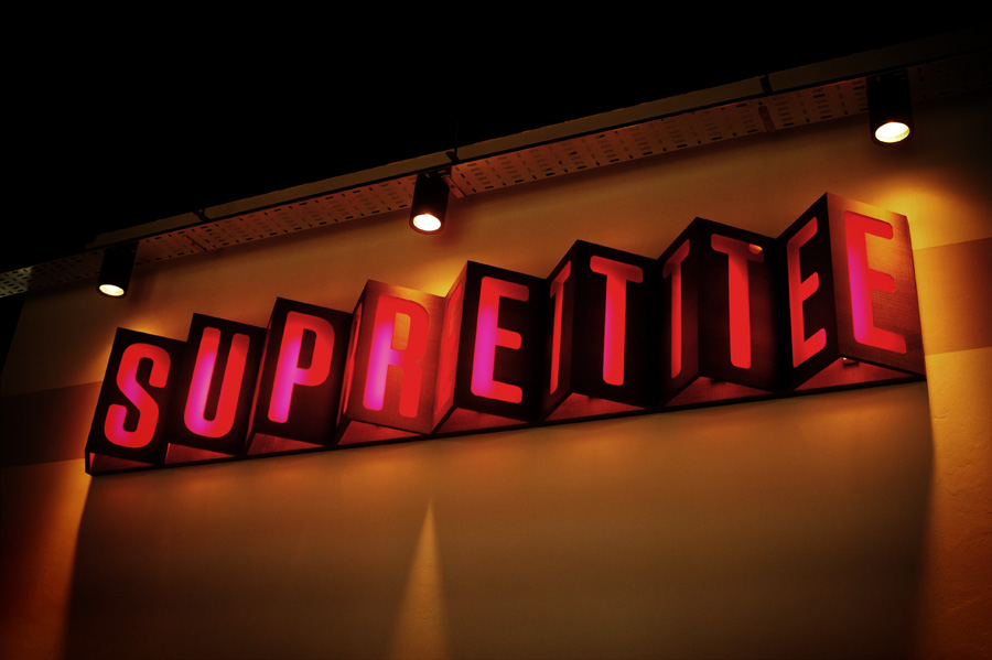
www.kamleng.com / www.suprette.com (Suprette is a compact restaurant bar cafe in the lauby of the hotel)
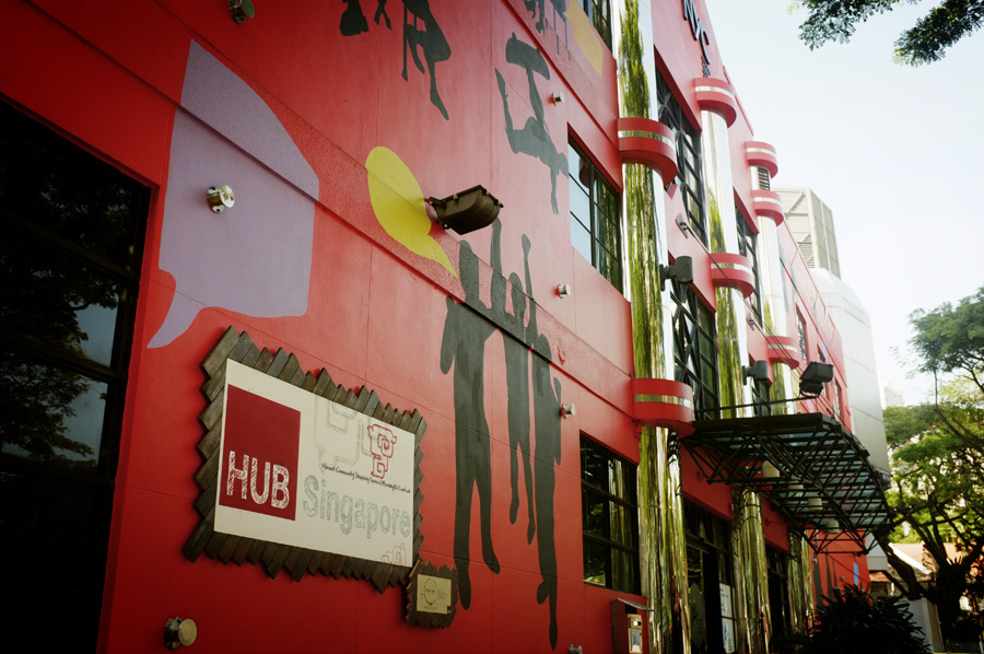
The hub coworking space
One of my favorit thing of the 1 year travel was the Hubud co-working space in Ubud, Bali. There are several Co-working spaces or "Hub" worldwide, and I want to visit Singapore one.

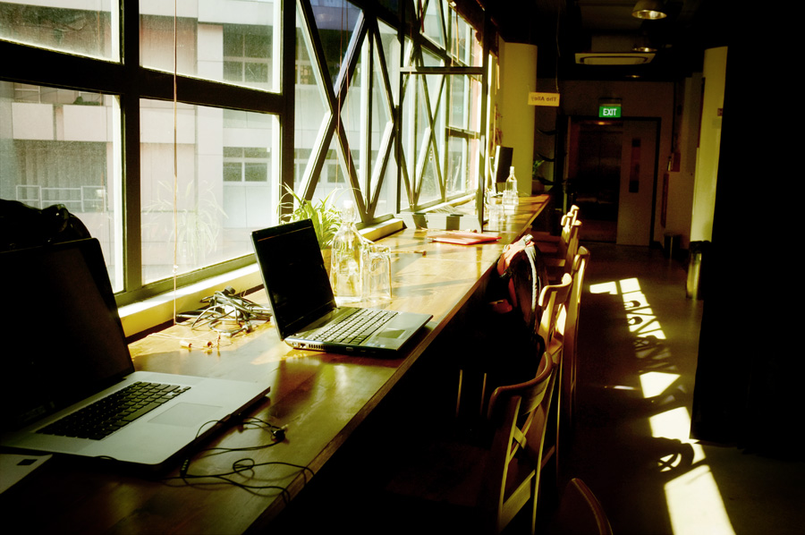
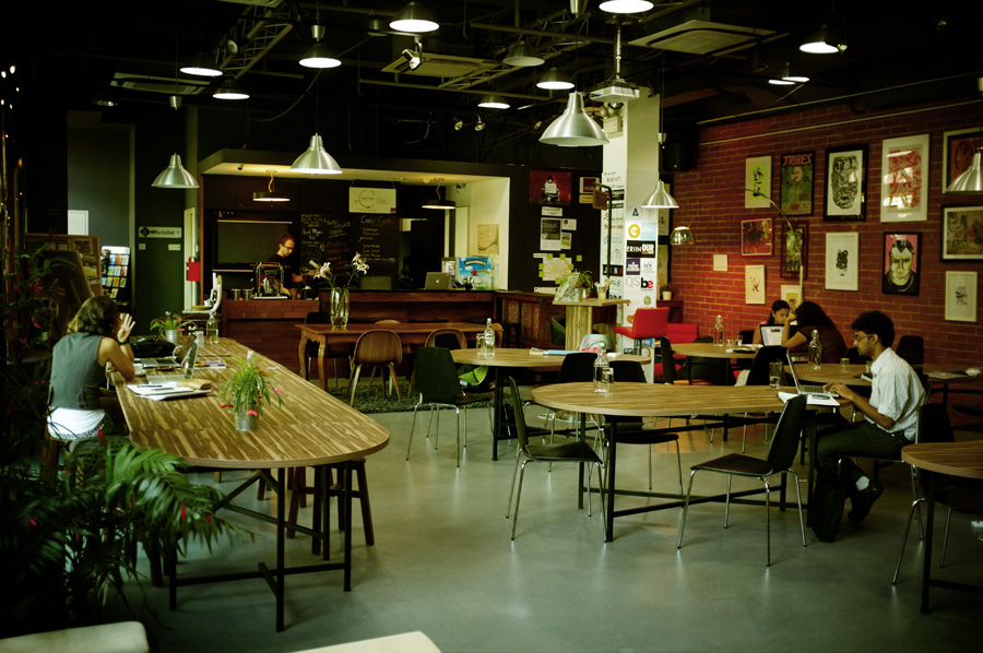
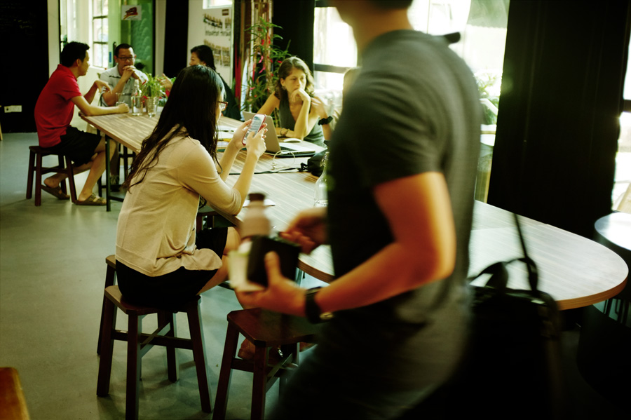

On this last picture, it seems France is not ready for co-working !!!!!
19
October
2013