01
June
2013
The Police Synchronicity 30th anniversary
posted in Music
at 11.03 AM
from
Florensac
(near Montpellier)
/ France
listening The Police Synchronicity !
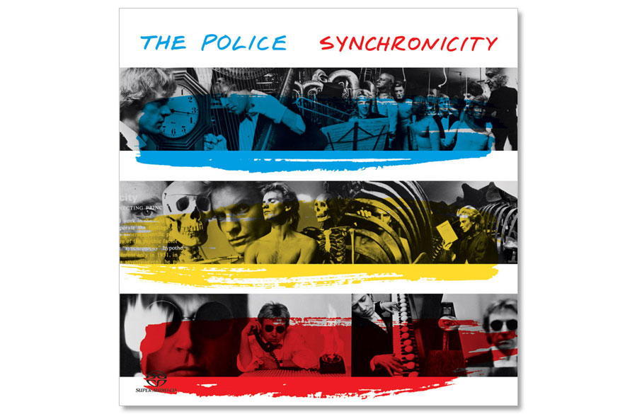
On june 1st, 1983 was release the 5th and last album of The Police. The album reached #1 quickly, and stole the legendary place to Michael Jackson "Thriller" album. To celebrate this anniversary, I will repost an article I have done some years ago and focus on the design of this album sleeve. Beside my passion to graphic design, I also have one for Sting and The Police, I know everything by them and so on have a special interest in the sleeves design... When you follow a band (and artist) that start in 1977, it show you a graphic design evolution over the last 36 years... You can see that some things designed in the early 80's are much better than thing design in 2010's ;)
It is the case of this amazing album sleeve. You probably all know it, because these 3 colors stripes are as famous as the band... But you may not know how crazy it can be... This sleeve is compose of 3 photos stripes, one for Sting, one for Andy Summers, and one for Stewart Copeland... and above each black and white images, you have a red, blue and yellow stripe... on both sides of the cover... That's simple...
It is the case of this amazing album sleeve. You probably all know it, because these 3 colors stripes are as famous as the band... But you may not know how crazy it can be... This sleeve is compose of 3 photos stripes, one for Sting, one for Andy Summers, and one for Stewart Copeland... and above each black and white images, you have a red, blue and yellow stripe... on both sides of the cover... That's simple...
This is the "normal" front and back sleeve :
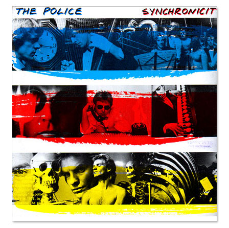
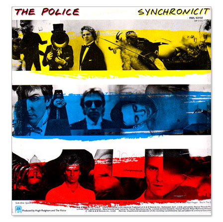
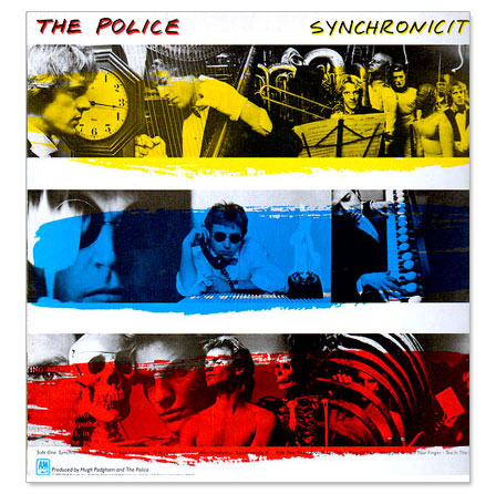
But, for the USA LP sleeve, a graphic designer have some fun... With all the pictures available, why not mix them?... and what about invert the stripes too... so on, some sleeve start with Andy in blue, some with Stewart in yellow, some with Sting in red...
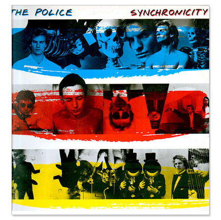
And what about mixing the picture of Sting, Andy & Stewart instead of having one strip for each of them ???
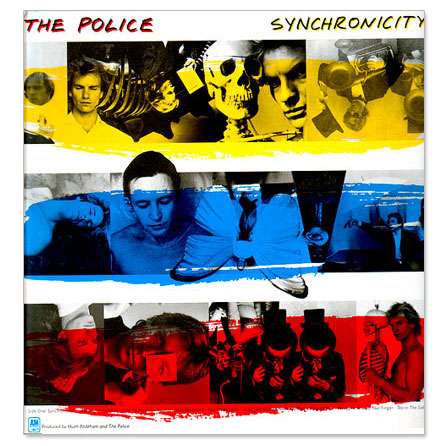
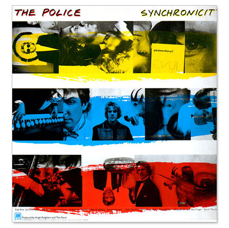
With this little game, according To Goldmine Record Album Price Guide : "With blue, yellow and red color bands; 93 versions of this cover exist" !!! but that's not all, for collectors there are even more rare versions... Some LP were issued with gold/silver/bronze stripes and some without color at all...
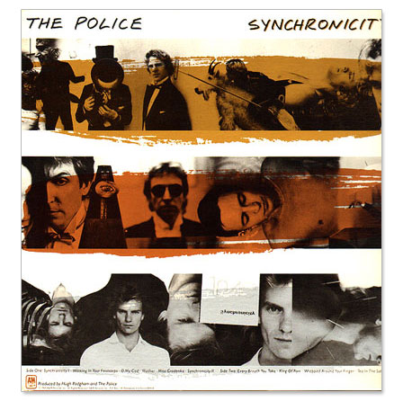
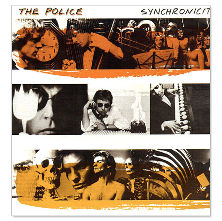
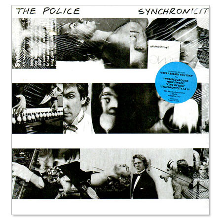
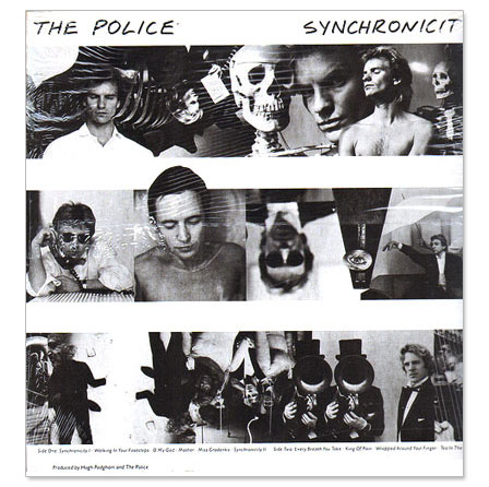
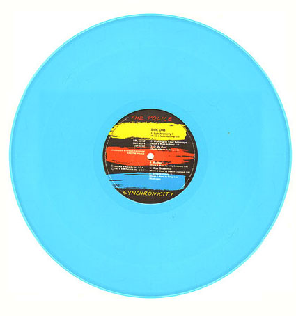
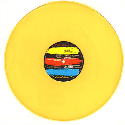
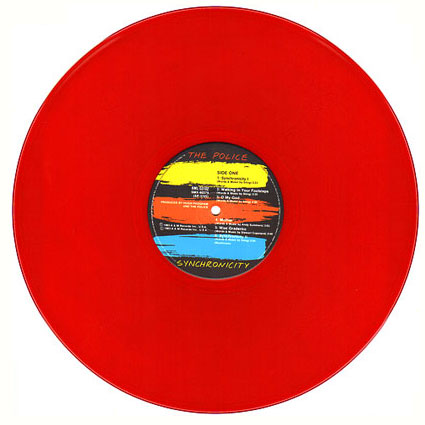
In Australia, instead of having fun on the sleeve, they have fun on the disc iteself, with issues in yellow, red or blue vinyl...
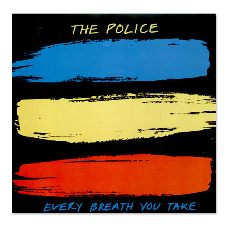
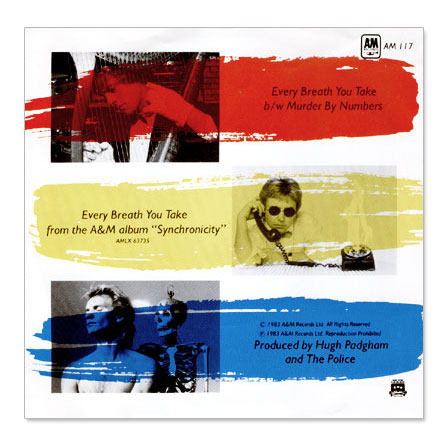
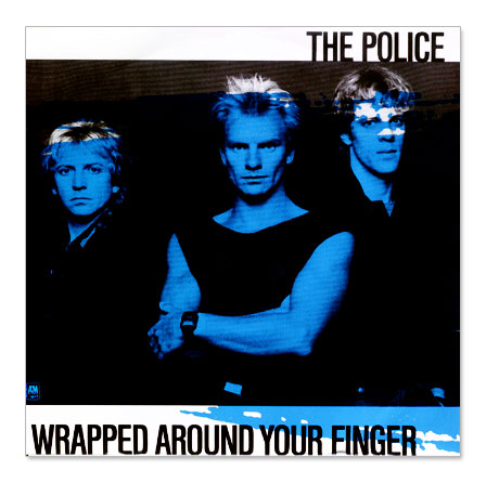
At the same time, the art director and designer in charge of this (according to Wikipedia : Jeffrey Kent Ayeroff, Norman Moore but I have no other infos), also can develop the stripes and colors ideas on the singles sleeves :
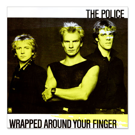
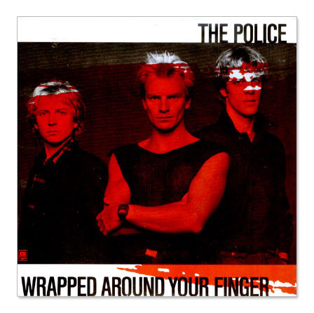
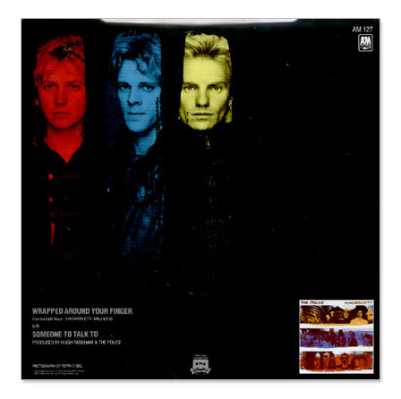
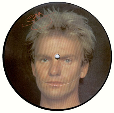
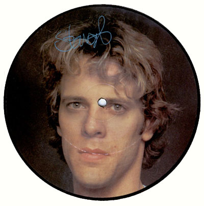
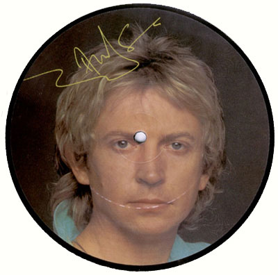
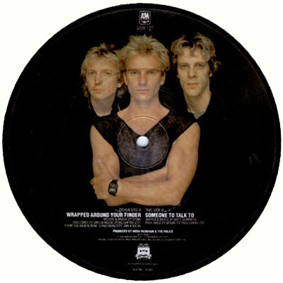
And in the 80's, you can make nice picture disc ! Funny to said the Sting one was issued at 8000 copies, while the 2 others at 1000 only ;)
16
May
2013
Nice to meet you : Piers Faccini
posted in Music | Nice to meet you
at 7.35 PM
from
Grabels
(near Montpellier)
/ France
listening Piers Faccini ;)
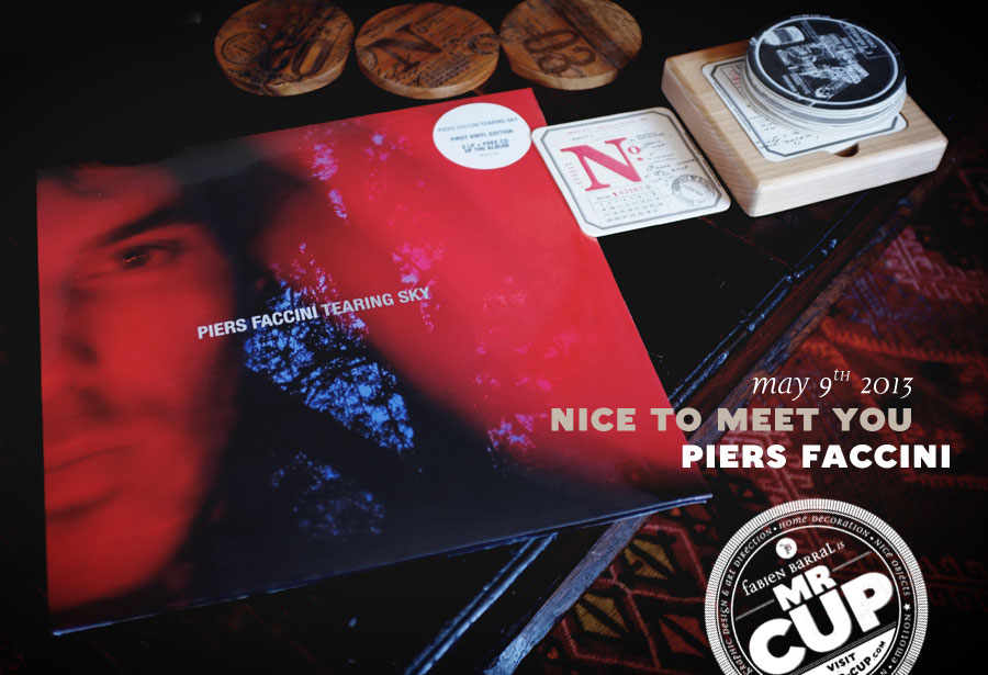
For all those who don't know Piers Faccini (shame on you), he's a singer, composer, songwriter, photographer, painter... mixing Englsih and Italian origins! I've followed him since his first album, "Leave no trace" in 2004 and for all the subsequent albums, I've seen him live twice, including an impressive showcase in a French record shop, where with only his voice, guitar and harmonica he can give you have chills !
But apart from the music, I like how he is involved in all the creative process of his albums, making the artwork and doing the photos and designing the sleeves with designer Uncle O... He is for me a full creative, passionate artist doing things just for the pleasure and beauty of it all…
With the magic of social media you now can be in contact with everyone, even if it is most of the time "virtual"... But this time it became much more concrete... After his tweet about a demo of one of his songs on soundcloud, I just retweeted it and we started a tweet exchange... He likes this blog and as I know he lives near me (now I am back in the south of France), I asked him if we can meet to share about design and inspiration... I came to graphic design through a passion for music, not the kind you play but the stuff you listen to... I've collected records over the years and spent more time looking for rare LPs or 7" vinyl when I was young instead of losing time in bars like most of my friends. So meeting a global creative artist like this, someone I admire and inspires so much through his music was really exciting…
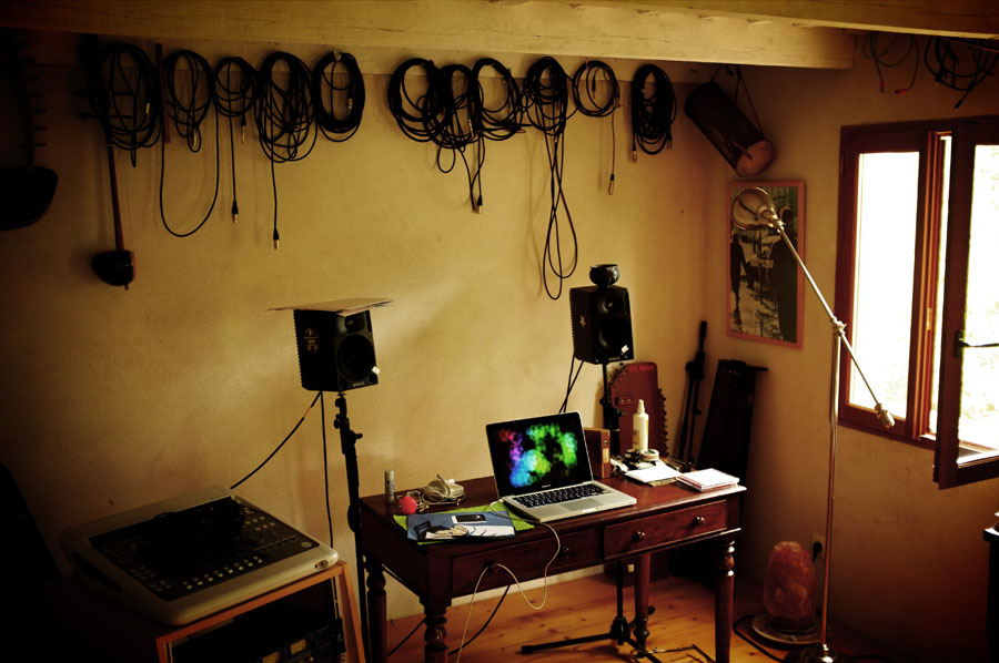
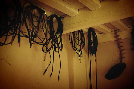
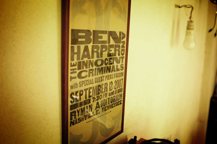
Our meeting was set up in his house, on May 9th... Piers lives a nice home in "Les Cevennes" with his wife and their 2 kids, and has a small house at the back of the garden where he can create, paint, and record his albums... We spent some hours talking about the process of the design of his album sleeves, about how today you can do your own promotion and be in contact directly with people who like what you do... I asked him to write me about all that we had talked about via email so as to have his own words (in italic black).
My wilderness sleeve process
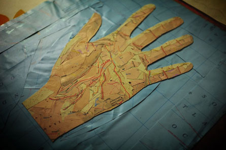
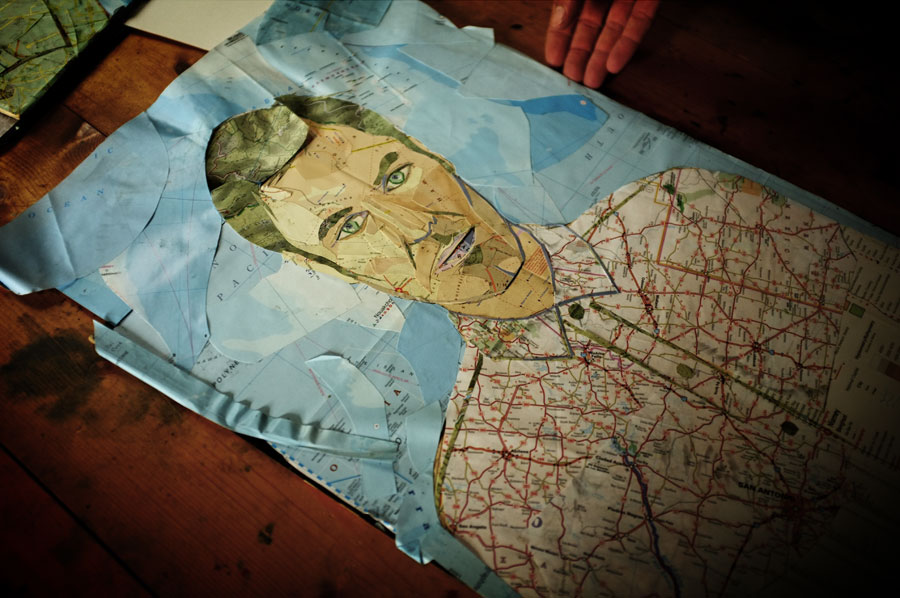
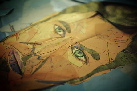
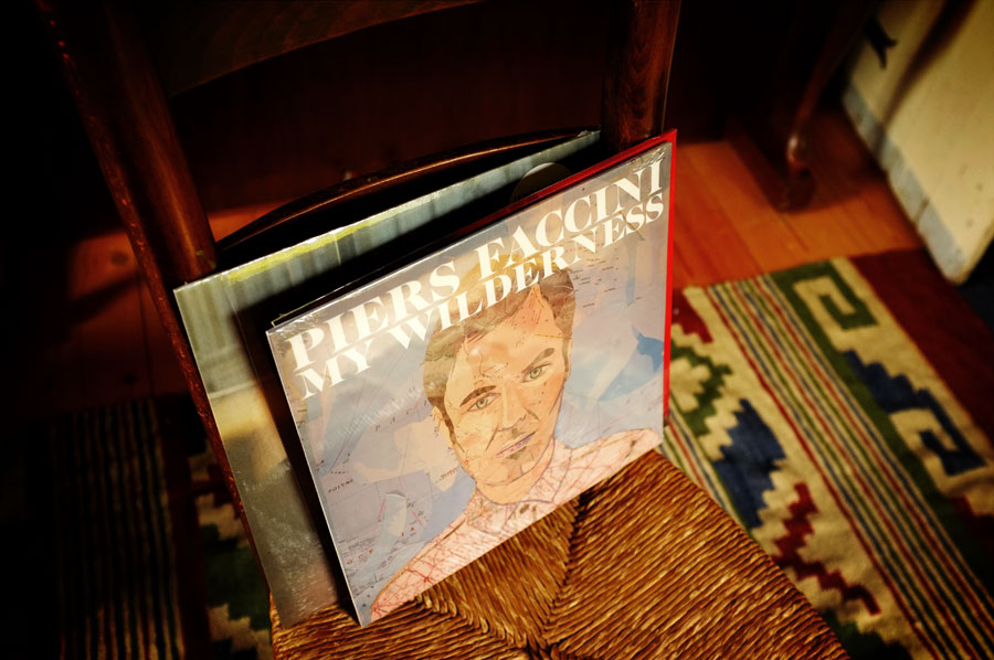
I have always been fascinated by these portraits used on his 4th album, even more now that I know how they were made... I always thought it was done with photoshop but actually Piers told me "I don't even have it !". He did these self portraits by cutting up maps ! Impressive...
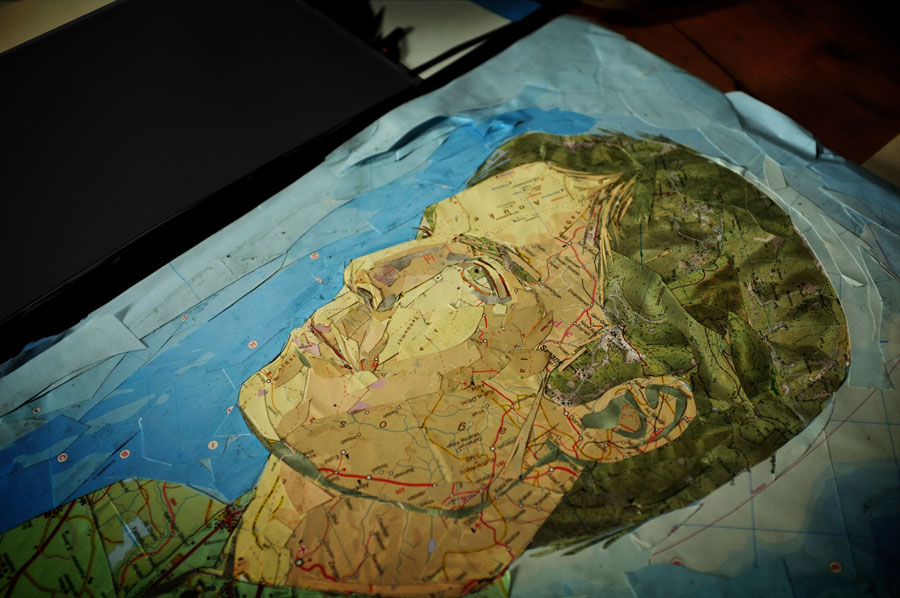
And it's part of the whole concept of the album :
The whole thing was inspired by a song 'my wilderness' that I wrote in the year that album was taking shape :
"Here was sorrow and here was I / Here was anger and here was my / Wilderness where I'd remain / Emptiness forever retain"
The idea came to me that when I write it's as if I go roaming in a desert, in a place where nothing is marked or signposted, nothing is permanent... In this metaphorical place I'm happy to be lost as I always end up finding something unexpected. A seed or a fragment of something that slowly grows into a poem or a song.
So with my songs I map my very own wilderness, I transcribe its geography and songs are the end result. This wilderness as well as being imaginary refers also to physical/emotional/spiritual journeys and discoveries.. That's how the idea of making a self portrait with maps came about. In order to tell a story, I deliberately chose maps not only for their colours but because of the links my music had with those places. For my skin I used the Sahara, for my shirt Mississippi and Texas, for my hair walking maps of the Cevennes.
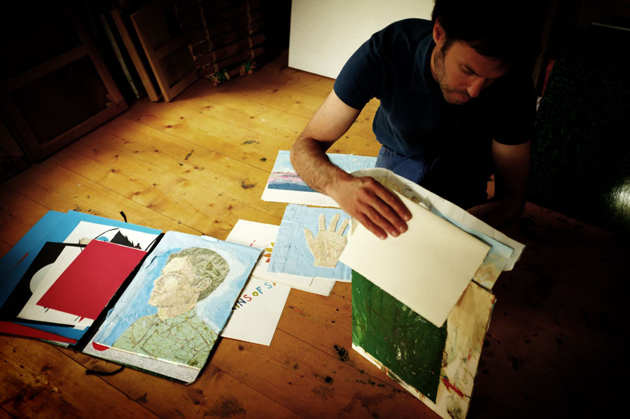
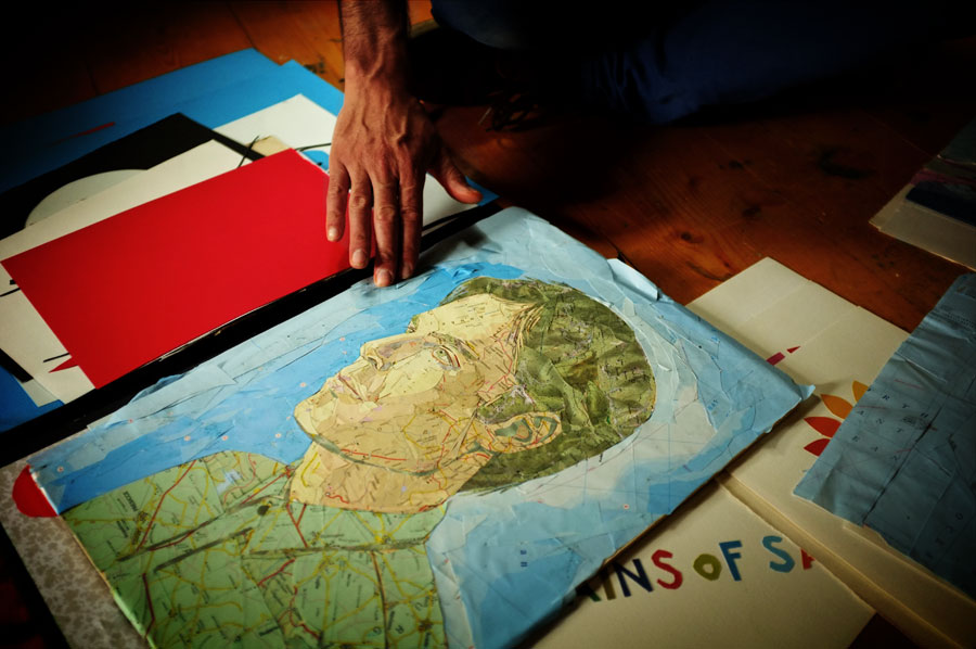
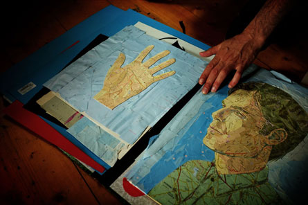
In fact, this side portrait was use on the American version of the album, while a front on portrait was used on the French sleeve. When I asked, Piers told me that when he presented the idea to the record company, the boss didn't like it ! But if he had to choose, he preferred the front on one... Luckily, the American label preferred the side one so in the end both portraits were used ! The US album also contains 2 more songs, which was how Piers conceived the album, but the French record company thought it was too long...
Between dogs and wolves new album sleeve
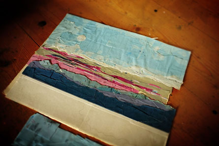
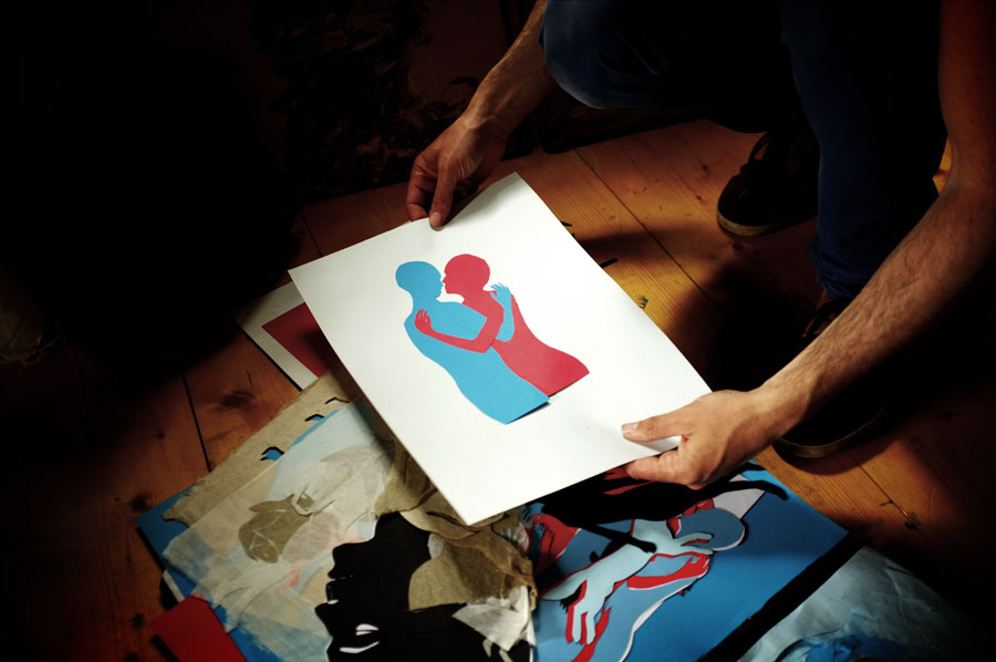
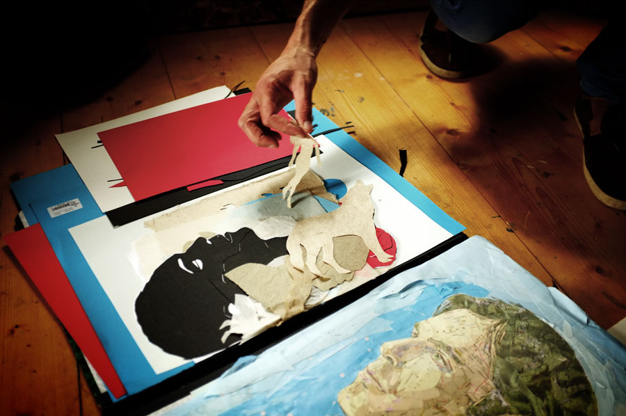
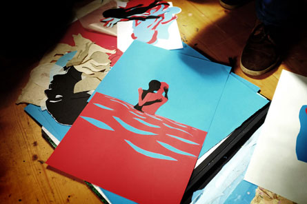
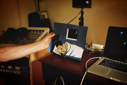
For the new album (coming later this year) I wanted to carry on working with cut out paper, this time I chose to work with silhouettes using a reduced palette of blue red and black. As a painter, working with paper is a way I can create work that is of a more graphic nature which is of course primordial with album artwork and design.
The title of the album is 'Between dogs and wolves' I've translated this French phrase into English because the expression doesn't exist in the english language. I liked the idea of using this title in a literal way to accompany an album of love songs because when we are in love we are in a way between day and night, between love and desire, between the mataphorical 'dog' and 'wolf' etc . The album also transcribes the moment of twilight and this 'non-time' between day and night to a landscape of relationships, and to the stories we live, falling in and out of love. The songs depict the unknowable and undefinable spaces between love and desire, between two lovers.
I feel that in a way what an artist does more than anything is to attempt to describe the unknown and the undefined, the treasure lies in the paradoxical and ambiguous 'in between' spaces !
I wanted the artwork to be a little like illustrations from a book of fables or fairy tales as well as being visually and graphically strong enough to imprint an association with the music in the mind of the listener. It also allowed me to carry on my love affair with work on and with paper.
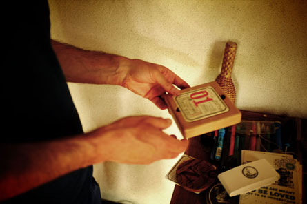
The Comic books reflections
Funnily enough the idea of The Comic books reflections come about through the desire to have something to post to the people that follow me online that wasn't mundane and gossipy as I'm no good at that! Being as much a visual artist as a writer, I came up with the idea of posting each day a drawing with a kind of aphoristic statement, a simple way to connect with people using poetry and drawing. They're going down really well, if I carry on the momentum, I'd like to make a book with them eventually. (you can see them on Piers facebook)
Freedom of your own label
Having my own label Beating Drum is a way to be able to finally make the decisions my own way without being answerable to a company running a business model that is increasingly bankrupt and devoid of interest. This way I can create the kind of things that I've always dreamed of doing even if they are limited edition. The economic model is very reliant on my relationship with the fans which as anyone can see who follows me is something that I also really value. Hopefully together with the people that follow me I will be able to keep on making music and art and great design objects too!
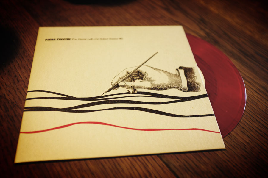
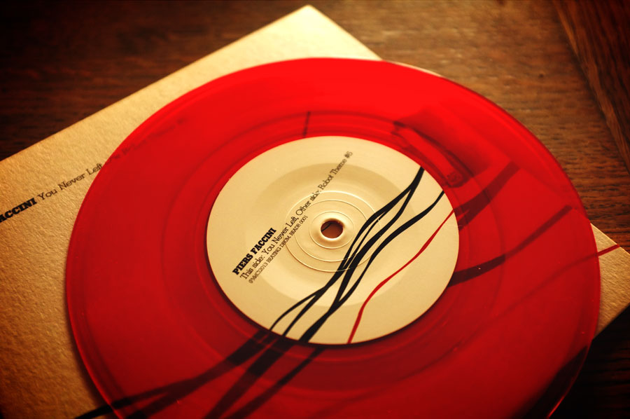
Here's the first 7" item under the Beating Drum label designed by Uncle O with the artwork done by both of them this time. The record was done to support the Disquaire day, the french version of Record Store day.
Songs I love
This project began as a way to interact with fans on a level that wasn't reliant on an album release. I would give away a song every couple of months on my website. The songs were covers of songs that I loved, as simple as that! It was a way for me to be a fan, recording the songs and playing with their arrangements was a way for me to celebrate the wonderful artists and traditions that have fed me over the years.
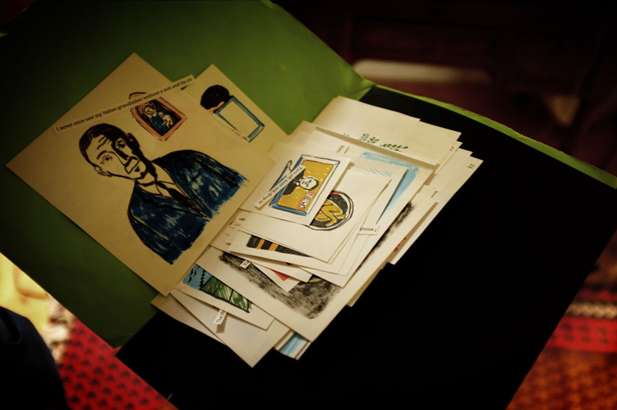
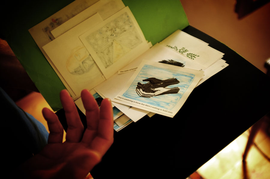
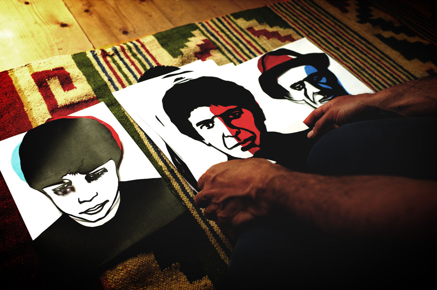
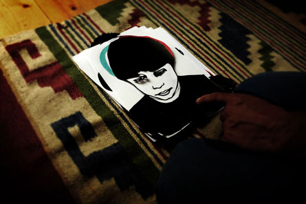
To accompany the new album we'll also be releasing a book/cd of the Songs I love. Using paper again I've made portraits of all the songwriters I've covered and written about each song, I'm really excited about this project and I hope all the people who love my music will dig the object too. It's another way for me to continue my collaboration with the designer Olivier Carrie aka Uncle O who I've been working with him since Two grains of sand and now that I have my own label we can really start to have some fun. We have a great working relationship, we're almost always on the same page and we never seem to step on each other's shoes. Sometimes we're uncannily in sync which is a joy! I started the label with my manager of the last 10 years Anais Ledoux and the three of us along with Olivier work very closely on all design/concepts/image to do with Beating Drum.
A new morning
A New Morning is the result of another collaboration, this time with the film maker Jeremiah. We've done so much together over the years especially for la blogotheque, (check my youtube channel. www.youtube.com/piersfaccinimusic ) Mezzo asked us to make a film of acoustic performances of my songs and together with Jeremiah we came up with the idea of filming the performances over the course of the four seasons in the Cevennes where I live.
We wanted it to be a film about music and songs within a normal day to day context, not just a beautifully filmed concert which seemed too banal somehow. We wanted the film to be about how music and songwriting are inseparable from the every day, that's why Jeremiah also filmed certain scenes at home with my kids and my wife. It's a film about sound, about the voice and songwriting as well as the portrait of a place, the mountains of the Cevennes. The film came about because Jeremiah is one of the few people who I feel really comfortable being filmed by. I also love his approach, his eye, his taste, his improvisation, his constant search for the perfect sequence. He also has the advantage of having a really instinctive understanding of music and performance, it was a very easy project to collaborate on as we're also great friends !
Painting, inspiration & instagram...
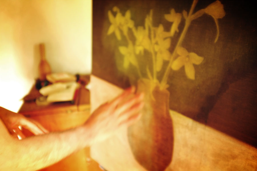
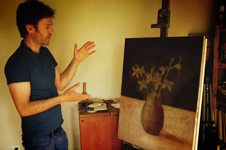
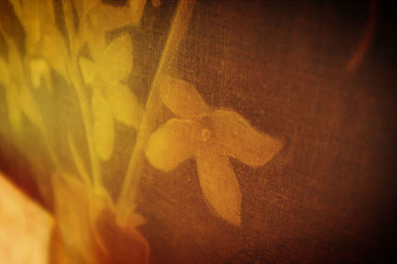
Piers finnaly told me about his paintings, and his interest in still life... a side that I did not really know from this amazing artist and that you can found on his site. I also told him about instagram, and since then, I guess he posts 10 images a day ;)
26
February
2013
23
February
2013
Hannes Beer
posted in Graphic | Music
at 11.03 AM
from
Singapore
/ Singapore
listening Coldplay Prospekt's March EP
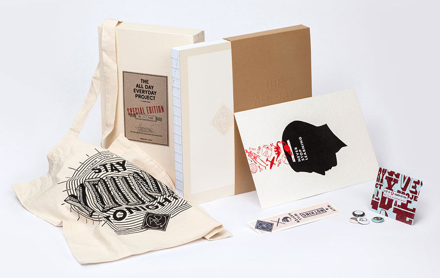
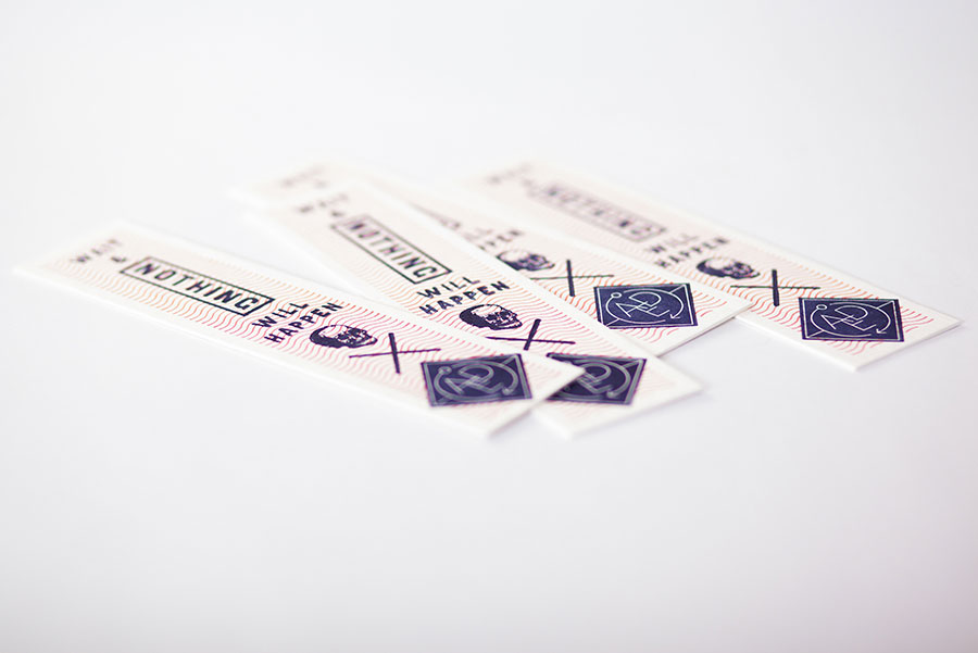
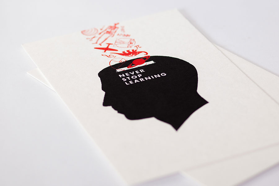
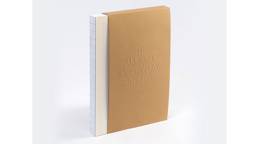
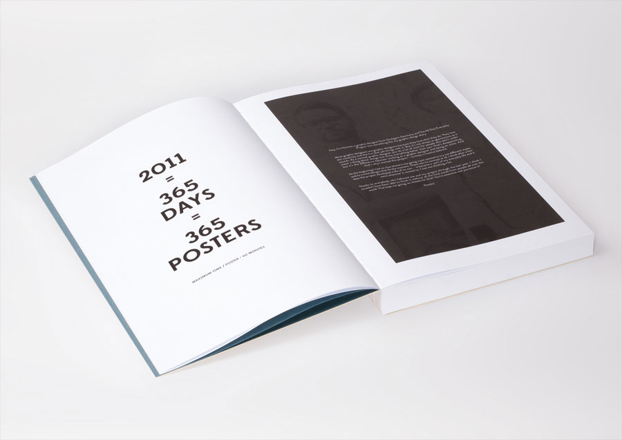
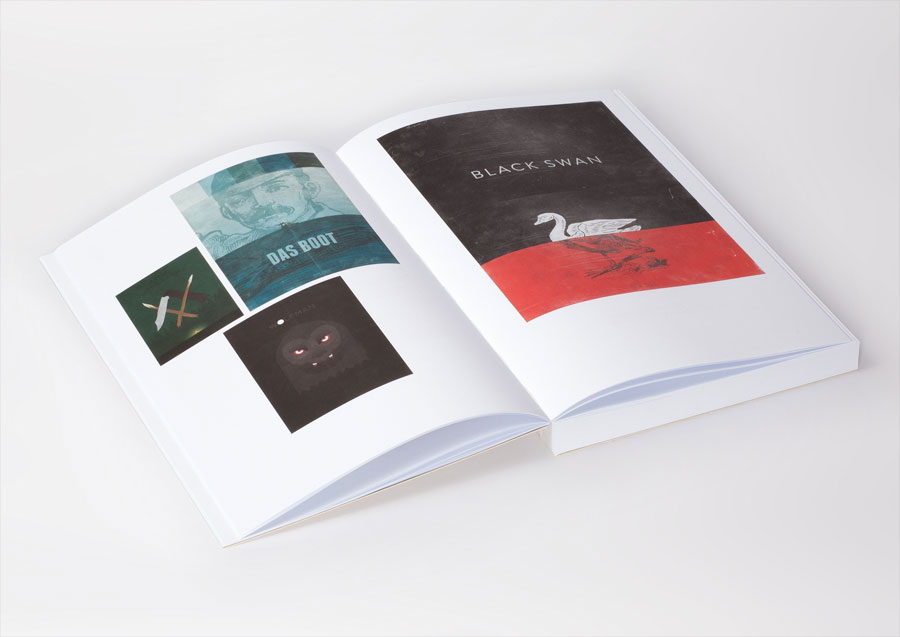
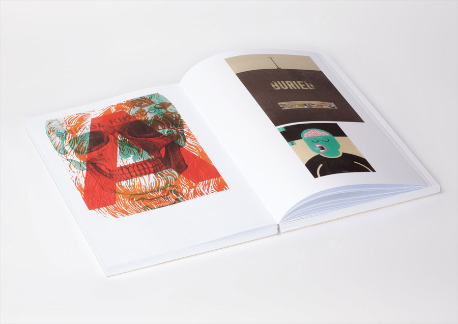
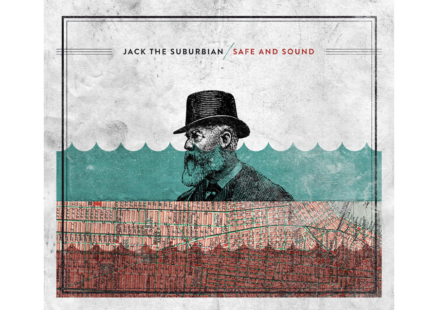
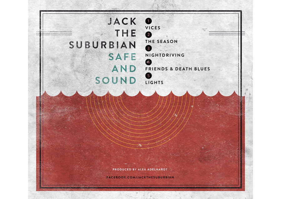
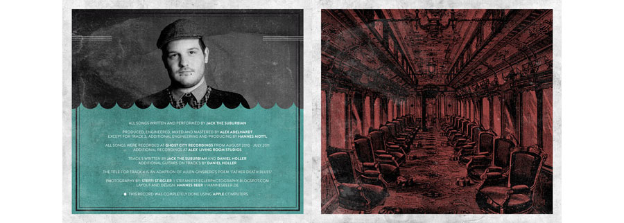
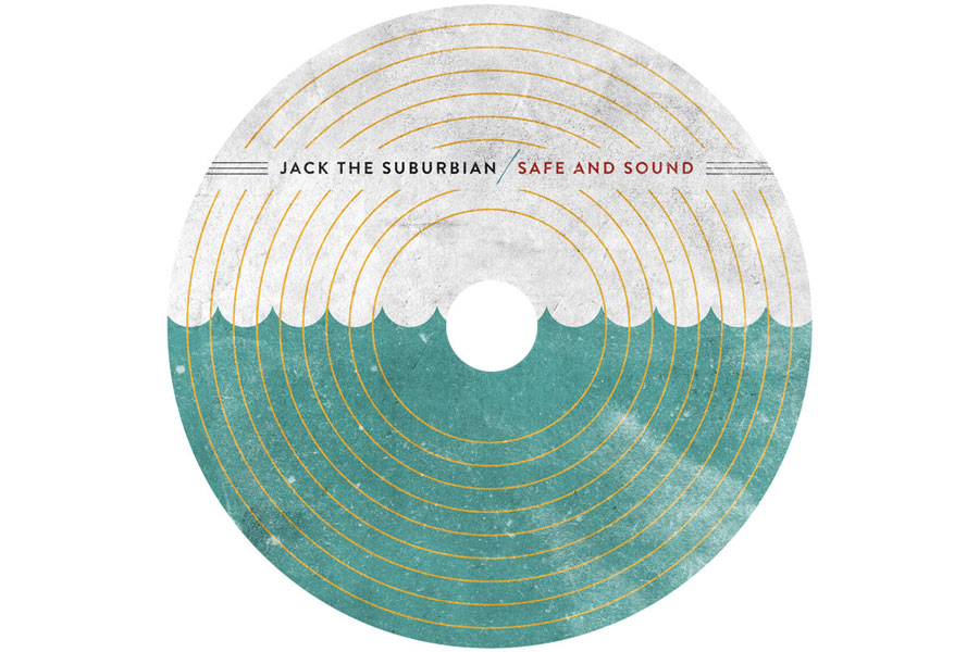
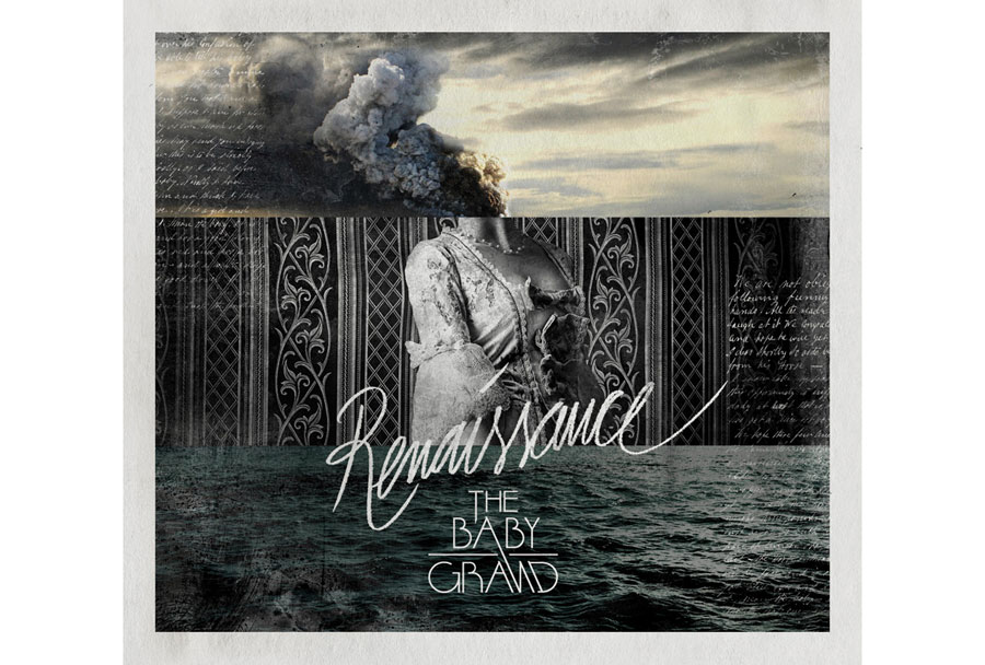
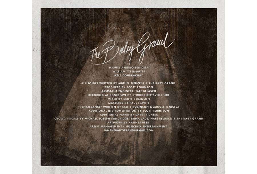
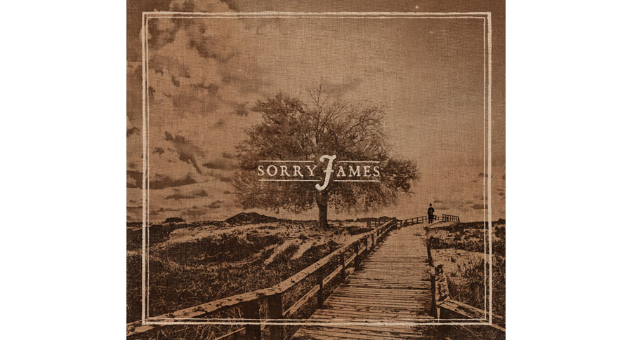
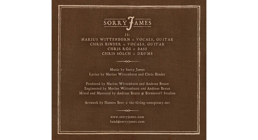
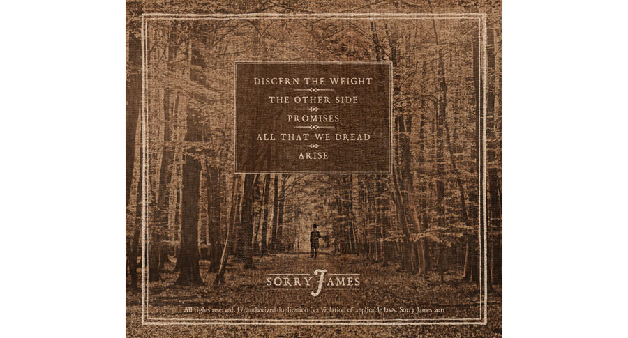
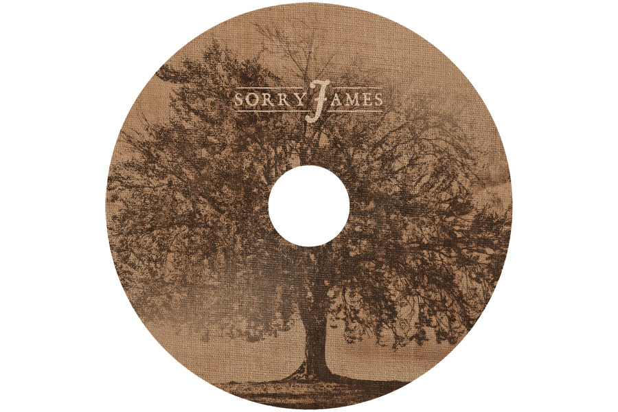
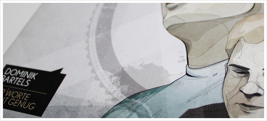
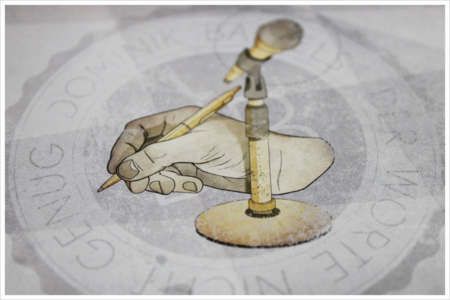
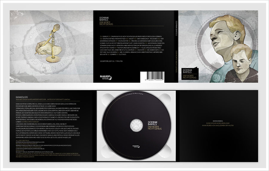
I am into a mood of posting images and no infos ! Today personal project and CD packs by Hannes Beer
