
18
July
2016
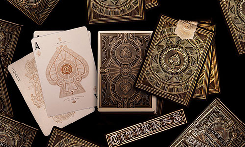
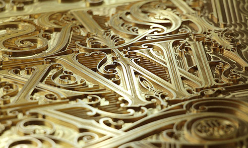
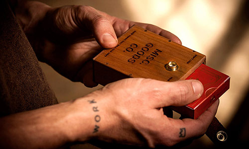
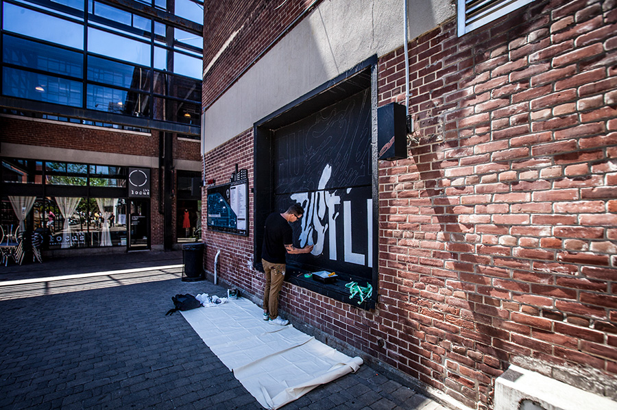
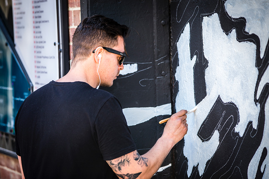
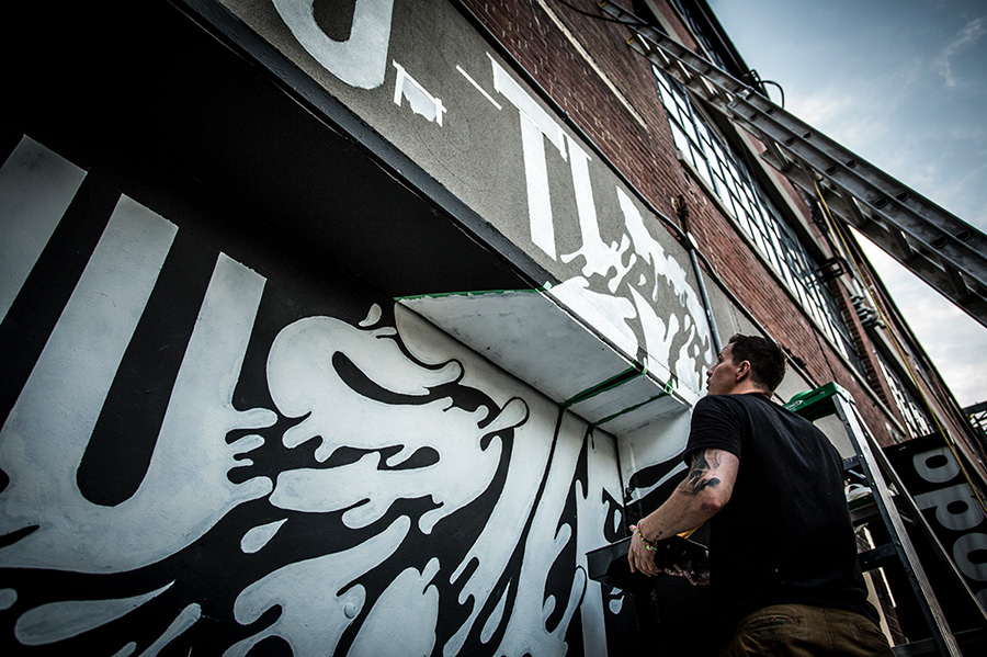
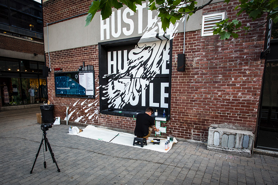
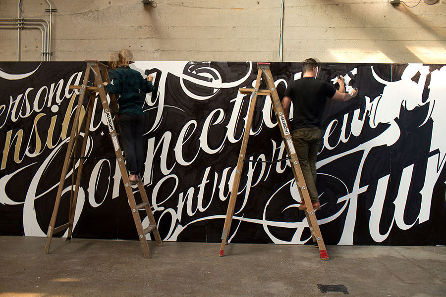
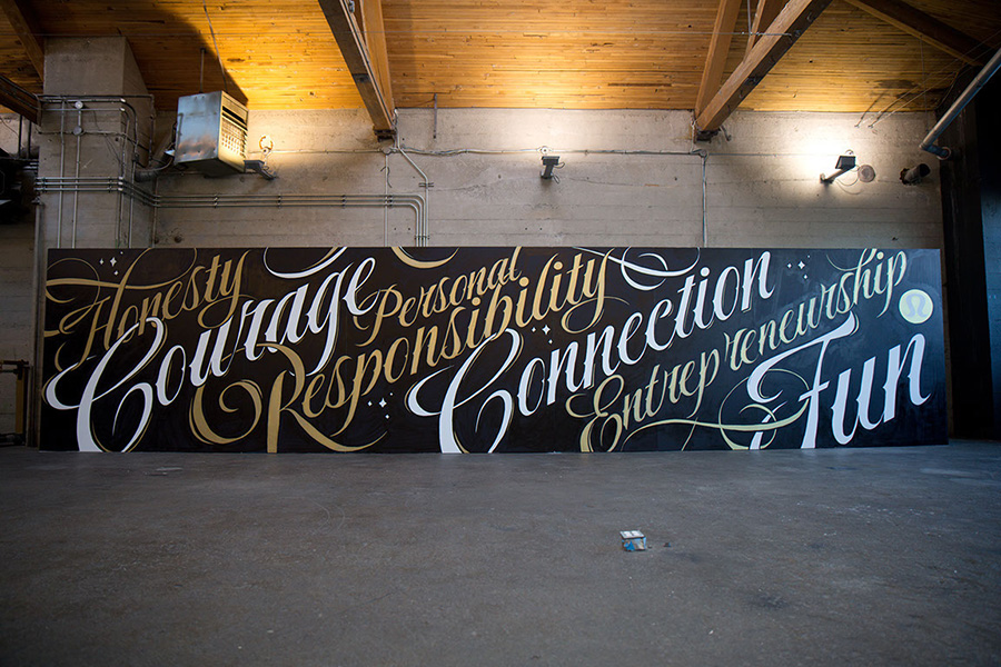
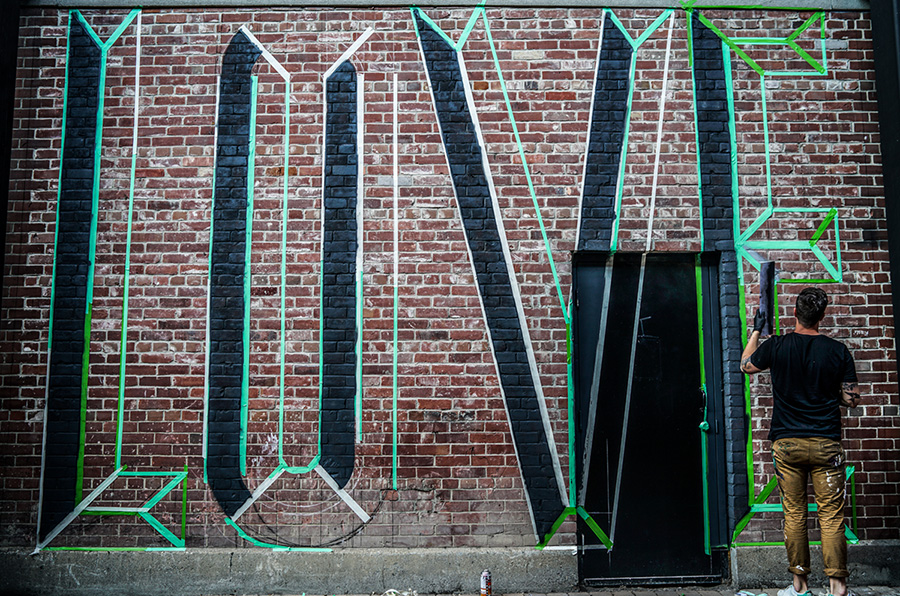
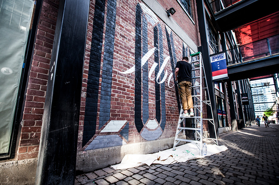
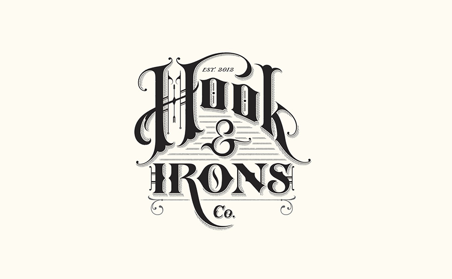
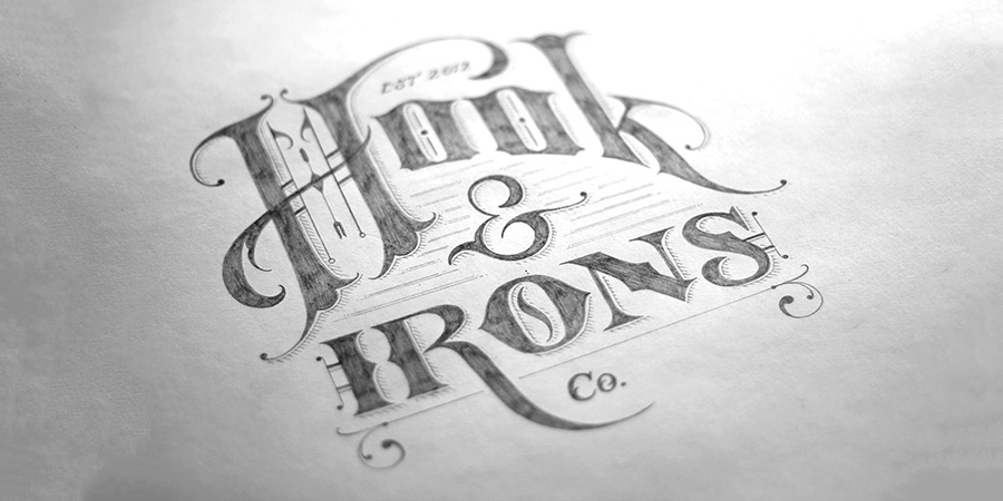
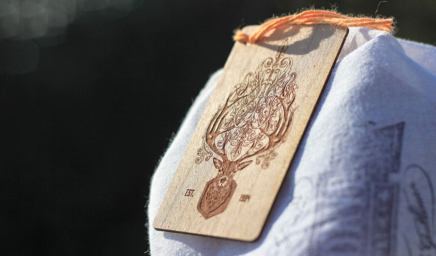
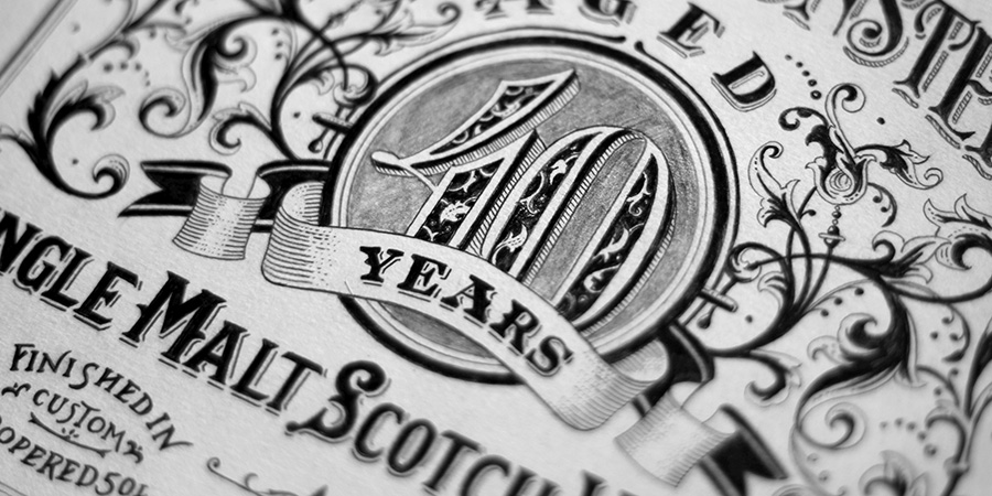
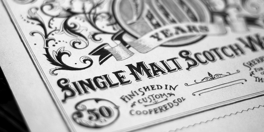
Ben Johnston is one of the inspiring lettering artist featured in Walter magazine vol2. Here comes a selection of his latest projects.
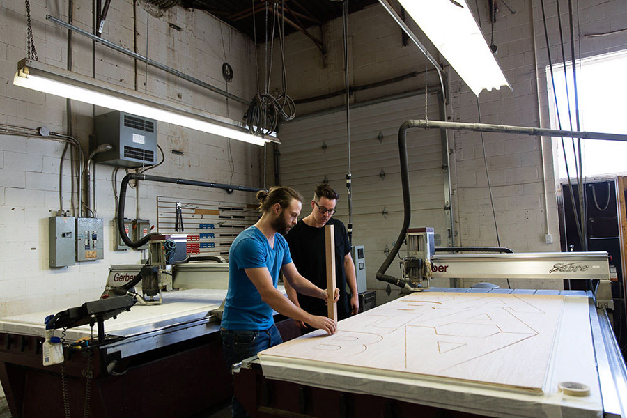
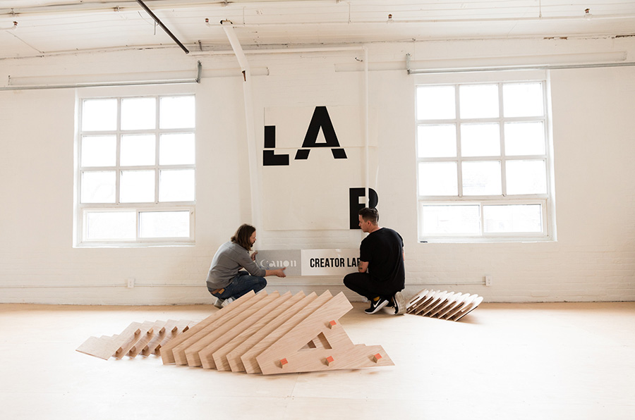
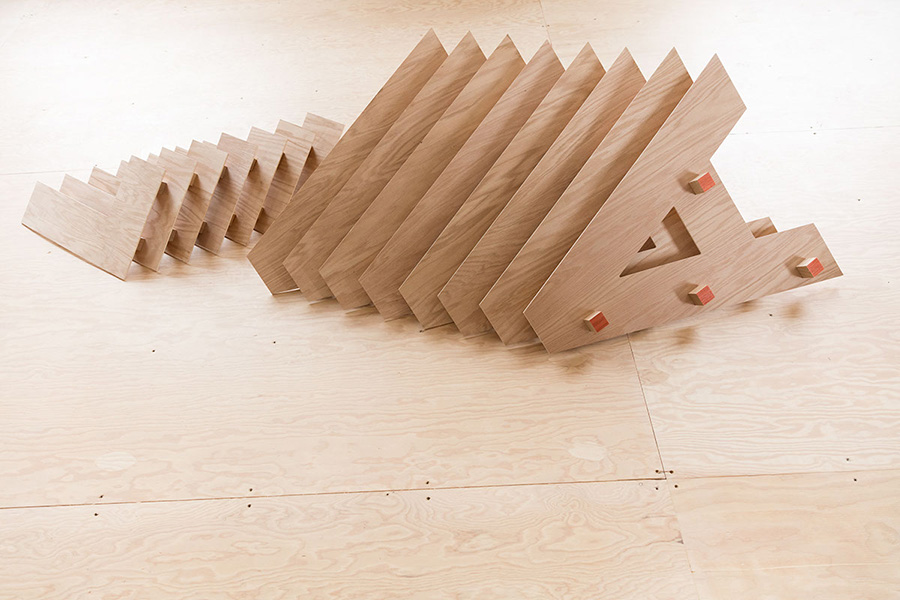
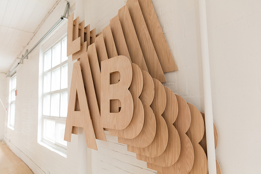
Canadian-born Ben Johnston is a 28-year old self-taught designer who grew up in Cape Town, South Africa. After a brief stint in industrial design, Ben started focusing on traditional graphic design, with a preference for creating typographic illustrations from scratch. His industrial design experience gives him the ability to break the confines of 2D and 3D, enabling him to bring his designs to life. Ben’s portfolio includes a prolific selection of completed projects for renowned ad agencies and major overseas clients. But it’s his handwritten designs that people talk about the most: huge handwritten typographic murals. Ben is currently based in Toronto as a full-time freelancer.
See more of Ben work in this past post and on his web site benjohnston.ca
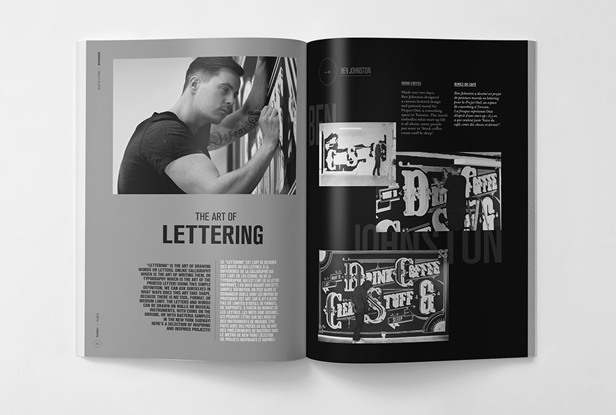
Ben is featured in Walter magazine in an article about "The art of Lettering" : “Lettering” is the art of drawing words or letters, unlike calligraphy which is the art of writing them, or typography which is the art of the printed letter! Using this simple definition, we can ask ourselves in what ways does this art take shape, because there is no tool, format, or medium limit. the letters and words can be drawn on walls or musical instruments, with coins on the ground, or with bacteria samples in the new york subway! Get wakter 2 for a selection of inspiring
and inspired projects!
13
July
2016
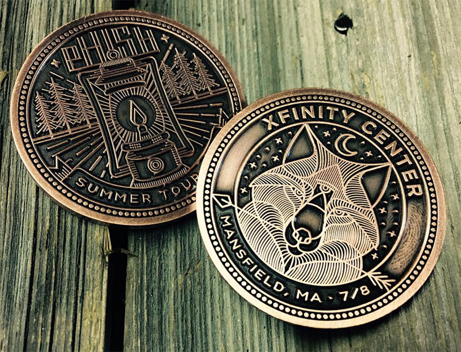
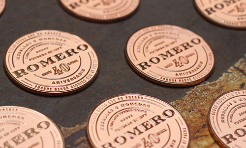
Love coins design, and Brain Steely illustration and specially animals looks perfect for it !
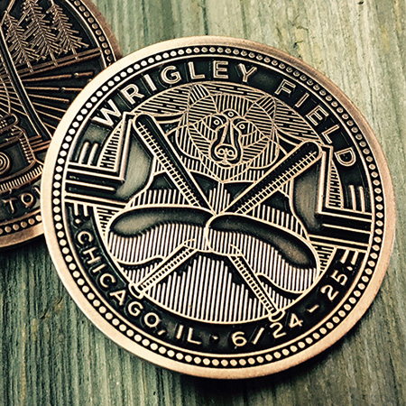
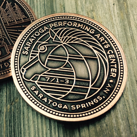
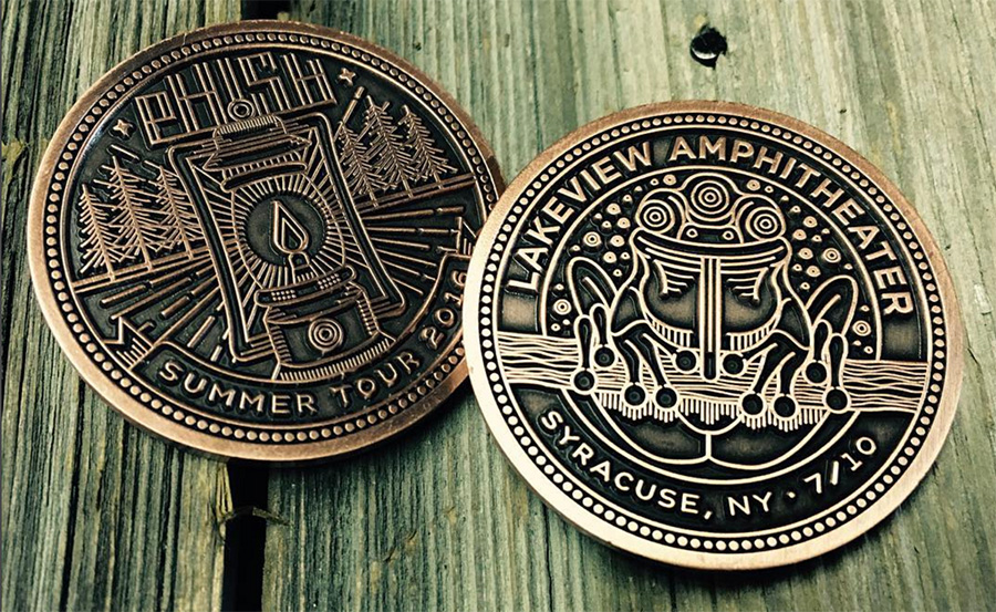
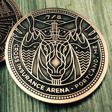
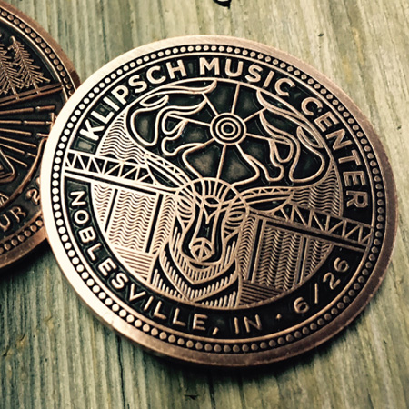
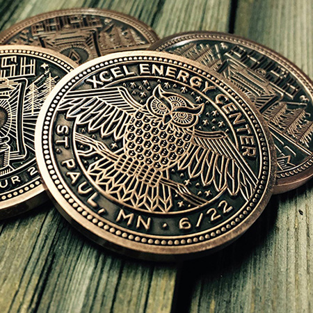
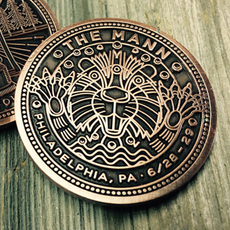
See more of Brian work on dribbble. Maybe time to do a news coin card ?
20
January
2016
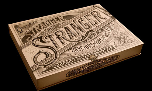
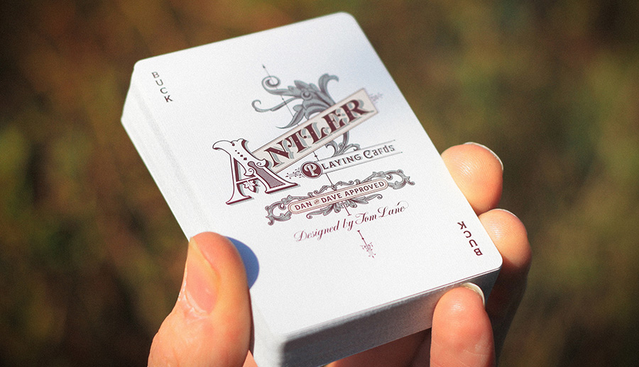
Walter 2 is in progress and it will include an article about handlettring with a selection of projects. Tom Lane, otherwise known as Ginger Monkey is an independent graphic designer & lettering artist. I ask him to participate to this year letterpress calendar but he was too busy ! I hope to have him next year... But the way, the normal edition of the calendar is still available here.
15
January
2016
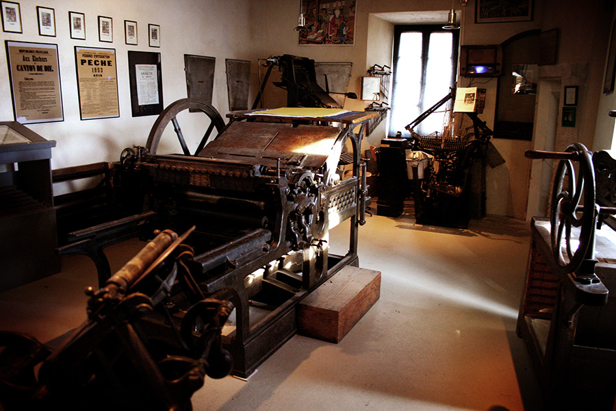
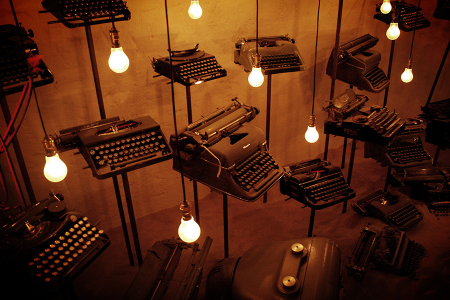
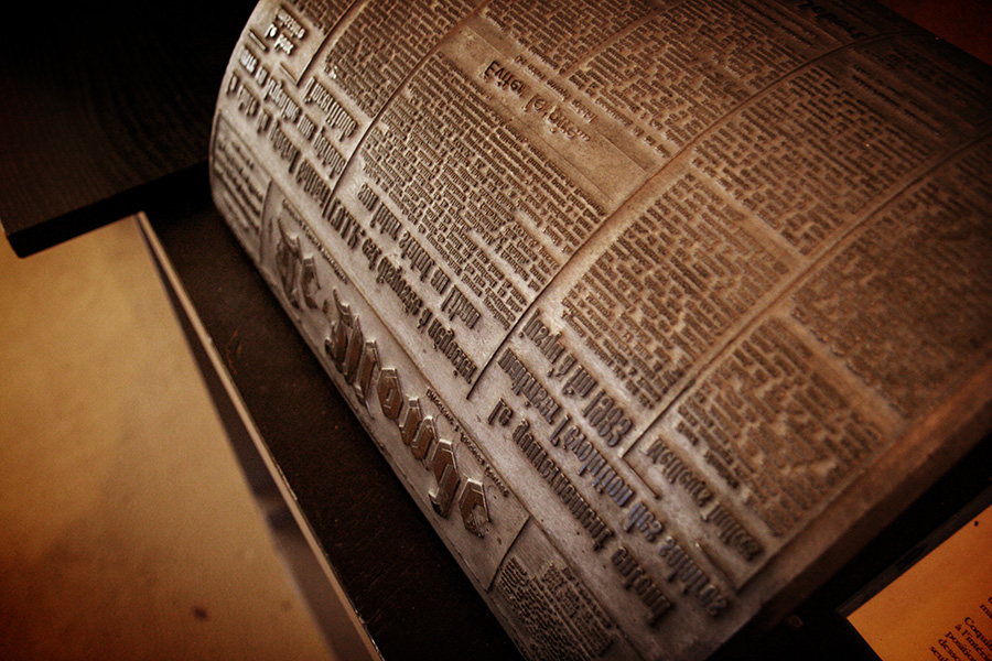
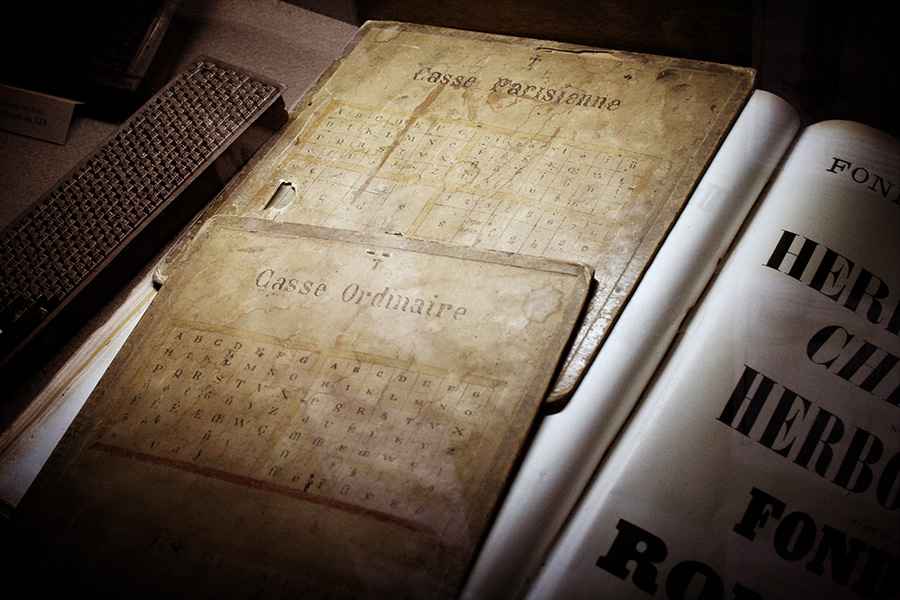
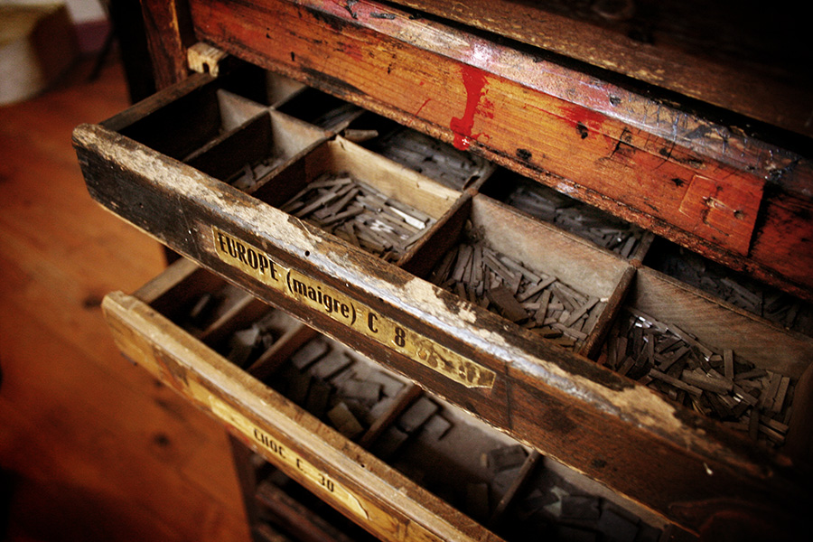
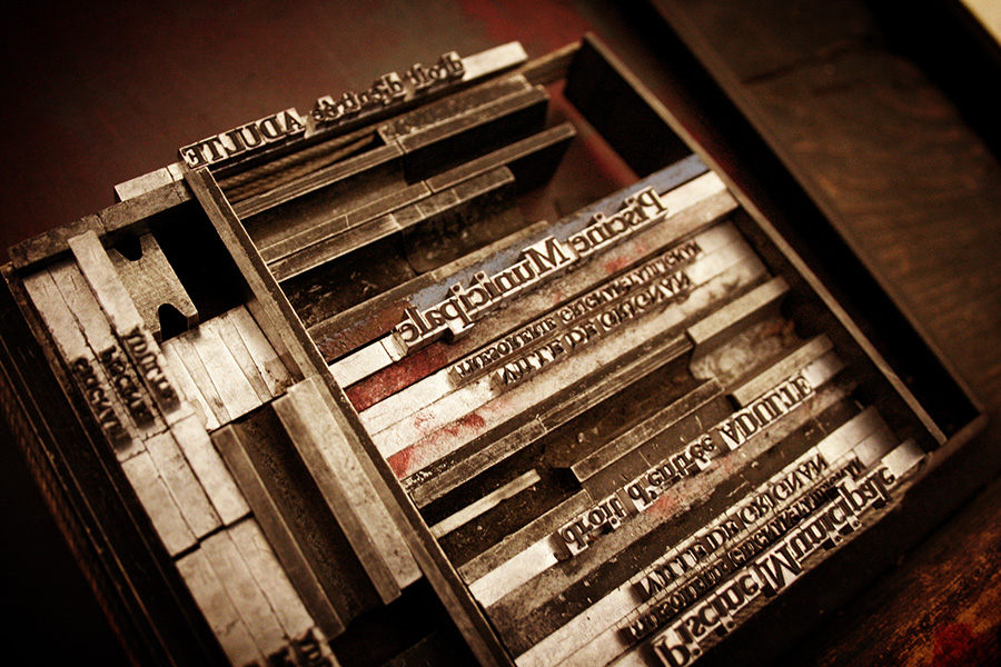
COLOPHON type museum
posted in Graphic
at 3.10 PM
from
Mr Cup Creative Studio . Arles
/ France
listening Walter Mitty soundtrack
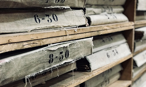
Some years ago, I work with a printer who has a nice type poster in his office. I see on the bottom it was "created by Colophon". I check what Colophon is, and found about this little museum run by passionates in a small village in France... I have to visit it ! And I shoot these pictures... They stay in my hard drives since then. I saw todayonly they launch a crowdfunding as they need help to continue the project ! They get what they ask for but I know that more is always better to support the makers ! So, I think it is time to share them !
Check Colophon support page here.
Check Colophon support page here.